This patch ports the close button from a ToolButton to a RoundButton so as to achieve better visuals because RoundButton's frame is much less prominent.
Diff Detail
Diff Detail
- Repository
- R120 Plasma Workspace
- Branch
- arcpatch-D18934
- Lint
No Linters Available - Unit
No Unit Test Coverage - Build Status
Buildable 9806 Build 9824: arc lint + arc unit
Comment Actions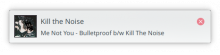
But some other fonts actually get pushed upward, see Ubuntu 10pt
before: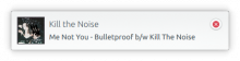
after: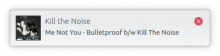
We have to find a way to take care of the spacing now that the "moat" is gone
Noto Sans 10 pt looks decent enough

But some other fonts actually get pushed upward, see Ubuntu 10pt
before:
after:
Comment Actions
I don't like this approach because the IconItem has no pressed state. This is already a problem for the Task Manager tooltips, and I'd like to not replicate it here too. Also I don't really like the fact that the close button is red here even before it's hovered; dismissing a notification is not a destructive action.
I have an idea though. Try applying this on top of your patch:
diff --git a/applets/notifications/package/contents/ui/NotificationItem.qml b/applets/notifications/package/contents/ui/NotificationItem.qml
index 83bd9dcd..5386e557 100644
--- a/applets/notifications/package/contents/ui/NotificationItem.qml
+++ b/applets/notifications/package/contents/ui/NotificationItem.qml
@@ -237,8 +237,8 @@ MouseArea {
             PlasmaCore.IconItem {
                 id:closeIcon
                 anchors.fill: parent
-                active: parent.containsMouse
-                source: "window-close"
+                active: parent.pressed
+                source: parent.containsMouse ? "window-close" : "window-close-symbolic"
                 animated: false
             }
         }
(You can do this with git apply - then paste, then hit Ctrl+d)
Let me know if that appeals to you.
Comment Actions
Or alternatively we could make the existing ToolButton flat all the time and then it will have the advantage of behaving like all other ToolButtons that people are already familiar with.
Comment Actions


You bet it does, it's looks much better. Unfortunately from what I'm seeing "window-close" is picked up from the desktop\Plasma theme while "window-close-symbolic" is picked up from the icon theme.
In practice that means if you, for instance, use the Oxygen icon theme and the Adapta desktop\Plasma theme, the default look of things is:
And when you hover over the icon you get this:

... which is the opposite of what we'd want!
We've thought about this too, but the problem is that the button is still centered and placed within a button, which makes it look badly aligned:
Ideally we actually wanted to use RoundButton, but we cannot for the life of us get icons to show up in it.
Comment Actions
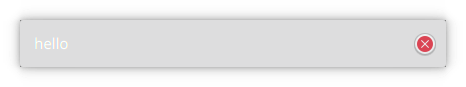
Update: I managed to get RoundButton working. While it does only have a minimal frame, unfortunately (with non-Breeze themes I believe) the button seemed to be suffering from odd coloring issues such as randomly taking on highlight color (even when the notifications were not interacted with).
Since I too now have little confidence in IconItem, I think the only thing we could do is make the existing ToolButton flat. But without the frame the icon looks too small.
Comment Actions
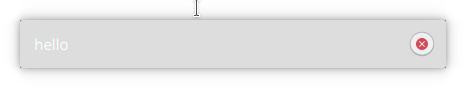
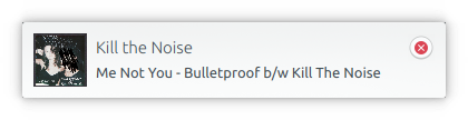
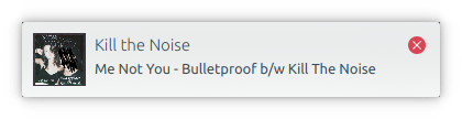
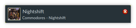
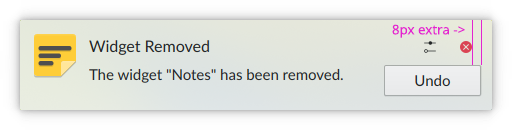
Alright so I'd like to give RoundButton another chance. Its advantage is that the frame is considerably smaller.
The control seems a bit weird though, it needs implicitWidth and an embedded icon class to work properly.
Some more real life testing is needed to see how the button behaves.