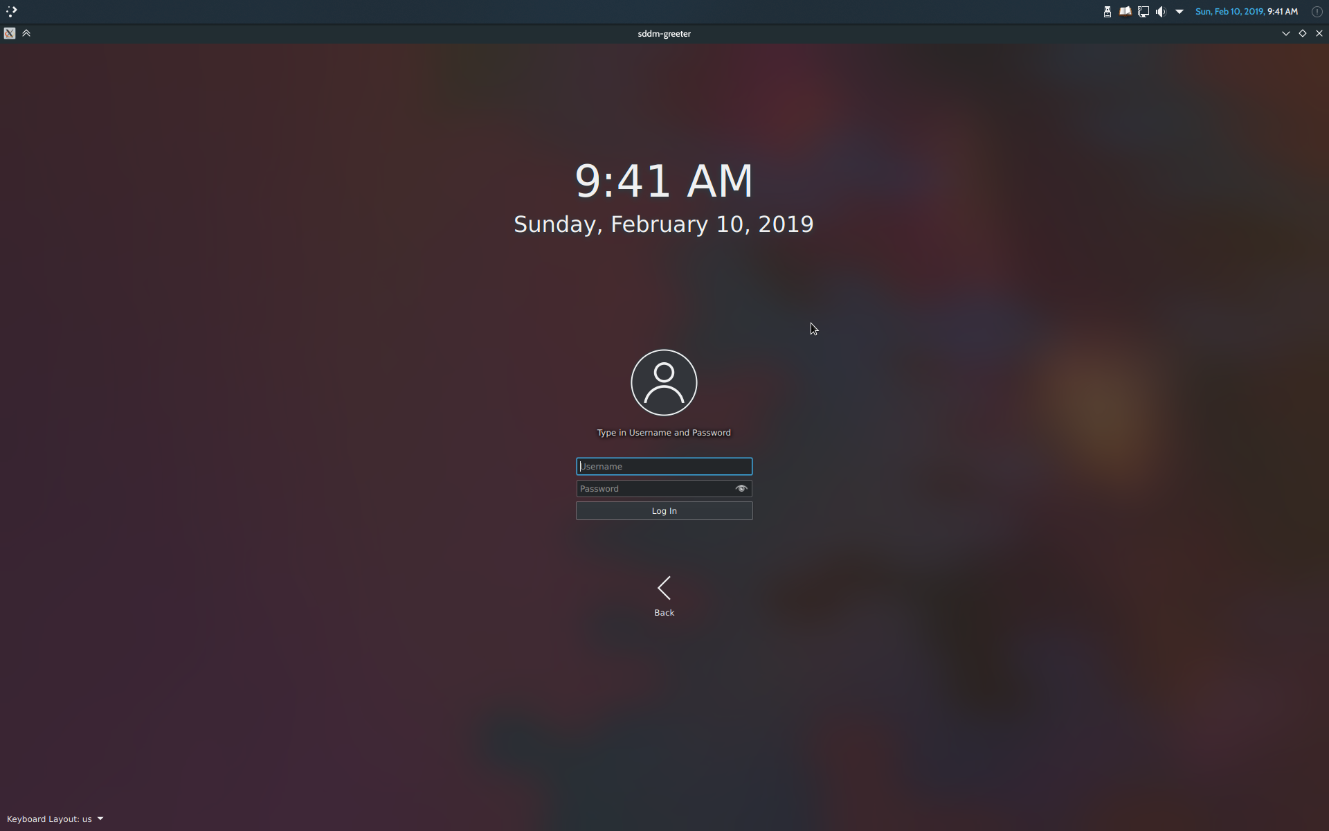
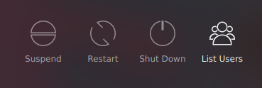
This patch adds the buttons Suspend, Restart, and Shut Down to the username prompt screen that appears once the Type User button is clicked so the user is able to suspend/restart/shut down from that screen without having to return to the initial login screen.
It also replaces the "Back" button with "List Users" (and an appropriate icon) on account of the latter being a more accurate description of what the screen goes back to once the button is clicked (and in case of future improvements, enables it to become a standalone login screen as well).
Details
Details
- Reviewers
filipf davidedmundson ngraham - Group Reviewers
VDG Plasma - Maniphest Tasks
- T10325: 5.16 Login screen improvements
- Commits
- R120:ccefa20ae859: [sddm-theme] Add buttons to username prompt to make it a full-fledged login…
Before:
After:

Diff Detail
Diff Detail
- Repository
- R120 Plasma Workspace
- Branch
- arcpatch-D18893
- Lint
No Linters Available - Unit
No Unit Test Coverage - Build Status
Buildable 8282 Build 8300: arc lint + arc unit
Comment Actions
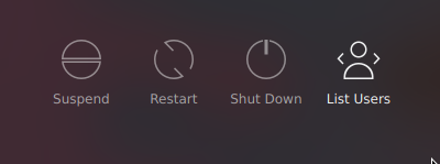
If we do this, then "List Users" and "Type User" will both be using the same icons. Feels like we should use more appropriate ones that visually suggest what the page it will take you to actually looks like.
Comment Actions
Yeah, like a line-art representation of the horizontal switcher, and a line-art representation of a username/password prompt.
Comment Actions
 Not too sure about the design but I managed to... make it symmetrical (sorry about all the edits)
How's this for the switcher?
Comment Actions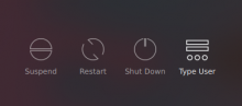
Any and all input regarding the design of the icons is appreciated :D
I couldn't really sleep last night so I made this one too

Any and all input regarding the design of the icons is appreciated :D
Comment Actions
+1 on the concept. Adding here my comments in the VDG channel regarding the icons:
- For the "Type User" icon, I liked the one that was dots/asterisks with an I-Beam cursor at the end.
- For the "List Users" icon, my recommendation is a new icons that has three people: two in the back, and a third in front of them, but a bit bigger.
Comment Actions
From my POV, +1 too.
| sddm-theme/Main.qml | ||
|---|---|---|
| 373–374 | should this also have visible: !inputPanel.keyboardActive ? | |
Comment Actions

Thanks for accepting the patch!
Should I land this and deal with the icons in another diff? Because this is in "plasma-workspace" and the icons are in "plasma-framework"?
Then again, I might have to change the code here (the new icons have different labels).
This is what I've got so far:
Comment Actions
For this image with the dots and type, shouldn't that be centered and not touch the edge of the circle?
Comment Actions
Hey guys so I opened up another diff to deal with the icons specifically: D19020
For this image with the dots and type, shouldn't that be centered and not touch the edge of the circle?
That works too, but the idea here was to make it seem like it has more depth. Not sure though. Still open to any and all suggestions....
Comment Actions
I would suggest to keep elements centered just to follow the general logic of the rest of the icons.