Improve the Kile Icon by incorporating the classic Kile letter design onto the cover of the notebook.
Details
Details
- Reviewers
ngraham mludwig - Group Reviewers
VDG Kile - Maniphest Tasks
- T10243: Some KDE applications could use better icons
- Commits
- R266:45cf4c00b372: Use a Kile Icon that is similar to the original
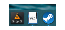
Before:

After:

Diff Detail
Diff Detail
- Repository
- R266 Breeze Icons
- Branch
- improve-kile-icon (branched from master)
- Lint
No Linters Available - Unit
No Unit Test Coverage - Build Status
Buildable 6068 Build 6086: arc lint + arc unit
Comment Actions
The original design was more consistent with the usual style for text characters used in Breeze icons, but I think using actual LaTeX fonts in this context works just as well or better for LaTeX users.
+1
Comment Actions
Hey, thanks for working on this.
I don't mind the change in font style.
However, do you think it's possible to add "Kile" somewhere onto the icon as well, preferably quite largely. With this icon, I always find it hard to locate Kile in the task manager.
Comment Actions


But I think at that point the meaning is less obvious than the root sign imo
Thats rather difficult. Adding it to the proposed design looks quite cramped:

The only good way to fit "Kile" into that shape is vertical, which looks weird and is not very legible:

A more elegant way would be just the letter K:

But I think at that point the meaning is less obvious than the root sign imo
Comment Actions
I would not recommend embedding the app name into the icon itself. The text isn't localizable, the icon would become really cramped, and in any event it would look weird since no other app does this.
For those reasons, our HIG specifically recommends against this: https://hig.kde.org/style/icon.html?highlight=icons#general-guidelines
Comment Actions


Well, it's not really arbitrary text, but the name of the application, so I it wouldn't be localized much. Besides, Kile's official icons have contained the character "K" or the string "Kile" for over 15 years.

Off the top of my head, another example of such an icon design is the one of Evince, which contains a stylized letter 'e' - I know it's from the competition ;)
Or to some extent, the icon of kcharselect, which I really like.
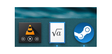
The biggest issue that I have with the square root icon is that it doesn't symbolize enough that it's the icon of an application. To me, it just looks like the application of a file type. Some dynamic element is missing, like a pencil, for example, to indicate that it's an application for editing such files.


Comment Actions
Can you show it at 100% size? You should generally show icons at 100% size so that they can be seen the way the user will see them.
Comment Actions


Do you think this looks more like an application? It could be added to all of the proposed designs.
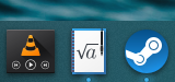
The proposed icons in my dock:

I have experimented with adding a black pen to the icon:

Do you think this looks more like an application? It could be added to all of the proposed designs.
Comment Actions
The uppercase 'K' is crisper at 100% size, so I think that's better than the lowercase 'k'. The lowercase 'a' still looks the best because of the empty space around it.
The idea with the pen is interesting, but there needs to be something to fill up that empty space.
Comment Actions


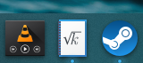
I have made the root a and root capital K design with the pen added:


At 100% scaling:
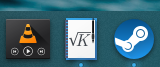
I think the root "K" is clearer, but looks a bit more cramped.
Comment Actions

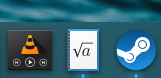
This uses the root a design from the Cantor icon which makes it pixel perfect and more consistent. Also, the pen is a bigger to be more recognizable at 100% scaling (this change can be made to the LaTeX font design as well).
I have made another design based on @ndavis feedback:


This uses the root a design from the Cantor icon which makes it pixel perfect and more consistent. Also, the pen is a bigger to be more recognizable at 100% scaling (this change can be made to the LaTeX font design as well).
Comment Actions
For me is these root sign nondescript. When the orig old blue symbol is not desired, how about to freshen it up? How? I don't know.
Perhaps Black & White just as all your other offers on these rectangular sheet of paper?
Furthermore exist these splash-screen. So maybe in yellow on these fuzzy gray paper?
Comment Actions
This icon is supposed to fit that style.
However, instead of black lines on a white background which looks more like simple text editing, this uses a mathematical formula which is one thing LaTeX handles wonderfully and is often used for.
The pen shows this is an application for editing/generating such files.
I can't think of a better symbol for LaTeX other than it's "Logo" which is just the Text LaTeX.
Furthermore exist these splash-screen. So maybe in yellow on these fuzzy gray paper?
This would not work at a small size and imo isn't very visually appealing.
Comment Actions
The used traffic cone by VLC is for me also nondescript, but that's their icon and therefore we know it.
My point is only that your new icon should be somehow similar to the stuff used by Kile, and not to try to describe what we can do with Kile.
Should I miss that your new icon will be the new Kile icon, I'm sorry for the noise :-)
Comment Actions
Kile folks, are you good with this now? If we don't hear back in a week or two, we'll have to assume yes. :)
Comment Actions
Sorry, but I'm still not a fan of this icon.
Moreover, as you pointed out in https://phabricator.kde.org/T10243, the "Don't destroy the app's existing branding" recommendation in the HIG has actually been violated by the previous version of this icon already.
Comment Actions
I have to agree with you here. Do you think a version of the icon with identical Text as the original Kile icon (big, horizontal "K", smaller, vertical "ile") with the notepad as the background would be enough to not differ from the existing branding too much?
I would like for some of the aspects of the current proposal (notepad, pen) to stay as the plain blue circle from the original icon does not integrate too well with the Breeze style.
I will update the revision with a version described above (original letters, notepad background)
Comment Actions
This has almost the same letter design as the original. I adjusted it a bit to fit onto the notepad.
This one has the letters arranged differently to make better use of the available space.
However, I think this looks less appealing and it is even less clear that the letters make the coherent word "Kile" than the original.
Here are some designs that are more faithful to the original:

This has almost the same letter design as the original. I adjusted it a bit to fit onto the notepad.

This one has the letters arranged differently to make better use of the available space.
However, I think this looks less appealing and it is even less clear that the letters make the coherent word "Kile" than the original.
@mludwig
What do you think of these designs? Are they close enough to the original to be recognizable?
Comment Actions
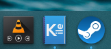
Yes, I like this version better, thanks. What about giving a blue foreground to the notebook and use white for the text?
Comment Actions
That is a great suggestion: Not only will this be closer to the original and therefore more recognizable, it even makes more sense semantically as the cover of the notebook will say "Kile" instead of the content of one page.
I will work on this and update the revision.
Comment Actions
I'm the author of this one:

That has been in Breeze for years. Please next time don't wait so much to complain about an icon that being the app launcher one can be easily noticed when updated.
Comment Actions
Please don't override the icons of applications without asking whether the developers are ok with it!
Comment Actions
Yes looks nice.
Would be good as icon for the Kile Handbook, for the application I would omit/avoid the "Notebook" look.
Comment Actions
Then we're just left with a blue surface and the letters "Kile" on it, which does not give any more information about the app than that it's called "Kile".
The icons should have at least some amount of meaningful symbolism related to the application on them.
The notebook shows that the application is used for interacting with text (as opposed to a book which can only be read, not modified).