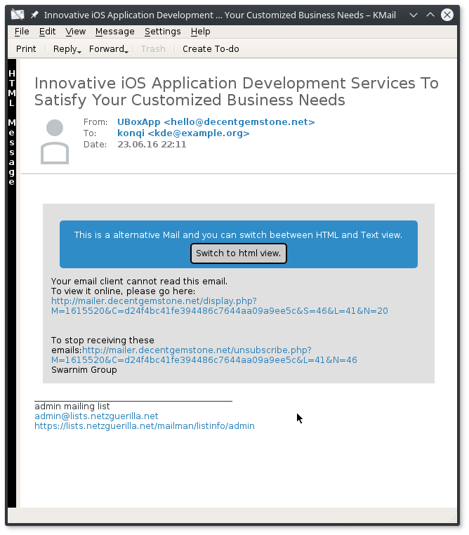
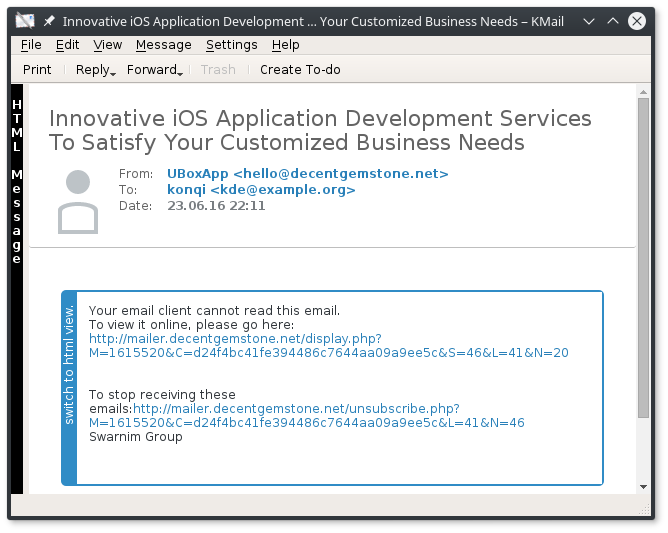
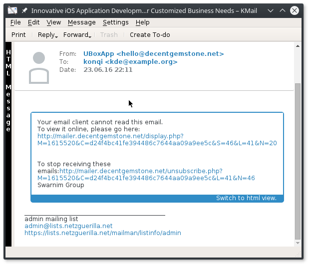
Alternative mails are often very different in the text part and html part.
So a user wants to switch between the parts actively.
Details
Details
Diff Detail
Diff Detail
- Repository
- R94 PIM: Message Library
- Branch
- master
- Lint
No Linters Available - Unit
No Unit Test Coverage

| messageviewer/src/messagepartthemes/default/templates/alternativepart.html | ||
|---|---|---|
| 34 | IIRC you should wrap your jQuery into anonymous function like this: $(function()) {
// your code comes here
});or $(document).ready(function() {
// your code comes here
});to ensure it's invoked after jquery is initialized. | |
| messageviewer/src/viewer/csshelperbase.cpp | ||
| 624 | Why not use QPalette::Button for background and QPalette::ButtonText for test? | |
| messageviewer/src/messagepartthemes/default/templates/alternativepart.html | ||
|---|---|---|
| 34 | This does not work - I get an error in the cmdline: js: Uncaught ReferenceError: $ is not defined if I change $ to qt.jQuery than I get: js: Uncaught TypeError: qt.jQuery is not a function so qtwebengine don't load jQuery differently :( | |
Comment Actions
To be honest, I think this is too much "in your face". If a user wants to mostly just read the plain-text part, why show such a big message and button right inside the email all the time?
I actually find the sidebar KMail currently has on the left edge of the email a more elegant solution. Maybe we could make it a bit more obvious that it can be clicked to switch the modes (maybe just showing a quick "tutorial" the first time a user starts KMail) and it should be activated by default (which it isn't atm for whatever reason).
So is there any strong argument against making better use of the sidebar?
Comment Actions
+1
Oh interessting - i only saw the sidebar only as feedback element not that I can click at it. That's where I started - there is no element to switch between boths modes. One other thing is, that if we have a attached mail with additionally an second alternative part, the sidebar only can switch globaly between html/text for every type. With my implementation way we could do this granualr for every alternative part. IMO thinks that the sidebar is too far away from the actualy content. But I could implement a sidebar directly at the left side of the content.
Comment Actions
Oh interessting - i only saw the sidebar only as feedback element not that I can click at it. That's where I started - there is no element to switch between boths modes. One other thing is, that if we have a attached mail with additionally an second alternative part, the sidebar only can switch globaly between html/text for every type. With my implementation way we could do this granualr for every alternative part. IMO thinks that the sidebar is too far away from the actualy content. But I could implement a sidebar directly at the left side of the content.
If even members of the team don't know about the interactivity, that does show that we have to make it more clear, indeed :)
Okay, switching modes separately for attached emails makes sense. I would only show it inline if there are actually multiple alternative parts, however (which I guess is rather the exception than the norm?).
The common use case is either you want to see a mail as plain text or as HTML (or actually the most common one is that you show it as plain text by default and then want to switch to HTML if the plain text part isn't really useful, once you've shown it as HTML there is rarely a reason to switch back to plain).
Comment Actions
Indeed a big button is not a good idea. I don't want it for sure. I want to read all email as text but I don't want it.
I actually find the sidebar KMail currently has on the left edge of the email a more elegant solution. Maybe we could make it a bit more obvious that it can be clicked to switch the modes (maybe just showing a quick "tutorial" the first time a user starts KMail) and it should be activated by default (which it isn't atm for whatever reason).
Yep html "statusbar" it's activate by default from 5.2.
So not sure that a button as it it's a good idea.
After that use jquery to switch can be a good idea but a big button as it.. no :)
So is there any strong argument against making better use of the sidebar?
Comment Actions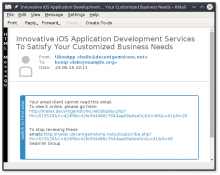
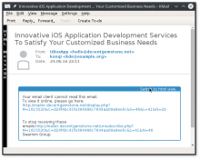
okay a fast test with a small part on the left:
on the top:

on the buttom:
( I know the colors can't work here, because we get confusion with encrypted mails).
Comment Actions
There should never be both the "global" and "local" sidebars be present at the same time, as that would just be confusing.
Comment Actions
jepp, but this "just" removal :D
First we should decide what kind of interface we want, before I put more effort in it.
- I would prefer either we go the global sidebar or the inline - I have not strong options for one or the other.
- I'm against that we have the global sidebar and if there are more alternative the inline sidebar additionally, because I think this is also confusing for the user.
- If we would go with the global sidbar, than no inline sidebar :D
- I think the inline sidebar makes it more clear, what is does and indicate better, what part is changed.
- the inline sidebar is a new element, the global sidebar was already introduced
Okay, switching modes separately for attached emails makes sense. I would only show it inline if there are actually multiple alternative parts, however (which I guess is rather the exception than the norm?).
the box / button is only shown, when there is somthing to switch.
The common use case is either you want to see a mail as plain text or as HTML (or actually the most common one is that you show it as plain text by default and then want to switch to HTML if the plain text part isn't really useful, once you've shown it as HTML there is rarely a reason to switch back to plain).
Hard to say, if you never want to switch back :D The intial problem is because senders of email do not send the a real alternative in the two parts, otherwise you would not need to switch. So maybe you siwtch to the html mail and see, that the plain text part is better readable.
Comment Actions
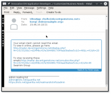
I think the inner "sidebar" is too invasive in plain text and it will break with HTML emails (there must be a way to toggle back from HTML to plain text).
How about adding a small button below the headers that would simply say "Show HTML" / "Show plain text"? Maybe we could even add it INTO the headers, by introducing a grantlee variable ({{alternativeToggleToolBar}}?) with well-documented class names so that header themes can override the button styles if they want to and document that it is mandatory for all header themes to use it or provide their own method for switching alternative types.
Comment Actions
It was a nice test for jQuery but I think it doesn't make sense here, because we already have a switcher.