In order to compare your incomes and expenses, you can use a stacked bar chart. However, usually the result looks like this
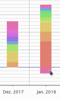
Incomes and expenses both make the stacked bar rise, which I find quite counter-intuitive.
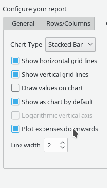
For better visualizing this, I created a toggle switch that allows you to plot your expenses as negatively-stacked bars:
The result looks like this:
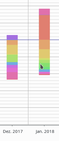
Incomes go upwards and expenses downwards.
By comparing the bars, you have a visual feeling on
- how much you earned or lost during a month
- which of your categories contributed to what amount
- how these contributions changed over time
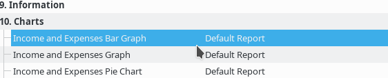
As I find this type of report quite useful, I added one in the default reports: