When watching movies with significant volume differences (i.e. most modern movies) I find myself adjusting the volume a whole lot. Since the volume OSD appears in the middle of the screen I also have to rewind the video. That's just too disruptive (#347123 was not enough), so let's make it possible to disable the OSD completely.
Details
Details
Diff Detail
Diff Detail
- Lint
Lint Skipped - Unit
Unit Tests Skipped
| applet/contents/config/main.xml | ||
|---|---|---|
| 15 | You cannot rename that existing key as it would reset every user to the default value then as it would read from a new key | |
Comment Actions
Got it! I changed:
- volumeAudioFeedback → volumeFeedback (like before)
- volumeOsdFeedback → volumeOsd
Ok?
Comment Actions
this begs more the question whether the osd layer should stay on top of fullscreen windows, rater than adding yet another configuration option
Comment Actions
this begs more the question whether the osd layer should stay on top of fullscreen windows
It used to not do that but people also complained (me included, I want it ontop of my video). Maybe we need a new, more compact design (like the bar we had in 4.x), or one in the top left rather than center like Windows 10 has these days.
Comment Actions
Could we have a small bar at the top edge of the screen in case of fullscreen app and otherwise the current one?
Comment Actions
I think the current UI is just fine as the default; no need to change it. Simply making it smaller wouldn't really help the submitter's use case very much anyway since it would still show up and cover up something. However I'd be open to making the default appearance configurable, as a small but vocal cohort of people don't seem to like it.
That's material for another patch though.
Comment Actions
Yes; I would be completely happy if the current (size and all) OSD would appear in the periphery of the screen, preferably a corner. So perhaps the missing option is actually a drop-down for the position of the OSD? An ambitious plan would be:
- Center: the current OSD. (Default)
- Notification Area: shows a thin vertical bar in the Notification Area (so the lower right corner for the default panel).
- Top: shows a very thin horizontal bar centered at the top edge.
- Bottom: like the above.
However I'd be open to making the default appearance configurable, as a small but vocal cohort of people don't seem to like it.
Yay! I was trying to not just be another voice by providing an actual patch, but...
That's material for another patch though.
...I won't commit to dig deeper into the OSD subsystem, which this would require.
Comment Actions
I just stumbled upon this reddit thread with a significant number of upvotes: https://www.reddit.com/r/kde/comments/9j57z2/fixing_the_awful_volumebrightness_osd_size/
So I guess it's an idea worth pushing forward. :)
Comment Actions
Yeah, I saw that too.
I'm still against an option to hide it entirely, but I could get behind an option to show a more compact version.
I could also support moving all of the square-style OSDs farther down so they're not as close to the center of the screen.
Comment Actions
I'm not suggesting we should base new options entirely off reddit opinions. That would be short-sighted. :)
However I see no harm in adding to this discussion that changes or new options to OSD would be welcomed by a number of people. Certainly falls under the category "quick and dirty user research" but then again, why disregard it completely?
From what I gathered so far there is a need (more or less) for a less obstrusive and a completely hidden OSD. I'd get behind three options so we don't overcomplicate things: classic, compact, none.
Of course I'm open to arguments why we shouldn't do this. :)
Comment Actions
Listening to user feedback is important. We not only have complaints on Reddit, but also someone was motivated enough to submit a patch here. I've also seen it brought up in Bugzilla tickets.
Comment Actions
It's not about that there are only complaints on Reddit. It's about the user group: do we want to deaign so that the small Reddit community is happy or do we want to design for the rest? Do we want to make the product more complicated (yes that's the result of a config option) to please some people on Reddit while at the same time we already have a mechanism to achieve the same?
Comment Actions
offer the option to obscure/hide the OSD, but I personally like the full screen OSD so i'd prefer to have the option to keep it
Comment Actions
I could also support moving all of the square-style OSDs farther down so they're not as close to the center of the screen.
why?
Comment Actions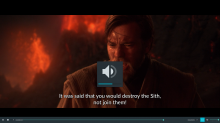
What would be the problem in having both the option to turn the OSD off and having the option to change its appearance?
The plasma-pa settings dialog is super uncluttered right now so I don't understand the argument that it would complicate things.
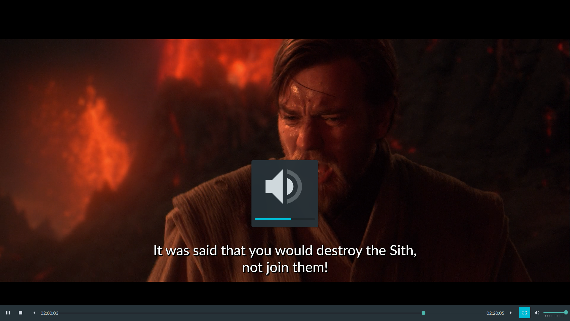
As for the default appearance of the OSD, I believe it's fine. If you move it down, you're sort of obfuscating less of the action in the video, but you're now also potentially blocking the user's subtitles, which is IMO worse than superimposing oneself over the video.
EDIT: Visual proof that we shouldn't be lowering the position of the OSD (and some people even have bigger subtitles than I do)
Comment Actions
For what it's worth: I opened this ticket and sent the patch, and I am not part of the Reddit community. Before I implemented my own fix I searched around for a solution I encountered a plethora of complaints and patches, with Reddit just being a drop in an ocean:
- https://sergiorafael.wordpress.com/2017/02/13/disable-kdeplasma-volume-osdpopup/
- https://unix.stackexchange.com/questions/449855/how-to-disable-the-volume-popup-in-kde-plasma-5-13
- https://forums.linuxmint.com/viewtopic.php?t=205707
- http://hipersayanx.blogspot.com/2015/12/disable-volume-and-brightness-osd-in-kde.html (filed a patch for brightness OSD that was rejected: https://bugs.kde.org/show_bug.cgi?id=343962)
- https://ubuntuforums.org/showthread.php?t=1198058
- https://www.reddit.com/r/kde/comments/5zyd1a/i_hate_the_new_volume_osd/ (has code to make the OSD into a thin horizontal strip)
- https://forum.antergos.com/topic/6370/annoying-volume-icon-pop-up
- https://github.com/Zren/plasma-applets/commit/337b7d11103da11576584bdd605726c38bbbc2f9
- https://forum.kde.org/viewtopic.php?f=88&t=85544
- https://forum.kde.org/viewtopic.php?f=67&t=99424
- https://forum.kde.org/viewtopic.php?f=289&t=153873
- https://bugs.kde.org/show_bug.cgi?id=363983
- https://bugs.kde.org/show_bug.cgi?id=398020
Do we want to make the product more complicated (yes that's the result of a config option) to please some people on Reddit while at the same time we already have a mechanism to achieve the same?
What is this "mechanism" you are talking about? I'm intrigued!
Comment Actions
What is this "mechanism" you are talking about? I'm intrigued!
We have a mechanism for theme providers to change the OSD. (the whole LNF package stuff). They can override all qml, that qml does the positioning.
The recurring pattern that we want to avoid is having a framework where theme creators can set everything, whilst simultaneously the default theme becomes itself a theme engine itself by having a billion options.
Comment Actions
The position that current state is the one and only way really puzzles me if I'm trying to look at it rationally.
Personally, I'm actually fine with they way things are and would probably not change much in my config, but I believe the following two arguments have merit:
- the square OSDs inefficiently consume space -> they just seem like copying macOS; Windows is more efficient (and more informative since it provides values as well) ... someone should correct me if I'm wrong, but the only reason I see for having them be that big is maybe if you're far away from the screen, otherwise the user could easily tell they're affecting e.g. audio even if the icon was many times smaller.
- the OSDs do sometimes get in the way while in full screen apps -> gaming and watching videos being the most common actions where you may not want any OSD interference; side-note: the OSDs are big and ugly when running older games which do not support your screen resolution
I think these are legitimate issues regardless of whether or not there has been talk about it on Reddit or elsewhere and I do not think addressing them should be seen as catering to a small group of users, but instead as following through on KDE's philosophy. Those that are okay with the defaults just use the defaults, however, Plasma is meant to be powerful when needed. On a practical and comparative level the user can already change the panel location and size, the location of notifications and so many other things... why must OSDs be a non-configurable thing then?
Comment Actions
Putting the responsibility on theme creators is not a sure-shot way to address things because they usually change a lot more than just OSDs. This means if the user simply wants to address particular concerns regarding OSDs, they also have to go along with the new theme's entire design vision (which is not necessarily always great). So this is in certain cases actually a worse solution than, say, getting a very specific extension in GNOME. Of course though, I do agree there should be a line where one customization option would be too much, I just don't think it applies here - both due to legitimate concerns I tried to touch on in my previous post and both due to the fact that plasma-pa settings are really not at all exhaustive as is (edit: the battery widget options even less and that's an understatement).
Comment Actions
Is this a solvable problem?
A theme with no options doesn't work unless the entire meta-theme is split up into dozens of individually themable components like we do with the lock and login screens, color scheme, etc. So we would need to create the concept of an "OSD theme." But note that some of these sub-themes are themselves configurable: for example you can change the size of the cursor selected by the current cursor theme, or change just the text color of the active color theme.
If, in the interest of pushing everything onto theme creators, we decided to change this and make themes non-editable, the result would be an enormous profusion of themes that are essentially forks of the Breeze version, but with very minor subtle differences from one another. It would be a huge irritation for people who just want to change one or two little things, and searching through and managing all the themes would become a nightmare. Also, most wouldn't be maintained over time as theme creators lose interest, meaning that store.kde.org would become a graveyard of dead themes--even more than it already is today. On the other hand, if we removed the concept of color themes entirely and just kept the individual editability of the colors in the KCM, we'd be losing the ability to easily switch between color themes and download new ones.
In all practicality, we will never have themes with no options or just options with no themes--and we probably shouldn't try to get to either place, because we wouldn't like the result. So I suspect that a firm separation between themes and options is going to prove elusive forever. It's inherently nebulous, and we will not be able to draw a hard boundary between one and the other, similar to how it's often hard to tell where one cloud ends and another one begins. We can only embrace nebulosity; attempts to nail it down will not succeed.
Comment Actions
On a sidenote, I think it's worth pointing out that anonym's change pertaining to the name of the "Volume Feedback" option may be good idea because I don't think that term is self-explanatory; I don't think a first-time fiddler necessarily understands what it's supposed to mean.
Comment Actions
Yes! Please.
I also struggle to understand what is the rationale for having something this big in the middle of the screen. Its not only distracting when watching movies playing games etc, but also while writing a report or just while basically doing anything that involves watching/reading the screen while listening to whatever in the background.
The real question is: why does the icon need to be this big? Why was the middle of the screen chosen as the only sensible and non configurable position to place the OSD?
Comment Actions
But that replaces everything else too. Look-and-feel packages aren't a great solution to the problem of wanting to change only one or two things, and conceptually, they don't scale at all.
Comment Actions
This hasn’t been merged. The option seem to already exist for all types of OSD in: Workspace → Workspace Behavior → General Behavior → «Display visual feedback for status change», though that’s a very vague and unclear option name.
I tried to use the look-and-feel package from the Reddit thread, but it reset a lot of my settings…
Then I tried to isolate the OSD change, to apply it alone, and didn’t find how if it is possible.
Afterwards make my own look-and-feel package so that I could apply the OSD and not lose all my other theme settings. But it just didn’t work for some things, and didn’t take some other things into account…
So I got back to applying the look-and-feel package to get the OSD, then put back all my other configs.
That’s the pain it was for me.
Now since we could chose where notifications does appear on the screen, I thought it was logical that it was the case for OSD.
Also, note that OSD takes more vertical space and display less information than a notification, so it could be argued that it’s even more necessary to be able to chose where it appears, or at least to make it a little more discreet…
Comment Actions
Personally I am in favour of the current Windows 10 style, a compact version in the top left corner. I tried to to create a mockup to demonstrate how it could look like:
To make hopefully everyone happy (*), there could principally be two options exposed (eg via a combobox plus a preview button, which simulates the choice):
- Default center big
- Top left compact
Additional there could be a radiobutton
- Display none in full screen apps
(*) except those, who do not like to introduce new options. :)
P.S. I am not on reddit.
Comment Actions
How about "Display compact version in full screen apps". And then make this behavior the default. The problem people have with the big version seems to be when it covers stuff up in movies, that are played normally in full screen.
EDIT: Ok, I just noticed that I suggested this already some months ago. I don't want to repeat the same ideas so ignore it if you want to.
Comment Actions
Any news on this OSD behaviour? The default notifications is incredibly obnoxious and it just seems like a horrible design decision to use an icon that covers about 20% of screen width/height and blocks whatever was below it right at the center of the screen, which tends to just be whatever the user was previously looking at, and they are now forced to wait for the notification to time out in order to be able to continue doing whatever they were doing. These notifications are not important enough to warrant my focus for 2 seconds every time a change happens (and I'm forced to focus on them because of the current behaviour), but just hiding them away like it currently happens is very counter intuitive. Sorry if I posted this in the wrong place but I've just spent about 2 hours looking for ways to fix this while baffled by the difficulty of changing what seemed simple and this seemed like the most promising discussion to talk in.
Comment Actions
In fact an option to hide the volume OSD was added in 5.19 already. Sadly I think we all forgot about this patch (sorry about that) but at least it's done now.
Further visual improvements to the OSD and reduction in its intrusiveness can be discussed at D20569.
Comment Actions
Thanks for trying, it's appreciated! However, D29263 does not solve my problem at all (see D29263#659354).
Further visual improvements to the OSD and reduction in its intrusiveness can be discussed at D20569.
I'm sad to say that this experience has made me quite disillusioned about participating further. :(