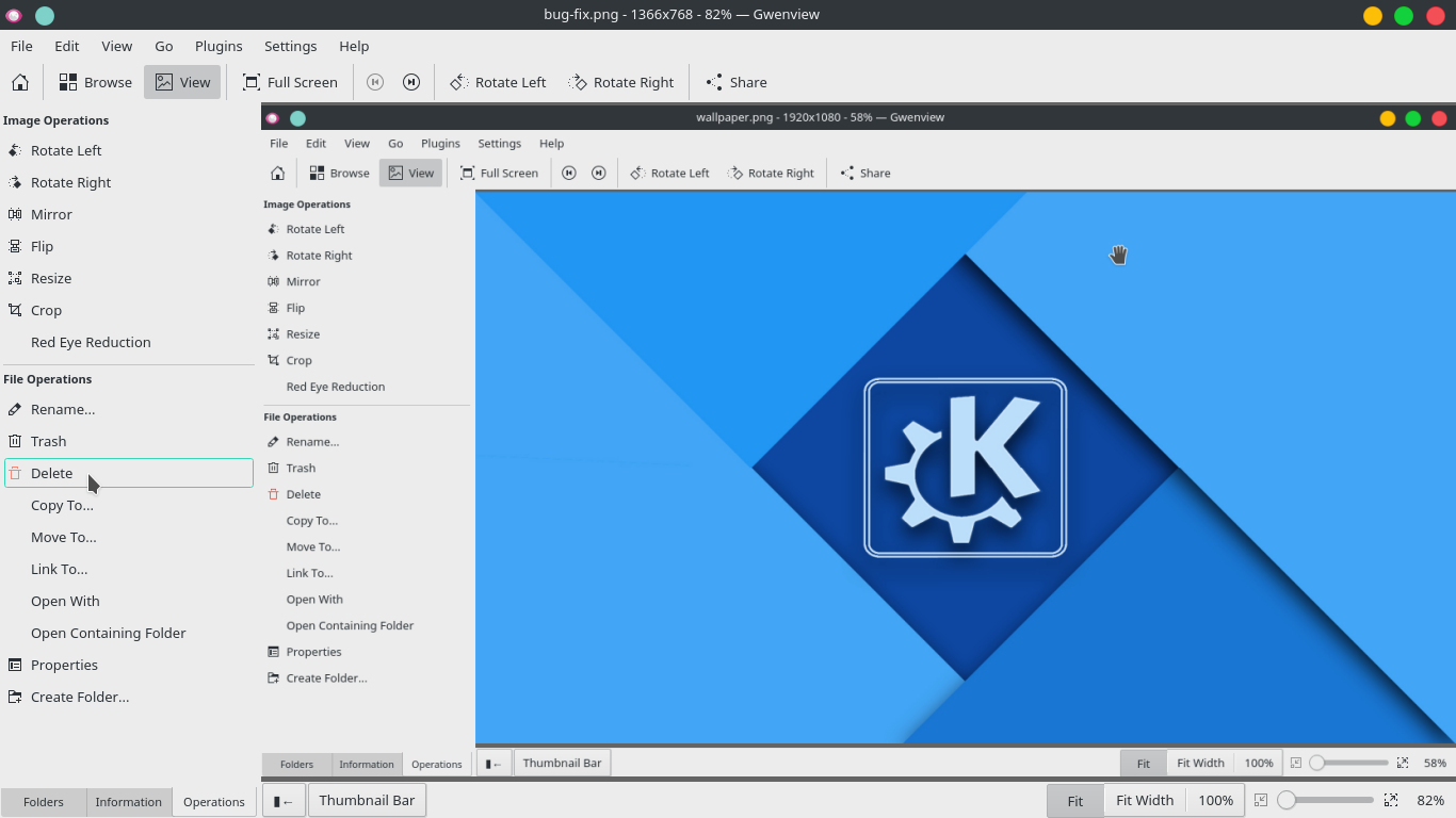
Sidebar content too close to the left boundary of the window.
This patch adds left margin to some of the sidebar contents.
BUG: 381535
| ngraham | |
| rkflx |
| KDE Applications |
Sidebar content too close to the left boundary of the window.
This patch adds left margin to some of the sidebar contents.
BUG: 381535
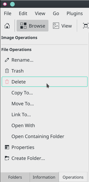
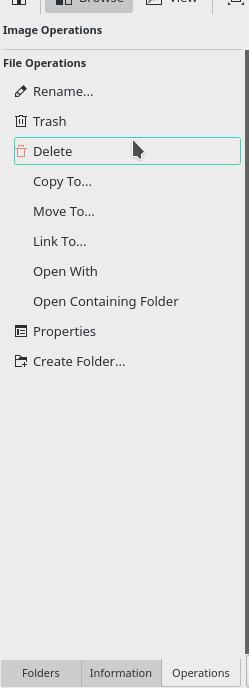
Before:

| Lint Skipped |
| Unit Tests Skipped |
You fixed this, yay! I was tearing my hair out trying to figure out what the issue was. This works and looks good to me, but I'll hold off on landing it until others have had a chance to comment on whether or not this is the right implementation.
Great fix, was on my list of things to improve, too :)
I'll give this a thorough test tomorrow (only looked at the screenshot so far, need to build and look at the code in detail still). But first two questions:
I only see margin "3" at 4 places, 3 of which will be added by this patch and
most of the "margin" values seem to be zero.
Thanks for the updates, much cleaner code :) In general I feel this could be done in an even simpler way, but haven't got the time really to figure this out right now. Maybe I'll send a follow-up patch.
Regarding the commit message: BUG: ... will automatically close the corresponding Bugzilla entry, however this only works when it is on a separate line (currently the text representation of the "Details" from above will become Summary: BUG: ... in the commit message, which won't work for this). Please add a short sentence in an extra line before BUG: ..., which would be good anyway e.g. to describe what the problem was before / why it was necessary to correct the margin.
Please see inline comments for some additional niggles:
| app/mainwindow.cpp | ||
|---|---|---|
| 537 ↗ | (On Diff #23391) | I don't think we need this for the Folders sidebar. The text already has enough margin, and if someone chooses to have no window border, we should not try to introduce an extra "border" inside the app. The right and bottom borders look ugly now, too. |
| 548 ↗ | (On Diff #23391) | Same thing for the Information sidebar. Here, only the part above the text input widget should be indented more, and also only on the left (see next comment). |
| 556 ↗ | (On Diff #23391) | In general I do not like how this adds more space everywhere at the top, right and bottom. We only want the wider margin on the left, don't we? Maybe you could try something like setContentsMargins instead. |
| app/sidebar.cpp | ||
| 158 | This caught my eye, because setting a non-quadratic icon size seems like a hack. And indeed, this leads to much more spacing now between icon and text. Could you try to find a way so the spacing looks basically the same as in the toolbar button at the top of the following screenshot?: 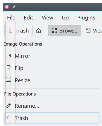 If this turns out to be too difficult, I'm willing to accept the current state. But at least we should try to be consistent here before giving up… | |
The space between icon and text now looks much narrower than without the patch. I think it was just fine in an unpatched Gwenview, it is only the left margin which needs tweaking. Note that in my screenshot I set the toolbar icon size to "small" to match the sidebar buttons. You can use pixeltool-qt5 or gammaray to make measuring easier.
As for the summary, please don't just repeat the title ;) Write what was wrong (i.e. section header text as well as buttons too close to edge of window when setting window borders to "none") and what fixes this.
HiDPI:
I still don't know why normal conventional methods like setting stylesheet or setContentsMargin are not working for QToolButton
Thanks, I'll look at your updates in a bit.
Meanwhile, please let us know which email address should be used when landing this patch on your behalf.
Much better, but I think we need one more iteration regarding the spacing (did not yet look at the code in depth).
Sorry, don't know that either. When looking around, you do not seem to be the first to notice this, though.
| app/mainwindow.cpp | ||
|---|---|---|
| 537 ↗ | (On Diff #23391) | That's not done. What I meant was that you should not touch the spacing here at all. If you look at Dolphin, the main folder view also extends all the way to the right window border. In addition, this does not align well with the left border of the tab strip below (w/o patch it was aligned perfectly). |
| 548 ↗ | (On Diff #23391) | I don't think this can be marked as "Done", because the Description text input widget is still affected by your patch, while it shouldn't be. It is only the text above this widget which should have extra margin added to the left. |
| app/sidebar.cpp | ||
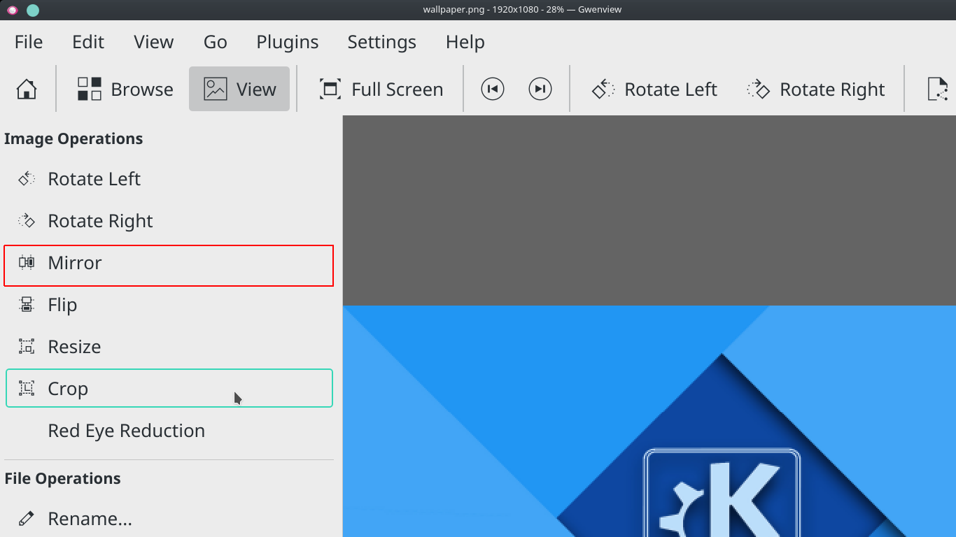
| 158 | Spacing now looks almost like it was designed by a professional designer, good job! However, with QT_SCALE_FACTOR=1.4 (i.e. fractional scaling), the rendering quality of the icons degrades massively (note that the toolbar is still fine): (Patch on the left, 17.08.3 on the right). | |
I don't think fractional scaling is supported by qt:
https://www.mail-archive.com/kde-devel@kde.org/msg09355.html
https://bugzilla.redhat.com/show_bug.cgi?id=1381828#c1
https://bugreports.qt.io/browse/QTBUG-55654
I also tried using floating point values for drawing pixmap and the result was much worse.
Skimming over those links, I get the impression those are about general scaling issues or autodetection. As you can see in my screenshot, fractional scaling works just fine. It is only your patch that makes it worse unfortunately.
I'm so sorry I have to tell you this, but now it breaks in another place. I'm confident you'll get it right eventually :)
Also, I guess you are still working on the margins of the text input widgets as per my comments?
Edit: Can't edit the inline comment, of course I mean "do NOT remove"…
| app/sidebar.cpp | ||
|---|---|---|
| 89 | That's a horrible hack which breaks gwenview -reverse (compare the text alignment w/ and w/o patch). Also, I'm not sure how this interacts with screen readers. I think it is best if you do remove the text internal to the button, so screen readers, RTL writing systems and potentially other things continue to work. As I said in D9145#176020, I would be okay with the version referenced there if this turns out to be too difficult. | |
Now i am out of ideas :|
Only small hacks like these seem to work, I think the first revision: D9145#176020 is much safer to use. Even if we think of any other way to resolve this problem, it is going to break gwenview in some way which we might not find right now.
Also my university exams are going on right now, so i am not able to devote much time to this issue.
I actually don't think text input widgets look bad with or without margin.

Still if you say i will remove the margin :)
Ok, then we agree. At least we tried and learned something in the process…
Also my university exams are going on right now, so i am not able to devote much time to this issue.
No need to rush, the earliest release this patch could ship would be 17.12.1 on January 8.
It looks bad in the default config (i.e. with normal window borders enabled), and regardless of window border size the left border of the text widget should be as close to the window border as the left border of the tab strip, to replicate the alignment from the right side. So yes, I would prefer if you removed the left margin from both text widgets. I guess this might boil down to not adding any margin to the container at all, and only indenting the text above a bit.
Thanks for the updates, I'll do the final review later today or tomorrow.
My bad, I meant "widgets with white background and blue frame", i.e. what you'll find on the Information and Folders panels.
| app/sidebar.cpp | ||
|---|---|---|
| 162 | Can you remove this? I think I found a way to fix the problem properly. Still needs some fiddling, but I'll have it figured out soon™ (sorry for the cliffhanger :) | |
I think i have fixed this finally :)
Does this look good?
I'll make some more changes and update the revision.
My fix won't be in Gwenview, you don't need to do anything here ;)
However, I wonder whether you uploaded the complete patch or missed a git add, because for me the Rating label is still too far to the left, while your screenshot is correct. Could you have a look?
The margin is still on the wrong side in RTL mode, but at least it interferes not as badly with the text as in a previous iteration and the sidebar headers are broken in that regard anyway. I don't want to overburden this patch, so you won't have to improve that for now :)
| app/sidebar.cpp | ||
|---|---|---|
| 162 | Phab shows a whitespace change here (added empty line), please remove. | |
| app/sidebar.h | ||
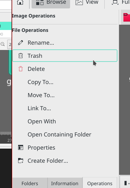
| 40 | const QMargins& margins would be better, but actually I don't really like this hacky way, because we have 4 headers, but you are calling this function only for one. This may be obvious now, but in several years nobody will understand the code. I think the best way would be to try to get rid of semanticinfosidebaritem.ui, i.e. manually create its items in code and essentially have in each sidebar a container (red rectangle) which is then indented at a central place: 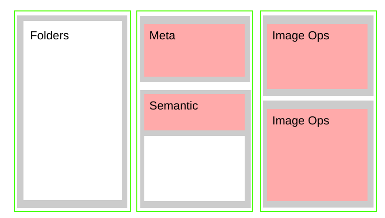 | |
Can we just set left-margin for title to 3 in constructor of sidebargroup, also set container margin to 3 for Image operation, file operation and meta information and set margin 3 inside ui file for semantic information (not whole of the container)
Depending on what you refer to with "container", the title might have double margin now? Just try it, I guess.
If you want to keep the ui file, I would be okay with that. But instead of the margin setter call at least add a comment to that effect at a similar place in the code.
Okay, so then it could work like so:
Could you try this? To me this looks much more clean and future proof than updateTitleMargin and multiple setContentMargin calls.
Here we go, fixes submitted for review in D9281 and D9282.
Backstory how I figured it out:
Looking at the other toolbuttons, I saw they worked fine. Then I added some text to the zoom buttons in the status bar and even wrote a test app with only some buttons in different layouts, all working fine. The only explanation left was that there had to be a bug somewhere, meaning it was not Gwenview's fault. And indeed, switching styles the problem happened only with Breeze and Oxygen. But still all other toolbuttons worked fine, how could that be?
Only by chance I stumbled upon the _kde_toolbutton_alignment property in GammaRay. Tracing this one back was not straightforward, but I ended up in Breeze. Seeing the special casing for Gwenview there was quite a suprise, to say the least. One git blame, some code reading and thorough testing later the patch was ready.
Thanks so much for your patience so far, I believe we solved all hard problems and now there are only some final nitpicks and adjustments left.
| app/semanticinfosidebaritem.ui | ||
|---|---|---|
| 20 ↗ | (On Diff #23765) | In SemanticInfoContextManagerItemPrivate::setupGroup, add formLayout->setContentsMargins(DEFAULT_LAYOUT_MARGIN, 0, 0, 0); so you don't have to duplicate the magic number in the .ui file. Move DEFAULT_LAYOUT_MARGIN to sidebar.h for this. |
| 38 ↗ | (On Diff #23765) | Removing this breaks the alignment of the rating widget. |
| 87 ↗ | (On Diff #23765) | Why do you need to add that? |
| app/sidebar.cpp | ||
| 41 | Now that we indent only the text and only on the left, we can easily make this a bit wider. I think aligning "Semantic" to "Description" would be nice. I tried this and we'd need to put 6 here for this. In addition, it looks a bit nicer for borderless windows. If you agree, please change. | |
| app/sidebar.h | ||
| 37 | According to the naming convention for Qt, containerMargin and mContainerMargin for the member variable might be more readable. | |
| 49 | Please move this to SideBarGroupPrivate and initialize in SideBarGroup::SideBarGroup with d->... = .... | |
| app/sidebar.h | ||
|---|---|---|
| 37 | addContainerMargin is not a member variable, mAllowContainerMargin is. | |
| app/sidebar.h | ||
|---|---|---|
| 37 | Mostly I was stumbling over the "allow" vs. "add" discrepancy, I think both should have the same name (with the member variable prefixed with m). Then I looked at the naming convention which recommends to not prefix nouns with "is/has/allow" etc. Granted, it looks a bit like an int now. If you don't like it maybe go with something like defaultContainerMarginEnabled instead? | |
| app/sidebar.h | ||
|---|---|---|
| 37 | How about mContainerMarginAllowed? | |
| app/sidebar.h | ||
|---|---|---|
| 37 | nvm, defaultContainerMarginEnabled looks better | |
Latest version LGTM. Thanks a lot again for your patch.
I'll commit this on your behalf to the stable branch as soon as the freeze for 17.12.0 has ended (probably end of the week).
If you like working on Gwenview and need ideas for what to tackle next (apart from the RTL issue…), let us know ;)