- use backgroundcontrast effect, improves readability a lot
- non-current actions a bit more translucent
- background is actually black if the color scheme is dark, looks washed out otherwise
- add an OK button, that was complained a lot
- short fade animation at the beginning
Details
Details
- Reviewers
sebas broulik - Group Reviewers
Plasma - Commits
- R120:5f2f343ef6a3: UI fixes for logout dialog
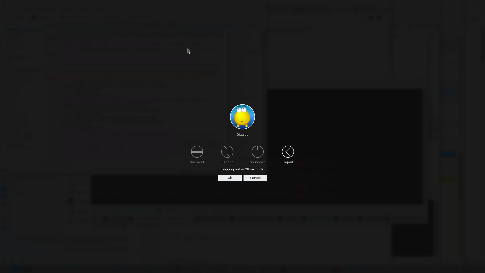
see screenshot
Diff Detail
Diff Detail
- Repository
- R120 Plasma Workspace
- Branch
- phab/logoutpretty
- Lint
No Linters Available - Unit
No Unit Test Coverage
Comment Actions
Background is quite dark for me now :/
Also, can we perhaps have pressing the arrow keys cancel the timer? It's quite unintuitive that when I press left the label still says "Logging out in n seconds" although Shutdown is highlighted.
| ksmserver/shutdowndlg.cpp | ||
|---|---|---|
| 199 | From what I can tell KWin doesn't support different background contrasts, ie. once you click Leave you'll change your Panel background contrast. Bhushan experienced the same when running a plasmoid in plasmoidviewer using a different theme, as soon as a tooltip shows up, it globally changes the contrast. | |
| 228 | Unrelated | |
| lookandfeel/contents/logout/Logout.qml | ||
| 54 | Don't let Martin see that you animate a window opacity manually | |
| 87 | Urgh. Can you add a TODO for Qt 5.8 :) | |
| 218 | Isn't it "OK"? | |
| lookandfeel/contents/logout/Logout.qml | ||
|---|---|---|
| 54 | ;-) But yes for a good, flicker free experience it needs to be animated by KWin. We can re add the logout effect to do the fading. | |
| ksmserver/shutdowndlg.cpp | ||
|---|---|---|
| 199 | right, i see that the panel gets dark, then suddenly gets ok again as soon i open a panel popup (so reapplies the old contrast on the popup window) this is quite unexpected, as the contrast values are in an atom that should be per window. Martin, any idea on this? | |
| lookandfeel/contents/logout/Logout.qml | ||
| 54 | ok, i'll remove it and then will do a separate review for a logout effect in kwin (that would just be fading that window) | |
Comment Actions
eh, the problem was mainly that there wasn't enough contrast.
i agree that it looks a bit dark, but if the priority is to ensure the text pops out, it kinda has to be quite dark
Comment Actions
No issues other than the ones Kai pointed out found. Once Kai is happy, you got my shipit, too.
| lookandfeel/contents/logout/Logout.qml | ||
|---|---|---|
| 21 | I think that's unused now | |