Changeset View
Standalone View
applets/taskmanager/package/contents/ui/ToolTipInstance.qml
| 1 | /* | 1 | /* | ||
|---|---|---|---|---|---|
| 2 | * Copyright 2013 by Sebastian Kügler <sebas@kde.org> | 2 | * Copyright 2013 by Sebastian Kügler <sebas@kde.org> | ||
| 3 | * Copyright 2014 by Martin Gräßlin <mgraesslin@kde.org> | 3 | * Copyright 2014 by Martin Gräßlin <mgraesslin@kde.org> | ||
| 4 | * Copyright 2016 by Kai Uwe Broulik <kde@privat.broulik.de> | 4 | * Copyright 2016 by Kai Uwe Broulik <kde@privat.broulik.de> | ||
| 5 | * Copyright 2017 by Roman Gilg <subdiff@gmail.com> | 5 | * Copyright 2017 by Roman Gilg <subdiff@gmail.com> | ||
| 6 | * Copyright 2020 by Nate Graham <nate@kde.org> | ||||
| 6 | * | 7 | * | ||
| 7 | * This program is free software; you can redistribute it and/or modify | 8 | * This program is free software; you can redistribute it and/or modify | ||
| 8 | * it under the terms of the GNU Library General Public License as | 9 | * it under the terms of the GNU Library General Public License as | ||
| 9 | * published by the Free Software Foundation; either version 2, or | 10 | * published by the Free Software Foundation; either version 2, or | ||
| 10 | * (at your option) any later version. | 11 | * (at your option) any later version. | ||
| 11 | * | 12 | * | ||
| 12 | * This program is distributed in the hope that it will be useful, | 13 | * This program is distributed in the hope that it will be useful, | ||
| 13 | * but WITHOUT ANY WARRANTY; without even the implied warranty of | 14 | * but WITHOUT ANY WARRANTY; without even the implied warranty of | ||
| 14 | * MERCHANTABILITY or FITNESS FOR A PARTICULAR PURPOSE. See the | 15 | * MERCHANTABILITY or FITNESS FOR A PARTICULAR PURPOSE. See the | ||
| 15 | * GNU Library General Public License for more details | 16 | * GNU Library General Public License for more details | ||
| 16 | * | 17 | * | ||
| 17 | * You should have received a copy of the GNU Library General Public | 18 | * You should have received a copy of the GNU Library General Public | ||
| 18 | * License along with this program; if not, write to the | 19 | * License along with this program; if not, write to the | ||
| 19 | * Free Software Foundation, Inc., | 20 | * Free Software Foundation, Inc., | ||
| 20 | * 51 Franklin Street, Fifth Floor, Boston, MA 2.010-1301, USA. | 21 | * 51 Franklin Street, Fifth Floor, Boston, MA 2.010-1301, USA. | ||
| 21 | */ | 22 | */ | ||
| 22 | 23 | | |||
| 23 | import QtQuick 2.6 | 24 | import QtQuick 2.6 | ||
| 24 | import QtQuick.Layouts 1.1 | 25 | import QtQuick.Layouts 1.1 | ||
| 25 | import QtGraphicalEffects 1.0 | 26 | import QtGraphicalEffects 1.0 | ||
| 26 | import QtQml.Models 2.2 | 27 | import QtQml.Models 2.2 | ||
| 27 | 28 | | |||
| 28 | import org.kde.plasma.core 2.0 as PlasmaCore | 29 | import org.kde.plasma.core 2.0 as PlasmaCore | ||
| 30 | // for Highlight | ||||
| 29 | import org.kde.plasma.components 2.0 as PlasmaComponents | 31 | import org.kde.plasma.components 2.0 as PlasmaComponents | ||
| 32 | import org.kde.plasma.components 3.0 as PlasmaComponents3 | ||||
| 30 | import org.kde.plasma.extras 2.0 as PlasmaExtras | 33 | import org.kde.plasma.extras 2.0 as PlasmaExtras | ||
| 31 | import org.kde.kquickcontrolsaddons 2.0 as KQuickControlsAddons | 34 | import org.kde.kquickcontrolsaddons 2.0 as KQuickControlsAddons | ||
| 32 | 35 | | |||
| 33 | import org.kde.taskmanager 0.1 as TaskManager | 36 | import org.kde.taskmanager 0.1 as TaskManager | ||
| 34 | 37 | | |||
| 35 | Column { | 38 | ColumnLayout { | ||
| 36 | property var submodelIndex | 39 | property var submodelIndex | ||
| 37 | property int flatIndex: isGroup && index != undefined ? index : 0 | 40 | property int flatIndex: isGroup && index != undefined ? index : 0 | ||
| 38 | 41 | | |||
| 39 | spacing: units.smallSpacing | | |||
trmdi: Why do you remove all `spacing`? This increases lots of wasted space which is not good at least… | |||||
| 40 | | ||||
| 41 | readonly property string mprisSourceName: mpris2Source.sourceNameForLauncherUrl(toolTipDelegate.launcherUrl, isGroup ? AppPid : pidParent) | 42 | readonly property string mprisSourceName: mpris2Source.sourceNameForLauncherUrl(toolTipDelegate.launcherUrl, isGroup ? AppPid : pidParent) | ||
| 42 | readonly property var playerData: mprisSourceName != "" ? mpris2Source.data[mprisSourceName] : 0 | 43 | readonly property var playerData: mprisSourceName != "" ? mpris2Source.data[mprisSourceName] : 0 | ||
| 43 | readonly property bool hasPlayer: !!mprisSourceName && !!playerData | 44 | readonly property bool hasPlayer: !!mprisSourceName && !!playerData | ||
| 44 | readonly property bool playing: hasPlayer && playerData.PlaybackStatus === "Playing" | 45 | readonly property bool playing: hasPlayer && playerData.PlaybackStatus === "Playing" | ||
| 45 | readonly property bool canControl: hasPlayer && playerData.CanControl | 46 | readonly property bool canControl: hasPlayer && playerData.CanControl | ||
| 46 | readonly property bool canPlay: hasPlayer && playerData.CanPlay | 47 | readonly property bool canPlay: hasPlayer && playerData.CanPlay | ||
| 47 | readonly property bool canPause: hasPlayer && playerData.CanPause | 48 | readonly property bool canPause: hasPlayer && playerData.CanPause | ||
| 48 | readonly property bool canGoBack: hasPlayer && playerData.CanGoPrevious | 49 | readonly property bool canGoBack: hasPlayer && playerData.CanGoPrevious | ||
| Show All 16 Lines | 65 | if (lastSlashPos < 0) { | |||
| 65 | return ""; | 66 | return ""; | ||
| 66 | } | 67 | } | ||
| 67 | var lastUrlPart = xesamUrl.substring(lastSlashPos + 1) | 68 | var lastUrlPart = xesamUrl.substring(lastSlashPos + 1) | ||
| 68 | return decodeURIComponent(lastUrlPart); | 69 | return decodeURIComponent(lastUrlPart); | ||
| 69 | } | 70 | } | ||
| 70 | readonly property string artist: currentMetadata["xesam:artist"] || "" | 71 | readonly property string artist: currentMetadata["xesam:artist"] || "" | ||
| 71 | readonly property string albumArt: currentMetadata["mpris:artUrl"] || "" | 72 | readonly property string albumArt: currentMetadata["mpris:artUrl"] || "" | ||
| 72 | 73 | | |||
| 73 | // | 74 | | ||
| 74 | // launcher icon + text labels + close button | 75 | // launcher icon + text labels + close button | ||
| 75 | RowLayout { | 76 | RowLayout { | ||
| 76 | id: header | 77 | id: header | ||
| 77 | Layout.minimumWidth: childrenRect.width | 78 | // This number controls the overall size of the window tooltips | ||
| 78 | Layout.maximumWidth: Layout.minimumWidth | 79 | Layout.maximumWidth: units.gridUnit * 17 | ||
trmdiUnsubmitted Should we make the height const like this too? e.g. make it a golden rectangle? 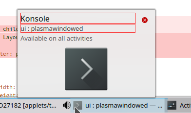 Otherwise, the size of the tooltip may be not consistent in all cases, e.g. a normal window vs a window which is available on all activities. trmdi: Should we make the height `const` like this too? e.g. make it a golden rectangle?
{F8088397}… | |||||
ngrahamAuthorUnsubmitted If we do that, then the size of the preview/album art area can get very short, which I don't think is desirable. ngraham: If we do that, then the size of the preview/album art area can get very short, which I don't… | |||||
trmdiUnsubmitted Could we have a fixed size rectangle with some ratio? trmdi: Could we have a fixed size rectangle with some ratio? | |||||
trmdiUnsubmitted I think it still looks acceptable, not tool short. This is the worst case: 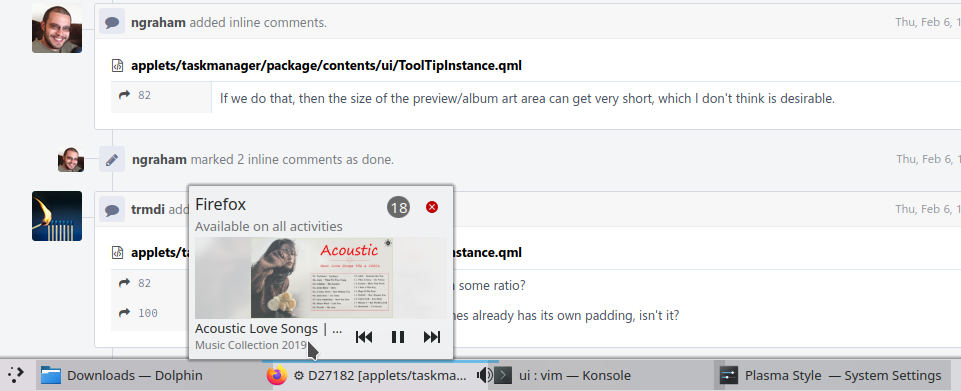 The better case without the "Activities..." line, the albumArt will be bigger. trmdi: I think it still looks acceptable, not tool short. This is the worst case:
{F8088588}
The… | |||||
trmdiUnsubmitted How do you choose the number 17? On small screens, the tooltip is a bit too big. trmdi: How do you choose the number 17? On small screens, the tooltip is a bit too big.
Could it be… | |||||
ngrahamAuthorUnsubmitted the number was chosen to make the tooltip exactly the same size as the current one. ngraham: the number was chosen to make the tooltip exactly the same size as the current one. | |||||
| 79 | 80 | Layout.minimumWidth: isWin ? Layout.maximumWidth : 0 | |||
| 80 | Layout.minimumHeight: childrenRect.height | 81 | Layout.alignment: Qt.AlignHCenter | Qt.AlignVCenter | ||
| 81 | Layout.maximumHeight: Layout.minimumHeight | | |||
| 82 | | ||||
| 83 | anchors.horizontalCenter: parent.horizontalCenter | | |||
| 84 | 82 | | |||
| 85 | // launcher icon | 83 | // launcher icon | ||
| 86 | PlasmaCore.IconItem { | 84 | PlasmaCore.IconItem { | ||
| 87 | Layout.preferredWidth: units.iconSizes.medium | 85 | Layout.preferredWidth: units.iconSizes.medium | ||
| 88 | Layout.preferredHeight: units.iconSizes.medium | 86 | Layout.preferredHeight: units.iconSizes.medium | ||
| 87 | Layout.leftMargin: units.smallSpacing | ||||
| 88 | Layout.rightMargin: units.smallSpacing | ||||
| 89 | source: !isWin ? icon : "" | 89 | source: !isWin ? icon : "" | ||
| 90 | animated: false | 90 | animated: false | ||
| 91 | usesPlasmaTheme: false | 91 | usesPlasmaTheme: false | ||
| 92 | visible: !isWin | 92 | visible: !isWin | ||
| 93 | } | 93 | } | ||
| 94 | | ||||
| 94 | // all textlabels | 95 | // all textlabels | ||
| 95 | Column { | 96 | ColumnLayout { | ||
| 97 | // app name | ||||
trmdi: Could it be zero here? Because `Text` lines already has its own padding, isn't it? | |||||
ngraham: Depends on the font; you can't necessarily count on that. | |||||
Heading has lineHeight: 1.2, so there are 2 things for padding here right? Could we remove one? trmdi: Heading has `lineHeight: 1.2`, so there are 2 things for padding here right? Could we remove… | |||||
| 96 | PlasmaExtras.Heading { | 98 | PlasmaExtras.Heading { | ||
| 97 | level: 3 | 99 | level: 3 | ||
| 98 | width: isWin ? textWidth : undefined | | |||
| 99 | height: undefined | | |||
| 100 | maximumLineCount: 1 | 100 | maximumLineCount: 1 | ||
| 101 | Layout.fillWidth: true | ||||
| 101 | elide: Text.ElideRight | 102 | elide: Text.ElideRight | ||
| 102 | text: appName | 103 | text: appName | ||
| 103 | opacity: flatIndex == 0 | 104 | opacity: flatIndex == 0 | ||
| 104 | textFormat: Text.PlainText | 105 | visible: text.length !== 0 | ||
| 105 | visible: text !== "" | | |||
| 106 | } | 106 | } | ||
| 107 | // window title | 107 | // window title | ||
| 108 | PlasmaExtras.Heading { | 108 | PlasmaExtras.Heading { | ||
| 109 | id: winTitle | 109 | id: winTitle | ||
| 110 | level: 5 | 110 | level: 5 | ||
| 111 | width: isWin ? textWidth : undefined | | |||
| 112 | height: undefined | | |||
| 113 | maximumLineCount: 1 | 111 | maximumLineCount: 1 | ||
| 112 | Layout.fillWidth: true | ||||
| 114 | elide: Text.ElideRight | 113 | elide: Text.ElideRight | ||
| 115 | text: generateTitle() | 114 | text: generateTitle() | ||
| 116 | textFormat: Text.PlainText | | |||
| 117 | opacity: 0.75 | 115 | opacity: 0.75 | ||
| 118 | visible: !hasPlayer | 116 | visible: !hasPlayer && text.length !== 0 | ||
| 119 | } | 117 | } | ||
| 120 | // subtext | 118 | // subtext | ||
| 121 | PlasmaExtras.Heading { | 119 | PlasmaExtras.Heading { | ||
| 122 | level: 6 | 120 | level: 6 | ||
| 123 | width: isWin ? textWidth : undefined | | |||
| 124 | height: undefined | | |||
| 125 | maximumLineCount: 1 | 121 | maximumLineCount: 1 | ||
| 122 | Layout.fillWidth: true | ||||
| 126 | elide: Text.ElideRight | 123 | elide: Text.ElideRight | ||
| 127 | text: isWin ? generateSubText() : "" | 124 | text: isWin ? generateSubText() : "" | ||
| 128 | textFormat: Text.PlainText | | |||
| 129 | opacity: 0.6 | 125 | opacity: 0.6 | ||
| 130 | visible: text !== "" | 126 | visible: text.length !== 0 | ||
| 131 | } | 127 | } | ||
| 132 | } | 128 | } | ||
| 133 | 129 | | |||
| 134 | // Count badge. | 130 | // Count badge. | ||
| 131 | // The badge itself is inside an item to better center the text in the bubble | ||||
| 135 | Item { | 132 | Item { | ||
| 136 | Layout.alignment: Qt.AlignRight | Qt.AlignTop | 133 | Layout.alignment: Qt.AlignRight | Qt.AlignTop | ||
| 137 | Layout.preferredHeight: closeButton.height | 134 | Layout.preferredHeight: closeButton.height | ||
| 138 | Layout.preferredWidth: closeButton.width | 135 | Layout.preferredWidth: closeButton.width | ||
| 136 | visible: flatIndex === 0 && smartLauncherCountVisible | ||||
| 139 | 137 | | |||
| 140 | Badge { | 138 | Badge { | ||
| 141 | anchors.centerIn: parent | 139 | anchors.centerIn: parent | ||
| 142 | height: units.iconSizes.smallMedium | 140 | height: units.iconSizes.smallMedium | ||
| 143 | visible: flatIndex === 0 && smartLauncherCountVisible | | |||
| 144 | number: smartLauncherCount | 141 | number: smartLauncherCount | ||
| 145 | } | 142 | } | ||
| 146 | } | 143 | } | ||
| 147 | 144 | | |||
| 148 | // close button | 145 | // close button | ||
| 149 | PlasmaComponents.ToolButton { | 146 | PlasmaComponents3.ToolButton { | ||
| 150 | id: closeButton | 147 | id: closeButton | ||
| 151 | Layout.alignment: Qt.AlignRight | Qt.AlignTop | 148 | Layout.alignment: Qt.AlignRight | Qt.AlignTop | ||
| 152 | visible: isWin | 149 | visible: isWin | ||
| 153 | iconSource: "window-close" | 150 | icon.name: "window-close" | ||
| 151 | icon.width: units.iconSizes.small | ||||
broulikUnsubmitted Can we please get this fixed in PlasmaComponents3 - this is being set all over the place, so clearly a bug in the component itself. broulik: Can we please get this fixed in `PlasmaComponents3` - this is being set all over the place, so… | |||||
ndavisUnsubmitted I suppose it depends on whether or not you think PC3 toolbuttons should reflect the look and size of Qt Widget toolbar buttons by default. Toolbar buttons in Qt widgets use 22px icons (equivalent to units.iconSizes.smallMedium). ndavis: I suppose it depends on whether or not you think PC3 toolbuttons should reflect the look and… | |||||
broulikUnsubmitted I'm merely stating that this is a behavioral change from PC2 to PC3 and realistically everyone using PC3 so far has manually hardcoded the icon sizes to some value. broulik: I'm merely stating that this is a behavioral change from PC2 to PC3 and realistically everyone… | |||||
ndavisUnsubmitted Another thing to consider is that window-close mimics the look of the titlebar close button with the margins of a normal breeze-icons monochrome icon, but the titlebar close button with the circle is larger than the other symbols until you hover over them. This leads to units.iconSizes.smallMedium being used for close buttons in some cases while other icons use units.iconSizes.small to get the same proportions. Should the margins be removed from window-close so that we can use the same icon size in the code everywhere to get the same kind of proportions? ndavis: Another thing to consider is that `window-close` mimics the look of the titlebar close button… | |||||
| 152 | icon.height: units.iconSizes.small | ||||
| 154 | onClicked: { | 153 | onClicked: { | ||
| 155 | backend.cancelHighlightWindows(); | 154 | backend.cancelHighlightWindows(); | ||
| 156 | tasksModel.requestClose(submodelIndex); | 155 | tasksModel.requestClose(submodelIndex); | ||
| 157 | } | 156 | } | ||
| 158 | | ||||
| 159 | } | 157 | } | ||
| 160 | } | 158 | } | ||
| 161 | 159 | | |||
| 162 | // thumbnail container | 160 | // thumbnail container | ||
| 163 | Item { | 161 | Item { | ||
| 164 | id: thumbnail | 162 | id: thumbnailSourceItem | ||
| 165 | width: header.width | | |||
| 166 | // similar to 0.5625 = 1 / (16:9) as most screens are | | |||
| 167 | // round necessary, otherwise shadow mask for players has gap! | | |||
| 168 | height: Math.round(0.5 * width) + (!winTitle.visible? Math.round(winTitle.height) : 0) | | |||
| 169 | anchors.horizontalCenter: parent.horizontalCenter | | |||
| 170 | 163 | | |||
| 171 | visible: isWin | 164 | Layout.minimumWidth: header.width | ||
| 165 | Layout.preferredHeight: header.width / 2 | ||||
| 172 | 166 | | |||
| 173 | Item { | 167 | visible: isWin | ||
| 174 | id: thumbnailSourceItem | | |||
| 175 | anchors.fill: parent | | |||
| 176 | 168 | | |||
| 177 | readonly property bool isMinimized: isGroup ? IsMinimized == true : isMinimizedParent | 169 | readonly property bool isMinimized: isGroup ? IsMinimized == true : isMinimizedParent | ||
| 178 | // TODO: this causes XCB error message when being visible the first time | 170 | // TODO: this causes XCB error message when being visible the first time | ||
| 179 | property int winId: isWin && windows[flatIndex] !== undefined ? windows[flatIndex] : 0 | 171 | property int winId: isWin && windows[flatIndex] !== undefined ? windows[flatIndex] : 0 | ||
| 180 | 172 | | |||
| 173 | // There's no PlasmaComponents3 version | ||||
| 181 | PlasmaComponents.Highlight { | 174 | PlasmaComponents.Highlight { | ||
| 182 | anchors.fill: hoverHandler | 175 | anchors.fill: hoverHandler | ||
| 183 | visible: hoverHandler.containsMouse | 176 | visible: hoverHandler.containsMouse | ||
| 184 | pressed: hoverHandler.containsPress | 177 | pressed: hoverHandler.containsPress | ||
| 185 | } | 178 | } | ||
| 186 | 179 | | |||
| 187 | PlasmaCore.WindowThumbnail { | 180 | PlasmaCore.WindowThumbnail { | ||
| 188 | anchors.fill: hoverHandler | 181 | anchors.fill: hoverHandler | ||
| Show All 33 Lines | 204 | Image { | |||
| 222 | source: albumArt | 215 | source: albumArt | ||
| 223 | fillMode: Image.PreserveAspectFit | 216 | fillMode: Image.PreserveAspectFit | ||
| 224 | visible: available | 217 | visible: available | ||
| 225 | } | 218 | } | ||
| 226 | 219 | | |||
| 227 | // when minimized, we don't have a preview, so show the icon | 220 | // when minimized, we don't have a preview, so show the icon | ||
| 228 | PlasmaCore.IconItem { | 221 | PlasmaCore.IconItem { | ||
| 229 | width: parent.width | 222 | width: parent.width | ||
| 230 | height: thumbnail.height - playerControlsLoader.realHeight | 223 | height: thumbnailSourceItem.height | ||
| 231 | anchors.horizontalCenter: parent.horizontalCenter | 224 | anchors.horizontalCenter: parent.horizontalCenter | ||
| 232 | source: thumbnailSourceItem.isMinimized && !albumArtImage.visible ? icon : "" | 225 | source: thumbnailSourceItem.isMinimized && !albumArtImage.visible ? icon : "" | ||
| 233 | animated: false | 226 | animated: false | ||
| 234 | usesPlasmaTheme: false | 227 | usesPlasmaTheme: false | ||
| 235 | visible: valid | 228 | visible: valid | ||
| 236 | } | 229 | } | ||
| 237 | 230 | | |||
| 238 | ToolTipWindowMouseArea { | 231 | ToolTipWindowMouseArea { | ||
| 239 | id: hoverHandler | 232 | id: hoverHandler | ||
| 240 | anchors.fill: parent | 233 | anchors.fill: parent | ||
| 241 | // Don't go under the player controls bar, when it's visible | | |||
| 242 | anchors.bottomMargin: playerControlsLoader.realHeight | | |||
| 243 | rootTask: parentTask | 234 | rootTask: parentTask | ||
| 244 | modelIndex: submodelIndex | 235 | modelIndex: submodelIndex | ||
| 245 | winId: thumbnailSourceItem.winId | 236 | winId: thumbnailSourceItem.winId | ||
| 246 | } | 237 | } | ||
| 247 | } | 238 | } | ||
| 248 | 239 | | |||
| 249 | 240 | // Player controls row | |||
| 250 | Loader { | | |||
| 251 | id: playerControlsLoader | | |||
| 252 | | ||||
| 253 | property real realHeight: item? item.realHeight : 0 | | |||
| 254 | | ||||
| 255 | anchors.fill: thumbnail | | |||
| 256 | sourceComponent: hasPlayer ? playerControlsComp : undefined | | |||
| 257 | } | | |||
| 258 | | ||||
| 259 | Component { | | |||
| 260 | id: playerControlsComp | | |||
| 261 | | ||||
| 262 | Item { | | |||
| 263 | property real realHeight: playerControlsRow.height | | |||
| 264 | | ||||
| 265 | anchors.fill: parent | | |||
| 266 | | ||||
| 267 | // TODO: When could this really be the case? A not-launcher-task always has a window!? | | |||
| 268 | // if there's no window associated with this task, we might still be able to raise the player | | |||
| 269 | // MouseArea { | | |||
| 270 | // id: raisePlayerArea | | |||
| 271 | // anchors.fill: parent | | |||
| 272 | | ||||
| 273 | // visible: !isWin || !windows[0] && canRaise | | |||
| 274 | // onClicked: mpris2Source.raise(mprisSourceName) | | |||
| 275 | // } | | |||
| 276 | | ||||
| 277 | Item { | | |||
| 278 | id: playerControlsFrostedGlass | | |||
| 279 | anchors.fill: parent | | |||
| 280 | visible: false // OpacityMask would render it | | |||
| 281 | | ||||
| 282 | Rectangle { | | |||
| 283 | width: parent.width | | |||
| 284 | height: parent.height - playerControlsRow.height | | |||
| 285 | opacity: 0 | | |||
| 286 | } | | |||
| 287 | | ||||
| 288 | Rectangle { | | |||
| 289 | anchors.bottom: parent.bottom | | |||
| 290 | width: parent.width | | |||
| 291 | height: playerControlsRow.height | | |||
| 292 | color: theme.backgroundColor | | |||
| 293 | opacity: 0.8 | | |||
| 294 | } | | |||
| 295 | } | | |||
| 296 | | ||||
| 297 | OpacityMask { | | |||
| 298 | id: playerControlsOpacityMask | | |||
| 299 | anchors.fill: parent | | |||
| 300 | source: playerControlsFrostedGlass | | |||
| 301 | maskSource: thumbnailSourceItem | | |||
| 302 | } | | |||
| 303 | | ||||
| 304 | // prevent accidental click-through when a control is disabled | | |||
| 305 | MouseArea { | | |||
| 306 | anchors.fill: playerControlsRow | | |||
| 307 | } | | |||
| 308 | | ||||
| 309 | RowLayout { | 241 | RowLayout { | ||
| 310 | id: playerControlsRow | 242 | Layout.maximumWidth: header.width | ||
| 311 | anchors { | 243 | | ||
| 312 | horizontalCenter: parent.horizontalCenter | 244 | visible: hasPlayer | ||
| 313 | bottom: parent.bottom | | |||
| 314 | } | | |||
| 315 | width: parent.width | | |||
| 316 | spacing: 0 | | |||
| 317 | enabled: canControl | 245 | enabled: canControl | ||
| 318 | 246 | | |||
| 319 | ColumnLayout { | 247 | ColumnLayout { | ||
| 320 | Layout.leftMargin: 2 | | |||
| 321 | Layout.fillWidth: true | 248 | Layout.fillWidth: true | ||
| 322 | spacing: 0 | 249 | spacing: 0 | ||
| 323 | 250 | | |||
| 324 | PlasmaComponents.Label { | 251 | PlasmaComponents3.Label { | ||
| 325 | Layout.fillWidth: true | 252 | Layout.fillWidth: true | ||
| 326 | lineHeight: 1 | 253 | lineHeight: 1 | ||
| 327 | maximumLineCount: artistText.visible? 1 : 2 | 254 | maximumLineCount: artistText.visible? 1 : 2 | ||
| 328 | wrapMode: artistText.visible? Text.NoWrap : Text.Wrap | 255 | wrapMode: artistText.visible? Text.NoWrap : Text.Wrap | ||
| 329 | elide: Text.ElideRight | 256 | elide: Text.ElideRight | ||
| 330 | text: track || "" | 257 | text: track || "" | ||
| 331 | } | 258 | } | ||
| 332 | 259 | | |||
| 333 | PlasmaExtras.DescriptiveLabel { | 260 | PlasmaExtras.DescriptiveLabel { | ||
| 334 | id: artistText | 261 | id: artistText | ||
| 335 | Layout.fillWidth: true | 262 | Layout.fillWidth: true | ||
| 336 | wrapMode: Text.NoWrap | 263 | wrapMode: Text.NoWrap | ||
| 337 | lineHeight: 1 | 264 | lineHeight: 1 | ||
| 338 | elide: Text.ElideRight | 265 | elide: Text.ElideRight | ||
| 339 | text: artist || "" | 266 | text: artist || "" | ||
| 340 | visible: text != "" | 267 | visible: text != "" | ||
| 341 | font.pointSize: theme.smallestFont.pointSize | 268 | font.pointSize: theme.smallestFont.pointSize | ||
| 342 | } | 269 | } | ||
| 343 | } | 270 | } | ||
| 344 | 271 | | |||
| 345 | PlasmaComponents.ToolButton { | 272 | PlasmaComponents3.ToolButton { | ||
| 346 | enabled: canGoBack | 273 | enabled: canGoBack | ||
| 347 | iconSource: LayoutMirroring.enabled ? "media-skip-forward" : "media-skip-backward" | 274 | icon.name: LayoutMirroring.enabled ? "media-skip-forward" : "media-skip-backward" | ||
| 275 | icon.height: units.iconSizes.small | ||||
| 276 | icon.width: units.iconSizes.small | ||||
| 348 | onClicked: mpris2Source.goPrevious(mprisSourceName) | 277 | onClicked: mpris2Source.goPrevious(mprisSourceName) | ||
| 349 | } | 278 | } | ||
| 350 | 279 | | |||
| 351 | PlasmaComponents.ToolButton { | 280 | PlasmaComponents3.ToolButton { | ||
| 352 | enabled: playing ? canPause : canPlay | 281 | enabled: playing ? canPause : canPlay | ||
| 353 | iconSource: playing ? "media-playback-pause" : "media-playback-start" | 282 | icon.name: playing ? "media-playback-pause" : "media-playback-start" | ||
| 283 | icon.height: units.iconSizes.small | ||||
| 284 | icon.width: units.iconSizes.small | ||||
| 354 | onClicked: { | 285 | onClicked: { | ||
| 355 | if (!playing) { | 286 | if (!playing) { | ||
| 356 | mpris2Source.play(mprisSourceName); | 287 | mpris2Source.play(mprisSourceName); | ||
| 357 | } else { | 288 | } else { | ||
| 358 | mpris2Source.pause(mprisSourceName); | 289 | mpris2Source.pause(mprisSourceName); | ||
| 359 | } | 290 | } | ||
| 360 | } | 291 | } | ||
| 361 | } | 292 | } | ||
| 362 | 293 | | |||
| 363 | PlasmaComponents.ToolButton { | 294 | PlasmaComponents3.ToolButton { | ||
| 364 | enabled: canGoNext | 295 | enabled: canGoNext | ||
| 365 | iconSource: LayoutMirroring.enabled ? "media-skip-backward" : "media-skip-forward" | 296 | icon.name: LayoutMirroring.enabled ? "media-skip-backward" : "media-skip-forward" | ||
| 297 | icon.height: units.iconSizes.small | ||||
| 298 | icon.width: units.iconSizes.small | ||||
| 366 | onClicked: mpris2Source.goNext(mprisSourceName) | 299 | onClicked: mpris2Source.goNext(mprisSourceName) | ||
| 367 | } | 300 | } | ||
| 368 | } | 301 | } | ||
| 369 | } | | |||
| 370 | } | | |||
| 371 | } | | |||
| 372 | 302 | | |||
| 373 | function generateTitle() { | 303 | function generateTitle() { | ||
| 374 | if (!isWin) { | 304 | if (!isWin) { | ||
| 375 | return genericName != undefined ? genericName : ""; | 305 | return genericName != undefined ? genericName : ""; | ||
| 376 | } | 306 | } | ||
| 377 | 307 | | |||
| 378 | var text; | 308 | var text; | ||
| 379 | if (isGroup) { | 309 | if (isGroup) { | ||
| ▲ Show 20 Lines • Show All 96 Lines • Show Last 20 Lines | |||||
Why do you remove all spacing? This increases lots of wasted space which is not good at least on small screens like 1366x768.