Changeset View
Changeset View
Standalone View
Standalone View
src/qml/MediaPlayerControl.qml
| Show First 20 Lines • Show All 222 Lines • ▼ Show 20 Line(s) | 215 | background: Rectangle { | |||
|---|---|---|---|---|---|
| 223 | Behavior on border.color { | 223 | Behavior on border.color { | ||
| 224 | ColorAnimation { | 224 | ColorAnimation { | ||
| 225 | duration: 300 | 225 | duration: 300 | ||
| 226 | } | 226 | } | ||
| 227 | } | 227 | } | ||
| 228 | } | 228 | } | ||
| 229 | } | 229 | } | ||
| 230 | 230 | | |||
| 231 | TextMetrics { | ||||
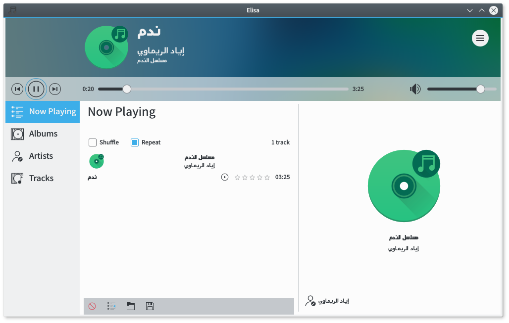
safaalfulaij: {F5677213}
{F5677214}
{F5677212}
(Look and the dancing duration slider) | |||||
safaalfulaij: After RTL as I didn't put it:
{F5690050}
LTR:
{F5690052} | |||||
| 232 | id: durationTextMetrics | ||||
| 233 | text: i18nc("This is used to preserve a fixed width for the duration text.", "00:00:00") | ||||
You can always use a length including hours we have some free horizontal space so this is OK. mgallien: You can always use a length including hours we have some free horizontal space so this is OK. | |||||
| 234 | } | ||||
| 235 | | ||||
| 231 | LabelWithToolTip { | 236 | LabelWithToolTip { | ||
| 232 | id: positionLabel | 237 | id: positionLabel | ||
| 233 | 238 | | |||
| 234 | text: timeIndicator.progressDuration | 239 | text: timeIndicator.progressDuration | ||
| 235 | 240 | | |||
| 236 | color: myPalette.text | 241 | color: myPalette.text | ||
| 237 | 242 | | |||
| 238 | Layout.alignment: Qt.AlignVCenter | 243 | Layout.alignment: Qt.AlignVCenter | ||
| 239 | Layout.fillHeight: true | 244 | Layout.fillHeight: true | ||
| 240 | Layout.rightMargin: !LayoutMirroring.enabled ? elisaTheme.layoutHorizontalMargin : 0 | 245 | Layout.rightMargin: !LayoutMirroring.enabled ? elisaTheme.layoutHorizontalMargin : 0 | ||
| 241 | Layout.leftMargin: LayoutMirroring.enabled ? elisaTheme.layoutHorizontalMargin : 0 | 246 | Layout.leftMargin: LayoutMirroring.enabled ? elisaTheme.layoutHorizontalMargin : 0 | ||
| 247 | Layout.preferredWidth: durationTextMetrics.width+5 // be in the safe side | ||||
astippich: +1 should be enough | |||||
| 242 | 248 | | |||
| 243 | verticalAlignment: Text.AlignVCenter | 249 | verticalAlignment: Text.AlignVCenter | ||
| 250 | horizontalAlignment: Text.AlignRight | ||||
| 244 | 251 | | |||
| 245 | ProgressIndicator { | 252 | ProgressIndicator { | ||
| 246 | id: timeIndicator | 253 | id: timeIndicator | ||
| 247 | position: musicWidget.position | 254 | position: musicWidget.position | ||
| 248 | } | 255 | } | ||
| 249 | } | 256 | } | ||
| 250 | 257 | | |||
| 251 | Controls2.Slider { | 258 | Controls2.Slider { | ||
| ▲ Show 20 Lines • Show All 66 Lines • ▼ Show 20 Line(s) | 322 | LabelWithToolTip { | |||
| 318 | text: durationIndicator.progressDuration | 325 | text: durationIndicator.progressDuration | ||
| 319 | 326 | | |||
| 320 | color: myPalette.text | 327 | color: myPalette.text | ||
| 321 | 328 | | |||
| 322 | Layout.alignment: Qt.AlignVCenter | 329 | Layout.alignment: Qt.AlignVCenter | ||
| 323 | Layout.fillHeight: true | 330 | Layout.fillHeight: true | ||
| 324 | Layout.rightMargin: !LayoutMirroring.enabled ? (elisaTheme.layoutHorizontalMargin * 10) : 0 | 331 | Layout.rightMargin: !LayoutMirroring.enabled ? (elisaTheme.layoutHorizontalMargin * 10) : 0 | ||
| 325 | Layout.leftMargin: LayoutMirroring.enabled ? (elisaTheme.layoutHorizontalMargin * 10) : 0 | 332 | Layout.leftMargin: LayoutMirroring.enabled ? (elisaTheme.layoutHorizontalMargin * 10) : 0 | ||
| 333 | Layout.preferredWidth: durationTextMetrics.width | ||||
| 326 | 334 | | |||
| 327 | verticalAlignment: Text.AlignVCenter | 335 | verticalAlignment: Text.AlignVCenter | ||
| 336 | horizontalAlignment: Text.AlignLeft | ||||
| 328 | 337 | | |||
| 329 | ProgressIndicator { | 338 | ProgressIndicator { | ||
| 330 | id: durationIndicator | 339 | id: durationIndicator | ||
| 331 | position: musicWidget.duration | 340 | position: musicWidget.duration | ||
| 332 | } | 341 | } | ||
| 333 | } | 342 | } | ||
| 334 | 343 | | |||
| 335 | Image { | 344 | Image { | ||
| ▲ Show 20 Lines • Show All 140 Lines • Show Last 20 Lines | |||||

(Look and the dancing duration slider)