Besides a search UI (google for kube), we want search/filtering in various places in the UI:
- maillist (filter list)
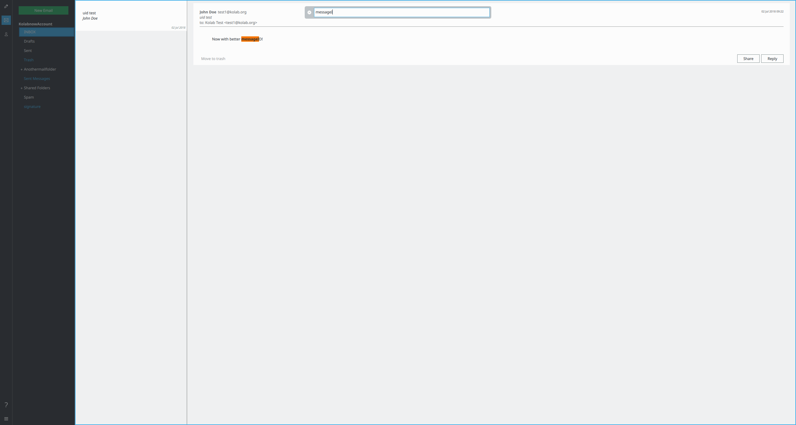
- conversation view (highlight matches and navigate through matches)
- folderlist (filter folders, potentially combined with subscription management)
- calendar
- contacts
I think this is a required complementary solution to a dedicated search ui, because the user wants to search within an already existing ui, which is different from starting a search from scratch. The two solutions could overlap/interact with each other by the current view being the starting point for a launched search UI, with it's own pros and cons (UI state altered vs. unaltered)....
How the search should function and what all is affected seems to be fairly specific to the UI:
- For the addressbook having a persistent searchbar seems like a natural primary UI element. For a calendar less so.
- Searching maillist and conversationview in tandem (one to filter and one to highlight matches) seems like a specific case that wouldn't make sense e.g. together with the folder list.
The challenge is to come up with a system that:
- Is intuitive
- Doesn't litter the UI with searchbars
- Allows you to search where you want
The solution we're currently striving for is:
- Avoid persitent searchbars unless part of the primary UI elements (e.g. in the addressbook or the search view)
- Have a button (looking glass) and shortcuts on searchable UI elements.
- Use a search overlay to provide:
- a searchbar
- an indicator for which area is being searched
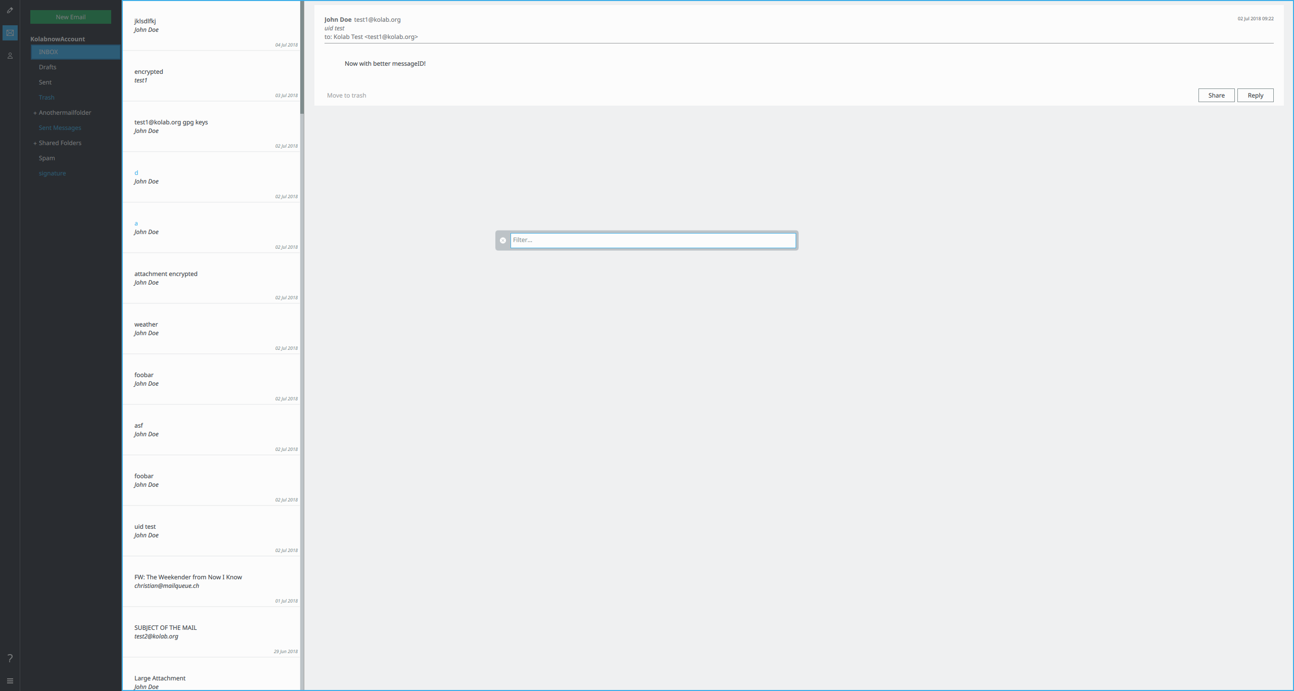
Visually I'm trying to:
- Dim everything not part of the search
- Not dim the searched area
- Initially the search bar is roughly in the center.
- Once searching starts and the UI elements change accordingly the searchbar moves to the top (to be out of the way), so the user can fully interact with the application.