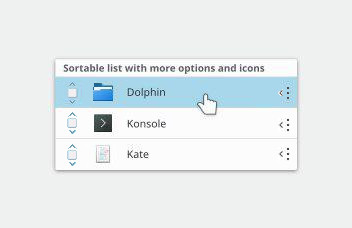
Going back to this discussion, it feels like this is headed in the right direction. The goal is to help users understand that they can action the list item and reveal more interactions. I feel also that it is easy to add different kinds of icons to anticipate any interaction from the user. However, we are trying to be at every angle that the user takes and for every angle, we want to add an icon. That feels like we are doing "powerful when needed" first and not using "simple by default" first. I wanted to challenge our team to do something different.
Try simple by default first. Instead of having 4-5 different icons representing move, slide, reveal, etc, let's have ONE icon to represent it all. ONE icon. It can be a combination of all the others if you want. My reasoning here is that space is limited, the UI can look crowded, representations like these are going to be in many different screen sizes, some will have touch while others will only allow mouse interaction, users need to discover at the same time that they are being guided or enticed to take an action. Therefore, it is more effective to use 1 icon instead of many to represent interactivity with the list item.
Can you propose some ideas?