Fonts “easy mode”
Open, Needs TriagePublic

Description

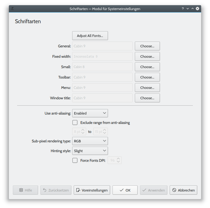
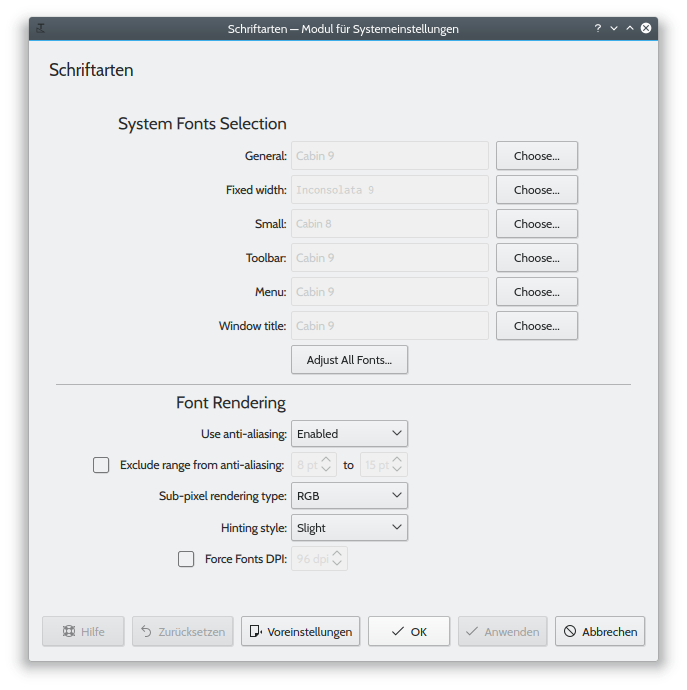
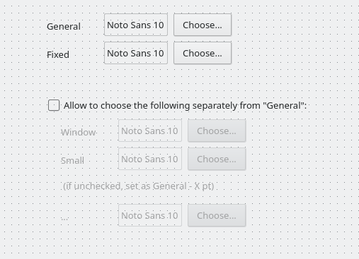
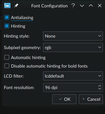
Add easy mode for users not familiar with font rendering. Use current interface as “advanced mode”.

Based on the ideas of a tool used in Munich {M120} the easy mode has

  • selection of a typeface
    • applies to all but “Fixed width”
  • selection of font size with predefined words
  • preview of selected typeface and size with different rendering options
    • anti-aliasing on/off
    • subpixel-rendering on/off
    • hinting full/medium/slight/off
  • reset to defaults button (panic button)
harmathy created this task.Feb 8 2018, 3:17 PM
progwolff added a subscriber: progwolff.EditedFeb 19 2018, 6:37 PM

Sorry for the delay.

As discussed in https://phabricator.kde.org/M120 it would be great to have an easy default mode. @harmathy: If I understand you correctly, you want to have a font chooser, a font size combobox and a matrix of 16 buttons showing all possible combinations of AA (on/off), subpixel (on/off) and hinting (4 modes)?

[edit:] or is it 12 buttons? Is AA required to have subpixel rendering?

For the advanced mode, I proposed to have pre-rendered text for different rendering settings. Something like https://phabricator.kde.org/M121
It should be possible to compare the different settings directly against each other without having to apply the settings.

@abetts What do you think?

In principle that would be it.

There is one slight problem with the hinting options:
While Qt uses fontconfig to set hinting options the QFont::HintingPreference exposes only hintnone, hintslight and hintfull. There is no hintmedium.

  • We can therefore render previews only for these three options using Qt.
  • Or if we want previews of all fontconfig hinting options we would have to use Xft or Cairo.

From what I understand there is no subpixel rendering without anti-aliasing in freetype.

In principle that would be it.

There is one slight problem with the hinting options:
While Qt uses fontconfig to set hinting options the QFont::HintingPreference exposes only hintnone, hintslight and hintfull. There is no hintmedium.

  • We can therefore render previews only for these three options using Qt.
  • Or if we want previews of all fontconfig hinting options we would have to use Xft or Cairo.

Right. I think there is no way around rendering the fonts with Xft/Cairo and displaying the pre-rendered results.

FTR:

It turns out that in Xft hintmedium is a synonym for hintslight, whereas in fontconfig hintmedium is a synonym for hintfull. Therefore the option hintmedium actually selects a different hinting method depending on whether the program uses Cairo or Xft.

This is not documented anywhere, as far as I know. I have had to figure it out by trial and error.

https://unix.stackexchange.com/questions/321857/why-is-xft-ignoring-font-settings

Then I guess it is much easier to use Qt after all, and drop hintmedium?

@harmathy Sorry, didn't notice your reply.
We could use Qt for hinting, but we will have to render the different sub-pixel versions ourself anyway. Dropping hintmedium seems like a good idea to me though.

I tried to unclutter the old kcm / new advanced mode a bit.
What do you think about this?

old:

new:

+1 from me too!

Shall we close this ticket?

I would like to add something visual like M120 and hide the details of the current KCM fonts behind a "expert settings" tab or similar.

ngraham reassigned this task from harmathy to progwolff.Jul 31 2018, 10:05 PM

I'd like to present an idea I had on this subject:

  • Also, assigning this to Julian Wolff since he's expressed interest in overhauling the user interface for the Fonts KCM.

    Can we also ask Julian to take a look at the mockups for this KCM?

    @progwolff , would you take a look at the mockups for this KCM? 😛

    We already discussed in D12849 if we should split the current layout into two tabs.
    I like the idea of a simple mode and using tabs here seems like a good idea.
    But we might want to have three tabs (Simple, Fonts fine-tuning, Rendering fine-tuning).

    As an alternative, we could split the rendering settings into a separate KCM.
    Then we would have three kcms (Fonts, Font Management, Font Rendering) and the "Fonts"-kcm would have two tabs (Simple, Fonts fine-tuning).

    I will also work on this on the behalf of the city administration of Munich. How can we coordinate the work?

    I like the idea of keeping everything in the same KCM. I think if we're going to implement the Simple/Advanced distinction, there's no reason to omit items from the Advanced tab. Let's put it all there and not make people hunt around for it.

    So we keep the separator line in the advanced mode and drop the tabs from D12849#263660 ?

    In D12849, tabs were suggested to separate the font and size selection controls from the anti-aliasing controls. That's not a true Simple/Advanced toggle because it would have preserved all the complication in the font and size selection UI. In essence, my argument is that it wouldn't have gone far enough! :)

    Most people would just want simple knobs for changing sizes and choosing the typeface, and don't care about minutely adjusting individual styles. Someone who wants to make their Titlebar text 12pt bold serifs but their general font 10pt regular sans serifs is definitely an Advanced user.

    That's the reason for my suggestion for a simplified UI with only three controls on the {mav Simple} tab.

    Either way, we first need to implement tabs with a decent look&feel in Kirigami (resolve bugs 394295 and 394296) .

    abetts added a comment.Aug 2 2018, 9:22 PM

    Can you maybe detail a lost of labels that need to be in this kcm? I can the mock them up in the kcm style I proposed and put it all together

    progwolff added a comment.EditedAug 8 2018, 5:32 PM
    • Current kcm / new kcm's advanced tab
      • first section: system fonts selection
        • font selection widgets for "general", "fixed width", "small", "toolbar", "menu" and "window title fonts"
        • "Adjust all fonts"-button for easy access to the properties of all fonts
      • second section: font rendering settings
        • "Use anti-aliasing". Can be either on or off. If off, all of the following options are disabled.
        • "Exclude range x to y from anti-aliasing". If AA is enabled in general, a defined range of font sizes can be excluded.
        • "Sub-pixel rendering type". Sub-pixel rendering can be used to improve the AA-enabled rendering results. It depends on the users monitor if she needs to set this to rgb/bgr/vrgb/vbgr. It can also be disabled by choosing "none".
        • "Hinting style". Font hinting can improve the readability of rendered fonts. Can be set to "none", "slight", "medium" or "full". We might want to drop "medium" in future (see https://phabricator.kde.org/T7927#130552)
    • New easy mode / new kcm's default tab
      • "User interface font" / font size
      • "Fixed width font" / font size
      • Font size selection might be part of the two font selection widgets or a separate widget.
      • Font size might be chosen by non-technical terms:
        • Small: (everything 1pt smaller)
        • Default (current default sizes for everything)
        • Elevated (everything 1pt bigger)
        • Large (Everything 2pt bigger)
        • Huge (Everything 4pt bigger)
        • Enormous (Everything 6pt bigger)
      • Rendering settings can probably be dropped here, as the defaults will work for most users
    rkflx added a subscriber: rkflx.Aug 8 2018, 8:20 PM

    Have you thought about how to keep the simple and the advanced tabs in sync, in particular when the user chooses conflicting options in both of them at the same time?

    This might become hairy and confusing very fast, and might not be what users are expecting in some cases.


    IMO moving the rendering settings to a second tab is enough. I doubt that many non-advanced users want to change the font anyway, so the Adjust All Fonts button should be fine – perhaps only split "All" into "Fixed" and "All (other)". AFAIK even in MS Office you set fonts by points, and not by selecting "Elevated".

    Let's not underestimate the intelligence of our users (or are you designing a "kids" mode?) Maybe the "easy" idea is more suited for a separate first-run or "favorite settings" KCM?

    abetts added a comment.Aug 8 2018, 8:25 PM

    I will try to come up with a UI concept that we can use for the proposed design. As I share this, please let me know if I am going the right direction.

    rkflx removed a subscriber: rkflx.Aug 8 2018, 8:35 PM
    ngraham added a subscriber: rkflx.Aug 8 2018, 8:39 PM
    In T7927#154103, @rkflx wrote:

    Have you thought about how to keep the simple and the advanced tabs in sync, in particular when the user chooses conflicting options in both of them at the same time?

    This might become hairy and confusing very fast, and might not be what users are expecting in some cases.

    Yes, I had worried about that, but hadn't come up with a solution.

    There is one very big use case that regular users want which my proposal is designed to support: changing the size of all fonts. Right now, this requires doing it in six places, manually, within a dialog box that's full of other controls. It's really annoying and error-prone right now, and the UI is overkill for the simple and common use cases of "make everything a little bit bigger or smaller". It's much less common for a user to say, "Make just this type of thing bigger, but make that kind of thing smaller, and keep this other thing the same size as it is right now."

    I think we're in agreement about moving the anti-aliasing settings to another tab/page, but I think we also need to consider improving the usability of the font and especially size adjustment UI. What we have right now is a pain to use.

    rkflx added a comment.Aug 8 2018, 8:48 PM

    Yes, I had worried about that, but hadn't come up with a solution.

    Without a solution there is not point in creating a draft.

    There is one very big use case that regular users want which my proposal is designed to support: changing the size of all fonts. Right now, this requires doing it in six places,

    Not true. Adjust All Fonts will do it in one step (the only problem is the incorrect "small" font).

    How about a simple plus/minus button, which affects all different font types at once? (IOW, providing an inline "easy" alternative to the Adjust All button for a single topic.)


    I understand where you are coming from, but I fear the proposal went a bit too far, making the UI cumbersome for a majority while optimizing for a minority. I think it should be possible to solve the problems without making other aspects worse.

    rkflx added a comment.EditedAug 8 2018, 9:07 PM

    One more quick idea (have not really thought about it, no final wording etc.):

    Edit to add advantages of this approach:

    • Preview of the chosen font
    • Still easy enough to change all sizes
    • It's always obvious for both the user and the backend when things should be in sync and when not
    • Everything in one place, nobody has to hunt around different tabs
    • Familiar font picker with a search field, which a combobox would not be able to provide
    • Simple (but not dumbed down) by default, powerful when needed
    In T7927#154111, @rkflx wrote:

    One more quick idea (have not really thought about it, no final wording etc.):

    In this mockup, is the bottom section dedicated to choose fonts differently than general but for specific elements, like a titlebar, window, buttons, etc?

    rkflx added a comment.Aug 9 2018, 8:19 AM

    In this mockup, is the bottom section dedicated to choose fonts differently than general but for specific elements, like a titlebar, window, buttons, etc?

    The point of that sketch was to illustrate the general concept. A real version should allow to configure exactly the same elements as the unmodified KCM, i.e. seamlessly map to kdeglobals (and thus the software stack built on top of that).

    In T7927#154109, @rkflx wrote:

    How about a simple plus/minus button, which affects all different font types at once? (IOW, providing an inline "easy" alternative to the Adjust All button for a single topic.)

    I could get behind that. The Adjust All Fonts... button has always rubbed me wrong because it will always produce incorrect output for the Fixed Width and Small fonts that then needs to be manually fixed. If we implement your suggestion, I'd be okay with the original proposed separation with the font settings on one tab and the anti-aliasing settings on another tab.

    Hey Nate, can we sync up about this at Akademy? We can work on a UI proposal together.

    Absolutely!

    In T7927#154109, @rkflx wrote:

    How about a simple plus/minus button, which affects all different font types at once? (IOW, providing an inline "easy" alternative to the Adjust All button for a single topic.)

    I could get behind that. The Adjust All Fonts... button has always rubbed me wrong because it will always produce incorrect output for the Fixed Width and Small fonts that then needs to be manually fixed. If we implement your suggestion, I'd be okay with the original proposed separation with the font settings on one tab and the anti-aliasing settings on another tab.

    I wonder why one would like to use a non-fixed-width font for text that is supposed to be used with such fonts…
    Not sure about the Small fonts tbh, but I do think that the current design (being used in latest released Plasma) is fine, and I think that adding tabs for such simple widgets is an overkill. Even “Advanced” button seems too much clicking, and seems that there is really coding stuff in there (if we were able to change fontconfig font priorities, then that could be called advanced.)

    Btw, for fixed width, it could be written near to the “Adjust All Fonts…” button that this type will not be affected, easy and direct. Maybe a tooltip or “what’s this” can provide info about the reason, or even a “Why?” link text appended to that shows a “what’s this”-popup-type.

    Be reasonable with changing stuff. No one will change thier fonts every two days.

    I wonder why one would like to use a non-fixed-width font for text that is supposed to be used with such fonts…

    One wouldn't; that's the bug that's introduced by using the Adjust All Fonts... button, which we're brainstorming methods of solving. :)

    rkflx added a comment.EditedAug 10 2018, 6:04 PM

    @progwolff Any comments on the proposal below?

    In T7927#154111, @rkflx wrote:

    One more quick idea (have not really thought about it, no final wording etc.):

    Edit to add advantages of this approach:

    • Preview of the chosen font
    • Still easy enough to change all sizes
    • It's always obvious for both the user and the backend when things should be in sync and when not
    • Everything in one place, nobody has to hunt around different tabs
    • Familiar font picker with a search field, which a combobox would not be able to provide
    • Simple (but not dumbed down) by default, powerful when needed

    it will always produce incorrect output for the Fixed Width

    Again, not true! Did you actually try this or look at the code before commenting? Changing the font name of all fonts via the button won't change the fixed font. (The only oddity is that changing the size will make the small font the same size as the other fonts.)

    Anyway, my checkbox proposal should solve that.


    Be reasonable with changing stuff.

    +1

    In T7927#154291, @rkflx wrote:

    it will always produce incorrect output for the Fixed Width

    Again, not true! Did you actually try this or look at the code before commenting? Changing the font name of all fonts via the button won't change the fixed font. (The only oddity is that changing the size will make the small font the same size as the other fonts.)

    Ah, indeed I had not used it, because I assumed that "Adjust All Fonts" will adjust all fonts. When a button will manifestly not do what its label says it will do, that's a problem.

    In T7927#154291, @rkflx wrote:

    Again, not true! Did you actually try this or look at the code before commenting? Changing the font name of all fonts via the button won't change the fixed font. (The only oddity is that changing the size will make the small font the same size as the other fonts.)

    Ah, indeed I had not used it, because I assumed that "Adjust All Fonts" will adjust all fonts. When a button will manifestly not do what its label says it will do, that's a problem.

    I'm sure it's done this way to help the user not change a text using fixed-font, to some other non-fixed-width font. That is exactly why I said we could just add a label or so, not change the behaviour of a well-known button.

    I looked into the Human Interface Guidelines and I found exactly, what I had in mind when I opened this task: In the section about settings there is a mockup of how settings would look like.

    There is a preview (No. 2) and there are presets (No.3). I guess in this case those would be just the previews as in M120.

    The are advanced options (No. 6) which are hidden by default. Those would be the current kcm_fonts settings.

    I am currently working on a mockup to implement this. However I am struggling a bit with the widgets from Qt Quick, especially with such an interactive arrow to reveal the advanced settings.

    abetts added a subscriber: mart.Aug 27 2018, 2:19 PM

    I looked into the Human Interface Guidelines and I found exactly, what I had in mind when I opened this task: In the section about settings there is a mockup of how settings would look like.

    There is a preview (No. 2) and there are presets (No.3). I guess in this case those would be just the previews as in M120.

    The are advanced options (No. 6) which are hidden by default. Those would be the current kcm_fonts settings.

    I am currently working on a mockup to implement this. However I am struggling a bit with the widgets from Qt Quick, especially with such an interactive arrow to reveal the advanced settings.

    You could contact @mart who is an expert with this stuff!

    Before we go any further here, I think we need to come to some agreement on the basic design:

    • Do we actually want an "Easy mode"? Or should we instead working on polishing the existing presentation so that it's easier? I find @mart's anti-mode arguments in M133 to be fairly convincing.
      • If we do want an "Easy mode", how do we present it? Tabs? "Expert/Advanced" settings that appear in a collapsible group box? Something else?
      • If we want an "Easy mode", what does it look like? Does it look like the original idea here: {M120} I have reservations about this design. Do users actually like it? To me the differences between most of the images are entirely too subtle to notice, and there are too many options. If I was presented with this, I would feel overwhelmed and have no idea what to do. It's information overload for a fairly subtle set of changes.

    Thanks for bringing this all together Nate. I feel very similar about this idea. The process of selecting your fonts and how sharp they look has straight correlation to the way that Windows does it. However, they have a special window that will help with this. It is not a common KCM style selection process. It is done as an "advanced" window. What is easy about it is the visual nature of the selections you make as a user.

    In my mind, a workflow for this would be:

    System Settings > Fonts > Font size/style selections > Advanced > Font Sharpness? Selection

    The problem which M120 solves is, that many users have developed a strong taste of how fonts have to be rendered:

    • Some want to have sharp outlines and prefer therefore heavy hinting and dislike sub-pixel rendering for its colour haze
    • Others want to preserve the characteristics of a certain font and therefore disable hinting and use sub-pixel anti-aliasing for best possible resolution

    But many users have no idea what hinting, anti-aliasing or sub-pixel rendering means. They decide visually, what suites them best.

    I would have no problem, if we would drop the “advanced mode” at all. But that would contradict the

    ‘’Simple by default, powerful when needed.’‘

    Thanks for bringing this all together Nate. I feel very similar about this idea. The process of selecting your fonts and how sharp they look has straight correlation to the way that Windows does it. However, they have a special window that will help with this. It is not a common KCM style selection process. It is done as an "advanced" window. What is easy about it is the visual nature of the selections you make as a user.

    Yes, and selecting “the right” font settings is portably in general a visual process.

    In my mind, a workflow for this would be:

    System Settings > Fonts > Font size/style selections > Advanced > Font Sharpness? Selection

    Thus rendering options are an essential part. A hinted font might look quite different from a non-hinted font.

    I can recommend the following reading:
    http://www.antigrain.com/research/font_rasterization/

    ngraham added a comment.EditedAug 28 2018, 4:43 PM

    @harmathy, my worry with M120 is that is is neither simply by default, nor powerful when needed. It is overwhelming for someone without pre-existing font preferences, who only has only very general ideas such as "I want my fonts to be bigger because I have bad eyesight". But it is not particularly powerful for advanced users and font nerds, who would prefer to tweak individual settings rather than choose one pre-selected set of settings from out of ten choices.

    I started implementing the functionality of M120 on basis of the current master: D17493

    However I encountered a fundamental problem: I wasn't able to register any image provider within the kcm module. This also affects the changes, which were made in D11064.

    rooty added a subscriber: rooty.Dec 11 2018, 4:24 PM

    hey @progwolff before it gets hardcoded, i think it should be System Font Selection (not Fonts)
    interesting idea though!

    ndavis added a subscriber: ndavis.Dec 11 2018, 4:36 PM

    In blind listening tests, a common practice is to play 2 files and ask which version the listener preferred. I think that approach could work for this if we only presented 2 options at a time. It would need to go through multiple rounds to get through all of the combinations though, so it would have to be a configuration wizard. Not really an easy mode in the sense that it isn't quick, but it could be useful for helping the user find what they like the most.

    filipf added a subscriber: filipf.Dec 11 2018, 4:56 PM

    It's really important to tackle this issue by putting oneself in the position of someone who's using Linux for the first time.

    Concerning font (typeface & size) settings, the average user will probably know what "interface font" and "titlebar font" mean - these are 2 most relevant options for them anyway. Said user will most likely not know what "fixed width" is, but this option does carry importance. Rest of the font options are more niche and could be placed in advanced mode, however, special must be taken care that changes in the "simple" variables are proportionally reflected in "advanced" variables.

    Now unlike previous settings, the average novice user has no clue about font rendering terminology and theory. This is why @harmathy's proposal is valuable. As far as what he's shown in the mockup I can't verify that the differences between the rendered font options are subtle; I do have a trained eye for this and perfect vision up close, but for the most part they look pretty different to me. I would also shy away from comparisons with Windows' ClearType configuration screen - this is a mostly useless, multi-step piece of software where differences between rendering options are not profound. There are also only so many ways you can design a visual font rendering chooser.

    But as a "font nerd" I would still use the advanced settings. In that regard my complaint is that we still don't have all the options, most notably the lcdfilter - a useful setting for fixing color fringing when using subpixel rendering. As an example, qt5ct offers a comprehensive font configuration tool:

    It's really important to tackle this issue by putting oneself in the position of someone who's using Linux for the first time.

    If that person came from macOS, they are used to chunky fonts that looked amazing. If that user came from Windows, they are used to wispy fonts that looked bad (even if they couldn't articulate this). Neither one of these people will change the rendering defaults. A new Linux user who is a font nerd on the other hand, will definitely want to fiddle with the font rendering settings.

    What I think is most important here is that we choose sane font rendering default settings. If we can detect the presence of an LCD screen and then turn on subpixel anti-aliasing and slight hinting and call it a day, I think that's probably a good 95% solution (probably a 99% solution, really) and the remaining people who are exceptionally picky can manually adjust things.

    I still don't see who this wizard's target user actually is. Someone who's a font nerd doesn't need or want a wizard, while a layman or casual user will never, ever change these settings, especially if we set a good default.

    Also from a practical perspective, a high DPI screen makes most font rendering issues go away, which is one of the major reasons why Apple went all in and has only sold machines with high DPI screens for a while now. All these tricks and hacks are workarounds for lousy screens, so we need to make sure that we're optimizing for that, because they're not detrimental at all on a high DPI screen--just largely unnecessary.

    Totally agree with you about having good defaults, although I am personally opposed to hinting (but have already written about this elsewhere).

    However what you say, that "neither one of these people will change the rendering defaults" isn't true from my experience. I've seen my fair share of discussion and complaining over the years. And those people usually aren't font nerds. You can easily tell because they operate in statements such as "why font rendering only good in Ubuntu", "why my fonts not look like in Windows", "why my fonts so ugly", "how do I get those Infinality patches cuz fonts look gooood with them???". They say these things because they don't understand the terminology and don't know how to set their fonts to "look like in Ubuntu/Windows" or to "to look good/not ugly". The visual aide would help them.

    Then there is also the subgroup of users who have found the settings that work best for them and will speak in proper terminology, but if you engage them you usually see they don't really understand what the options are. Fonts nerds are the smallest group from my experience.

    I still don't see who this wizard's target user actually is. Someone who's a font nerd doesn't need or want a wizard, while a layman or casual user will never, ever change these settings, especially if we set a good default.

    You don't need to be a font nerd to be interested in finding a font appearance that looks best for you. That would be like saying only icon nerds want to change icon themes and icon nerds don't need icon theme previews. I think the real argument against making a font wizard is the fact that we already have previews in the fonts section for each of the settings. The wizard would still be nice, but it would be a bit redundant.

    Sorry guys, this request here does not seem to have good grounding. I agree with Nate. Can we re-evaluate? More than anything, I would need to see a clickable prototype of the proposed interaction with this wizard. I haven't seen anything yet.

    rooty added a comment.EditedDec 23 2018, 12:14 AM

    I still don't see who this wizard's target user actually is. Someone who's a font nerd doesn't need or want a wizard, while a layman or casual user will never, ever change these settings, especially if we set a good default.

    Anyone who's working in design and/or publishing (and doesn't like ClearType or Apple and their vendor lock-in), isn't tech savvy and is seriously considering Linux as a publishing platform would benefit from a simple font changing wizard.

    Windows still butchers fonts geometry in hidpi (they're just bigger so it's less noticeable), and Apple changed the AppleFontSmoothing setting around the time the 2012 MBP retina came out so that if you want low dpi font smoothing to look presentable you have to use 'defaults -currentHost write -globalDomain AppleFontSmoothing -int 3'.

    And there's the ClearType tuner argument as well.

    In T7927#170776, @rooty wrote:

    I still don't see who this wizard's target user actually is. Someone who's a font nerd doesn't need or want a wizard, while a layman or casual user will never, ever change these settings, especially if we set a good default.

    Anyone who's working in design and/or publishing (and doesn't like ClearType or Apple and their vendor lock-in), isn't tech savvy and is seriously considering Linux as a publishing platform would benefit from a simple font changing wizard.

    Windows still butchers fonts geometry in hidpi (they're just bigger so it's less noticeable), and Apple changed the AppleFontSmoothing setting around the time the 2012 MBP retina came out so that if you want low dpi font smoothing to look presentable you have to use 'defaults -currentHost write -globalDomain AppleFontSmoothing -int 3'.

    And there's the ClearType tuner argument as well.

    This part is understood. There is no problem here really. The technology we are talking about is great. What I am finding challenging is how do we interact with these ideas in a KCM, or any other configuration module. What do we present to the user, when, how? I want to see more UX work around this idea. I would help, but I am not understanding the basic premises of the interaction.

    rooty added a comment.EditedDec 23 2018, 12:36 AM

    I want to see more UX work around this idea. I would help, but I am not understanding the basic premises of the interaction.

    Hmm I agree, we need a leaner/better interface

    Let's not confuse ourselves here. I'm saying that we don't need a wizard for the font rendering settings (not the size or typeface) because:

    1. Conceptually, wizards are for helping casual users navigate something complicated
    2. Casual users have no interest in changing the font rendering settings (not the size or typeface)
    3. Font nerds and typographic professionals do not need and would not use a wizard to change the font rendering settings, especially considering that the advanced UI for doing this is pretty navigable as is

    I've come around to the idea of a first-run wizard that asks the user basic questions to help them set up their workspace, and I think one of those could ask whether they prefer text to be compact or large. But I don't see a place for font rendering options there.

    1. Casual users have no interest in changing the font rendering settings (not the size or typeface)

    What do you base this claim on?

    ^ Actually that makes sense, if font rendering looks good OOTB they probably wouldn't tinker with them. Then the problem are the suboptimal FreeType packages shipped with FOSS-committed distros, as well as the font rendering defaults, as you mentioned. That might be where most of the murmur I read come from, but still, we can't be 100% sure of user behavior.

    1. Casual users have no interest in changing the font rendering settings (not the size or typeface)

    What do you base this claim on?

    1. Conceptual: most casual users don't change any settings except for maybe the wallpaper (and a lot don't even do that, believe it or not), which is why good defaults are so important.
    2. Logical: as you mentioned, if the defaults are good enough, there's even less reason to.
    3. Experiential: I have done IT support on a freelance and professional basis since I was 15 years old and have extensive experience working with casual users and observing their habits. Back in the Windows XP days in particular, I was always amazed by how awful the font rendering looked on people's computers despite the presence of a variety of (off-by-default) options to improve it in various ways. Nobody ever changed these settings, not even technically proficient people. Practically no KDE plasma users I have ever encountered in the wild or who have posted screenshots anywhere have turned on sub-pixel anti-aliasing if it was off by default--including developers, if screenshots of proposed patches are any indication.

    The people who change font rendering settings are expert users, font nerds, and typographical professionals--exactly the types of users who don't need and are actually sometimes insulted by wizards.

    Hmm that makes sense, thanks for clarifying! I'd also really get behind turning subpixel rendering on by default, if possible.

    Back in the Windows XP days in particular, I was always amazed by how awful the font rendering looked on people's computers despite the presence of a variety of (off-by-default) options to improve it in various ways. Nobody ever changed these settings, not even technically proficient people.

    Haha yes, it was actually kid @rooty telling me to turn on ClearType on my WindowsXP machine what got me started on the font nerd path.

    ngraham edited projects, added Plasma; removed Plasma: KCM Redesign.May 1 2020, 2:37 PM