Update default brush presets and brush tips
Closed, ResolvedPublic

Description

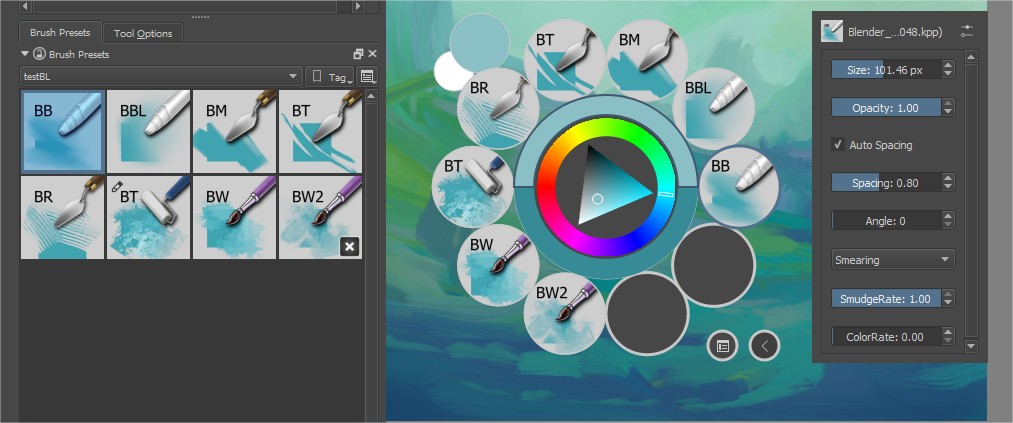
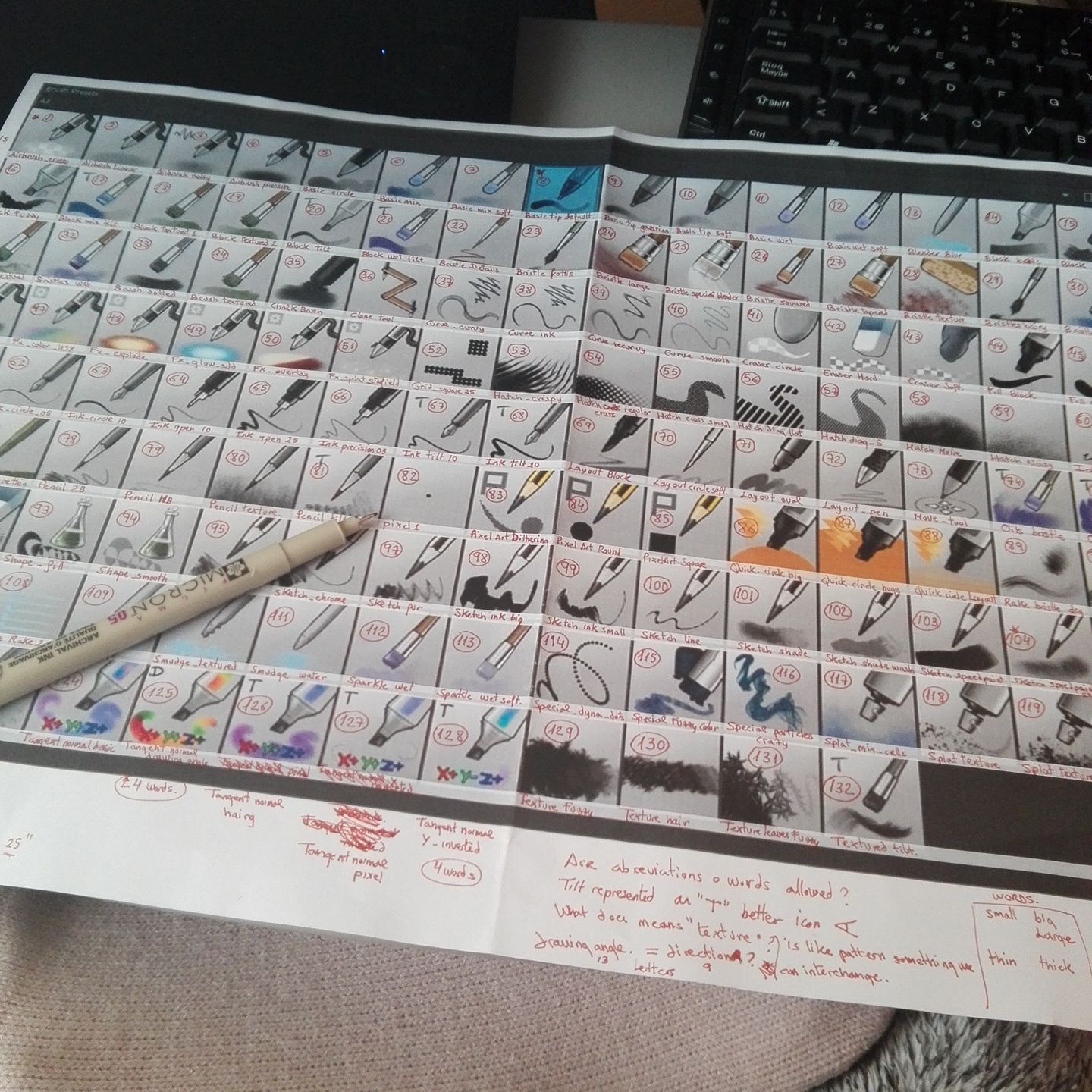
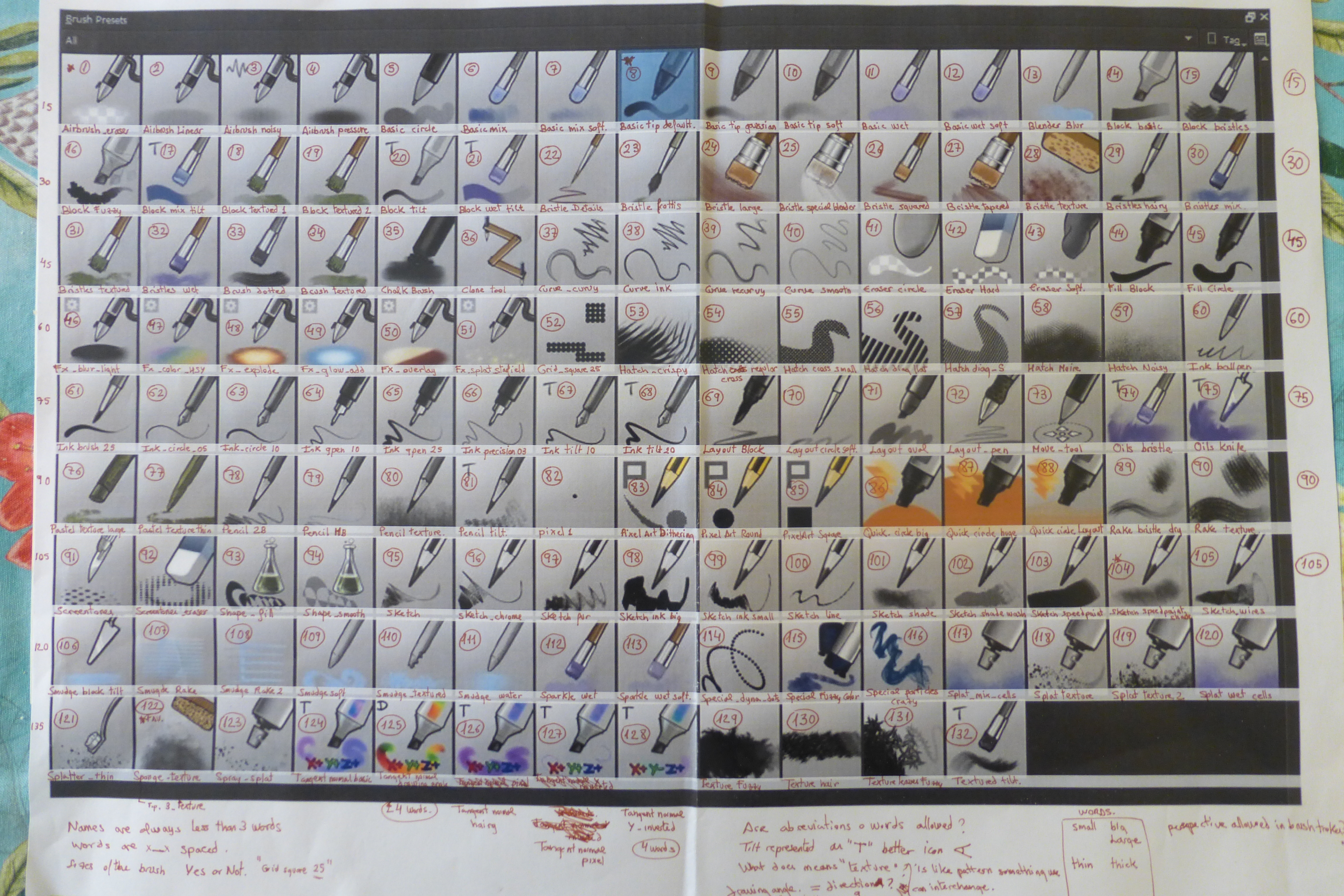
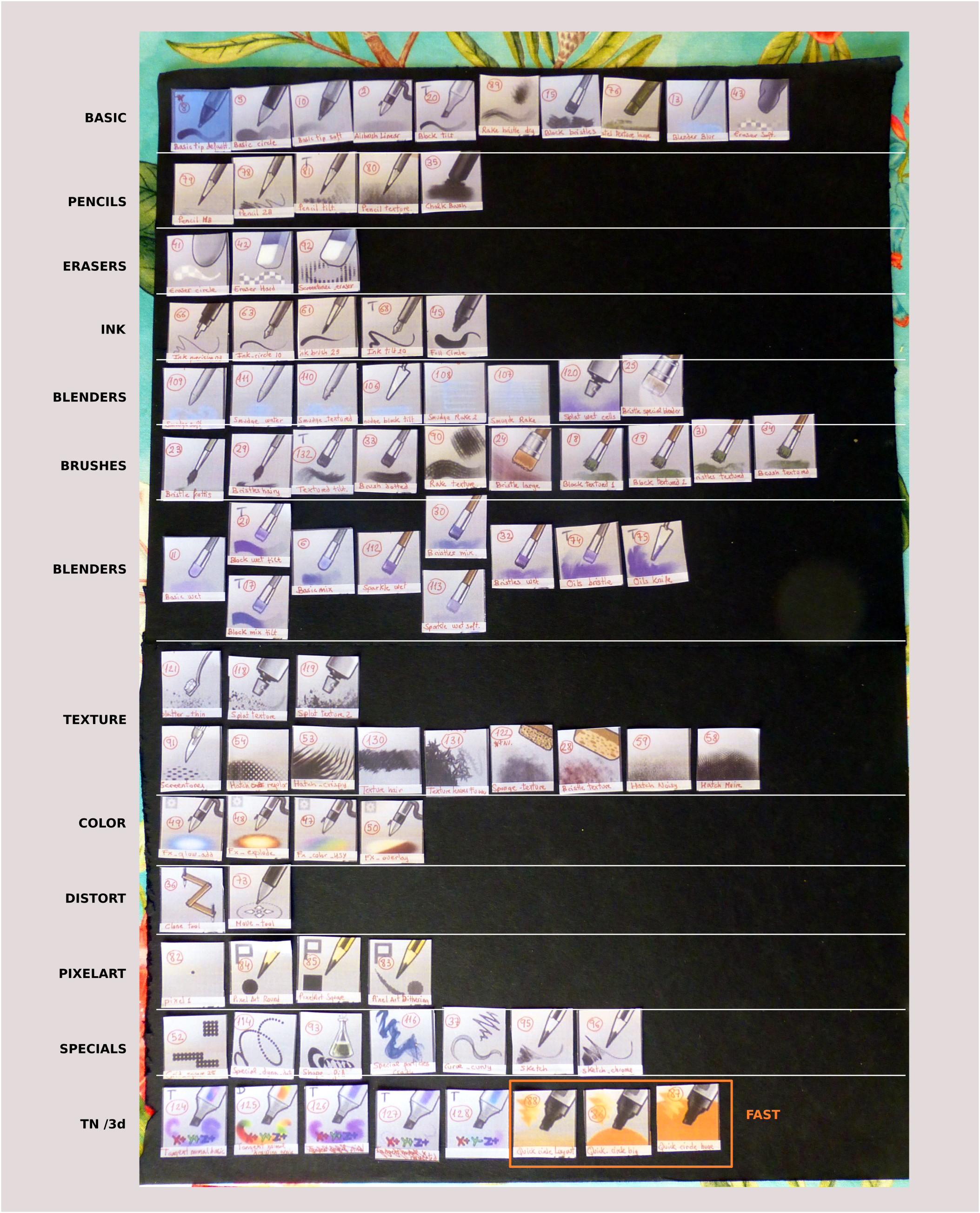
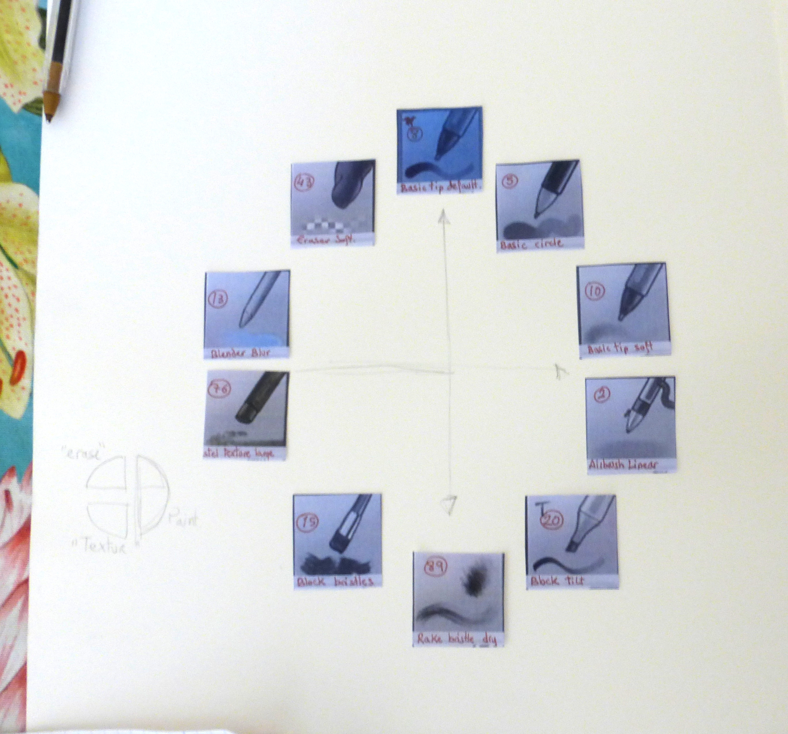
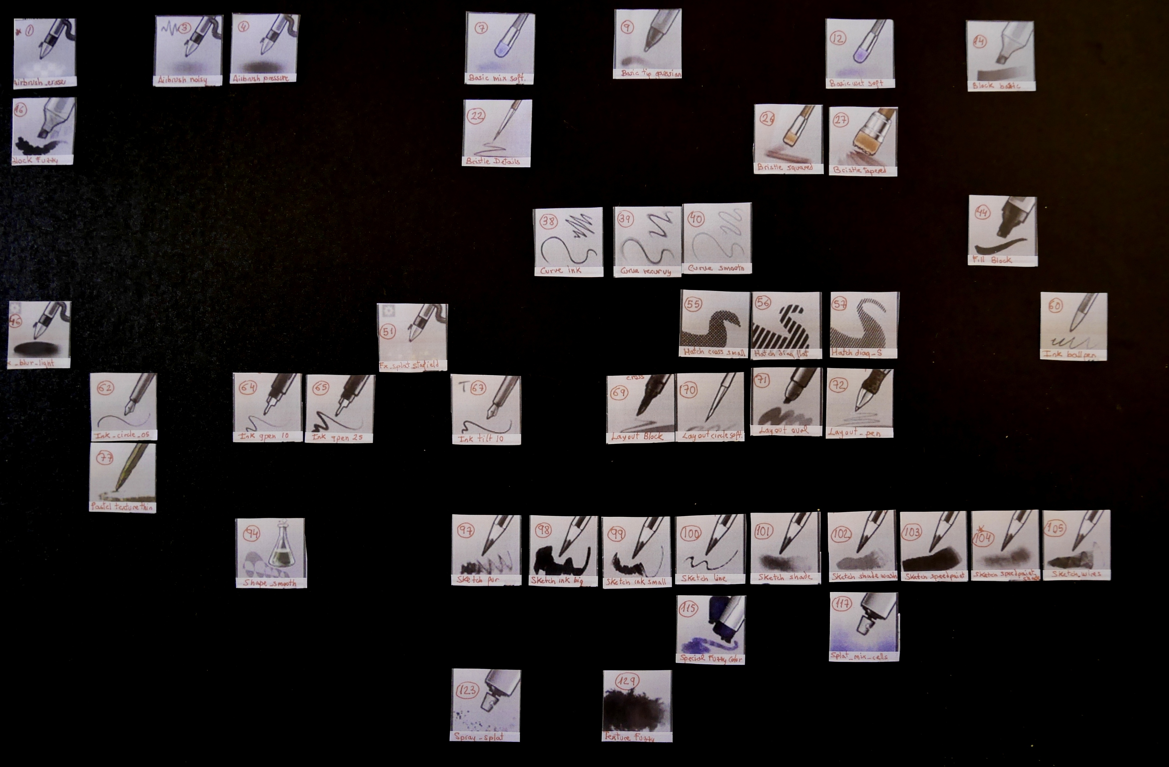
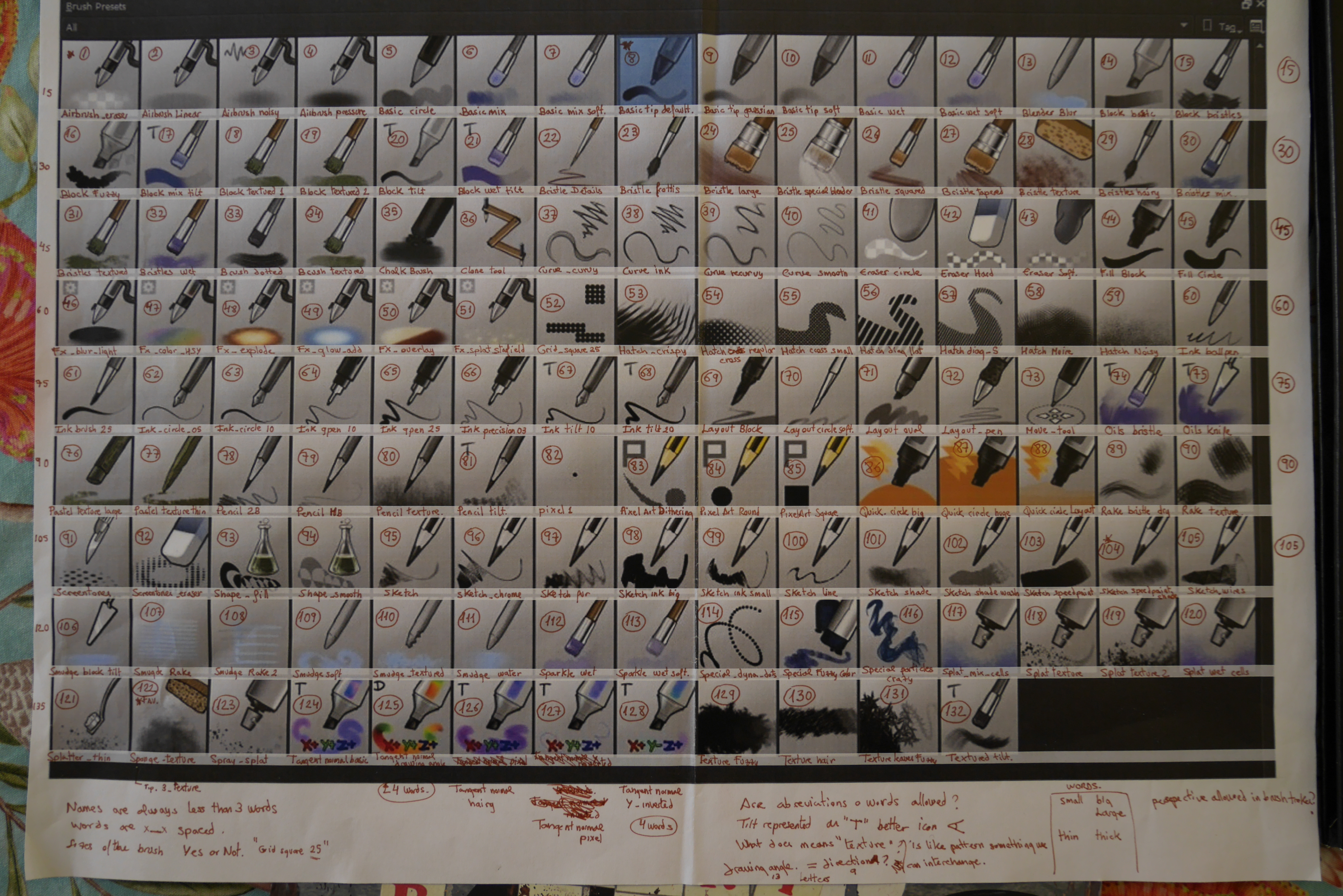
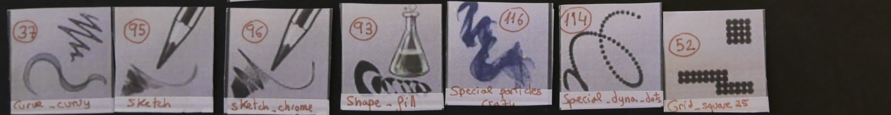
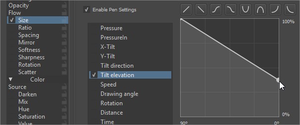
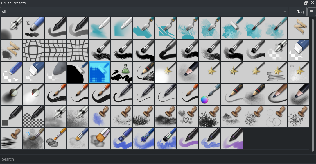
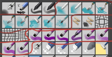
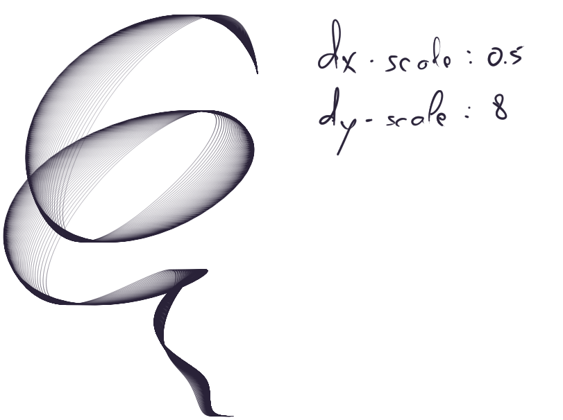
The brush tips and brush presets have not really been looked at in quite a few years. This task is to look through them and try to improve the default presets and tips that will ship with Krita 4.0. The end result will mostly be updated KPPs and images for brush tips

With what I have seen and heard, these are some things to think about:

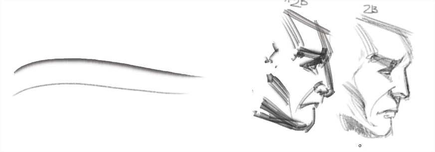
  1. are we showing a big enough variety in brushes?
  2. are our brushes optimized very well for performance?
  3. are there any tips that we really don't need...or some tips that would be really nice?
  4. are there some presets that are very similar to others and don't provide much value?
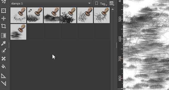
  5. are there other brush packs out there where we could ask the author's permission to include them in our defaults?
  6. having a 3.x default brush bundle for people want the old default presets
  7. our default theme is dark, but our preset icons all have a light background. Is this alright -- or does it make them stand out too much?

With the little time in IRC discussing this, there seems to be quite a bit of ideas for improvements. If you have any new ideas...or ideas with the above points list them below

There are a very large number of changes, so older changes are hidden. Show Older Changes

@ramonmiranda spent a while playing with your brushes. I pretty much added almost all of them. The new stuff should all appear in the nightly windows build when it runs on Friday. Thanks for all your hard work on it.

@rempt I started updating some brush tips to clean up their names. That is going to take a bit of time since renaming a brush usually breaks preset(s) in the process. The main naming convention I am using right now is to just describe what the tip looks like. Most of them are all blobs, so I have been trying to think of shapes, patterns, or anything else creative to differentiate them. Just as long as it isn't something like "texture53". I think that is the best we are going to be able to do.

I added a few more presets with the different brush engines like the bristle and grid one.

ramonmiranda added a comment.EditedFeb 2 2018, 6:40 PM

Hi, today i have been working on icon redesign. Following David Revoy template with Safe frame i have made this


you can notice different little changes:

  • Text on the upper left to help with mnemonics Blender Basic is just BB and that way is more recognizeable.
  • The Shape for brushtroke blending is different enough in each of them.
  • The color has changed from cyan, which doesn´t help very much to recognize the shape. anyway the color can be changed. (Each brushtroke use a filter layer with color balance.)
  • No gradient on background. Helps readibility adding contrast between BG and Brushtroke.
  • Tested on mini size and text still readable and i can find them between other presets easily.


Don´t worry for the Cross , that was done in Krita 3.3 and there i have not copied that brush, in Krita 4.0 Doesn´t appear
That is my contribution for today.

@ramonmiranda thanks for the preset icons. I wonder if there is a better way to do text overlays than putting it directly in the image. Doing that for every brush would be tedious...and it doesn't take into account localization and how some people might make brushes in other languages like Japanese.

The first letter of every word is a neat idea. I wonder if somehow we could extract that from the brush name and superimpose that in the brush preset image when it is shown. That way that part could update on its own.

Something that maybe other artists could give feedback on.

I personally think the sketch brush presets are a bit weak, so I might spend some time this weekend and improve those. I also might try to spend more time on the brush tips and rename or add more. If you want to talk tomorrow (Saturday), let me know. that is the weekend, so I have a bit of free time if you want to discuss over Google hangouts or something.

@scottpetrovic glad you like them. Tomorrow morning i have time. I will be awaken since 9:00 so if you want to talk is perfect.
Your other languages ideas and concern are totally true.
Text is something to be discused. I have done some others to show you too

Testing pencils to see what kind of texture i can achieve. I use 2 brushes to do this. one for details and another for shading areas.

The noticeable here is the non texture (pattern) dependency. That is good if we want the brush usable at diferent sizes . Because people often don´t sketch in high res but in small sizes due personal preferences or CPU performance. My High res is 6000px wide and performance without Instant preview is enough for big sizes. 500-600px


So after testing in highres 6000px wide, i did the same for low res 1024px wide. And this is the result. The texture loose quality but not too much. maybe a bit of sharpen would help. for the moment i don´t apply sharpen filter and i put side by side to compare them.

What do you think. Is this done before ? i would like to know if someboody arrived to same ideas to not repeat them :D

I am btw, not agreeing with the idea of using a flat gray for the presets background because it will clash with the realistically shaded preset icons and take a significant amount of oomph out of the result icons.

rempt added a comment.Feb 5 2018, 2:12 PM

I'm not sure... Is the plan to replace all the backgrounds, or only for some presets?

Storm added a subscriber: Storm.Feb 5 2018, 3:00 PM

Here is my personal opinion on an ideal brush preset icon.

1; Forget tool icons* - they aren't useful in any way to tell me what this brush is doing - that's what sample strokes are for. Exceptions would be special effects that cannot be expressed well with a stroke.

2; Use dark BG with white stroke preview - the majority of artists use a dark color theme already, as it's better for the eyes.

3; Use solid color* - gradients make it harder to read sample strokes accurately.

4; Keep it simple and focus on what that brush looks like, instead of trying to convey technical information.

5; Use color coding to differentiate main brush types. I do this by tinting the dark background.

I'm attaching a screenshot of my own brush icons as an example of my approach.

  • Gradients, little tool icons and other pretty/fancy things are contra-productive. A brush icon doesn't need to be pretty/trendy - it needs to convey _information_ in a simple and easy to read way. Nice looks are of no practical use whatsoever, they place trendiness above usability.
woltherav added a comment.EditedFeb 5 2018, 6:50 PM

okay, so I thought it might be an idea to check how much certain brushes are affected speed wise and by instant preview... but got distracted by a bit of sadness.

Scott, the name changing you've done had messed up the spacing of a lot of brushes, meaning they have radically different textures in the stroke.

  • The brushes most affected by these are the "Dry" brushes and in general brushes using masked brushtips.
  • Another one is that some brushes seem to be using "Abominable snowman", while I am not sure they should. This includes, Wet_Bristles_Square, Waterpaint_soft_edges, Waterpaint_soft, Stamp_Hearts(this definitely shouldn't be using that tip...), and Blender_Textured.
  • Dry Bristles Smooth seems to be using the wrong brush tip too, gives the icon shows a rake effect. (I think it ought be the oil_bristle, not oil_knife)
  • Dry Bristle Textured Scribble missed its masked brush

That said:

- Airbrush
   Doesn't need auto, just set spacing to regular at to, say, .1
- Basic Chisel Smooth
   The brush tip of this one got messed up: it should be at 90° and actually circular(ratio turns it oblong).
- Basic Flow
   Can have auto spacing turned off and spacing set to 0.25
- Basic tip default
   Can have auto spacing turned off and spacing set to 0.20-0.25
- Blender blur
   Can have auto spacing turned off.
- Blender Mover
   Can have auto spacing turned off. Does pop a little with instant preview, but at the same time turning off instant preview makes it super slow, and no combo of spacing/horizontal fade can get the desired result for this brush.
- Blender Tendrils
   Should be left alone. Pops with instant preview issues like mover, but auto spacing cannot be turned off for it.
- Blender Rake
   Pops with instant preview, but little we can do about it.
- Blender Textured
   Pops wiht instant preview, but little can be done about it. Not sure if it needs auto spacing, it can work with regular spacing set to 0.04
- Blender Textured Marble
   Pops massively. To the point turning off instant preview might be recommended. Auto spacing can be turned to regular spacing with 0.1
- Blender water
   Pops masively, but without instant preview is too slow. Auto spacing can be turned off and regular spacing can be 0.1
- Blender Water Spong
   Pops a little, and can have instant preview turned off by default just fine.
- Clone tool
   Is bugged with instant preview?
- Clone Tool Textured
   Needs manual.

I suggest that the ones that say "instant preview pops a little" or something like that, are tested on a slow computer to determine where the instant preview threshold should go.

Blender blur DONE (Blender_Blur Copy_01.kpp)

Can have auto spacing turned off.

Blender Mover DONE (Blender_Mover Copy_1.kpp)

Can have auto spacing turned off. Does pop a little with instant preview, but at the same time turning off instant preview makes it super slow, and no combo of spacing/horizontal fade can get the desired result for this brush.

Blender Tendrils DONE (Blender_Mover Tendrils)

Should be left alone. Pops with instant preview issues like mover, but auto spacing cannot be turned off for it.

instant preview set to off
precission set to 1
spacing is auto .60
size by pressure off.
I would keep this kind of Blender. no pops here now. It provides a different way to move paint.

Blender Rake DONE (Blender_Rake Copy 01)

Pops with instant preview, but little we can do about it.

Instant preview set off. This brush is for strong and confident brushtrokes in different directions not long brushtrokes due the rake of the brush so if the size is not too big performance is good enough.

Blender Textured DONE (Blender_Textured Copy 03)

Pops wiht instant preview, but little can be done about it. Not sure if it needs auto spacing, it can work with regular spacing set to 0.04

set spacing to 0.10 to see more clearly the texture.
Instant preview set ON. No pops here.

Blender Textured Marble DONE (Blender_Textured Copy 02)

Pops massively. To the point turning off instant preview might be recommended. Auto spacing can be turned to regular spacing with 0.1

Instant preview set to off.
spacing to 0.10

Blender water DONE (Blender_Water Copy 01)

Pops masively, but without instant preview is too slow. Auto spacing can be turned off and regular spacing can be 0.1

NO pops here . i don´t know if i have to change something. works fine on i7 16GBRam Nvidia 1050

Blender Water Spong DONE (Blender_Water Copy 02)

Pops a little, and can have instant preview turned off by default just fine.

Thanks for the feedback Wolthera. I was not using too much instant preview just in heavy sizes but i see i have to test in all brushes all sizes. The Auto spacing i set to Auto when i need to speed my brushes , here works well. I set the spacing in a constant value when i work with textures mainly and i want to not overlap the dabs stoo much.

Talking about sketching, you know i published some sketches recently. These are the brushes i used.
I think we already have good tips and enough to create good sketches and even more completed traditional pencil looking images. So i have used default resources to create these 2 new brushes:

Sketch_2B Copy 01 pencil for Shading
Suggested name: Pencil Shading
This brush produce a good texture to mimic graphite and as his rotation is set to drawing angle we have a good texture that follows the brushtroke. And it works in small sizes and big sizes
Sketch_2B Copy 02 pencil for Draw with fine detail.
Suggested name: Pencil Draw
This brush produce a very fine line but is scalable and we don´t loose texture

The Brushes:

For the tag, btw, we used to have multiple tags, but that didn't work out because our tag management system is a bit wonky. However, we should have a single tag, like, in the 3.x series Timothée made the 'demo' tag that the pop-up palette was set to by default.

Ideally this tag ought to have the simplest set of brushes. It used to be something like basic_tip_default, eraser_circle, mix_wet, inking_gpen and a bunch of others, but I guess we'll need to really look at the total we'll have later on and decide which are the 10 most basic ones. We can even set the defaults of the 10 brushes script to use these :p

Well after some consideration, i have done a version of the Blending icons with gradient to see if the result are better or not. Cyan was rejected as color because it has same tone vale than BG. so i test with white. That helps a bit. The good stuff is that keeps coherence with the default set so we don´t have to remake all the icons even when there is a lot of stuff to improve imo but slowly. I am taking notes to get order in the chaos.

And this is the final for today.

@ramonmiranda which brush tips did you use for the pencil presets. I tried loading them in, but it said the tips were missing. Also when you showed me last time, the brush tip looked like a gradient (which we don't have right now in the defaults). We either need to add the new tip, or point to the newly renamed tips. The tips were renamed last Saturday, so there shouldn't be any more renaming for them if you have the latest nightly.

For the preset icons, it sounds like we are going the following directions

  • color code the different types: blenders, watercolor, dry, etc
  • have a plain grey background

@scottpetrovic I use a simple gradient. you can use this but i am gonna test several versions.


I shown you 5 different brushes. Today i will make 2 more. (doing them right now.)

scottpetrovic added a comment.EditedFeb 7 2018, 2:27 PM

Color coding the presets....

We might want to determine how we organize the colors. Here is the base guide that we previously used for colors. https://community.kde.org/Krita/Brushes_Preset_Preview

It doesn't cover all different types of brushes we have though.

Here are some colors I tried to assign to different areas. They are extremely subjective, but possibly better than nothing (which is what we have for most types right now)

  • Airbrush (yellow)
  • Basic (black)
  • Blender (teal)
  • Clone (maybe doesn't need a color)
  • Distort (maybe just use a dark grey grid and show how the distortion affects the grid)
  • Dry ( dark purple)
  • Eraser (white)
  • Fill ( orangish red)
  • FX (probably can't do a color with this)
  • Ink (maybe just black)
  • Pixel (light orange)
  • Pencil (grey)
  • Spray (some type of magenta)
  • Stamp (Green)
  • Waterpaint (dark blue)
  • Wet (light Purple)

Feel free to make your suggestion

To me right now, the purpose of the colors seems to help differentiate the behavior of the brush. It will be most helpful when viewing thumbnails only. It will be easier to see the groupings of types of brushes if they have the same color.

I wouldn't put in too many colors. For example, some people can't differentiate easily between shades of orange or shades of purple. Based on that, it might be best to limit the color choices to Black/White/Red/Orange/Yellow/Green/Cyan/Blue/Purple, and while they don't need to be the extremes of these colors, we should try to sorta group them. In the case of bright colors like Yellow and Cyan, well, we're using the cyan-esque colors for the blending brushes, and already using a darker variant. Yellow, if used, should also use a darker variant to make sure people can see the color.

I agree that distort should distort a grid. Purple for wet brushes sounds fine too.

Similarly, I think the eraser should just a pattern approximating the transparency checkers like we have now.

The real tricky bit is textured strokes versus non-textured strokes. Like, Quickbrush, shape brush, inking, airbrush and the basic brushes have no texture, while sketch, grid, pencils, masked tips, predefined brushes/spray and textured brushes all have a textured result. Like, how much are we gonna sub-divide those two major categories?

Here you have 2 more brushes for Draw/Sketchiin with pencil or charcoal feeling


With this 4 we con cover a wide range of sketching i hope you find them interesting


Tilt elevation to control size

tilt declination to control the direction of brushtroke
Tilt to control size.
Both uses pattern 4 "04 paper c grain"

The brush with gradient was previously submitted.

@ramonmiranda thanks for the stuff!

I updated the names of the "sketch" presets. They now all say "pencil" at the beginning I also added your new presets and the gradient brush tip.

For the colors, I see you uploaded some blender ones...but the only images I see in the ZIP file are the white ones. People seemed to like the colored blue ones, so maybe we should use those.

Could you also share your KRA brush preset template? I wouldn't mind trying to update some of the icon images as well.

@scottpetrovic Hi, glad you like them.


After some feedack in twitter https://twitter.com/ramonmva/status/960947431809732610 and facebook Krita group https://www.facebook.com/groups/883585008407522/permalink/1490887627677254/
i agree with you. people prefer colored ones. and as Wolthera says is cyanesque color or teal as you commented.. so we are right following guides.

About the Icon template i am using i hope you find it useful. If you change icons just let me know because each brushtroke i make has a reason, it is not a simple brushtroke. i take care of spacing, Shape of the brushtroke to not compete with other brushes shapes, Focus to improve the readibility in small sizes and more...

About the names i would like to find a way to place in the order that the capture shows Draw, shade , draw, shade.
Draw means for me detail, sharp point
Shade mean for me Shading, volume, and larger areas even when the brush are capable to achieve small sizes and be useful.

Okay, I updated the icons. I had to remake several of them because they had like a double shadow applied. I also went out of my way to ensure the tool icons were a little tealish, and also included Ramon's speed updates. Hopefully everything works properly now, because that was very fiddly.

woltherav added a comment.EditedFeb 8 2018, 6:33 PM

Okay, just updated the eraser icons.

The following kra file contains only the layers with the checker pattern and the different strokes that are used as a mask. Use layer>copy/layer->paste to easily move it to the icon template.

Edit: I also added some emblems to indicate various angles and tilt to master. I think it might be a good idea to still have brushes that use tilt have some kind of indicator, considering those are always a bit odd to use. anyway, attached are the svg files for those emblems, if you guys disagree with the look:

@woltherav thanks for the work, i will check them today.(Btw sorry for the doubled shadow. When you see the icon hundred times you get a bit lost until refresh, so thanks for extra work. )

I am also thinking about preparing my icons and review them to be available for krita 4. Would you agree with that? Because realistic Skeuomorphism is cool like Deevad do so what do you think about that? Would you like to have more painterly icons and follow this line or give the users again vector icons type like i did for the "Design guideline page" ? I think vector is cool because we can do variations very quickly and is all SVG in inkscape.

@ramonmiranda, the SVG files are technically already available in the Vector Library Docker.

I think though that SVG is still a wee bit too limited to handle the painterly look we're going for right now. I would focus on only handing the tools you feel are missing right now.

Might be better to focus on the presets themselves/tags/icon colors.

Scott seems to have decided to make the dry brush icons all purple, and I am wondering if that's not too confusing? Because we used to use purple for the wet dulling brushes, and the dry ones, paint wise do the opposite. Maybe I am overthinking this.

@woltherav I din't see the wet vs dry had similar colors. Maybe the wet brushes could be pink. We don' t have a ton of wet brushes, so I don't know how useful it would be to give them two colors based on a property like dull or smearing.

I was just following the list I made. Feel free to post an updated version of it with your thoughts .

radianart added a comment.EditedFeb 9 2018, 9:55 PM

I tested brushes and noticed some of them have wrong brush tip or tip settings for masking brushes. These are fixed now. And I saved all names and icons (except clone brush, it have new icon and tip, scott will have to make one more name :P).
I also changed some presets to something better in my opinion.
Tips "chisel_knife" and "chalk_round_hard" changed to blurried versions, they makes better results.
I'll probably play with brushes more and add some feedback on other presets.

@radianart - thanks. I will take a look at those.

After the meeting today, we are going to try to do another build of Krita 4.0 for testing. I want to at least get the icons a little more consistent before that happens. They look a bit sloppy right now with some having gradients, and other with just a solid grey. There seems to be some conversations with exactly what needs color, but nothing posted here to help guide that decision.

I will take a shot at updating some of the gradient background icons to make them use the solid grey. Also try to make them a more consistent with the direction we are going. We can always make further tweaks later.

Let's see if we can get the presets in a good state by this week. Artists can then get a good idea of how the presets are going to look & behave. We can get better feedback that way too.

ramonmiranda added a comment.EditedFeb 12 2018, 3:40 PM

ok, here i update the latest pencils using default resources as they are renamed in krita 4.0 Beta night build (git0c60008)

I would take into consideration to remove the following by the following reasons:
Pencil 2B
Pencil 6B

1- ithink sketchbrushengine doesn´t fir very well here
Pencil Chrome is a name that has no sense in meaning imo. Chrome means for me shining or metal, and pencils are not related with that. Time ago we used this name becouse type of shading that produces but i think this is more digital than "pencil". I would remove it from pencils and move it to a tag called "specials" where we could put these kind of brushes.

2- Same with Pencil Hatch noisy. Also we i think this is not a good way to create texture because we can not control the size of the "noise" .We could use another ways to produce dirty texture.


I have been thinking about how to get the best of what we already have in krita. It sounds a bit crazy but take it as it is. An experimental place for experimentation. As we are making new things with brushes maybe is a good time for this kind of thing
sometimes is complicated because emotional attachments to the brushes. But for this experiment imagine everything is possible.

I often find myself searching for the right presets and then I have to search by word or visually. That is not a big issue. It takes me little time but I feel is not the best way to do that.

I have thought what other users are using, so i take in consideration some facts:

  • What Videos, tutorials, screen capture, photos, 5*xx 4*xx are showing about layout and preferences
  • There is not a perfect solution. Even when is the best solution people can disagree due they are used to previous solution or personal taste.
  • krita covers a widest range of users. From beginners to pro users.
  • Pro or advanced users often use customized tools

This is my proposal to have the krita set more organized. To do it** I have printed several copies,numbered and wrote brushes name and cut all the brushes separately.

  • This makes the set more mobile because I can move brushes freely without worring about the names. (Then we have to being able to translate all these changes to the real application. Also this way I have a overall view on what we have on the table. After lot of game "moving" the brushes i think in them this way

I go from simple brushes , using only opacity and basic spacing to more complicated "organic" feeling . From simple to complex, order to chaos.
So i ended with this idea in each category :
First we have the "Basic" behavior, then we have a more Textured Brushtroke, then we have the brushes that are controlled with Pattern, and finally we have Special Brushengines (Hairy, Hatch...)
I think this helps also the user to guess where to llok for a texture for example.

Let's put a name on them

Is hard to find good names, even harder ordering them alphabetically, but here we go. Who knows, maybe you will like it.

Basic (10 basic brushes to cover a wide range of painting without knowing the program) covers painting both hard and soft,texture by brush tip and pattern,erasing and basic blend.
These are my basic for a begginer. If you post in a wheel you get something like this.

Blenders
We have already covered this cathegory with some brushes.

Draw (pencil and shading)
We have already covered this cathegory with some brushes.

Erasers

Ink
Modify color (blending modes)

Painting
Paintwet (colorsmudge)

Smudgers (if we don't want to use the blender word and here has more sense because they are wet too.

Texture brush (brushes with more organic feel. Simmulates texture by the brush tip. Low spacing)
Texture rough (textures with big sizes and big spacing. Also controlled by patterns)

Specials (other brushengines) they are almost at the end because they have unusual behavior or special features. Pixelart could be here.
ZYX tangent normal (3d. as this is different from illustrative painting I would keep them at the end of the set.

Quick brushes (I don't know if we are going to keep this brushes )

I have tried to keep the set organized and i have deleted more than 40 brushes, and i find the set visually easier to understand.

I have a list with all the brushes that i have removed and why. are you interested or do i finish this experiment?


Virtual Deleted (for now) 44 brushes, 88 left.
How i decide what to remove? well i tried to get the more visual pleasant and useful combination. My focus is what people can expect the first time krita opens. and make the experience as much comfortable as possible. No knowledge of tools or brushes are needed.
So if you like the idea here we go.
You are going to see lot of “IMO”( in my opinion). Of course you can disagree totally or not. I expose my ideas based on my own experience and i hope this help.

  • 1 it can be changed by eraser soft. They do basically the same, erase softly. the Airbrush erase don´t use the Airbrush feature. Also imo is not a good idea put an eraser as the first brush in the default pack.If you(begginer) try it in a blank layer you can see nothing is happening and think the software is bad or the tool is not working.
  • 3 The “noise” size controlled by density can’t be modified In big canvas sizes this could be make the noisy effect invisible or not perceptible.
  • 4 Airbrush pressure is a redundant term. It would be like the tipical Airbrush. Added 2 instead, Airbrush linear i would remove linear.
  • 7 we have a lot of “wetpaint” colorsmudge brushengine based brushes.
  • 9 Gaussian term is not a common word to describe behavior in brushes. It is slow and Soft curve can do the same and more imo.
  • 12 The Soft thing is not enough for me to be as brush.
  • 14 Added 20 instead. If the tablet has no tilt options, we can use RMB to change angle.
  • 22,26, 27 Added 24 instead.I wish to control the size of bristles and the scale of them. nowadays they are always 1px width wich is nice for low res but is useless for highres images. 6000px wide.
  • 38, 39, 40 i can’t see practical uses. Maybe sketching. Added 37 to have a sample of this brushengine. I would add to the “specials” category
  • 44 added 45 instead in “ink” category. It is only to fill big areas, it could be replaced by 86 or 87. The tip can be changed to be square to be more usable in squared surfaces just changing the brush tip to square.
  • 46 Slow and nowadays we have another Blender Blur wich is soft. If DOF is what we need i would put it in FX or Distort Category
  • 51 There is a newer version for krita4. WIP
  • 55, 56, 57 Added 53, 54 instead in Texture category
  • 60 It can be replaced by 63.
  • 62, 64 Very small imo. Added 63 instead
  • 65 added 68 instead.
  • 69, 70, 71,72 i consider them as basic brushes. 69 or 71 can be replaced for 20. 70 can be replaced by basic brush with opacity by pressure. 72 can be replaced by ink brush just to take notes.
  • 77 added 78 instead . Is texture controlled by pattern in Basic category
  • 94 Added 93 instead. We can control opacity by the upper menu slider or RMB. it would be great to have opacity by pressure or gradient as original Alchemy software.
  • 97,98,99,100,101,102,103,104,105. added 95, 96 as representation of the Sketchbrushengine. Shows basic features. too much variation of the same brush engine (11 brushes). The pencil icon is not very intuitive. Size doesn’t control real size but Area to be affected and this is not usual behavior but special behavior in sketch brushengine. This can confuse some users.
  • 115 Useless imo. Only show change on color dynamics.The sorrounder brushes are very different. And the icon is related to dry technique like pastel so this could be confusing.
  • 117 Added 120 (Blending cat. “Particle” Effect that blends color.)
  • 123 Added 118, 121 instead
  • 129 It is not related with nature neither texture. Random in rotation makes very hard to predict results. And useless imo.

I hope this will help a bit to roganize a bit more . If not let me know because this takes al ot of time and tests. :D

I am kinda lost on what is going on here. I understand you're doing this with the old set? Will you now add the ones of those that hadn't been in the new set to the new set? Will you then reevaluate the new set?

I just have the feeling you are working in a different universe from us?

@woltherav i am doing this with the old set trying to organize my ideas to make the set in krita 4.0 the most complete we can. without forgetting good stuff that comes from 3.x. This is to understand better why we add something or why we remove it. because we have started from 0 and that is easy but maybe not the best way. So my idea is to combine both. No review is needed for 4.0 because we are doing it right now.

For example i need to add wetpaint brushes with new icons and maybe new brushes. Do i have to remove everything and start from 0? maybe not. So i review what we have in similar behavior and brushes and try to get the best from that. The new arrangement helps me to find the brushes and test them. So i can be faster and precise on what i do.

I think this is not another universe, but is my own way to achieve my best results.

No, I just must've missed your intended goal. It makes much more sense now, thanks.

While i am reviewing the wetpaint brushes i upload these icons to see what do you think


The Basic Airbrush with a not so dark spot i think gives the idea that the color increases gradually in a soft way.

Only showing the opacity change. This is what i understand as basic brush. Hard Edges, opacity by pressure and good opacity curve to ensure that the low levels of pressure are well used. "S" type curve.
And some stamps brushes icon

Grass icon You can see the spikes when zoom out and not as opaque shape but with blank areas.

Cracks. Here the pattern is simmulating some kind of dirty voronoi with a brush tip. When zoom out, you can recognize the shape as "lines with some spots "

Water. very useful to create little waves on water. I just leave a spot of what is the brushtip When zoom out, The horizontal shapes are good to make difference from other stamp brushes.

Do you prefer i focus on stamps or wetpaint first.?

Wetpaint, Scott already handled most of the stamps, and wetpaint is still old-style.

I like the way that they looks after some changes. Just testing on my pc.

The smaller, The better we notice the differences

ramonmiranda added a comment.EditedFeb 15 2018, 3:17 PM

updated: Brushes


Well here we go with the icons for wet paint. (The brushes we have already ) I would like to add some more, but for the moment i think this is enough. I know that the last 3 where i have used stylus,they are different from a dirty style but if you think it carefully they provided very digital look so i think that is the best way to show them. i hope you like them. @scottpetrovic if you agree or @woltherav upload in git. I think i can optimize them and more interesting stuff maybe tomorrow.

ramonmiranda added a comment.EditedFeb 15 2018, 3:24 PM

Brushes:


The icons:

i am in Krita 4 Beta (krita-nightly-x64-v4.0.0.51-300-g4840e16bfe)
I have noticed there are some issues with pencils and i have some thoughts that i want to share with you.

Pencil 2B
I like the look of the brushtroke but this doesn´t look like a pencil. :) What i would expect in a basic 2b is a just be good to add details and give a nice sketch feeling with a bit of grain or texture (pattern). so when i found something like this i think is more like digital ink or digital effect. I think Tilt is not a basic behavior
I have done a version on what i think is a good 2B or basic Pencil. (i don't like to use 2b or 6b because is like cutting the possibilities of a brush for the user mind imo.)
The effect is noticeable even better with big sizes

Pencil 6B
I would just remove it, we digitally don´t need too much with pencils. Just something to draw with and another for shading as i published in previous post with examples.
When i use the drawing angle with rotation as shading is to keeb the direction on shading helping to get a good sense of volume. But i would call this a "shading" pencil not 6b or 8b . also 2b and 6b don`t share same look and this could be confussing for the user.

Pencil Chrome
That is an interesting one as i love this brushengine from the begining. If i remember well i did 2 videos
https://www.youtube.com/watch?v=fNK_pfQITM0
https://www.youtube.com/watch?v=I2T29daZPdU
But i really think this brushengine would fit better in a cathegory called "specials" because it behaves specially good ;) but different.

Pencil Hatch noisy
I think this is more related with texture brushes not Pencil. And as uses noise, the effect looks different in different sizes. It would be awesome to be able control the noise size and randomnes scale.

Pencil Pattern Shading
Appears like i sent to phabricator. to avoid the "invisible brush" produced by tilt configuration i reuploaded them. and also provided info on twitter and facebook

Pencil Pattern Tilt
This brush works well but i have a doubt about this . I am lefthanded so i would turn the brushtip 180º. Maybe righthanded prefer 0º? it is curious for me.

If this is fixed we could have lees feedback ranting about pencils i think.

woltherav added a comment.EditedFeb 16 2018, 1:36 PM

Ramon, I've updated the icons with yours. However, stamp_grass stamp_scales and stamp_water have double shadows again. If you add in the fixed pngs for them in the next 5 hours, I can still push them before the final version.

I also updated the final ones without a new styles icon and went and changed the fill ones to black. That yellow just didn't make sense to me at all.

We could still turn all the dry brushes to blackgrey by throwing adesaturate filter over them, but I'll leave them be for now.

I'll go look into the sketch/pencil stuff.

Edit:

Imade the changes you suggested, left 2b alone as Ramon did not include a KPP file for the new proposed Basic Pencil, and move sketch and hatch to fx, though I am not sure if they should be there either...

The sketch brush engine brush may be different, but they are used to sketch with first and foremost. The hatch noisy is intended to replicate a very specific effect found in comics, much like stamp_shoujo_bubbles and fill_screentone.

ramonmiranda added a comment.EditedFeb 16 2018, 4:02 PM

@woltherav i think black is better for fill also because it is "paint" action. Wich i would think is normal. A brush without opacity control.
I sent the right brushes to get 4 different effects we hadn´t. I gave them good names to be shown in order of use by pairs, And i am testing to include 2B as people understand 2b usually and use a lot like for example Elias and other users of the krita group.

ok, here i update the latest pencils using default resources as they are renamed in krita 4.0 Beta night build (git0c60008)

Okay, did some updates, the current collection looks as follows:


Well this what i understand is a good basic preset for sketching. It is different and uses base resources. We can control the ratio, pattern, and opacity to achieve a wide range of effects. i hope you like it. It doesn´t use tilt i think and works also with the mouse but not so well. I am sure i can improve some pencils for the final release

This comment was removed by ramonmiranda.
razvanr added a comment.EditedFeb 17 2018, 6:37 PM

These are my thoughts on the new presets:

  • Basic Chisel Smooth: jagged edges, fixed by changing the spacing, eg. auto spacing of 1 seems to improve it
  • Blender Blur: spacing too large for blur effect, again auto spacing of 1 seems to be quite nice
  • Blender Mover: spacing as well, I haven't found a good setting for it (for the vertical movement), auto spacing 0.3 gives somewhat acceptable results to me
  • Blender Mover Tendrils: auto spacing 0.3 seems better in my opinion
  • FX Image Blur, FX Image Sharpen, FX Pixelize need better thumbs, they're very indistinguishable on a zoomed out thumbnail view
  • FX Smoke Particles is kind of impractical, you need to move super fast to get some separation between lines
  • FX Value Burn, FX Value Dodge I feel like they need to be stronger, opacity of 0.3 is too low, also the brush tip is super transparent
  • Ink Bristle: jagged edges even with anti-aliasing on, don't know if this is fixable in the settings, might be the engine
  • Ink Leaky: jagged edges
  • Spray Smokey: default has erase mode on, I think this isn't intended
  • Stamp Mountains Distant: quality of brush tip too low, very blurry
  • Stamp Water: is too frequent, doesn't really feel like stamp and it's probably harder to control like this
  • Wet Smear: spacing is too large, I personally like a setting like auto spacing of 0.6
  • Wet Soft Tilted: same, I'd go for an auto spacing of 0.3 or something in that range

For all brush presets, maybe it's me :D but I like having whole numbers on default settings, such as size, example, Stamp Scales has size of 81.72 by default, why not 81.73?! :D yah, I'd go with 80, but that's just me.

This update is awesome! :D

razvanr added a comment.EditedFeb 17 2018, 7:35 PM

One more thing, I noticed the default precision is now 1 (lowest quality), in prior versions it's 5 (highest), I guess we should use 5?!

Other than the above, the thumbs need to be remade so that info about tilt etc. options are on the thumb (if it's standardized yet)

I'm really happy with the new brushes except except for the things above, if we fix some of those (some are probably just my preference) than it would be super! :)

These are some of the modifications which reflect my own taste I'd make to some of the brushes. It's a really good start, I had to change very few things.

Nice feedbak. Tomorrow i will test it. Thanks Razvan

Can we really not have names like:

A_Basic
A_Blender Mover
B_Dry Bristles

etc.?!

It's unintuitive that for example the wet brushes come after the stamp brushes, wet brushes should come after dry brushes or be part of a "traditional" or "natural" brush group or something. And no I don't think using the tag system is good for doing categories like these cause it's way too annoying to switch between tags when doing art especially when you got presets that you jump from located in different tags.

I really like the idea from before that @woltherav mentioned with categories , I mean, we (the people that make our own brush packs) already do this in our brush sets cause it just makes sense to organize. This way brush packs won't disrupt the krita default presets either (if we come up with a code, maybe like KRA_A_Basic, etc.). In my case all my brushes start with RZV and so they're placed right in the middle of the default brush set just after the pixel brushes and before the spray, stamps and what comes next.

in regards to new presets being proposed, I see some of them have "auto" spacing turned on. Is this still frowned upon or does someone know something I don't? I thought it really hurt performance. We have even gone out of our way to turn auto spacing off for the presets that previously had it on.

Spacing is the biggest culprit for lag in brushes so we just need to be careful. Lag is also the biggest complaint about Krita in 3.x across everything.
http://mirror.cc.columbia.edu/pub/software/kde-applicationdata/krita/marketing/Krita_User_Survey_Report_April_2017.pdf#page=16

In the latest survey results with the new presets, I don't think one person mentioned lag, so that is a good sign. People seem to be more concerned about a larger variety of brush presets.

@razvanr That google docs is not used any more. It was a hassle to try to keep that straight. There was so much stuff people wanted to change that we thought it would be better to start from scratch.

@scottpetrovic @razvanr yes, auto spacing hurts performance on big brushes . Auto spacing is bad, we shouldn't use it without good reason.

One more thing, I noticed the default precision is now 1 (lowest quality), in prior versions it's 5 (highest), I guess we should use 5?!

Why? Can you see the difference? In 90% cases I can't. In 98% I can't see difference between 2 and 5 precision. I'm painter though, I never make lineart at all.
My opinion: precision 1 for most, 2-4 for precise brushes like inking of bristle ones.
Lover precision makes brushes a little faster, good for big highly textured brushes.

So I find the current FX Glow Add, FX Value Burn & FX Value Dodge (which isn't even value dodge, it's color dodge blending) pretty useless/low quality. I'd strongly lean towards the "FX" (multiply, dodge, color etc.) brushes that @Deevad has if he's ok with having them defaults in krita.

@razvanr : It's ok.

A feedback after looking at the current collection ( as seen in the screenshot under ): you are using too many time the same gfx icon.
In my experience, each preset needs a unique brush icon. Picking a brush within a list of preset with the same icon add confusion.
A variation of colors or decorations can work too (eg. Pencil can have stripe of colors, dots, various coated painting).
Also, the deform-engine presets with the wireframe thumbnail are not blending really well visually, in my opinion.

ramonmiranda added a comment.EditedFeb 20 2018, 5:15 PM

Well here i go, after reading the last comments. great to see feedback so here i left my 2 cents.

First of all i have to say that the brushes i do are optimized for 6000px wide canvas, so the optical best results are for that resolution. Do you agree with that or Do you think we have to reduce the brushes size? let me know.

also i think the brushes and the feelings are very subjective and related with workflow and style of painting. For example i don't use ink brushes in most cases. and i use blenders to move paint a lot, but this is my workflow. So lets go with the feedback

Precision i use 1 when i need Fast performance and not detailed brush tip is needed. In my netbook i notice this a lot because is not very powerful, so i reduce the precision usually to get better performance. We aimed to a wide range users group so i agree with @radianart to keep the most of brushes with precision 1.
Fast computers can't notice this as much.

Tags i prefer an optimized default and all visible in a docker. then i have usually the RMB wheel to look for a specific tag. and "/" to change between two last. Or lately i use the brushes preset history docker

Also i would like to have a "default" tag to separate from other 3rd users brush packs.

Auto spacing on-off. I use auto in some brushes. sometimes i don't see diference in the main computer. As i read in comments Auto is better turned off to improveperformance. Can anybody give a link with info?

Fx Color cathegory was good as it was in Krita 3.x so we could keep as it is and simply redo the icons. the template is available via @scottpetrovic. I did the template using the base from @Deevad and then adding the groups, brushtrokes and so on. i agree we have to avoid using the same icon in lot of brushes. and make each one as different as we can.

Distort images with grid. I would put them more at the end on the set. and let me explain this.

Referring to feedback from @razvanr

These are my thoughts on the new presets:

  • Basic Chisel Smooth: jagged edges, fixed by changing the spacing, eg. auto spacing of 1 seems to improve it

Referred in previous post.

  • Blender Blur: spacing too large for blur effect, again auto spacing of 1 seems to be quite nice

Auto spacing makes slower brushtrokes with big canvases and big brushtrokes. Could be nice for little ones, more precise . So more feedback to decide would be good.

  • Blender Mover: spacing as well, I haven't found a good setting for it (for the vertical movement), auto spacing 0.3 gives somewhat acceptable results to me

It is more versatyle to have the tilt option activated but we could put to drawing angle for the uses without tilt.0.3 is slower here

  • Blender Mover Tendrils: auto spacing 0.3 seems better in my opinion

Optional. this changes the effect optically to better with low res or mid res. Doubting because 0.60 is faster and we would use this for special cases.

  • FX Image Blur, FX Image Sharpen, FX Pixelize need better thumbs, they're very indistinguishable on a zoomed out thumbnail view

Agree

  • FX Smoke Particles is kind of impractical, you need to move super fast to get some separation between lines

Agree with big resolutions. We can do two things . make the brushtroke in a layer and then scale it. (loose a bit quality) or Change the parameters to make it more visivle. This is what i consider a spcial brush so i would put at the end of the default set. with other "specials" visual wonders. ;)

  • FX Value Burn, FX Value Dodge I feel like they need to be stronger, opacity of 0.3 is too low, also the brush tip is super transparent

i think we had good options before in krita 3.x i would kee them.

  • Ink Bristle: jagged edges even with anti-aliasing on, don't know if this is fixable in the settings, might be the engine

I think is not a good idea to mix this bristle brushengine wich is special for me with ink where precision is crucial. Anyway i don't use too much ink so my opinion here is not so valuable.
I think we could keep some bristle engin brushes from 3.0 but for high res they show glitches as the fibers are always one pixel width. I would more opinions

  • Ink Leaky: jagged edges

same as ink bristle

  • Spray Smokey: default has erase mode on, I think this isn't intended

:DDDDD totally not

  • Stamp Mountains Distant: quality of brush tip too low, very blurry

@Deevad could explain how he use it and decide if we need it as default

  • Stamp Water: is too frequent, doesn't really feel like stamp and it's probably harder to control like this

for me is ok to create small ripples in water. But if we can find a better tip, perfect

  • Wet Smear: spacing is too large, I personally like a setting like auto spacing of 0.6

trying to avoid auto here since i read latest comments and performance influence

  • Wet Soft Tilted: same, I'd go for an auto spacing of 0.3 or something in that range

trying to avoid auto here since i read latest comments and performance influence

For all brush presets, maybe it's me :D but I like having whole numbers on default settings, such as size, example, Stamp Scales has size of 81.72 by default, why not 81.73?! :D yah, I'd go with 80, but that's just me.

True, that is important for final release when the tweak here and there are finished. but yes is logical in a practical sense.

This update is awesome! :D

i hope this so and we all have now the chance to achieve it.

rempt added a comment.Feb 20 2018, 7:49 PM

Note: all Krita 3 presets and brushes are available from share.krita.org (https://share.krita.org/p/1206895/), so there is no need to have duplicates of those in the new default bundle.

Couple of comments, I do agree with @razvanr about the default size of the presets, for the sake of consistency, I think they could be rounded to whole numbers, also similar presets are (I think) expected by users to have similar sizes.

@ramonmiranda as for how big a preset should be, I think a 6000k wide canvas is a bit big for any new/less experienced user, I'm thinking that a more general canvas size usage goes around 2500k average. experienced users would not get bothered by smaller sizes any way, (been able to modify at will). Obviously that's just an observation from some posts I've seen, not a constant per say :)

Finally I also agree with @Deevad regarding the moving presets icons, they seem inconsistent with the rest. although the grid shows very well the effect, maybe a mix of "brush/wand" icon plus smaller grid (instead of the stroke) could be a better fit.

I don't think 6K is too big of a canvas, consider the fact that soon 4k monitors soon be standard. I think it's a good idea to start preparing for that and 2.5k images will be small on those, 6k will be medium size, not even that large. And even without 4k monitors, if you do work professionally (pictures that need to be printed, even 6k is medium in some cases), I think 6k is a reasonable starting point. So with this I agree with @ramonmiranda.

You sold me on the precision and after playing a bit with the settings it's true I don't really see a difference between 1 and 5 so anything that improves performance will be more than good, considering now that with masked brushes that's going to be a problem even with medium brushes and especially when talking about smudge brushes. I never tried (or tried to understand) the auto precision option so no comment here.

For the tags I use the same method as @ramonmiranda, I didn't know about the brush history docker, will have to check that out. Also agree on a default tag, but I'd also like the categorization as I mentioned earlier and as @woltherav was saying. I think that would improve organizing the brushes quite a lot.

@ramonmiranda for auto spacing go to this page https://docs.krita.org/Brush_Tips#Parameters and search for "auto (spacing)", it basically makes the spacing tighter so 0.1 is way tighter with auto turned on than without so it does affect performance quite a bit but it also affects the look of the brushes and some times you just have to go with a tight spacing to get the look you want so it's not always a fix for performance.

I also agree on the FX category, it was fine in krita v3.

Also @ramonmiranda I don't have tilt on my wacom so I can't check those ones out. I didn't know some of them use tilt because it isn't specified in the thumb and I probably didn't check all the parameters. So the thumbs have to be redone to include those proper icons like tilt, blend, etc.

So my question is how do we work on this? Is there a central repository for the brushes presets or something? I don't think uploading random zip files here for feedback is good enough if we want to speed up and improve this thing. We should use a git branch or something in which we can all upload and make PRs or if there's any other ideas I'm open to suggestions.

rempt added a comment.Feb 22 2018, 9:32 AM

The central repository for brush presets it krita's git repo. I would prefer to let Scott have the final curation of what goes in there, to avoid too much of the committee effect.

So then @scottpetrovic, is it a specific branch and how's the workflow on this? Should I just send PRs to a specific branch or give you brushes to check and you curate? or...

In T7424#129351, @rempt wrote:

Note: all Krita 3 presets and brushes are available from share.krita.org (https://share.krita.org/p/1206895/), so there is no need to have duplicates of those in the new default bundle.

@rempt i Have some doubts about the workflow we are following.
would be the brushes for 4.0 Beta the default set in krita? as it is right now? . you say no need for duplicates so i don't understand a thing. Maybe you are referring that we can mix the sets becuase we can download the 3.x defaults So are we preparing this set to replace the old or to be in combination with him?. Then the icons are not gonna fit visually talking.
We have good brushes but the order is bad for usabillity. Maybe we have to discuss this more in depth with @scottpetrovic @Deevad @radianart @razvanr @woltherav and so on...

if someone missed here i left my thoughts on this. You can delete it if you think this is useless


I have been thinking about how to get the best of what we already have in krita. It sounds a bit crazy but take it as it is. An experimental place for experimentation. As we are making new things with brushes maybe is a good time for this kind of thing
sometimes is complicated because emotional attachments to the brushes. But for this experiment imagine everything is possible.

I often find myself searching for the right presets and then I have to search by word or visually. That is not a big issue. It takes me little time but I feel is not the best way to do that.

I have thought what other users are using, so i take in consideration some facts:

  • What Videos, tutorials, screen capture, photos, 5*xx 4*xx are showing about layout and preferences
  • There is not a perfect solution. Even when is the best solution people can disagree due they are used to previous solution or personal taste.
  • krita covers a widest range of users. From beginners to pro users.
  • Pro or advanced users often use customized tools

    This is my proposal to have the krita set more organized. To do it** I have printed several copies,numbered and wrote brushes name and cut all the brushes separately.
    • This makes the set more mobile because I can move brushes freely without worring about the names. (Then we have to being able to translate all these changes to the real application. Also this way I have a overall view on what we have on the table. After lot of game "moving" the brushes i think in them this way

      I go from simple brushes , using only opacity and basic spacing to more complicated "organic" feeling . From simple to complex, order to chaos. So i ended with this idea in each category : First we have the "Basic" behavior, then we have a more Textured Brushtroke, then we have the brushes that are controlled with Pattern, and finally we have Special Brushengines (Hairy, Hatch...) I think this helps also the user to guess where to llok for a texture for example.


      Let's put a name on them

      Is hard to find good names, even harder ordering them alphabetically, but here we go. Who knows, maybe you will like it.

Basic (10 basic brushes to cover a wide range of painting without knowing the program) covers painting both hard and soft,texture by brush tip and pattern,erasing and basic blend.
These are my basic for a begginer. If you post in a wheel you get something like this.

Blenders
We have already covered this cathegory with some brushes.

Draw (pencil and shading)
We have already covered this cathegory with some brushes.

Erasers

Ink
Modify color (blending modes)

Painting
Paintwet (colorsmudge)

Smudgers (if we don't want to use the blender word and here has more sense because they are wet too.

Texture brush (brushes with more organic feel. Simmulates texture by the brush tip. Low spacing)
Texture rough (textures with big sizes and big spacing. Also controlled by patterns)

Specials (other brushengines) they are almost at the end because they have unusual behavior or special features. Pixelart could be here.
ZYX tangent normal (3d. as this is different from illustrative painting I would keep them at the end of the set.

Quick brushes (I don't know if we are going to keep this brushes )

I have tried to keep the set organized and i have deleted more than 40 brushes, and i find the set visually easier to understand.

I have a list with all the brushes that i have removed and why. are you interested or do i finish this experiment?

@razvanr The work flow for this process has been pretty much entirely on this forum thread. As you can see, it is a very long forum thread. Uploading a ZIP/KPP file is what we have been doing. Brush sizes around 50-250 seem to be the target we are going for with these defaults. Of course things like inking brushes will be smaller. A few presets need to be updated to fit this pattern.

I see a lot of disagreements and differing opinions with artists on things, so I generally try to wait for people to agree with each other before making a move.

The Krita 4.0 brushes are getting to be a pretty good base and we are getting some very positive feedback about them. I don't think making major changes is a good idea at this point. It is getting close to release and it takes time if anything would affect all presets.

Guideline for Changes to be in Krita 4.0

  1. Brush performance - if you can make a brush perform faster, that is likely to be added. There is a delicate balance between quality and speed when making these brushes. People seem to be much more offended though if performance is bad. It doesn't just make a poor brush, but it makes people say "krita is bad". Performance beats out quality with these default brush presets. If you want to make your brush presets for a more HD painting experience that is fine. Just not for these defaults we ship. Spacing is almost always the main culprit when it comes to performance. I think we have an ok balance right now with the spacing that a lot of people seem to be happy with. Having a lower end machine helps testing with this threshold (I have a low-end Surface Pro 4 that I use). We are optimizing these default brushes for low to mid computer systems.
  1. Minor tweaks to be more uniform - Things like making the brush sizes whole numbers is fine. Most of our presets have whole numbers, so it does look better if they all have them. Another example would be a brush that has too large of a brush size compared to the others. "Blender Blur" for example is 450 pixels. I am not sure if it needs to be that big since none of the other blender brushes are quite that large.
  1. Variety - If there is a new brush that has a noticeably different result than any of our existing brushes in 4.0, that could get added. People always want more variety. I recently added a couple brushes from our survey feedback like a couple shapes brushes for concept work and an impressionism one.
  1. Preset images - There is a lot of back and forth between how these preset icons can look. I am not as concerned with it, but I know @woltherav and @ramonmiranda have been in there a lot, so I would consult them if you have some ideas for those. We just need to be consistent across all brushes.
rempt added a comment.Feb 22 2018, 1:48 PM

Yes, the new brush presets will be the default for 4.0 instead of the ones in
3.0. The 3.0 brush presets will be available for download from
share.krita.org. We could consider shipping the bundle with Krita but
disabling it by default.

We should not have brushes from the 3.0 set in 4.0 by default because those
are in the 3.0 bundle, not even with a new icon.

@rempt i agree we could add the bundle installed but dissabled. This is a good idea. People is going to look for their old loved ones.

Then we are doing wrong right now because we have same brushes but improved and with a new icon. I think we need some more brushes with wetpaint (doing them this week) some new icons for Distort stuff and some textured brushes. I think we can end this set with a good resource and we are almost finishing. :D

@rempt, @scottpetrovic in the current proposed krita v4 default presets I see 3 issues:

  1. inconsistent thumbnails, some have those icons in top left corner, some don't, also quality is bit of an issues on some like @ramonmiranda talked about
  2. the FX brushes area useless, every painting program today includes some glow effects and shadow effects brushes (color dodge & multiply) for which I'm proposing @Deevad's fx part of his set and remove the "value dodge" and "burn" thing have really no use
  3. on variety: there's a lot of smudge brushes (set on smudge), but I see almost no dulling brushes, I think we need a couple of those as well, if you like I can provide examples from my own set that I'm working on as an idea

@razvanr

  1. @ramonmiranda can speak to the thumbnails more. He has been doing quite a bit with these
  2. Saying things like "useless" isn't convincing anyone . It is better to get feedback from multiple artists asking questions like "Maybe we have too many FX presets?" I am sure you realize different people have different work flows with how they work, so what you think is just part of the answer. I think some of these were originally taken from the Krita 3.0 set. Maybe it just needs more discussion. We haven't really discussed the FX ones much. The main thing is that we at least need one preset from an engine. I think FX Smoke Particles is the only brush preset that is using the Particle Engine.
  3. Please provide a few KPP files. As long as it gives noticeably different results than anything we have, it should be ok

@scottpetrovic sorry, wasn't my intention to be nebulous about the fx part of the set. The trouble I'm having with it is really with only 3 presets: the fx glow add and the fx value burn & fx value dodge as they are now. They are way too small (I think the size is 30) and the opacity is too low, it's very difficult to do anything with them, very hard to control and I personally think we can do a lot better and as far as this type of brushes go I'm leaning towards david revoy's set as I mentioned before. With the others from FX part of the pack only the thumbs need to be improved.

I'll come back later with some proposed brushes from my set

Hello guys,

Sorry a bit late to the party.

@rempt adding the default brushes as bundle is good idea, also i agree that old brushes should be there but disabled. +1

@ramonmiranda @razvanr @scottpetrovic @woltherav and everybody who worked on the brushes, these are really great. i specially love the blending brushes, the textures are also nice, i like the sponzy ones :) the quality of the blend brushes is really improved. the set has covered all the area to showcase and help people understand how brushes work part without adding too many variation. nice!

For feedback I would suggest to do one round of pruning (if it is possible now) to remove any closely related brushes or brushes that give similar results.

The brushes are awesome thanks for working on these and i regret I couldn't take active part in this exercise.

razvanr added a comment.EditedFeb 24 2018, 12:40 PM

So this is my proposal from my own pack for some of the things I think are missing in the default set, summed in this image:

The presets are mostly influenced by tutorial videos I saw on photoshop and other painters online:

  1. Jeremy Fenske, see https://www.youtube.com/watch?v=pQ98HRYtpWw, brush is very useful as "fill" brush as well as for quick digital sketches like in the vid, because it has pressure sensitivity but it's goes to full opacity very fast
  2. Sinix Design, see https://www.youtube.com/watch?v=MOE3e7PaqNw - don't think I captured the feeling for this smudge brush as well as I wanted so any improvement you see fit is fine, I mean in general for all of these presets
  3. Proko, after watching his traditional drawing vids
  4. The Art of Aaron Blaise, see any of his digital drawing/painting vids https://www.youtube.com/watch?v=sRSOl87oeh4, he uses a type of this preset a lot
  5. this was just something I saw used by someone in a hangout and I tried emulating it

6 & 7. no vids to show, I made them after seeing Simon Stalenhag's work: http://www.simonstalenhag.se/

  1. Aaron Griffin, see https://www.youtube.com/watch?v=iBtHniaWKrI, quickly create variation for an interesting look

Hope you find some of them worthy of including int he default pack. I also agree with @kamathraghavendra above in the fact that there's a lot of repetition in some of the brushes, eg.:

And as I mentioned, I'm leaning towards including the FX (especially multiply, dodge, color) from David Revoy's set. Alright, that's it for me, over and out!

Presets:

Let's start out with the redundant conversation. @razvanr @kamathraghavendra

I attached all of our dry brushes that @razvanr pointed out that were marked as redundant/too repetitive?

Which brushes out of here do you think give too similar results? Razvan just highlighted everything which doesn't really point out what to remove

Just to make sure we have standard pencil available icon. This is the classic Noris School pencil. I love it since my school times Well it is saturday so don't expect too much from me until monday ;)
In fact is done using my vector icos wich can be used to fill some gaps in icons.

@razvanr i will read this later but thanks for the feedback and ideas. Our most important resource is human resources.

razvanr added a comment.EditedFeb 24 2018, 4:15 PM

@scottpetrovic here's my specific feedback regarding the default presets I don't see necessary and yes I agree this is very subjective:

  • Blender Textured should go, I think Blender Textured Marble is nicer and enough
  • Blender Water, I know David Revoy has something similar I personally found it produces a quality not up to standard and I don't really see the benefit of having it around
  • Dry Textured Soft, I think Dry Textured Creases is very similar and better quality and you can pretty much get Dry Textured Soft if you lower the opacity on Dry Textured Creases
  • between Blender Blur and FX Image Blur I'd keep FX Image Blur, if we're talking about pure blur I find FX Image Blur superior also cause it actually uses the filter engine, I'd increase the hardness of the brush tip though to be stronger effect cause you can always lower the effect with the opacity slider but you can't make it stronger easily, same goes for FX Image Sharpen
  • FX Smoke Particles, I don't find it to be nor 'particles' nor 'smoke', but I think I know why it's called that way. I think this is settings are nicer and more useful:

  • don't see the reason for Ink Leaky, at that size it's exactly as Ink Fineliner, unless it's there just so there's something using the curve engine for some reason
  • Ink Precision is also (at that size) indistinguishable from Ink Fineliner, but with smaller size, don't see the reason for it
  • Ink Brush and Ink Tough are basically the same, I personally like Ink Tough more
  • Pencil 2B & Pencil Pattern Tilt don't look like a pencil at all cause of the brush tip. I think I already uploaded a modified version of Pencil 2B which might be better, or not, although I can't really test the tilt stuff cause I don't have tilt on my stylus
  • like I mentioned before I think Stamp Mountains Distant needs to go or be improved, it's very low quality
  • Stamp Shoujo Bubbles, can't understand what use that would have, it's way too noisy, brush tip with randomness around 25 and density 100 I can think of ways to use it for bokeh effect and fx in general, I think that's a better setting
  • Watercolor Soft and Watercolor Soft Edges are basically the same
  • Wet Smear and Wet Soft Tilted don't look like wet at all because of the shape of the brush tip, I personally don't see the need for them and I proposed modified settings for them already should they be kept around

That's what I got

Stamp Shoujo Bubbles

... You don't know what shoujo bubbles are? Because it is for making shoujo bubbles. Not every preset exists for making paintings, some of them exist for making line and comic art...

Similarly, the reason there's different ink presets is because of the different pressure curve. Different humans need to use different pressure curves because they naturally press harder or weaker on their pen.

razvanr added a comment.EditedFeb 24 2018, 4:56 PM

Oh right, for manga, didn't think of that, alright, that's cool. I was thinking they look very good for bokeh effect if it weren't for that noise :).

As for the other curve pressure sensitivity, yah, definitely and my argument against including 3-4 variations just for the curve sake is 2 arguments really:

  1. the default brushes should be a "generic" set and if you want more control and to make it to your liking then just change the settings yourself, I don't think it should be the burden on the software to cover all possible preferences. It should stick with one good preset per "category", that way why not have 3-4 presets for curve sensitivity per all brushes?!
  2. there's an "input pressure global curve" which I myself use too cause I have a very light touch and I hate to press hard on the tablet and I think if this setting was bit more advertised keeping one generic "average" preset per "category" would mean that you as a user just need to modify this global curve if you prefer a softer or harder pressure.

@razvanr : 3-4 pressure variation for ink brush is nothing fancy for digital-inking. If the thumbnail are different it will not be a problem (eg: soft=thin brush, medium=pen nib, hard=tubular ink pen). So big +1 with recommendation of @woltherav.

By the way, a list of critics after testing it on git~master:

  1. Be careful for not transforming the default-krita-kit into a full collection of dramatic textured brushes. It's good to have active experts here on board and I appreciate the energy. It's fine to have the top 10 of the genre in it by default; but don't make it dominant by default.
  2. Think to help the end-user: I insist the brush-thumbnails right now are really repetitive. Each preset needs a unique visual. Remember; redundancy was the problem to solve with this thread.
  3. The representation of the mini stroke under the tool: please don't paint it on the thumbnail with the actual tool. Paint an iconic stroke that "feels" like what the result will be when reduced at a 16x16pixels icon.
razvanr added a comment.EditedFeb 25 2018, 7:53 AM

@Deevad @woltherav ok, I can be sold on the fact that ink (specifically) can benefit variations in pressure curves, but the I would argue that the current ones [I haven't tried git-master, just the release 4.0.0-beta1 (git b322ae6)] offer very little variation making them almost indistinguishable from each other, the ones I pointed out, just play with them and see for yourself if you feel any significant difference.

on 1. I'm not sure exactly what you mean by this, you mean, not to focus too much for example on textured brushes?! I'm personally happy with the set apart from the comments I made above and possibly with the addition of the presets I proposed that focus mostly on "traditional" category because I feel this is the part lacking a tiny bit, cause traditional stuff includes a lot of things: dry brushes, wet brushes, watercolor, ink, pencil, charcoal, chalk etc.

on 2. I agree, but @Deevad can you be bit more specific about which ones you think are too similar? and I want to stress out the need for consistency on top, I think there's only one thumb that uses the icon for tilt, but there are other presets that use the tilt option but don't have that tilt icon and minor things like this

on 3. I think the ones that mostly need improvement in the depiction of the icon are the "dry" brushes, the purple ones. Although I might have a proposition on some of these? Like the way I'm dealing with the more "iconic" thumbs in my pack is to have a mini-picture, not just a stroke, eg.:

Perhaps it might be something interesting? Don't know it's just an idea.

@razvanr : I have the feeling you want to push me to defend, explain or justify my feedback more than necessary. I think I was clear enough in my previous message. But here a last try:

  1. About too many textured/traditional : I see you are happy with them. I'm not. I don't think the default brush-kit is well balanced for general purpose right now. It's my opinion.
  1. About pointing all brushes using same brush-icons: deform, turquoise knives, violet brushes, wands, pencil (eg. blur/pixelated/wand looks exactly the same when reduced in brush docker). So, almost all. Just use a brush-preset docker with them minified and you'll see. I thought it was obvious.
  1. About mini symbolic stroke under the tool: The texture on your example is not visible when reduced. Adding a cat doesn't solve anything. What I'm saying is adding the stroke (eg. in black on picture under) is more efficient if it's a caricature or the real stroke zoomed than painting it with the real stroke directly on the thumb. Because the stroke has to be visible reduced. So, it's possible to guess the preset even at 32x32pixels size:

ref. default-kit right now, many looks duplicate (thumbnails):

Wow! My smartphone told that lot of feedback is happening. So first of all thanks all for being here on Sunday ;) and let me give my 2 opinion. Wich is that.

@razvanr : 3-4 pressure variation for ink brush is nothing fancy for digital-inking. If the thumbnail are different it will not be a problem (eg: soft=thin brush, medium=pen nib, hard=tubular ink pen). So big +1 with recommendation of @woltherav.

By the way, a list of critics after testing it on git~master:

  1. Be careful for not transforming the default-krita-kit into a full collection of dramatic textured brushes. It's good to have active experts here on board and I appreciate the energy. It's fine to have the top 10 of the genre in it by default; but don't make it dominant by default.

you can suggest what to remove or to keep. I think the basic is covered.

  1. Think to help the end-user: I insist the brush-thumbnails right now are really repetitive. Each preset needs a unique visual. Remember; redundancy was the problem to solve with this thread.

One of the main guideline , this is why we removed a lot of stuff to simplify the choice of user and also redo the thumbs to help the user guess what the brushes do. Do you think we have too many stamps? dry brushes? would you keep them but with new thumbs. Maybe we could reduce the set a bit more. i am working on that right now. But we have to give at least Nature brush, Splats, and Bg grunge.
Maybe a modular system to load categories as separate bundles would be a good idea. like "wetpaint.bundle, Blenders.bundle and so on, I talked yesterday with @scottpetrovic about that.

  1. The representation of the mini stroke under the tool: please don't paint it on the thumbnail with the actual tool. Paint an iconic stroke that "feels" like what the result will be when reduced at a 16x16pixels icon.

I agree this is an important topic .I did in Blenders, Pencils, Stamps and Wetpaint. I treat each brush as a unique, even i enhance with sharpen and levels searching to create a unique shape that describe the behavior. Is working for you? let me know.
Details like (Ribbons, shape of bristles, silouette), color of the tool, and shape is what i am looking for.

Do you think that 6 brushes by default is good or do you prefer 8 as shown in the capture?

@razvanr
I think the ink brushes are also another world. I don't use ink so i can not help in this category.
About the Thumbs, Skeoumorphism is what Krita is using, we can not change right now with 14 days until release. It is impossible to create so many good thumbs for that date.
Texture brushes: maybe we can delete a few of them, but i agree with you on my taste of textured brushes. Answered deevad previous paragraph.
Fx i agree, they can be improved. I will think in a solution or different way to express these brushes. I have some sketches with ideas.
Letters have been declined because other languages don't use Occidental letters. Cyrilic chinesse, so on. Drawings is too elaborated for each brush and can creates confussion.

For everybody THANKS. and be relaxed end enjoy. This is not an easy task and we are trying to do our best. And after all this is not paid, at least in my case so is an emotional contribution what we do. saying that I open to ideas

razvanr added a comment.EditedFeb 25 2018, 12:14 PM

@Deevad no, I wasn't trying to push you to defend anything, I'm just trying to understand better what you mean, sorry.

  1. well let me clarify, I'm happy with the (stroke) quality of the ones that are present, I agree with you that it's not well balanced at the moment
  1. I agree and this issue has been brought up before as well, I think it got lost in the comments
  1. I agree :), the mini-picture thing (cat) was just an idea

@ramonmiranda see https://phabricator.kde.org/T7424#130187

I've been keeping quiet about most stuff unless it's like supervital, but what happened with many of the icons is that they had a nice icon, and then with updating to the new background, scott made most of them have the same toolicon. I think he misunderstood why it is okay that the stamps have the same icon, but that it isn't okay for say, the inking brushes (the icon in this case was to show the tool with the closest pressure curve).

I don't really enjoy the brush preset discussion because quite frankly the majority of people don't seem to be interested in other people's workflow. I am seeing that back in the survey as well: people who go like...

  • "oh, krita needs to focus on natural media, because natural media is the only thing that anyone would want painting programs to do. All the other brushes are useless" - this ignores people who draw more design focussed art
  • "Oh, krita should n't do natural media instead we should all focus on truly abstract things" - This ignores that people do want to make figurative stuff.
  • "Oh, krita has too many complicated brushes, nobody uses those, it really only should have pixel and colorsmudge brushes, get rid of everything else" this ignores that there should be possiblity for experimentation.

This on top of the fact nobody seems to read back just makes presets really frustrating to me, and I've genuinely tried to stay out of the discussion except for things I care about.

Here's the thing: both Scott and I are actually too busy getting bugs fixed, documentation and release notes done.

Here's the list of things relevant still:

  • Icons for a lot of presets need unique look. Preferably ones that actually explain what makes the brush unique.
  • Some presets gave a have a hsv effect, this needs to be visible in the stroke.
  • Filter brushes need to be stronger, and need to have better icons.
  • Fx chrome is poorly named and underappreciated. The reason I insisted to have it return was because it was the one preset people named that seemed to convince them that Krita's more exotic brush engines could be cool. In this set, the majority of alternate engines has been completely ignored. This one in particular was first under sketch, then under pencil, and then under fx. It makes no sense why it would be under effects outside or it being an alternate engine. Please consider this.
  • From the preset survey noone seems to understand that the blend brushes double as paint brushes via color rate. I agree that this is not a wise mechanic to expose in the default set. Please choose a number of them and convert them to colored brushes.

Neither Scott nor I can take responsibility for these. They still need fixing. Please resolve them.

Deevad removed a subscriber: Deevad.Feb 25 2018, 1:39 PM
rempt added a comment.Feb 25 2018, 1:51 PM

I've closed the preset survey. I'll spend some time trying to figure out what the results are telling us, as well as going through this discussion. I feel I tend to agree with David and Wolthera, though, that we're not in a good shape yet.

The current set doesn't feel well-balanced for various workflows (we want to support sketching, painting, inking and experimenting out of the box, pixel art is a very minor consideration), the icons are rather samey and the set doesn't yet play to Krita's strength, that is, almost all presets are pixel or smudge presets, with very little use of the other engines.

I cannot find the original set of criteria, thanks to google's awesome search capabilities in our meeting notes, but it was something like this:

  • Should support the activities from our vision (sketching, inking, painting)
  • Performance should be good
  • Should show-case our brush engines
  • Should not be over-whelmingly large

We didn't put in "presets should be instantly recognizable from the icon", but that's a given, of course.

Maybe we should have a separate irc meeting to discuss what we have, but on the other hand, we're already in a too-many cooks, spoiled broth situation.

Deevad added a subscriber: Deevad.Feb 25 2018, 2:15 PM
razvanr added a comment.EditedFeb 25 2018, 4:25 PM

I would like to help with the thumbs but honestly the conversation has been so disorganized I'm not sure it won't just be time wasted. How do we organize this better?! I understand there's little time before official release.

I'm still waiting news on the proposed brush presets, and a week ago I gave feedback on the brushes and changed settings to improve them but heard nothing of it. I agree with David that the set is not balanced yet, I'll try and summarize here what I think of categories:

Concept Art - lacking, almost no brushes, I can propose some
Texted - ok
Traditional painting (dry) - almost no brushes, I only count the blisters brush here
Traditional ink - ok
Traditional pencil - ok
Traditional other (ballpen, chalk) - none
Blenders (and only blenders) - ok
Oil painting (digital & traditional) - none
Traditional watercolor - ok
FX - not ok
Pixel - ok (for now given its not a priority)
Stamps - ok
Vegetation - lacking, I saw only grass

Can't think of anything else, all comments welcome. The above category listing doesn't include the concerns about the thumbs & the repetition problems I listed before.

This also doesn't look at the different engines. I find the pixel, quick brush, shape, smudge, spray, hatching, grid, clone, deform, filter, normal (I can see the use even if I don't have tilt) & watercolor (should there be an engine like this) useful, the others I don't find useful and the way I see it, as a developer if you make a preset just for the sake of showing there's an engine that can be used that's a good indication that that engine is not worth keeping around

rempt closed this task as Resolved.Feb 25 2018, 4:36 PM

Yes, the discussion has become rather too chaotic to be productive. After today's irc discussion and given that 70% of Krita's users use Deevad's brush preset bundle, I've offered Foundation sponsorship to Deevad to pick up this task, with full ownership and trust. Deevad has accepted :-)

The idea is to take what we've got now, and what's in Deevad's bundle: deevad will combine those into a whole, discard what doesn't work and make consistent icons.

Hi i am using this thread only to give my feedback. The entire set is good for lot of stuff. And now is more organized. we go from 132 brushes to 117. Less brushes with more diversity. Cool!
My first impressions are divided in 2 groups.
Things i miss:

  • some brushes to create smoke or better particles Fx like rain or snow.
  • more brushes to recreate texture of rocks.
  • A brush flat (digital) for concept. i solve this changing the ratio on the brush.
  • Soft brush to create skin. Solved with another brush. So maybe 50% miss

Things i would change
Textures. more patterns to play with.
The way of renaming stuff. i see there are now letters, sufix, numbers and this add more long names. I know nowadays this is the only way to get sorting in krita. so maybe in future.
Digital
Eraser Circle . (and the thumbs shows squared shape. Circle=Round not square.
Eraser small . Small is an ambiguous term. Deppends on size of canvas and the use i give to him. I would prefer Eraser Square that shows the user that he can expect an eraser to erase angular shapes. and is ok with the thumb.
Eraser Soft. I would use auto with softness curve instead of gaussian wich is expenssive in terms of CPU and Soft curve is more versatile.
Airbrush Soft. This is an example that shows we can use the term "soft" to indicate the user the kind of brushtip we use. I like it but i think it could be more coherent. I understand the Airbrush as a Soft brushtroke tool. maybe Soft brush is enough as name. Airbrush for me means if we press the stylus don't move and continue holding the stylus, the effect of brushtroke is more and more obvious. No airbrush feature is used here.
Basic-1 Quick brushengine sample. I think is good for low CPUs . I use another trick to get similar sffect but with all brushes. i use "use pen pressure "feature and put it in my Brushes and stuff pannel.
Basic-2 opacity . The curve for pressure is linear so we can not get full opacity in one single brushtroke. Change the type of curve to an "s" type is enough to solve it if you prefer have full opacity.
Basic-3 Flow and Basic-Flow Opacity are similar personally i use the Basic-4 a lot to create soft brushtrokes.

Pencils
Good enough to have a good set.

Blenders
I miss some of them because i use blending as painting tool so, it is part of my own style. For basic usage is enough

Dry brushes
I use the Chalk soft, Chalk grainy, and Chalk details (Uses pattern and is not marked anyway) to create some grainy textures i use the Dry_Bristles eroded. It doesn't use the pattern, so i can scale easily the brush changing this way the scale of texture. This is something that i do to play with different shapes.

Halftones brushes.
I like the emblem of halftone to show the user the behavior. As an idea I would add the feature of scaling the halftone easily with shift+alt+drag to increase the scale(the size of pattern). and shift+drag to increase the size or area of the brush. i would love to see that because it could be used also with another brushes that use pattern... and i would bind to another shortcut (a letter on my keyboard with no shortcut for example)

That is all for now. I think now is time to see the release and see how users receive the new tools and resources. ;)