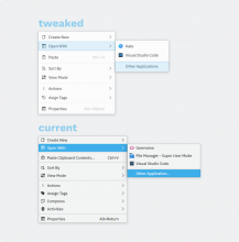
What's different?
Color / style
- Change color from view background and window background mix to 100% view background
- Why? Because the closer something is to the screen (buttons, popup menus, etc) the lighter it should be, to keep some level of hierarchy in the UI design.
- Make the shortcut text a bit more transparent
- Why? Having the text be at 100% opacity on both sides makes it feel busier. Making it slightly transparent (doesn't have to be as transparent as the mockup) helps alleviate that issue a bit.
- Change style to T11124 / ndavis' patch
- Why? Because of the consistency goal.
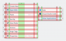
Spacing and sizing
Sizing:
- Increase 4 pixels to the 26px vertical selection area
- Why? While still hard to touch, it probably will help quite a bit. Also, the size can match buttons and tabs.
Spacing:
- Vertical border padding increased from 0 to 3
- Why? There are multiple reasons. It's harder to touch outside the region with a couple pixels more. It also makes the spacing after a divider look centered (right click on Dolphin and look at the vertical spacing of the Properties button)
- Horizontal border padding increased from 7 to 10
- Why? Those extra three pixels match the 3px added before.
- Horizontal icon <-> label padding increased from 6 (?) to 8
- Why? It's a good middle ground between too close and too far. It can be reused for the arrow part too. It can also be added with Units.largeSpacing (I think, probably not lol)
- Horizontal label <-> shortcut padding increased to 48px
- Why? It feels much more organized and easier to read
- BUT it might not work with long words (check with German in case there's a patch for this task)
- Shortcut label <-> arrow increased from 6 (?) to 10
- Why? Increased legibility
- Why not invert the [10]icon[8]label[48]shortcut label[10]arrow[8] to [10]icon[8]label[48]shortcut label[8]arrow[10] so it's more symetrical?
- The arrow isn't optically aligned that way, so it wouldn't look connected to the submenus. Thankfully, we can reuse the numbers from the left [10]icon[8]label on the right shortcut label[10]arrow[8]label and it looks fine :D


