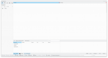
T13070 KDevelop mockup
Open, Needs TriagePublic

Description

First and foremost, this is based off of @manueljlin design mock ups of Calligra. I'll probably get some small refinements done but this is 98% of the style and layout I have in mind.
I also tweaked with the default look to a layout used by someone else (Eike) to be sure it'd still maintain a level of consistency.


Mock ups above updated on July 20th, 2020.

Related Objects

StatusAssignedTask
OpenNone
OpenNone
PhilipB created this task.Jul 12 2020, 2:58 AM
PhilipB updated the task description. (Show Details)Jul 14 2020, 1:52 AM

Edit: Will update tab style to use full area.

I'm noticing that we have two tab styles here which do not appear to be used consistently:

  1. Active tab is lightened with a blue line on the top. Used for sidebar tool views.
  2. Active tab is blue with a blue line on top. Used for open documents as well as the tool views on the bottom in the second mockup.

Yeah, I've been intrigued as what to do with it. Since this mock up is a straight rip off of @manueljlin I didn't give it much thought but now that I'm setting which styles are for what and where I need to update them.

PhilipB updated the task description. (Show Details)Jul 14 2020, 7:34 PM

Updated. check images on description.

Thanks!

Seeing a main window with several tab bars (some toolviews, some multi-document views) makes me feel like there's too much blue. I feel like my eyes are being pulled in multiple directions.

Maybe we should re-think the blue background for the selected tab and use a darkened/lightened background color instead, with just a blue accent line on the top/bottom.

What do you think?

Yeah... Maybe use the lighter hover blue from other mock ups in sections that aren't focused on, like if I'm using the left panel I expect the UI to focus on the panels interface and not have the screaming deep blue in other sections. It's 3am so I'll sketch it up tomorrow and see how it turns out.

It also doesn't help that all that blue is on the same level and not spread out.

Better? It is using the active but unfocused color. It leads me to a question, how is what known to be active and focused, on my crappy mock up is seems rather arbitrary.

Maybe have a couple of panels take precedent like the project tab in use and anything vertical of the zone, breaking off any lateral distraction.

Or anything directly in the zone of the active coding, like the konsole and code browser, to retain its active and focused status.

PhilipB updated the task description. (Show Details)Jul 18 2020, 11:48 PM
PhilipB updated the task description. (Show Details)
PhilipB updated the task description. (Show Details)Jul 20 2020, 12:50 PM
ngraham edited projects, added VDG; removed Breeze.Jun 8 2021, 4:40 PM