Reduce default panel height by a tiny bit
Closed, InvalidPublic

Description

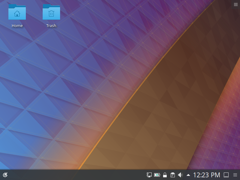
Here's how the default Kubuntu Bionic install looks when you log in for the first time:

Notice the ugly full-color icon for the Show Desktop widget in the bottom-right corner? That's because the default panel height is tall enough that the widget's icon is full-color. If we just reduce the panel height a tiny bit, it becomes monochrome instead, and looks pretty:

So much better, right!?

This setting lives in ~/.config/plasmashellrc`:

[PlasmaViews][Panel 2][Horizontal1856]
thickness=36

The default thickness is 36, and changing it to 34 does the trick. 30 might be even better since this change also causes the Kickoff icon to be resized too, and at a thickness of 30, the icon doesn't look inappropriately small.

ngraham created this task.Mar 6 2019, 7:58 PM
ngraham triaged this task as Wishlist priority.
rikmills added a comment.EditedMar 6 2019, 8:05 PM

I considered such a change, but rejected it as it also messes up the scaling of our Kickoff menu icon in an unacceptable way. I did it in a different way though, so will have another play to see if it goes better this way, but I fear 30 for a panel height may be pushing it too small.

I also have concerns that the smaller monochrome icon is not as clear as to what its purpose is to someone looking at the panel for the 1st time.

Yeah. We do get user complaints about the ugly icon though. It's nicer-looking in a newer Frameworks release, but it's still odd to have one color icon in a panel with otherwise nothing but monochrome icons.

Yeah. We do get user complaints about the ugly icon though. It's nicer-looking in a newer Frameworks release, but it's still odd to have one color icon in a panel with otherwise nothing but monochrome icons.

Maybe we can substitute in a modified icon. I also looked at that briefly when doing the Bionic panel set up, but a substituted scaled monochrome icon had a fuzziness on it's lines that also looked weird and out of place.

Also I don't think out Kickoff menu item looks thaaaaaat bad at the proposed size IMO.

Relevant to this is D21593

ngraham closed this task as Invalid.Jun 9 2019, 3:20 AM

Fixed upstream in D21593; no longer needed.