Kubuntu: Use the Ubuntu font unstead of Noto
Closed, WontfixPublic

Description

Ubuntu is a really excellent font and looks much better than Noto. And we're an Ubuntu-based distro; we should use the same font as our parent distro to preserve a bit of that continuity.

The first thing I do whenever I reinstall is change the font to Ubuntu and it's amazing how much better all the text instantly looks.
ngraham created this task.Dec 27 2018, 5:09 AM
ngraham triaged this task as Wishlist priority.

I have always thought the Ubuntu font looks quite 'unamazing' on KDE, but that is a very subjective, personal and likely hardware and setup dependant thing.

I also don't really buy the argument that we are a Ubuntu flavour, so should use the Ubuntu font. The whole (or at least part) of the point of flavours is that we can do things differently from the main distro, use a different DE and apps, AND do the best things we can to integrate those onto a Ubuntu base. So we should do things on merit for our DE for our users, and not because they are Ubuntu. I accept that we do make some compromises in this area, in terms of standard things installed and settings, but I don't feel switching our default, when not mandated, is one of them.

In terms of integration, diverging from something like a default fon't that pretty much all the upstream KDE UI design and testing has been done with is something that would we need to have very good and non-trivial or aspirational evidence that there is;

(a) a real and overriding benefit to the most users, or a very evident lack of detriment; e.g. not acceptable in my mind to please a bit more 20% of users, while another 10% get a worse experience, on a change that is not critically needed;

(b) that we are not going to get a gradual or sudden regression should upstream KDE make technical changes to font rendering and scaling, since they are not likely to test with this font. Extra important for backports if we are to maintain quality of user experience with those.

So my stance is that I have to have a strong -1 as an initial take on this, and will need a lot of convincing to switch that to anything else. Who knows though........... :)

Wasn't this raised some time ago during the transition from Ubuntu fonts to Noto? Of course, I cannot find it, but IIRC, the dispositive factor was not the visual appeal of the font but the broadest possible coverage. Apparently, Noto fonts together cover all the scripts encoded in the Unicode standard. Certainly at the time, Ubuntu did not.

Plus Noto fonts are DFSG compatible / FSF and OSI approved, while Ubuntu are not.

rooty added a subscriber: rooty.Dec 27 2018, 6:24 PM

screenshots?

I'm against this as well since I think we should use the Noto font since we are a KDE distribution. So I'm -1 on this one.

rooty added a comment.EditedDec 27 2018, 6:47 PM

Ubuntu is a really excellent font and looks much better than Noto. And we're an Ubuntu-based distro; we should use the same font as our parent distro to preserve a bit of that continuity.

There's no accounting for taste but I personally feel Noto looks a lot better than the Ubuntu font. (The Ubuntu font's 'm' is the bane of my existence.)

Having said that, I do feel there are fonts that look better than Noto (Open Sans, Cabin, Lato, etc.) and that there might be something to your request.

However, I don't think the reason should be that neon is an Ubuntu-based distribution seeing as KDE runs on pretty much everything, even Windows. And also, if you look at just neon itself, you'd have to, by that same token, pay tribute to Debian as well :D It's a vicious cycle... best to just leave it be.

ngraham added a comment.EditedDec 27 2018, 7:04 PM

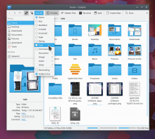
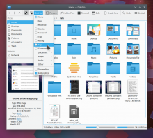
Sure, here are some screenshots. I agree that a lot of this comes down to aesthetic preferences, but to me Ubuntu really does look better than Noto. The line weights are slightly thicker, which I think results in clearer, more readable text and less blurriness, especially at the standard size of 10 which is quite small. At this size Noto can be quite blurry.

Noto 10 (default):

Ubuntu 10:

Click on one and then switch between them with the arrow keys to visualize the differences between them. Despite being slightly larger in term of font metrics, Noto is wispier, lighter, and blurrier compared to Ubuntu. And where Ubuntu really shines IMHO is at 11 pt. At this size, it's a bit bigger than Noto, but not comically huge, and the difference in clarity and readability is just enormous:

For reference, 11 pt Ubuntu is what our parent distro uses itself, so it's not like this would be some kind of grand experiment: Ubuntu is probably the most widely used Linux distro in existence. However I know better than to formally propose this because every time I have in the past, people pulled out the pitchforks and torches! :)

rooty added a comment.Dec 27 2018, 7:43 PM

Ubuntu 11 pt looks a lot better
I'm gonna hold back the pitchforks/torches if you manage to make it 11 pt :D

rikmills added a comment.EditedDec 27 2018, 8:27 PM

We already had the 11pt discussion, and decided against. It just makes the things bigger and more clownish looking (as if a 3 year old with bad eyesight had designed it), and bumps the UI scaling in ways that hurt on older hardware with lower size/res screens.

Sure, here are some screenshots.

Thanks for those. Ubuntu 10 is not as bad as I thought, but my other concerns still leave me seeing no good reason to make this change.

Ubuntu 11 is scarily even more hideous than Noto 11 was, which is quite an achievement!

filipf added a subscriber: filipf.Dec 27 2018, 10:36 PM

My 2 cents:

  • the Ubuntu font has a lot more personality than Noto
  • design wise it may down to preference, but nonetheless I think Ubuntu is not quite a top-tier font (but is better than Noto)
  • the Ubuntu font really is thicker, which makes it a bit more legible
  • Noto has crazy script support, beats Ubuntu in this category
  • 11pt is great for laptops that need a scaling factor of 1.1 or 1.2, but represents a negative change for desktop machines
  • the question of how well Plasma and the Ubuntu font fit together is worth asking, although we may just not be used to the two being paired
  • it's also important to guarantee that upstream will not mess sth up, but anecdotally speaking, I don't think I've ever had a problem with this, and I always non-default fonts.

Ultimately I think the best solution would be for upstream to default to a better font (easier said than done though). It would also be cool if we had our "own" font, as is the case with GNOME and Cantarell.

Just commenting as a user here.

I used Cantarell for a few months and the look of it on my desktop is interesting. It felt more "natural" than using something like Open Sans or what not. However, using Ubuntu (the font) felt more adaptive and true to the desktop (looking at System Info, Dolphin, etc).

Whatever happened to Oxygen? Would that need some more work (or are we just looking for a font to ship by default?)

ngraham renamed this task from Use the Ubuntu font unstead of Noto to Kubuntu: Use the Ubuntu font unstead of Noto.Dec 28 2018, 3:05 AM

Keep in mind that this is a discussion pertaining to Kubuntu only. It's not a proposal to move away from Noto for all of KDE. Just Kubuntu.

rooty added a comment.EditedDec 28 2018, 3:10 AM

I used Cantarell for a few months and the look of it on my desktop is interesting. It felt more "natural" than using something like Open Sans or what not. However, using Ubuntu (the font) felt more adaptive and true to the desktop (looking at System Info, Dolphin, etc).

Cantarell blends in very nicely with Plasma in my opinion (it actually reminds me a little bit of the Ubuntu font) and seems to have nice glyph/alphabet support (especially Cyrillic).

If you liked Cantarell, you might also like Cabin. Numbers look a lot better with Cabin (and other humanist fonts, no hinges/serifs) than with Cantarell or Lato, but even with that in mind I think that Ubuntu/Cantarell/Lato are a better fit because of the range of alphabets they support (even though nowadays, from what I could gather, Plasma just falls back to other fonts in case the default font doesn't support what you're asking for).

Whatever happened to Oxygen? Would that need some more work (or are we just looking for a font to ship by default?)

Unfortunately its creator passed away so the font is unmaintained.

BTW, the Linux Mint distro just switched their fonts entirely from Noto to Ubuntu recently: https://github.com/linuxmint/mint-themes/issues/200

ngraham closed this task as Wontfix.Sep 18 2020, 12:52 AM

I guess not