Proposal for new timeline design.
Description
Description
Comment Actions
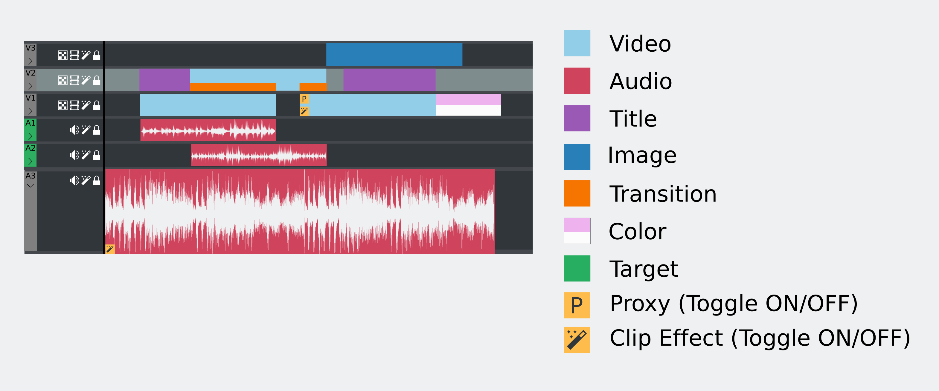
Here is the initial proposal.
- The idea is that every clip type should have a defined color.
- Added a proxy and effect togge to the clips.
- Added effect toggle to the track headers as well.
Will post more as I develop the idea.
Comment Actions
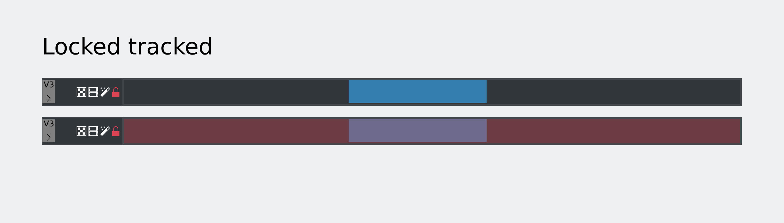
I think the locked track stuff should be orange. Red should generally be reserved for things that can be destructive, errors or things meaning off/disabled.
I don't think the entire background of a locked track should have its color changed. Instead, there should be a vertical highlight bar with the lock color at the right edge of the track header.
Is there going to be enough space for the track labels on each header? What if I want to name a track something longer than 2 characters?
Comment Actions
I noticed you used green as the color for "Target". What is a "Target"? Is that the current selection? If so, the color should be Plasma Blue (#3daee9). Green should generally be used for positive things or successful operations while Plasma Blue is used for selections.
Comment Actions
When you lock it it will disable that track, you wont be able to move clips in the track anymore.
I don't think the entire background of a locked track should have its color changed. Instead, there should be a vertical highlight bar with the lock color at the right edge of the track header.
I think the red overlay is a good visual support in a big project with many tracks. I was thinking of the "led" light to activate the track to turn red as well.
Is there going to be enough space for the track labels on each header? What if I want to name a track something longer than 2 characters?
those two characters "v1" or "a1" are more of the track id, used to help you target a track. there is a place for naming a track which i will make a proposal soon.
Comment Actions
The target track is the chosen track to move the clips from the project bin to the timeline.
Comment Actions
I like the idea. I think we should have a default settings like:
- Video-track=blue (clip=blue) and the 4 other types different but on the same color-type (color clip/ slideshow clip 25% darker/ title clip 25% brighter/ library clip 50% darker).
- Audio-track=green (audio associated with video), ungrouped audio (25% darker), audio only (25% brighter), effect audio (50% darker).
- Individual colors for each clip should be possible (for a 2nd timeline with "pre-selected" clips).
- Other basis color for video and audio should possible as well (for a 2nd or 3th timeline).
But we can switch off colors as well.
Comment Actions
By disable, do you mean actually make it so that video/audio on that track won't be visible/audible? It's not really off/disabled if it still plays video or audio.
I think the red overlay is a good visual support in a big project with many tracks. I was thinking of the "led" light to activate the track to turn red as well.
My concern with changing the entire background color is that it will limit the number of colors that look good on locked tracks. If any transparency is used on colored clips, then those colors can look especially bad against a red background. Don't the track headers stay visible no matter where you scroll to in the project? What if instead of doing the whole background, you just changed the color of the border around the track?
Comment Actions
You wont be able to add clips to that track nor move any item in it. But you can see and hear the content already there though.
I think the red overlay is a good visual support in a big project with many tracks. I was thinking of the "led" light to activate the track to turn red as well.
My concern with changing the entire background color is that it will limit the number of colors that look good on locked tracks. If any transparency is used on colored clips, then those colors can look especially bad against a red background. Don't the track headers stay visible no matter where you scroll to in the project? What if instead of doing the whole background, you just changed the color of the border around the track?
Hmmm, I had done a proposal where I changed the background of the track header only but it didn't look good. Will think more about it.
Thanks
Comment Actions
More ideas for locked tracks. I cannot see orange working though in this case. What do you think @ndavis?


Comment Actions
Would you mind sending me the mockup so I could play with it? Writing text isn't the most efficient way to make visual suggestions.
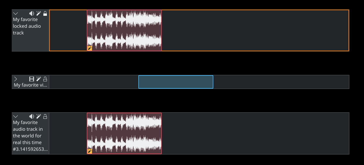
I think it would be a good idea to shorten long names with an ellipsis and use a tooltip to show the full name when the track is rolled up (like track A2 in the original mockup). When the track is not rolled up (like track A3), wrap the name to fit the rest of it onto new lines until it runs out of space and needs an elipsis w/ tooltip again.
Some questions:
- Are there only 2 types of tracks (Audio, Video)?
- Can each track only hold one type of content?
- Can a track only hold one clip at a time? For example, a video track with 2 different imported files on it.
Comment Actions
It is attached ! :)
I think it would be a good idea to shorten long names with an ellipsis and use a tooltip to show the full name when the track is rolled up (like track A2 in the original mockup). When the track is not rolled up (like track A3), wrap the name to fit the rest of it onto new lines until it runs out of space and needs an elipsis w/ tooltip again.
Good idea.
Some questions:
- Are there only 2 types of tracks (Audio, Video)?
Yes.
- Can each track only hold one type of content?
The video track can contain videos, title clips and images (bitmap or vector). That is why in the general proposal each clip has a different color to differentiate.
- Can a track only hold one clip at a time? For example, a video track with 2 different imported files on it.
A track can handle a sequence of clips. Didn't understand the example though.
Comment Actions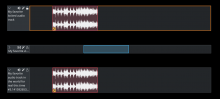
Here's what I've got right now. I thought the A# and V# labels were redundant, so I removed them. I decided to keep the lock white since I thought it looked better for a monochrome style icon. I also added an orange outline to the locked track area.
Comment Actions
The A# and V# leds are very important. They are used to target which tracks you will move the selected clips to from the Project Bin. Here you can find examples of how other programs work: https://www.reddit.com/r/editlines/
Of course our method is simpler...
I like the orange outline, elegant. Will think of some suggestions as well. One thing now we have to think are the icons. Should they be monochromatic or colored? Should there be two icons, one for each state? Or should they be highlighted if active?
Cheers :D
Comment Actions
I see. This must be a fairly common thing in video editors. If this is what people are used to, then it should stay. I have experience with DAWs, but not much with video editors.
I like the orange outline, elegant. Will think of some suggestions as well. One thing now we have to think are the icons. Should they be monochromatic or colored? Should there be two icons, one for each state? Or should they be highlighted if active?
In general, monochrome style icons should not be colored (compare action icons to emblem icons). What do you mean by 2 icons for each state and highlighted if active?
Comment Actions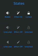
In general, monochrome style icons should not be colored (compare action icons to emblem icons). What do you mean by 2 icons for each state and highlighted if active?
In the previous case only the lock icon changes (Opened/Closed). Should the others change as well? See example:
With the recent mute icons changes how can we proceed?
Maintain as the proposal above or we should add color?
Comment Actions
I see a problem reappearing with the unlock/lock icons which I fought I had squashed before. The open lock is barely distinguishable on higher resolution screens from the locked one, as there's not enough visual difference. On purpose back then I reworked Kdenlive icons to use the slash when unlocked, as this gives much more visual difference than just a small break in the lock's shackle. So, please keep in mind higher res displays, and make things clearly visually different!
Comment Actions
The track locking frame indication gives both clear visual guidance but can also distract enormously, more so when multiple tracks are locked, which I sometimes need to do. Any of my projects has at least a topmost locked company logo track ... which currently won't distract, but with the new suggestion it would stick out prominently. Of course, people are different, so some prefer prominent indications depending on their workflow, while others might get diatracted by too much bling.
Comment Actions
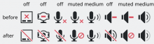
Use the new audio-off or audio-volume-muted icons. It's difficult to say exactly which one is right, but I'm leaning towards audio-off since there is no associated volume control. I can make a equivalent "effect off" icon. The Existing lock and unlock icons can work, but it does seem a bit inconsistent with the other 2. I'd say stick with them. I think it would be a good idea for me or another Breeze dev to make lock and unlock icons consistent with how they are in Kdenlive (unfilled unlock, filled lock)
Comment Actions
Which resolutions are the lock/unlock icons too small for? Is this also with scaling enabled? Can you send a full screen screenshot of an instance where it isn't easy to tell the difference between lock/unlock icons?
Comment Actions
Maybe some kind of greying out or adding transparency would be an idea for locked tracks, might as well work for muting audio or hiding video. Greyed out elements are common in GUIs to indicate something is disabled or can not be changed.
Regarding using outlines for locking: imagine having three tracks below each other, where the top and bottom ones are locked. It should be clearly visible that the track in the middle is not locked, without having to look closely at the left and right edges.
When thinking about colors in general it might be worth to keep in mind color schemes with highlight colors different from blue, as well as specific negative neutral and positive colors. Using the theme colors can result in better visual coherence with the rest of the UI, on the other hand there may be color schemes which make some things hard to distinguish.
Comment Actions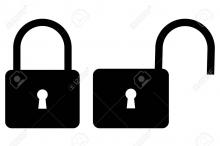
What's the most important element in our UI?
Just something to keep in mind when thinking about colors and transparencies... It's a UX classic mistake to make, to only look at images of the one part of the interface being discussed, separate from the rest of the UI and so lean towards whatever design is most striking. This leads to every UI element being designed to stand out the most, which makes for a jumbled, distraction filled UI where every element is vying for the users attention and distracting their attention away from the most important information.
I would argue that the most important pieces of the UI are actually the preview window - how your project looks, and the contents of the clips, or what you're going to add /move in the project. These deserve maximum emphasis, and everything else should be the minimum that can still be quickly recognized by the user.
Large slabs of color?
Now, I *do* think that different colors for different track types is a good idea, however, tracks take up a large part of the visual space of the UI, and what sort of track it is, is not the most important piece of information in the entire Kdenlive window UI.
Accordingly, I would keep the colors chosen, fairly muted, so they're not distracting from more important information, such as the preview window and what the actual contents of each track are. For example, it's more important that the user sees quickly that it's the clip of their two year old blowing out birthday candles, and how that looks in the playback, rather than that track V3 happens to be a video track.
Also for that reason, I'm really hoping that thumbnails are just missing from the mockups above and not as a design choice for the future UI.
Status icons
For the same reason, I would avoid using color (even just red) in the icons. If you can convey what function they represent without drawing extra attention away from more important elements of the UI, then it's better to do so. I agree that a tiny gap is too small to quickly show the different locked/unlocked states, however using red for something constantly onscreen is distracting. Its a color typically used for dangerous warnings. A less distracting way would be to use something like:

I'd drop the keyhole as unnecessary detail, and make the width of the curved bar thicker in smaller sizes for emphasis, but you get the idea.
Comment Actions
Here is a overview of "Color Coding Your Editing Timeline in Avid, Premiere & Final Cut X": https://www.filmeditingpro.com/color-coding-your-editing-timeline-in-avid-premiere-final-cut-x/
Comment Actions
Which resolutions are the lock/unlock icons too small for? Is this also with scaling enabled? Can you send a full screen screenshot of an instance where it isn't easy to tell the difference between lock/unlock icons?
IMHO, sending a screenshot doesn't make sense: because it won't ever reflect my screens resolution, as well as my workplace and eyesight correctly. scaling isn't the issue, it is the icon design in itself, when e.g. icon size of 24 is used.
Comment Actions
Are you aware that icons need to be in a square design? So your suggestion needs to be scaled down in order to cope with its almost 1.5x width for the open state. In turn, it won't fit into the overall UI breeze icon design anymore.
There's a good deal of work and thought for why I originally designed the track icons as they were, it was not a flash of the second.
As for the red cross-out, I'm sharing your sentinent, albeit you should check with the KDE icon and breeze icon design guidelines. At least that gives the reference, and we should be very clear about why and when we deviate from them.
Comment Actions
This is probably already on the TODO-list, but in case it's not:
It would be great if one could just drag a clip to overlap another clip, creating a transition automatically, like crossfade in REAPER
Comment Actions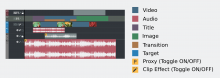
Another quick proposal about colors.
Edit:
- Added thumbnails to tracks.
- Made tracks less saturated.
- Locked tracks get greyed out and track header changes color to red.
- Changed target color.
- Changed color of selected track.

Comment Actions
It would be nice if this kind of stuff could be shared with other KDE applications as a library in case anyone ever wanted to start developing a DAW or audio editor for KDE.
Comment Actions
Would those look just as good with a light theme? If not, consider partly transparent clip background colors. The clip background colors will naturally be less saturated when combined with the white or dark grey of the application background. This way you can also use black for waveforms with light themes and white for waveforms with dark themes. The colors I used for the background in my mockup are the same colors already used by Plasma and KDE applications in various places. I don't know exactly what transparency values they use though.

Comment Actions
So I started implementing colors in the timeline. I agree that we should ideally use variations of the theme's original colors, in our case mostly breeze dark: https://community.kde.org/KDE_Visual_Design_Group/HIG/BreezeDark
I am not sure we want a different color for each clip type. This would make the timeline quite messy in my opinion and distract the user. But I am open if you think it's better.
Anyways, we must decide track colors.
- audio track
- video track
- locked track
- disabled track (muted or blind)
Color clips:
- Audio clips
- Video clips
- other types (color, images, titles)
- Locked clips
- Disabled clips
I will post a screenshot of my first tests soon
Comment Actions
I am using this palette but with desaturated colors.
I am not sure we want a different color for each clip type. This would make the timeline quite messy in my opinion and distract the user. But I am open if you think it's better.
I guess we can do some tests to see and brainstorm some more.
Anyways, we must decide track colors.
- audio track
- video track
- locked track
- disabled track (muted or blind)
Color clips:- Audio clips
- Video clips
- other types (color, images, titles)
- Locked clips
- Disabled clips
I will post a screenshot of my first tests soon
Will compile and test as soon as it is applied.
Comment Actions
Wouldn't it be a good idea, to let the users decide, which color a specific clip should have?
This would be a great way to organize the timeline for individuals.
At the beginning of https://helpx.adobe.com/premiere-pro/atv/cs6-tutorials/customizing-the-timeline.html you can see the different colors and change possibilities.
Comment Actions
+1
Individual colors for each clip should be possible (for a 2nd timeline with "pre-selected" clips).
Other basis color for video and audio should possible as well (for a 2nd or 3th timeline).
But we can switch off colors as well.
As I mentioned above
Comment Actions
Yes, I like the idea to have a default scheme and the ability to customize the colors as well. Could be a junior job.
Comment Actions
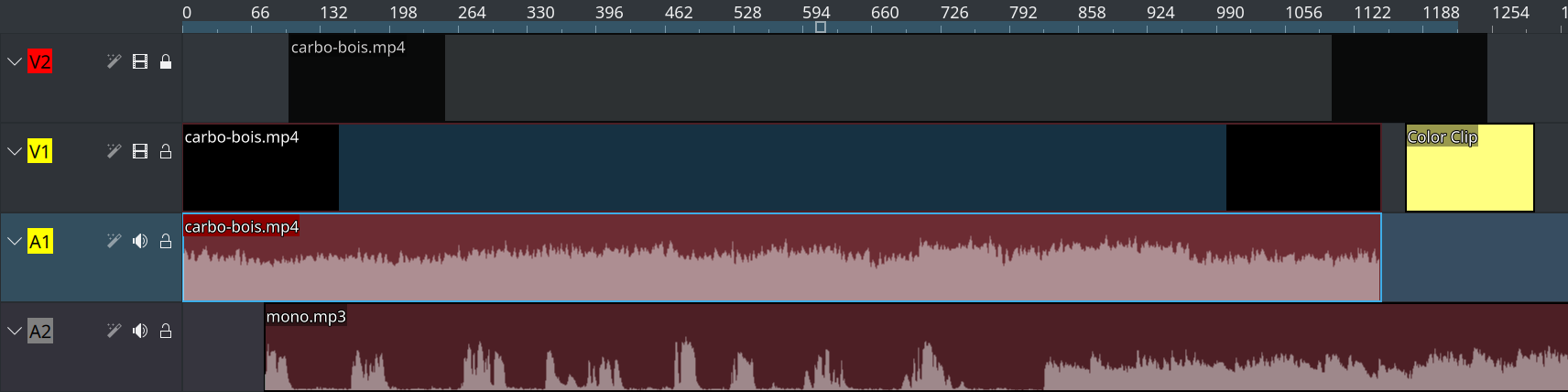
First attempt looks good. Title clip is selected.
First attempt looks good. Title clip is selected.
I would make the:
- video track bit more light blue
- audio track more light green
Comment Actions
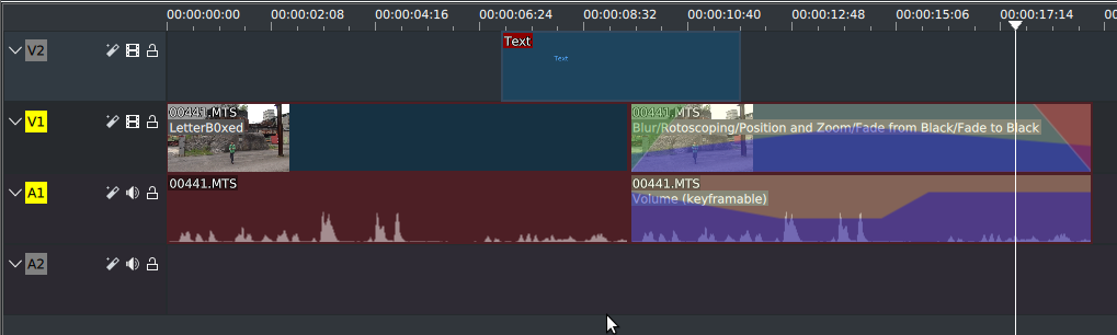
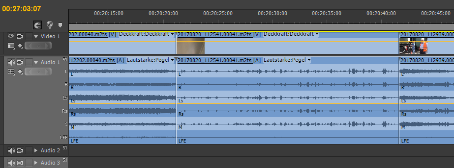
Do audio clips normally only show one side of the waveform? If so, that might make it more difficult to spot phase related issues.
Comment Actions
Do audio clips normally only show one side of the waveform? If so, that might make it more difficult to spot phase related issues.
No. There is a configuration option in Kdenlive's settings dialog to show separated channels or not, and it directly changes the display.
Comment Actions
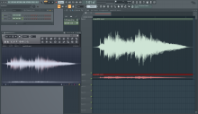
Yes, the waveform should probably match the color of icons and text (Breeze Dark: #eff0f1). The Adobe Premiere waveform also has a line at the middle to help show where the wave form starts and ends.
I think FL Studio does a good job of showing waveforms in an attractive way with good visibility:

Comment Actions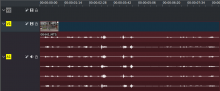
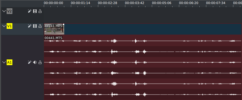
Build #61 looks good. Even with "zebra" for the channels and good contrast.
Top would be if we have the channel names "L,R,Ls,Rs,C,LFE".