[applets/notifications] Widen pop-up and reduce spacing when on top or bottom center
Summary:
Somehow the notification pop-up's positioning has never felt quite right to me. When it's
in a bottom corner, it blocks the view of the latest messages in chat apps, or the text
I'm searching for in Kate. When it's in a top corner, it blocks part of the open app's
toolbar or tab bar that I often use. The best place I've found for is in the top-middle,
which doesn't block very many of the thing I'm active using, and its centered position
feels aesthetically pleasing. I've been using this for a bit and quite like it.
However there is ony deficiency: the pop-up is not very wide, so it becomes quite tall
when displaying multi-line messages from chat apps in particular, which makes the
notification stack intrude into the middle of the screen where it definitely blocks things
you want to be looking at. This is annoying.
This patch resolves that issue by making the pop-up's size wider and the spacing between
pop-ups smaller when the pop-ups are positioned in the top or bottom middle.
Test Plan:
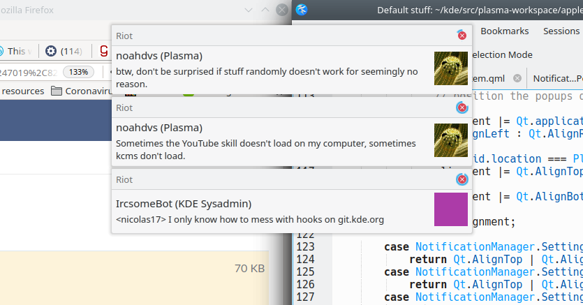
Centered pop-ups now look like this:
Single pop-up:
Stack of pop-ups:
There is no visual change for pop-ups in the corner, where they are by default.
Reviewers: VDG, Plasma, broulik, ndavis, cblack, bshah
Reviewed By: VDG, Plasma, broulik, ndavis, cblack, bshah
Subscribers: bshah, IlyaBizyaev, ndavis, cblack, plasma-devel
Tags: Plasma
Differential Revision: https://phabricator.kde.org/D28989