Following the Kirigami guidelines this is the front page at "normal" scaling.
The clickable wireframes (not perfect wireframes some parts still need editing) are here as a zip: https://share.kde.org/index.php/s/7SUl9q4zSUwumib
Mock Description
Mock Description
There are a very large number of changes, so older changes are hidden. Show Older Changes
Comment Actions
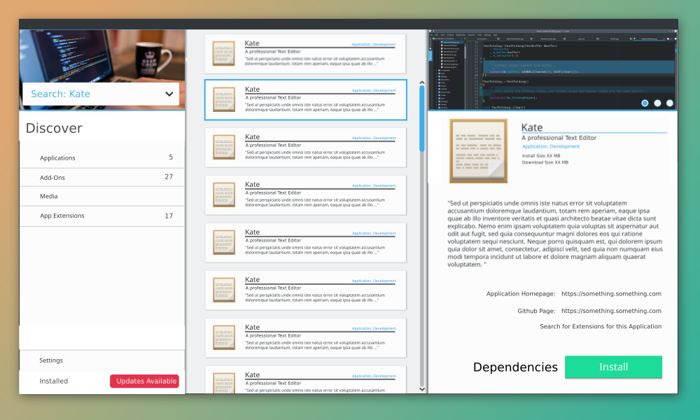
In general I am not a fan of all the blue separator lines used. I think we should only use them as a highlight effects, to draw the attention of the user towards it. Using it too often and it become just meaningless noise. I think we can use a different, more neutral color for the same effect or often even get rid of them e.g. the Details view in picture 7 between "Kate" and the subtext.
I am also not happy with the navigation re:Search. Ideally, I think we should either have the whole search business going on in the left drawer/pane or in the center. I think the Kirigami HIG might be a bit lacking for this use case. It should allow for some kind of toolbar where we can put the search entry field. Especially on mobile phones, where you want to enter search term AND get a look on the results in the same view. If it was in the drawer only you'd not be able to do that.
Over an out!
Inline Comments
What is that? Tags, tabs etc.? If they are tabs like things, you should stick to the default text color. If they are more like tags, I think blue is acceptable.
I think this is too much. With it we got the term "Search:Kate" two times and searched term ,"Kate", 3 times. I would suggest to remove at least one of these
Comment Actions
review result from jens mockups left panel search and filter second column search results third detail view.
Inline Comments
+1 for pstefan. what I don't understand is that the picture height isn't the same than in the right window.
I like it but as pstefan describe it should look like something the user know. maybe an toolbar but than I would move them to bottom cause kirigame use bottom toolbar as fare as I know.
I think here is a mix you have in the sidebar the search feeld but the result area is in the main frame.
can you make the sidebar for search + filters and the main frame for results
maybe add something like show more and you come to the detail view but also if you click somewhere else you go to the detail view, but have always the same "layout" (detail view and overview page) would be awesome.
I like it maybe you can add in the second line rating or downloads if it is "importend" (good rating or often downloaded)
I like this column based approach. very nice but the search area look a bit to much information on top.
maybe when you add the filters on bottom.
make the line gray instead of blue cause blue is for highlight / select but there is nothing highlighted.
you wrote here "search for extensions for this application" if you search for kate than the search result should show also the extensions and alternative apps.
the problem is when you search after text editors you will get a big list and when you go to kate (detail view) the search maybe can modified automatically to show on top kate than the extensions and than the old search result so something like a more detail search of the thing you select.
please show us also which packages will be installed when you click install and where the files are located when the software is already installed.
the subgroups should be shown anywhere in each entry maybe instead of application, development there should be written system updates, ...
than you have the same layout than in search for
Comment Actions
We aren't showing the size in the application display.
What do you mean by "application display"? In the detail page, the size is shown, right at the top. I would not show it in the list, though, assuming that people who install right from search results already know the application. If they want to know more, the click on it to see the details.
Comment Actions
Not sure if that's a good idea. Because showing just the icon is rather boring looking and doesn't really ad much beside visual fluff
Showing something fancy at the top of the drawer is kind of a pattern in Kirigami, inspired by the drawer in Android. It doesn't have to just show the logo, though. If you have a better idea, shoot :)
what I don't understand is that the picture height isn't the same than in the right window.
Good point. Jens, why is that? ;)
How would text look like that's way to long? Translations to German at least always end up huge. :(
Would line breaks be a problem here?
What is that? Tags, tabs etc.? If they are tabs like things, you should stick to the default text color. If they are more like tags, I think blue is acceptable.
I'd user-test that and see whether they realize it's clickable and what it does.
I think here is a mix you have in the sidebar the search feeld but the result area is in the main frame.
The idea here was to always start with the search from the sidebar and then if you realize the result list is too long, you narrow it down further with filters. It's also something to user-test.
Maybe add something like show more and you come to the detail view but also if you click somewhere else you go to the detail view
Indeed, that's something I also suggested at some point. Just having a "fake link" for people looking for something to click on. But again this is something which can also be tested with users.
you wrote here "search for extensions for this application" if you search for kate than the search result should show also the extensions and alternative apps.
It should, but you might have come to the page in other ways than searching, so offering a way to get to extensions from the detail page does still make sense.
Comment Actions
Sry just a quick comment about blue line - its not part of it as a seperator but as a visual flair thing. We can remove the line if you guys think it wont fit at all.
We can remove the icon and simply display a grey area - but packing it with buttons and links wont work as that would require more buttons. If there is a suggestion for another visual - I am all go.
Search for Extensions is only within the application meaning the list is tiny in comparison. "Installed" sounds like a good idea to add.
When you click on the appp you get a "show more" effect as you are thrown into the app overview.,
The reason for the "home" thing not just being "home" is to display that its a breadcrumb, since when you go one level deeper it will go "home > search: kate > kate overview" or something I worry that just going from "home" to "home > search: kate > kate overview" will break consistency and be more of a worry for the user than an assistant
The reason for the images not being the same height is to divorce the sidebar from the main view. We can remove one if you guys like.
Inline Comments
Comment Actions
we can change the colour to dark grey in "search kate" (/nonclickable).
the blue "search deep" ones are indeed tags of sorts. Essentially clicking one bring you directly to the second level of the search narrowing it based on the category chosen.
(there is an interactive wireframe too btw)
Comment Actions
Showing something fancy at the top of the drawer is kind of a pattern in Kirigami, inspired by the drawer in Android. It doesn't have to just show the logo, though. If you have a better idea, shoot :)
I don't think it should be a hard requirement though. Android doesn't have one either. It is mostly used when you have several user accounts you can switch between. I don't think it's wise to show something only for the sake of it.
Would line breaks be a problem here?
I don't know, tbh. We'd have to see. I think it would look a bit odd with a such big font weight. And depending on the language one might encounter this case more often than in others.
The idea here was to always start with the search from the sidebar and then if you realize the result list is too long, you narrow it down further with filters. It's also something to user-test.
I find that to be strange UX wise. How would it work on mobile? As is, I'd assume one could not see the search results on mobile if one starts the search from the drawer/sidebar. That doesn't sound right though.
the blue "search deep" ones are indeed tags of sorts. Essentially clicking one bring you directly to the second level of the search narrowing it based on the category chosen.
Since one can combine these tag like things in a query (+spelling), I would make them look more like selectable categories too. Like in Dolphin's search, or the one in the Steam shop. Perhaps another way to think about it: How would one remove one of the categories from the query?
I feel the way it's currently designed is too akin to the look – and thus expected behavior – of tabs on several big mobile OSes.
Comment Actions
Are specific link types defined in the AppStream spec?
Why would a pie-like widget be easier to implement? If we can only use a smaller area for the visualization, I'd rather use a smaller bar than a pie. Pies often look strange and do not really work well for adequately visualizing data
Comment Actions
Are specific link types defined in the AppStream spec?
I'm not sure what you're asking.
Why would a pie-like widget be easier to implement? If we can only use a smaller area for the visualization, I'd rather use a smaller bar than a pie. Pies often look strange and do not really work well for adequately visualizing data
It's easier because we need to swap the background with the current proposal.
We'll have to think of something different then...
Not sure if that's a good idea. Because showing just the icon is rather boring looking and doesn't really ad much beside visual fluff