Mock History
| Current Revision |
|---|
Mock Description
@voidfragment why would we do that though? An address bar has nothing to do with searching or filtering.
@voidfragment,
Yes, but what is the logical connection between a filter and an address bar? If you wanted to combine something with the address bar, search would make more sense because web browsers already do that.
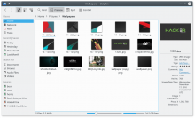
@ndavis, the logic is: Filter Bar operate on current address i.e. opened folder, so when you opening, for example
/home/pictures/wallpapers
you gettin opened "wallpapers" folder with files
12-7.png
14-2.png
14-3.png
120-8.png
and you can write "12" into empty area of Address Bar as if you're keep writing the path, but it working as Filter at the same time sifting out files not matching the "12".
I wouldn't embed the filter bar in there because then we would lose the ability to keep the filter bar open while navigating around, as you can right now. However using it as a search field would make sense since you never need to navigate while the search field is open. basically we do what modern web browsers do, for the same reason.
I wouldn't embed the filter bar in there because then we would lose the ability to keep the filter bar open while navigating around, as you can right now
Damn, I didn't think about it ((
I wouldn't embed the filter bar in there because then we would lose the ability to keep the filter bar open while navigating around, as you can right now. However using it as a search field would make sense since you never need to navigate while the search field is open. basically we do what modern web browsers do, for the same reason.
I would really like such an approach. Especially love what the elementary team did on their "Files" browser but I am not sure this would work for dolphin because of the bunch of search options/filters we have. It is more than just a bar like KRunner.
If I may chime in, I don't consider the elementary dropdown a great experience. Text is way too small and you get the grid behind it, When the search isn't instantaneous (and for many people and in many cases it isn't) it looks weird. Then as the search traverses the filesystem and new results show up, it resizes, creating visual clutter and overwhelms the user's mind. It would possibly be better to use the grid view as a search. Clicking on "back" or the now active Search button or pressing Esc would cancel the search and the grid, along with the addressbar would revert to the folder it was on before the search. To show results in their folder, the user would right-click, and that folder would become the path shown in the top bar. Also right-clicking it would yield an option to copy the path. If it is search now, it can't be edited with one click. Now to edit the path directly, the user would need a separate Edit button or a right-click enry on the pathbar to edit it.
I think it is important to keep the content frame and the pathbar consistent (displaying the same thing) in order to avoid confusion and potential havoc. The pathbar should show the path of the folder that the grid shows, and the grid should adapt to the pathbar if it is changed or a search is happening.
Also I think the order of results in the content frame (and this is a point regardless of the layout that ends up being implemented) should be ascending based on time of finding. In other words, newly found results should be added to the end of the results view, because it is annoying when you search for a file and the results keep coming, but you have already found what you were looking for, and now it plays catch with you: by the time you would select it, something else is in its place, but you can't cancel the click, the brain doesn't work that way. So I think new results should not take the place of already found ones inthe grid/list. Regardless of the default sorting criteria.
The advanced search options could be in a dropdown similar to Nautilus. Or when the down arrow in the search field is clicked, the toolbar would extend to the bottom, showing the additional options. The options set there could appear in little boxes in the search bar, at the end of it to be exact. This includes tags, date, filetype, etc. With little "X" icons on them when hovered, in order to remove additional criteria when no results are shown.
Also there has to be a no results placeholder text, something like "No matching files or folders found. Try removing criteria or a different keyword." with a crossed (or broken) magnifying glass icon.


Should we add a toggle for the information sidebar here? AFAIK the only other way to enable or diisable it is via the menu or shortcut (F11 by default)