Consolidated brush editor UI design ideas
OpenPublic

Mock History

Current Revision

Mock Description

These are some potential ideas and direction we could take the brush editor settings area going forward.

Currently the editor is locked to the toolbar, but there are more long term plans to make it detachable.

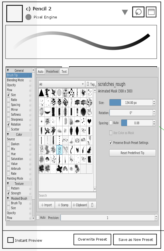
I think when this happens, it is going to be more important to condense this window. There is some feedback that the live preview area needs to be larger. It doesn't give a good preview with painting brushes that are usually over 80 pixels. Right now the brush preview area only shows up to 20 pixels big.

I also think we need to organize the configuration options more. right now the brush editor configuration options are all over the editor. They are settings that aren't tied to a specific brush, but span across all brush presets.

scottpetrovic created Consolidated brush editor UI design ideas.Sep 20 2018, 6:36 PM
scottpetrovic added a project: Krita.
scottpetrovic added subscribers: Deevad, woltherav, gdquest, rempt.

Hi, @scottpetrovic!

Just a quite thought after a very brief look: for the "Proposed Brsuh Editor Design" you'd better use "Brush Tip->Predefined" and "Pattern" tabs :) They are much more wide and will be easier to judge :)

Just a quick draft:

@dkazakov - I can make designs of other areas once we get the general direction down. In the existing brush editor, all the curves setting pages took up the most space. I was mostly showing how we can update that page to allow us to make things smaller.

It might be a good idea to think about the brush tip page as well once we get into this. We could always stack those options. So a grid of brush tip images at the top, and the setting sliders would be below. I am sure there are probably other solutions if we thought more about it

Here is some video progress with what I have been tinkering with so far. The video explains some of my thought process and how I am trying to think of different people and what they need from this editor.

https://youtu.be/2hWPzNFPIxY

Hi Scott. I like the direction of the new design and I think you did a great job saving space without making any major compromises.

Moving the various "pen settings" into a drop-down instead of that big box makes entire thing a little bit less overwhelming, too.

You mentioned keeping the scroll area on the right side in your youtube demo, and I agree with that, as it creates a little bit of wiggle-room for adding extra options and properties if needed.

Nice work so far!

rempt added a comment.Sep 28 2018, 8:48 AM

I do think we need a full-sized brush editor, maybe as a modeless dialog window, so brush creators can access all options without scrolling.

@rempt - the idea with the scrollable area for settings is that if we turn this into a window/docker, people can resize it to be whatever they want. If they want to see everything, they can just resize it to be large. If they just want to see a small portion of it so it doesn't hog up so much of the screen, they can do that too. That was the idea.

@emmetoneill - Thanks. Side note I have been using your blending color picking options and it is a life saver when doing landscape paintings and getting sligh color shifts.

A couple comments on Youtube really like the idea of this being in a window. I am starting to think that it is more important to have this editor as a window/docker than a temporary popup like we have now. I think most other art programs have it as some type of window/docker as the only option.

This was another design (in the last comment on youtube) of someone wanting it to be a docker.. https://i.imgur.com/yCunDyg.png That probably won't be the design we go with, but I think it shows people want to 1. work with the editor and the canvas as quickly as possible and 2. make the the editor as skinny as possible so there is more room to paint.

One idea on how the UX could work is that if someone presses the brush settings button in the toolbar, it would just show the brush editor docker if it wasn't already shown. I think making it a detachable popup with the toolbutton is going to be problematic like it was before, so I am kind of not wanting to go that route. I am starting to lean towards seeing what we can do to make it a docker.

I think the balancing act is how do we appease people that want to see a lot of settings at one time, and how do we appease the people that want just a slice of the settings so they can maximize their canvas workable area.

emmetoneill added a comment.EditedOct 1 2018, 9:26 PM

I think the balancing act is how do we appease people that want to see a lot of settings at one time, and how do we appease the people that want just a slice of the settings so they can maximize their canvas workable area.

Honestly, it seems like there are two schools of thought in play here.

1.) Up until now I've always thought of the Brush Settings editor as the place where you design, create, and tweak custom brushes. You open it with the goal of authoring a new brush for your collection, save that brush, and then use your new brush or share it with others. It's really a tool for people who are want to create their own brushes. There are people like David Revoy, Ramon Miranda, and GDQuest who are brush authors; they spend a lot of time working with the Bursh Settings editor to create their great bush packs, and then as users we maybe do a little bit of tweaking them to our own tastes, if at all. That's one way of thinking about it.

2.) On the other hand, the idea of keeping the Brush Editor settings open in a separate window or docked to the side leads me to think that some Krita users see it as something to be constantly tweaked while they work on their art. It's not so much about opening, editing, and saving a brush preset. It's about having constant and persistent control over every aspect of their brush, while they work, and tweaking the settings not once a month, but on a stroke-by-stroke basis. That's really the only way I can reason about wanting to dock the whole brush editor.

So I guess my question is: what is Krita's vision for the brush editor? Is it a 'devkit' or workshop for brush makers to spend a decent chunk of time in, creating brush presets for other people to use and maybe occasionally tweak? Or is it a place for artists to jump back and forward from as they work, making minor tweaks to their brushes?

I think the answer to that question may help to guide some design decisions. If it's a brush maker's workshop that you open, design, and save, then I think it existing in a separate, non-modal window (which could even be pushed to a second monitor or workspace) makes a lot of sense. But, if we see it as a thing that artists should be constantly tweaking while they work, then a dock seems like a reasonable path.

In my opinion, the brush editor is kind of data-dense for a dock (as you can see in that mockup you linked, it's overwhelming!), and I've personally never thought of it as a thing for tweaking my brushes while they work, so I'm leaning towards the window option. If I was going to spend an afternoon creating brushes, I think my ideal setup would be to have a Krita document open on one workspace and the brush editor open on another (if I had a dual-monitor setup I'd use that instead).

Finally, once you go down the path of thinking of the brush editor as a docker for tweaking things as you work, it starts to feel like it's stepping on the toes of the Tool Options docker, which was designed to be a place where you tweak the settings of your active tool as you work. As such, I'd argue that in order to find the 'balance' here, it's best to keep the Brush Editor as the place where presets are designed, and to improve the Brush's Tool Options by adding some temporary parameter offsets (for example a "Tip Rotation Offset" slider-spinbox) that users can tweak as they work. Do users need to have constant access to every brush setting, or are there really just one or two that they like to tweak as they work that can be mirrored or offset within the Tool Options docker?

Side note I have been using your blending color picking options and it is a life saver when doing landscape paintings and getting sligh color shifts.

Glad to hear it, Scott. I've had a few messages from people who really like it, and I hope to make some improvements to it in the future. =]

I have most of this functionality implemented in my branch to look like the wireframes.

Over IRC, we are starting to go the direction of having two separate ways of editing brushes for a long term approach. There are two groups of people:

  • People that want to see a lot of things at one time
  • People that want to see a slim version that they can work right on the canvas and tweak settings

Right now we only seem to do things for the first group. That is probably why most of the comments are about detaching the editor. Either way, I think we first need to get the editor condensed a bit more to make it easier to do a solution for the second group of artists.

The one setting area that is really long with this one column format is the auto brush tip type...especially with the extra mask option of blending modes. I am not sure how much more I can do with it before collapsing it behind something else. There either needs to be a bit of scrolling, some other way to collapse or break-apart settings, or make the settings area even taller.

@emmetoneill - good points.

From the latest IRC discussion, even the brush authors like David Revoy and GDQuest really want it as a detachable area. I also agree with you that sometimes people just want tweak specific settings like the brush angle or swap out the brush tip image frequently without going through a pop-up.

The vision, for me, is to do whatever we need to do to make artists job easier. Right now I am thinking this will include the following:

  1. Condense the brush editor settings as I have them. This will help pave the way for the next step as well as organize things better.

2.A later patch -- Add some type of new "Active Brush Settings" docker. This docker will just vertically stack all the active brush settings a brush contains. If a brush doesn't use an area, it won't appear in this docker. The docker also won't be used for brush management like saving and renaming. If we did this approach, we could make the docker a lot skinnier. This will also allow us to re-use the existing UI settings areas so we don't have to do much duplicate UI work re-creating everything. There are a TON of settings areas across all the different engines, so would do whatever we could to not have to maintain that in two spots.

Those are my thoughts right now with the vision. I have a feeling once we can get a skinny active brush settings docker done, there will be future requests. We will have to get there though before we can determine what the next step will be.

Sounds good to me! Nice work so far.

I submitted a patch with these set of changes that appear on the wireframe. This patch doesn't allow a detachable editor, but it condenses many of the settings to make it easier when we move this editor to a separate docker. It takes up a lot less space now than it did previously

https://phabricator.kde.org/D15903

Not sure if it better to comment here or in D15903 but I have one small wish.
Wish for pixel and maybe smudge brush engine settings. Move the Color setting category (Darken\Mix\Hue\Saturation\Value\etc) to the bottom of settings list. These color options very rarely used but take some space.
Also I think I'll be a little more logical.

@radianart - in terms of organizing the setting areas, we probably need to do a bit more work and brainstorming. There are a few settings areas where you only select one option. For example painting mode and blending mode. I don't know if we need an entire settings area just to select one option. There are probably other tweaks like you mentioned as well with moving things around. Maybe a later patch could be trying to organize the settings a bit better