I took all of the feedback and requirements that Dmitry has given and created a mockup for the updated layers docker. I tried to address most of the concerns that were brought up.
Mock Description
Mock Description
There are a very large number of changes, so older changes are hidden. Show Older Changes
Inline Comments
Good job @Scott! I like this V3 because:
- The large offset/tab/alignement for layers inside groups. It's easy to read.
- The thumbnails for groups ( thanks Raghukamath for thinking about them!)
- Opacity slider is full width of docker again
- Properties of layer are mini buttons on each layers, I think it's a good "krita-style" thing.
- Layer type icon in front of the preview thumbnail ( on dynamic/ local selection ).
- The tree view lines on the layer at the bottom.I wish they were on all the mockup
About the 'update icon' I would prefer it in front of the Layer name, and keep the first icon before the thumbnail for a descriptive icon of the layer type.
Comment Actions
deevad: what do you mean by "update icon". The icon that looks like a refresh icon is what the file layer uses. I was thinking the layer type icon could all be consistent, so all be to the left of the preview icon. If we make the icons to the left of the layer name, I would think we want want all of the different layer type icons before the layer name. Not sure if I am confusing things.
The idea about the tree view on the masks was to help visually see the difference between nested layers and layers masks. If the masks and nested layers all used the tree view, they would start to look alike. That was the thought about why to have them different.
Comment Actions
About my previous comment, yes Scott, the "refresh icon" ( = "update icon") did confuse me as a layer-type icon. I think it's wrong to use this type of icon here. The layer-type icon should be reprenseting something else ( a little disk, a link, or a 'file'), and the 'refresh icon' action should move in the action buttons along lock/inherit-alpha/lock-alpha imo.
Other things that bugs me:
- I think communicating about the layer-type is the highest priority, and paint-layer shouldn't be considered as a non-icon layer-type.( confusing)
- A propos layer-type icon, the Plasma5 flat version of vector layer is not really comunicating about vector.
- I think the offset/tab/alignement of each layer in the docker is important to read fastly a layer stack.
- I like the distinction you want to do between "tree of group layer" and "tree of mask layer". It's a very good idea, it could be solid line versus dashed lines.
- This one might be more controversial: I think 'visibility icons' should keep vertical alignement, but not as a first information on left. Layer docker is often on the right side of the screen. The ideal place to align vertically something is imo on right of the docker.
I made a creative mockup to communicate this ideas visually:
Comment Actions
deevad: interesting ideas. I really like using a disk as the icon for a file layer. I also like adding an icon for paint layers as it currently doesn't have one. Is the refresh action a new action for file layers? I didn't think that functionality currently existed.
The added tree display with the color difference does communicate more clearly. It is slightly more busy looking, but that can be for the heavy group layer users to decide. I don't use a lot of group layers, so I don't know how that will affect others.
I am not sure how the eye icon will work on the right. Will it be 'sticky' to the right, so it always appears on the right area. If the layers nests one more level to the right, will the visibility icons disappear?
Comment Actions
- ( About the file-layer "refresh action icon" ) Sorry. This action don't exist, my mistake. I don't know why I had it on my head.
- ( About the "eye icon" ) True. If the stack offset/tab/alignement by 2 or 3 levels; the eyes here will become problematic.
After test, with "eye icon" column on left all was looking too complex: As a big table with many icons and separator.
I tried a pass to simplify it.I started to like the layers with a constant width block size : the empty gap on right also helps the stack to be read imo.
Nesting groups within groups on many sublevels could work visually this way and be read as a node tree.
I also decorated the full block color background when the layer has a color.
Here is the mockup:
Comment Actions
deevad: all of these things look nice to me.
The only question I would pose to others is how much red (or other) color do we need show if a layer is marked as colored? Do we want it to just occupy the left area like on my eye icon. Or do we want to color the entire layer background?
Comment Actions
hey guys, silly idea, but how about aligning all the icons to the left? With icons just missing/having an empty spot when the feature is not available?
Like
Paint layer---|L|T|A|F|O| |
Group layer---|L| |A|F| |P|
vector layer--|L| |A|F|O| |
Fill layer----|L| |A|F| | |

(Lock, Transparency lock, Alpha inheritance, layer eFfect, Onion skin, Passthrough)
That way you can more easily locate a feature on a layer type and see if it's missing?
Might get lengthy after a while though...
Comment Actions
Wow!! I like the version-4.jpg.
Nice mockup scott.
some observations -
- I really like the dotted line and solid line separation for group and layer with masks, this is something unique to Krita. +1
- I also like how all the layer type icons are placed now, and I agree with deevad about the current vector layer icon in plasma. +1
- While I like the color added to layer background, I am also trying to imagine how it will look when there are more colors, the layer stack would be colorful, also we need to define the colors, I would suggest keeping pastels colors a bit towards grey, so that they look good in the design, Also what will happen if a color is assigned to a group will all the layer beneath it get that color?
- I presume the file layer icon ( floppy icon) is temporary? because it doesn't denote file, it denotes save.
- A small nitpick and may be irrelevant point but how are we going to show layer highlight, I mean selected layer and if you notice when we arrange layers by dragging and droping a white light line appears to show where the layer will be inserted , if it is a group the the border gets highlighted, how this will be done?
- Similar to the grey dimming that we done for invisible layers can we have some thing like that for completely locked layer, offcourse with the (superlock) lock being highlighted.
Thank you very much for the brilliant mock-ups scott!
Comment Actions
Proposal for right-click menu option to color layer and a palette of colors.
( inspired by Linux Mint and Elementary file browser to color folders )
Comment Actions
wolthera: after talking with you over IRC, I think you meant align all of the layer icons to the right instead of the left. I am not sure if you were thinking that they would go on the same line as the layer name, or stay below. If we put them to the side, that will make the entire width a bit wider, so the design won't work as well with small widths. Maybe you could attach the idea.
deevad: +1 for the color changing. I was originally thinking of specifying it in the layer properties, but I think putting it in the right-click menu is better. I also like the idea of having a limited color palette of colors to choose from. I like it exactly how you have it.
Comment Actions
kraghukamath: we definitely don't have to stay with the disk icon for file layer. I think the idea was that the current icon looks like a refresh icon and could *potentially* confuse someone.
Comment Actions
+1 for right click color ,for those who would need more colors, I would suggest an option in properties to choose color from color selector if that can be done .
Comment Actions
deevad's example shows 11 different colors. While I am sure it is possible, I am not sure of the added benefit of doing that right now. A use case would be helpful with needing more colors. Otherwise we are designing in the dark with no real use case.
Comment Actions
an idea was proposed via IRC to potentially make the icons on the left side by the visibility. The lock ability is available to all layer types, so it could potentially work.
This would also add the functionality to be able to lock/unlock many layers at a time similar to the dragging operation with the visibility. The one potential downside is that dragging could poentially make layers hidden if you are a bit sloppy. Not sure if the added functionality is more important than an occasional mistake.
Another thing that has been brought up a couple of times is whether to put the eye icon on the left or the right side. I don't really care either way.
Comment Actions
deevad's example shows 11 different colors. While I am sure it is possible, I am not sure of the added benefit of doing that right now. A use case would be helpful with needing more colors. Otherwise we are designing in the dark with no real use case.
Architecturally, we can just assign a hex code to any given layer, and tell qPainter to paint it with 70% transparency, or 50% transparency over the theme-color for the widget item(we can even use a small amount of blending modes here, but transparency is sufficient). As this is UI, we can assume it's all in sRGB(qColor). So what we do is give 11 quick-pick colors, and then give it a proper picker in the layer-properties, like we have for canvas-background?
Oh, dumb little thing 2: Your example thumbnail are all black, but when you have a semi-transparent layer, it's difficult to see the boundaries, so perhaps a 1px border around a thumbnail?
Comment Actions
+1 for @Wolthera ideas of 1px border around thumbnail boundaries.
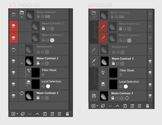
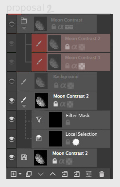
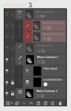
@Scott: The new pad-lock icon position/column makes sens on 'proposal 3'.
Comment Actions
Hi, @scottpetrovic!
I really like your ideas. Especially with color coding and offsetting the layers :) I have a few questions and comments:
- Are we still supporting switching "Compact mode"? As far as I remember quite a lot of users switch to the compact mode right after installing Krita. I guess I saw it on @Deevad and @timotheegiet videos. Is it useful for painters to switch to it when dealing with a huge heap of layers?
- How does the "Layers" drop-down looks like? Does it filter color-coding or just name filtering? I have a feeling that for "quick-filter" feature it might be too hidden. It needs at least three clicks to access it, isn't it too much? Or it is very rarely used function? I would like to hear other people opinion about that.
- I also have a concern about the neighborhood of "Visible" and "Lock" buttons. Isn't they quite easy to mis-click? Probably we should keep only one there?
- With graying-out the icons on the invisible layers. The main question is: should we disable them or just gray-out? We had quite a lot of bugreports about "I cannot remove a layer if it is invisible". What implementation is the best here? Should we allow changing their state or not?
- There is also a question about selection masks we were talking on IRC. Looking at your design, I feel that we might want to use visibility checkbox for mask's "Active" state. It should be rather understandable and, coupled with graying out, easy to see.
Comment Actions
@dkazakov
I believe @scottpetrovic has design this for thumbnail view. I agree that I have also seen most user go to minimal view , even I myself go to minimal view, so I think we should see if this view can be used instead of minimal view or is there a need to design a minimal view for power users.
I am under opinion that we shouldn't disable the invisible layers , I still need to delete those regardless of visibility, I also propose a way or option in right click menu to delete all hidden layers at once , It helps in cleaning up the layer stack in final stages of artwork.
Comment Actions
thanks for the comments @dkazakov.
A lot of these ideas and feedback are from people that use layers very heavily with nested groups and different masks.
- This is just one view of the how the layers will be displayed. It should still be possible to have different views. This design looks the most like the current 'detailed' view, so I would think it would replace that one.
- I am not sure what you mean by the Layers drop-down. Do you mean the 'view settings' drop down that currently allows you to select different views? That is shown in the last mockup. That is being updated to show the layer filtering. The layers docker has a massive amount of functionality, so I think the only the most commonly used functions need to be visible at the start. I know very few people that use filtering, so I don't know if it is important enough to take up a lot of the normal UI. The filtering only works with colors with the feedback I have seen, so it is just a drop-down.
- The main reason the lock icon was put on the left by the eye icon was because a couple people said they want the ability to quickly drag with their pen and lock/unlock a lot of layers. Locking is also available to all layer types, so it will available like the visibility option. We could maybe make the width bigger for those columns so there is more padding by each icon. That would help mis-clicking.
- The greying out idea came from feedback that they want a more visible way to see that a layer is hidden. It seems a bit redundant to me since we already have an eye icon, but maybe it is more helpful when there are a lot of layers on the screen. I am not sure what 'disabling' a layer means. Is that the same thing as locking it? It seems like it should be ok to delete an invisible layer.
- I do like that approach with removing the active selection icon. In the IRC conversation, I remember it is a bit confusing since the active selection and visibility pretty much do the same thing. Whatever we decide for the invisible greying out should be used for the masks as well.
Comment Actions
- This is just one view of the how the layers will be displayed. It should still be possible to have different views. This design looks the most like the current 'detailed' view, so I would think it would replace that one.
I guess if we start redesigning the docker, we should change the Detailed view as well :(
- I am not sure what you mean by the Layers drop-down. Do you mean the 'view settings' drop down that currently allows you to select different views? That is shown in the last mockup.
Yes, I mean the one shown in your last mockup.
That is being updated to show the layer filtering. The layers docker has a massive amount of functionality, so I think the only the most commonly used functions need to be visible at the start. I know very few people that use filtering, so I don't know if it is important enough to take up a lot of the normal UI. The filtering only works with colors with the feedback I have seen, so it is just a drop-down.
Yes, I meant the content of the dropdown shown in your mockup. What should the user be able to choose there? Colors or text or both?
- The main reason the lock icon was put on the left by the eye icon was because a couple people said they want the ability to quickly drag with their pen and lock/unlock a lot of layers. Locking is also available to all layer types, so it will available like the visibility option. We could maybe make the width bigger for those columns so there is more padding by each icon. That would help mis-clicking.
Well, I'm not sure how easy it would be to make "ability to quickly drag with their pen". It should be a separate task at least. Anyway, dragging over one of the two adjacent areas might be complicated a bit. Probably, the "stroke" should be limited to one type of buttons at least.
- The greying out idea came from feedback that they want a more visible way to see that a layer is hidden. It seems a bit redundant to me since we already have an eye icon, but maybe it is more helpful when there are a lot of layers on the screen. I am not sure what 'disabling' a layer means. Is that the same thing as locking it? It seems like it should be ok to delete an invisible layer.
Yes, "disabling" means locking. The question is, should the user be able to change layer properties, like Inherit Alpha and so on, when the layer is "grayed out"?
- I do like that approach with removing the active selection icon. In the IRC conversation, I remember it is a bit confusing since the active selection and visibility pretty much do the same thing. Whatever we decide for the invisible greying out should be used for the masks as well.
Ok.
Comment Actions
- All of the mockups show the detailed view, so that should be fine. There are also minimal and thumbnail views. Those designs will need to be modified.
- The filtering drop-down would just show colors. Each color would be a separate option.
- Thanks for the clarification about dragging with your pen. A lot of people seemed to think that functionality was included as part of this work. We will need to make a separate task for that.
- I think when a layer is locked, it just means you cannot modify the layer on the canvas (no painting/erasing or moving). I think it is ok to change any setting or use any button on the layers docker still.
Comment Actions
Hm... now I'm wondering, if most of the painters switch to compact mode right after installing Krita, probably, we should drop the Detailed view completely? And implement a new Compact mode only? Or at least design Compact mode properly and make Detailed view look the same as compact, but with Thumbnails?
Comment Actions
For what it's worth, I never switch to the compact view, and always use the default detailed view ( @dkazakov that must be someone else's videos ). Also of all the people I've seen using krita, very rare are those switching to compact view.
Comment Actions
There were also a couple points about the UI for drag and drop to make it more clear.
- Make the draggable layer semi-transparent so it is easier to see where it will be placed.
- Make the border and outline slightly thicker with where the layer will be placed while dragging.
Comment Actions
Hi, Scott!
I really love the new layout! I have only one question/suggestion left:
In the updated design the layer properties icons are aligned to the left border. Which means all the icons of the same type are placed in the same column. Therefore if the layer stack has at least one "complex" layer with a lot of icons, e.g. animated one, then all the other layers will have empty space to the right of their properties area. How should we best handle it?
I see two options:
- Keep it as it is. But it'll mean that all the layer names will be truncated due to a single layer having too many properties. And at the same time they'll have empty space at the right. I cannot say it is too bad, but at least it is something we should think about.
- Keep it aligned to the left, but put the icons in reverse order, that is rare properties first (e.g. Onion Skins) and common properties last (e.g. Lock). This will remove the empty space at the right and will allow layers have longer names. I'm not sure this is the best/sanest approach, just an idea :)
Comment Actions
@kazakov: The property icons on the right cannot be perfectly aligned since different layer types have different properties. I don't think we want empty spaces though. I don't think we have the extra space to allow for 'empty' slots for that type of alignment.
The layer properties on the right are all right aligned, so they will "stick" to the right like they currently do on the layers minimal view display. There are some properties that are very common like the lock and transparency lock, so that is why I had them shown first. Because other layer types will not have some of those properties, the icons columns will not be perfectly aligned. I think that will have to be a compromise to show as much as possible in the least amount of space (so close to solution 1 on your idea).
If the layers docker gets too small, the layer name will start to get truncated like it currently does on the minimal view. With the feedback, it seems that people value seeing all of the icons more than having the layer docker be a smaller width.
2nd comment: For the empty spaces on the two masks, those are the current properties that exist. If there are new properties or functionality we could put there, I would be ok with that.
Comment Actions
If we're touching the layer docker's insides, it might be good to check whether we can make D&D more comfortable by increasing the drop zone: https://bugs.kde.org/show_bug.cgi?id=358619
Comment Actions
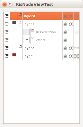
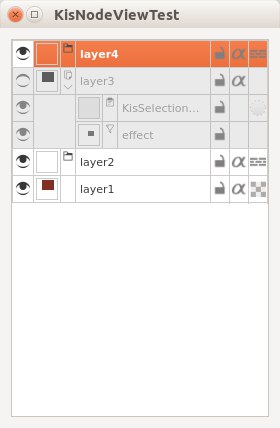
Hi, Scott!
I'm not sure about graying out the inactive icons. Here is what I have at the moment. Given that the icons of invisible and visible layer are equally grayed out, one cannot tell easily what layers are active or not.
Comment Actions
Is it possible to make the background slightly grey on invisible layers? People should be able to tell the layer is invisible at a glance. I think the problem right now is the white background is confusing since it is on both visible and invisible layers.
I am not sure how things will look on colored layers though. I guess if their is a color, the color will become greyer if it is invisible.
What do other artists think?
Comment Actions
I like the darker/desaturated proposition. (@scottpetrovic's mockup in previous message).
Comment Actions
Hi, @scottpetrovic and @timotheegiet!
Could you answer a couple of questions about the expected behavior of the Layers Docker?
- What properties/actions of the layer should available (editable) when the layer is *locked*?
- Drag&Drop
- Move Up/Down
- Properties dialog, including mass-editing
- Color label editing with the popup (also available in the properties dialog)
- Layer Styles
- Remove layer
- Merge Down (merge from and merge to)
- Rename (also available in properties dialog)
- Inherit Alpha and other icon-like properties
- How does it apply to the visibility? Should all these actions be available when the layer is invisible?
Comment Actions
- I think someone would need to check PS or a similar application. I think locking is technically only paint-locking, but I am not sure.
- All actions should be available to invisible layers.
Comment Actions
Locking prevents painting, layer selection from the canvas and operations like transforms/moving things around.
However @dkazakov , none of the operations you listed should be affected by layer locking. And they should all be available on invisible layers. That's how it works in PS at least.
Locking is mainly used to filter layer selections in PS. Because you can box select layers in PS, and you can lock the background - then, you only pick characters and other assets in the foreground with the layer select/move tool. So you can easily move them, put them in a layer group, transform them...
Comment Actions
I guess I don't use lock layer like gdquest, I use it to make sure a layer will not be edited accidentally.
So I wouldn't make remove and merge down available on locked layer. But all the others, sure they could be available.
About invisible layers, yes they should all be available, although Merge Down an invisible layer result is quite the same thing as deleting that layer.
we also have file layer which currently has reload icon before the layer name, Can we show the file layer icon besides the lock icons ( like we thought of showing Fx icon besides locks when a layer has layer style applied) or are we going to show it on the left of the thumbnail like masks and selection icons.
sorry for asking so many questions.