Improve header and metadata display
ClosedPublic

Authored by ngraham on Jan 18 2018, 11:29 PM.

Details

Summary
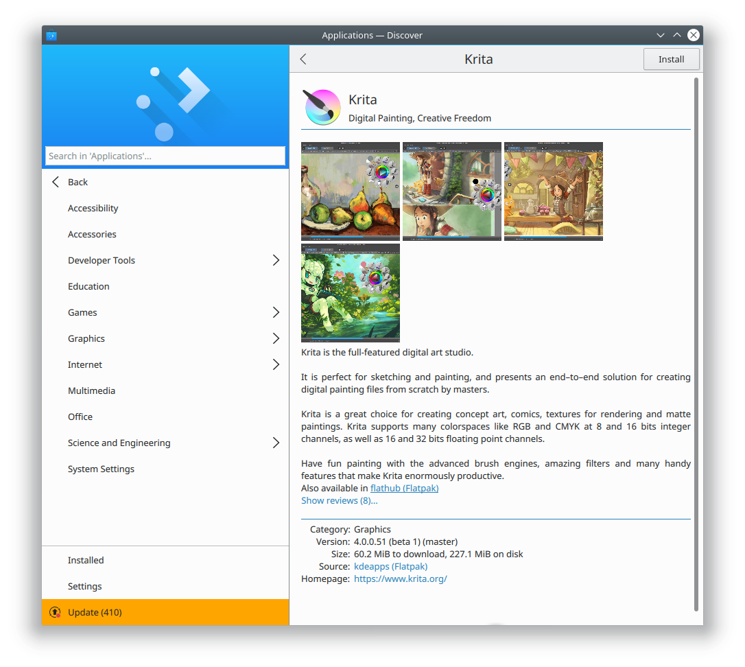
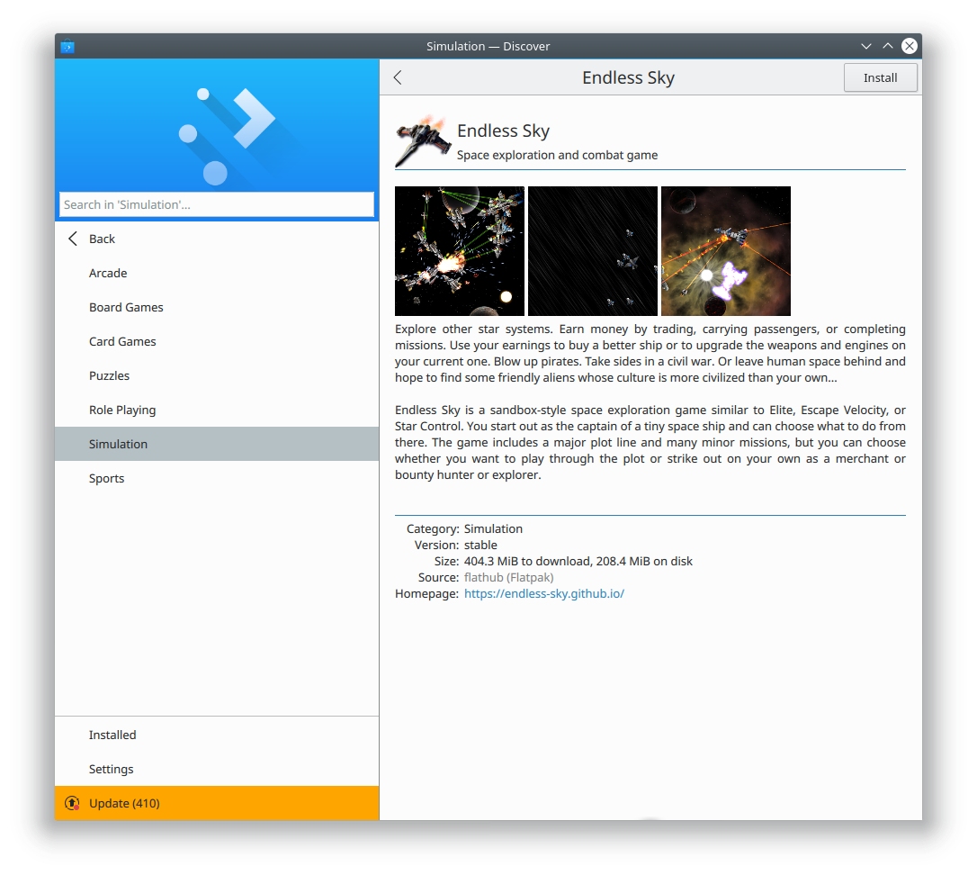
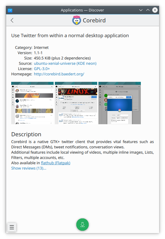
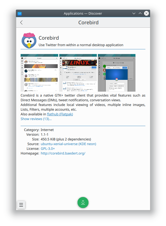
  • Moved the icon back onto the page, and removed it from the header
  • Moved app metadata below the description, to let users focus on the icon, screenshots, and description
  • Added blue lines between each section

Looks better on desktop and mobile now--IMHO of course!

This patch does not include any string changes, so it can go into 5.12.

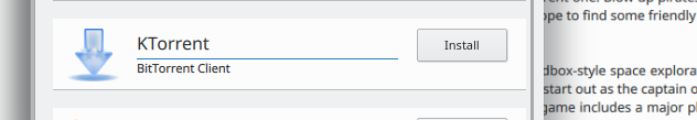
Supports D9976, which changes the source switcher UI to use a combobox instead of links.

Test Plan

Tested in KDE Neon (please pardon the fact that the before and after screenshots have different window sizes):

Krita, before:

Krita, after

Endless Sky, before:

Endless Sky, after

Blender, before:

Blender, after

Mobile UI, before:

Mobile UI, after

Diff Detail

Repository
R134 Discover Software Store
Lint
Automatic diff as part of commit; lint not applicable.
Unit
Automatic diff as part of commit; unit tests not applicable.
ngraham created this revision.Jan 18 2018, 11:29 PM
Restricted Application added a project: Plasma. · View Herald TranscriptJan 18 2018, 11:29 PM
Restricted Application added a subscriber: plasma-devel. · View Herald Transcript
ngraham requested review of this revision.Jan 18 2018, 11:29 PM
ngraham edited the test plan for this revision. (Show Details)Jan 18 2018, 11:34 PM
ngraham edited the test plan for this revision. (Show Details)Jan 19 2018, 1:50 AM
ngraham planned changes to this revision.Jan 19 2018, 2:13 AM

I just realized that this can't go into 5.12 because I changed a string and there's a string freeze. I'm going to remove the combobox part of this patch and put it in a second one to make this patch potentially able to go into 5.12.

ngraham updated this revision to Diff 25619.Jan 19 2018, 2:43 AM

Revert Combobox changes, as they changed a string and we're past the string freeze date for 5.12

ngraham updated this revision to Diff 25620.Jan 19 2018, 2:45 AM

"You missed a spot"

ngraham retitled this revision from Improve header, metadata display, and version chooser UI to Improve header and metadata display.Jan 19 2018, 2:49 AM
ngraham edited the summary of this revision. (Show Details)
ngraham edited the test plan for this revision. (Show Details)
ngraham edited the summary of this revision. (Show Details)Jan 19 2018, 3:39 AM
ngraham edited the summary of this revision. (Show Details)Jan 19 2018, 3:53 AM
ngraham edited the summary of this revision. (Show Details)Jan 19 2018, 3:58 AM

In my opinion this looks absolutely wonderful!

When we last discussed Discover app pages in VDG Telegram channel I said that the version selection should be at top together with the other basic information, but by this I meant foremost that the info should be together not necessarily at the top. In fact later on I also had the thought that all this metadata info actually does not belong to the top of the app page. At the top there should be the name and if available screenshots of the app, such that the user gets a direct first impression without being overwhelmed with data. This is executed here perfectly.

Just a quick question: how do the reviews open up if clicked on the text link? Will they move the details further down?

Thanks for the vote of confidence, Roman! In this patch, I didn't touch the review UI; it's still a pop-up.

ngraham edited the test plan for this revision. (Show Details)Jan 19 2018, 3:20 PM
januz added a subscriber: januz.Jan 19 2018, 3:34 PM

+1 Looks way more organized, and it's easier to grasp what application you're seeing and what it does on a quick glance. Minor nitpick: I'd add more margin around the summary text (to separate it better from screenshots and the summary link).

andreaska accepted this revision.Jan 19 2018, 4:09 PM
andreaska added a subscriber: andreaska.

Big improvement from design and usability. Top the app information and bottom tecnical stuff

This revision is now accepted and ready to land.Jan 19 2018, 4:09 PM
colomar accepted this revision.Jan 19 2018, 7:24 PM

This is a clear improvement from my perspective, and I don't see it introducing any usability issues.

apol added a comment.Jan 19 2018, 7:54 PM

I like it, some nitpicking:

This is the application delegate, I think it would make sense to do the same use of the blue line that is here.
Also I would remove the blue line under Details much like we don't have it under Description at the moment.

discover/qml/ApplicationPage.qml
145–186

This is a new string. Can't have new strings for 5.12.

apol requested changes to this revision.Jan 19 2018, 7:54 PM
This revision now requires changes to proceed.Jan 19 2018, 7:54 PM
ngraham added inline comments.Jan 19 2018, 8:54 PM
discover/qml/ApplicationPage.qml
145–186

Aww darn.

What about removing the application name from the header, to avoid redundancy?

ngraham updated this revision to Diff 25664.Jan 20 2018, 12:06 AM

Re-add logic for handling source switcher in description that was mistakenly removed

ngraham updated this revision to Diff 25665.Jan 20 2018, 12:10 AM

Removed the "Details" header text to prevent string changes so this can go into 5.12

ngraham marked 2 inline comments as done.Jan 20 2018, 12:14 AM
apol accepted this revision.Jan 20 2018, 2:01 AM
This revision is now accepted and ready to land.Jan 20 2018, 2:01 AM
ngraham edited the summary of this revision. (Show Details)Jan 20 2018, 2:15 AM
ngraham edited the test plan for this revision. (Show Details)
This revision was automatically updated to reflect the committed changes.