Horizontally center shadows and make them bigger
ClosedPublic

Authored by ngraham on Dec 29 2017, 3:39 PM.

Details

Summary

FEATURE: 388256

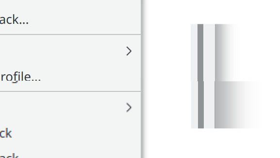
VDG has decided that shadows should be horizontally centered and bigger. This patch implements those changes in the following way:

  • Window and menu shadows are now horizontally centered
  • Shadow size increased to the maximum value
  • Shadow color changed from pure black to a slightly lighter Breeze standard color: Shade Black
Test Plan

Tested in KDE Neon. Before:

After:

Diff Detail

Repository
R31 Breeze
Lint
Automatic diff as part of commit; lint not applicable.
Unit
Automatic diff as part of commit; unit tests not applicable.
ngraham created this revision.Dec 29 2017, 3:39 PM
Restricted Application added a project: Plasma. · View Herald TranscriptDec 29 2017, 3:39 PM
Restricted Application added a subscriber: plasma-devel. · View Herald Transcript
ngraham requested review of this revision.Dec 29 2017, 3:39 PM
ngraham edited the test plan for this revision. (Show Details)Dec 29 2017, 3:45 PM
abetts accepted this revision.Dec 29 2017, 3:52 PM

I love it! People, please accept. Just notice how the depth perception works better this way. With the current implementation, shadows don't show a strong depth perception and they almost disappear. I like this new patch a lot!

This revision is now accepted and ready to land.Dec 29 2017, 3:52 PM

Dont merge please, this needs authorization from VDG first

apol added a subscriber: apol.Dec 29 2017, 4:52 PM

Dont merge please, this needs authorization from VDG first

@ngraham and @abetts are the VDG, no?

abetts added a comment.EditedDec 29 2017, 4:54 PM
In D9549#183809, @apol wrote:

Dont merge please, this needs authorization from VDG first

@ngraham and @abetts are the VDG, no?

Last I checked, yes... ;)

In D9549#183809, @apol wrote:

Dont merge please, this needs authorization from VDG first

@ngraham and @abetts are the VDG, no?

Last I checked I was... ;)

no prob then!

No matter what, I will definitely wait for at least @hpereiradacosta to weigh in.

These new shadows look amazing! :D

januz added a subscriber: januz.Dec 29 2017, 10:44 PM

I knew it would look better, but not this much better!
Please accept this change

@hpereiradacosta I feel this is a good direction for the theme. I am sure we can evolve it to fit new ideas.

This comment was removed by hpereiradacosta.

I have no objection to the change, in principle.
Now:

  • I feel that the top shadow at least should be somewhat smaller than the three other sides. Comments welcome
  • could you check with ALake. He is also VDG and the original style/decoration designer. If he already gives his approval on any other channel (e.g. Telegram), then fine with me too.
  • there is another review (I think, don't remember which), on the same topic, and which should be discarded if this one gets landed.
  • Did you check that there is no *glitch* with the shadow maximum size, on small size tooltips' shadow. (last time I checked there was one, which I had no time to fix).

I have no objection to the change, in principle.
Now:

  • I feel that the top shadow at least should be somewhat smaller than the three other sides. Comments welcome

Ok looking at the code it seems the top shadow is already smaller.
In which case please ignore :)
I guess I should give a try to actually apply the provided patch ... Will do and keep you posted.

  • could you check with ALake. He is also VDG and the original style/decoration designer. If he already gives his approval on any other channel (e.g. Telegram), then fine with me too.
  • there is another review (I think, don't remember which), on the same topic, and which should be discarded if this one gets landed.
  • Did you check that there is no *glitch* with the shadow maximum size, on small size tooltips' shadow. (last time I checked there was one, which I had no time to fix).
cfeck added a subscriber: cfeck.Dec 31 2017, 1:52 PM

I remember the shadows were made thin on the left so that cascading popup menus look smoother.

In D9549#184334, @cfeck wrote:

I remember the shadows were made thin on the left so that cascading popup menus look smoother.

Hello christoph,
Thing is: the same (inverse) argument was used to justify centered shadow: right cascaded windows (in a similar manner as submenus) would not look distinguishible one from the other with the current shadows.
So that you can't have both, unless you use different shadows for windows and for menus (which I find not so eleguant).

On top of that, current shadows should be made rtl aware for this to actually work

Personally I think this is a valid argument, but not a very strong one though.
Other thoughts welcome.

Hugo

I agree. I hope we can see that the change is not really about what "makes sense". Because that way it is harder to make everyone agree. This change is stylistic and oriented into evolving the breeze theme and overall look and feel. I like the depth perception that the centered shadows bring. Thanks @hpereiradacosta

I did check to make sure that tooltip shadows still look okay. Here are some more screenshots:

Small tooltip:

Large tooltip:

The other proposed change is D8232, by @rpelorosso, who has expressed positive sentiments about this one. @rpelorosso, would you mind closing D8232?

And FWIW, @alake commented in D8232 on the subject of centered shadows:

Ok, I agree now that there shouldn't be an option. I think it is fair to say that the contrast on the left side of overlapping windows could be improved. The proposed compromise solution actually looks decent too and it keeps the lighting reasonably consistent. The VDG and Hugo are discussing. Oh and in case it is sometimes forgotten, thanks for submitting the patch. :-)

...Which sounds like a general approval of what's done here, but let's wait for him to weigh in anyway.

zzag added a subscriber: zzag.Dec 31 2017, 5:36 PM

Looks great, but I think shadow size for the left and right side should be smaller.

Hello Nathan, thanks

And FWIW, @alake commented in D8232 on the subject of centered shadows:

Ok, I agree now that there shouldn't be an option. I think it is fair to say that the contrast on the left side of overlapping windows could be improved. The proposed compromise solution actually looks decent too and it keeps the lighting reasonably consistent. The VDG and Hugo are discussing. Oh and in case it is sometimes forgotten, thanks for submitting the patch. :-)

...Which sounds like a general approval of what's done here, but let's wait for him to weigh in anyway.

Nathan,
I think the "proposed compromise" in Andrew's comment is to keep the shadow left-right asymetric though strenghtening a bit the left side.
So this is not the proposed patch. Does'nt mean he would disagree with this patch, but this is not what this comment reffers to.

Hugo

I did check to make sure that tooltip shadows still look okay. Here are some more screenshots:

Small tooltip:

Large tooltip:

The other proposed change is D8232, by @rpelorosso, who has expressed positive sentiments about this one. @rpelorosso, would you mind closing D8232?

Thanks for double checking.
I can confirm it here too.
All in all, I am ok with the patch. Would be nice to have Andrew's opinion on it, but no big deal. Lets wait a day or too and push if nobody objects.

Thanks for the patch and for waiting for me on this !

Hugo

hpereiradacosta added a comment.EditedDec 31 2017, 6:17 PM

@hpereiradacosta I feel this is a good direction for the theme. I am sure we can evolve it to fit new ideas.

Regarding this (and the comment you made on the other thread), I am restating my oppinion here:

If it is only "a good direction" then it is not enough sorry.

I would really like to avoid too many iterations on this topic. Window decoration are very visible to users, so changing it every two releases gives a really bad impression on the quality of the code and of our design.
We should get it as right as possible before pushing to the official repo.

Andy, if you think the shadow should be improved, please indicate how so that the patch gets fixed before it gets committed.
Devs can work with patches applied to the official code, there is no need to commit for changes to be tested.

Hugo

I mean to say that the shadows are improved with this patch being proposed. I would not change anything. My thought is that in future years we can revisit and think if we need to make any new changes. This is a huge visual improvement in my opinion. I think we should accept the patch.

rkflx added a subscriber: rkflx.Jan 1 2018, 4:19 PM

New year, new look ;) Great work, this looks impressive and solves the left-side usability problem at the same time.

The screenshots above show a different shadow size for windows and menus respectively. This is actually something I like, because having a smaller shadow means having the illusion of a smaller z-height between menu and window, so you get a better feel that the menu belongs to the current window. Note this means in case a menu extends beyond the window we'd now have two different shadow sizes above another single window in some cases, i.e. like this:

I welcome this change and assume this is a conscious decision of the VDG for desktop style GUIs, because IMO usability and looks are more important than perfectly replicating the physics of light. Shadows of Plasma widgets/popups are already centered and smaller anyway, and it alleviates the problem mentioned by Christoph (nested menus). So +1 from me.


However, the single spin box in the shadow config dialog of Breeze still affects both at the same time, meaning if you decrease the default from 64px to 63px, the menu shadow will suddenly get very large. This could be solved in two ways:

  • Duplicate / split the config options for menus/tooltips/… and windows.
  • Set a static size for the menu/tooltip/… shadow, only make the window shadow size configurable. (← I'd prefer this.)

Also, I wonder whether the maximum value of the spin box should be increased. In general a default value means the user can increase or decrease something to his liking, while now he can only decrease this.

Regarding closing the other Diff: If we don't center the Breeze widget style at the same time (which personally I don't think is mandatory), we could still provide the option do disable centering of shadows. As can be read in the comments, some like off-centered shadows which is a unique offering of the Plasma desktop. After all, the code needed for this should not be too complex. Maybe @rpelorosso could work on this and on the RTL issue in D8232?

Last thing I want to mention is HiDPI: IMO in addition to "must work on Wayland" for any new feature / default, we should have the policy of "must work on HiDPI" (could be a dependent patch, though). Currently, the bigger shadow size only scales correctly for menu shadows, but not for window shadows (top: 2x scaling, bottom: 1x scaling doubled in size retroactively):


TL;DR, I'd like to see:

  • menu shadow size not affected by config dialog
  • increased maximum value
  • option to disable centering, RTL aware
  • fix HiDPI window shadow size

I can make the spinbox not affect menus; good catch. This was a pre-existing bug, but it gets bigger with the patch.

Increasing the maximum value makes sense. Will do.

I'd rather not make this an option, for all the reasons that have already been articulated on the subject. Since the status quo was never particularly RTL-aware in the first place, can we tackle that in a follow-up patch rather than overloading this one?

Will work on HiDPI, good catch. I agree, we should always test that. I'll make a note for my future patches.

Hello, my take on the following suggestions:

TL;DR, I'd like to see:

  • menu shadow size not affected by config dialog

I think menu shadow size should be

  • smaller than window size
  • scale with the window size (controlled by the spinbox), so that ratio between the two is fixed, rather than be fixed (otherwise you can end up with the weird situation) were menu shadow is larger than window shadow.

this was in fact the idea behind the possibly buggy original code.

  • increased maximum value

Agreed

  • option to disable centering, RTL aware

It was agreed in the other patch by VDG that there should not be an option, and that one should decide on one design or the other. From this patch the agreement seems to be moving towards centered shadowed.

  • fix HiDPI window shadow size

Definitly, though that might require some interactions with e.g. kwin.
Should be a different patch anyway.

Best,

Hugo

Hello, my take on the following suggestions:

TL;DR, I'd like to see:

  • menu shadow size not affected by config dialog

I think menu shadow size should be

  • smaller than window size
  • scale with the window size (controlled by the spinbox), so that ratio between the two is fixed, rather than be fixed (otherwise you can end up with the weird situation) were menu shadow is larger than window shadow. this was in fact the idea behind the possibly buggy original code.
  • increased maximum value

Agreed

PS: these two should also be too different patches.
(the first, at least, which is a bugfix, or feature change depending on how you see it)

The other proposed change is D8232, by @rpelorosso, who has expressed positive sentiments about this one. @rpelorosso, would you mind closing D8232?

I've closed D8232.

ngraham updated this revision to Diff 24593.Jan 2 2018, 2:21 PM

Increase maximum shadow size

@rkflx, I don't see any issues when using QT_SCALE_FACTOR to simulate HiDPI. Can you elaborate on how you got the issues to show up?

@hpereiradacosta, are you approving this patch as-is and then we can follow up with more for the remaining issues brought up above?

ngraham planned changes to this revision.Jan 2 2018, 3:05 PM

Never mind, found it. Menus look off in HiDPI mode, too. Will work on this.

hpereiradacosta accepted this revision.Jan 2 2018, 3:10 PM

@rkflx, I don't see any issues when using QT_SCALE_FACTOR to simulate HiDPI. Can you elaborate on how you got the issues to show up?

@hpereiradacosta, are you approving this patch as-is and then we can follow up with more for the remaining issues brought up above?

yes !
Many thanks for the effort.

Thanks! Also, the HiDPI shadow issue I thought was caused by this patch is also present without it (this patch just makes it more visible), so that too can be addressed in another patch.

This revision was not accepted when it landed; it landed in state Changes Planned.Jan 2 2018, 3:19 PM
This revision was automatically updated to reflect the committed changes.

@ngraham
A follow up on the menu vs window decoration shadow size, and a suggestion for the window decoration shadow size option, for discussion.

  • right now there is an explicit 3/4 (12/16) conversion factor between the menu shadow size and the window shadow size, which I believe is working correctly, except possibly with update glitches, when the window size is changed.

Maybe this scale-down is too small especially since the new default window shadow size is larger, and one could for instance try 1/2 (or even 1/4th) instead of 3/4

  • on the shadow size option: thinking about it, it makes little sense to have a "per pixel" option (especially in a world where you have high dpi screens which blur the definition of "pixel"). One could imagine instead having a combobox with a set of well defined fixed values, similar to what we have for icon sizes already, or window borders.

I could think of something like

  • tiny: 16 pix
  • small: 32 pix
  • normal: 64 pix (your current default)
  • large: 96 pix
  • huge: 128

this, with a reduction of a factor 2, or 4, for the menu shadows wrt window shadows.
What do you think ?

Hugo

That all sounds totally reasonable to me.

rkflx added a comment.EditedJan 2 2018, 4:58 PM

I can make the spinbox not affect menus; good catch. This was a pre-existing bug, but it gets bigger with the patch.

Are you sure this is an old bug? Works for me (and Hugo mentioned it too), i.e. starting from the default changing size in both directions affects window and menu shadows at the same time, like it should.

I did not look at the complete code, but at least your patch does not contain anything which changes this coupling. I suspect to achieve the situation in the screenshots your patch relies on the fact that the menu shadows just use the old default size (which was based on the old window default size). Now as soon as you introduce a new default size (but only for windows), things break.

Could you check that? (I might be wrong, but currently it looks like the issue is with your patch.)

  • right now there is an explicit 3/4 (12/16) conversion factor between […] Maybe this scale-down is too small especially since the new default window shadow size is larger, and one could for instance try 1/2 (or even 1/4th) instead of 3/4

Yeah we should try this. However, it might turn we even need a different scaling function or think about a static size. I'd need to test it live. In case we decide to use a set of well-defined fixed values, we also could just hard-code some combinations (in terms of logical pixel sizes, not physical pixel sizes) which work good enough.

  • huge: 128

Maybe "Very Large", to be consistent with the window decoration button size combobox wording? Also, "No" should be an option.

In D9549#185034, @rkflx wrote:

I did not look at the complete code, but at least your patch does not contain anything which changes this coupling. I suspect to achieve the situation in the screenshots your patch relies on the fact that the menu shadows just use the old default size (which was based on the old window default size). Now as soon as you introduce a new default size (but only for windows), things break.

Right, that's exactly it. The old menu shadows were just hardcoded to use a smaller version of the old default size, and it didn't consult the default at all until you changed it, at which point it becomes as big as the menu shadows. This is the pre-existing bug in the code. With my change, it become more noticeable because now the default window shadow is much bigger, but it's not a new issue I've introduced. Before changing anything else, let's get some consensus on how we want to proceed:

  1. Menu shadows are always small
  2. Menu shadows are always follow window shadow size
  3. Menu shadows are always follow window shadow size, with some adjustment (50% as big? 75% as big? 25% as big? Something else).
In D9549#185034, @rkflx wrote:

I did not look at the complete code, but at least your patch does not contain anything which changes this coupling. I suspect to achieve the situation in the screenshots your patch relies on the fact that the menu shadows just use the old default size (which was based on the old window default size). Now as soon as you introduce a new default size (but only for windows), things break.

Right, that's exactly it. The old menu shadows were just hardcoded to use a smaller version of the old default size, and it didn't consult the default at all until you changed it, at which point it becomes as big as the menu shadows.

Don't think so. The same "default" shadow size is used for the window decoration and for the window style. Now of course, once the style has been recompiled you need to restart the applications to have the new default value properly accounted for. No bug. Just a momentary glitch due to recompilation I think.

This is the pre-existing bug in the code. With my change, it become more noticeable because now the default window shadow is much bigger, but it's not a new issue I've introduced. Before changing anything else, let's get some consensus on how we want to proceed:

  1. Menu shadows are always small
  2. Menu shadows are always follow window shadow size
  3. Menu shadows are always follow window shadow size, with some adjustment (50% as big? 75% as big? 25% as big? Something else).

For me, definitly 3 since this is what we have now, with a possibly adjusted scale factor. Alternatively, hardcoded smaller sizes that match the combobox enumeration would also work. Be certain that not _everybody_ will be happy with the change, no matter what the change is. It is just a question of making a sensible change.
Note that there was never any bug report about the current choice (3., with 75% scale factor), so far.

Right, that's exactly it. The old menu shadows were just hardcoded to use a smaller version of the old default size, and it didn't consult the default at all until you changed it, at which point it becomes as big as the menu shadows.

Don't think so. The same "default" shadow size is used for the window decoration and for the window style. Now of course, once the style has been recompiled you need to restart the applications to have the new default value properly accounted for. No bug. Just a momentary glitch due to recompilation I think.

Well, I take it back. There is a bug, and it is (more or less) introduced by your code.
The window shadow option range and default is defined at two places (due to issues with kconfig generation code), and these two must be kept in sync:
kdecoration/breezesettingsdata.kcfg, which you changed

and
kstyle/breeze.kcfg which was not updated.

I just pushed the necessary modification to the second file.

abetts added a comment.Jan 2 2018, 5:18 PM

The only thing that we could address later is that the concentration of this shadow for the menus makes it so that the shadows become a tad darker. Since the space they have to spread in is smaller, the colors combine a little bit making the shadow be more pronounced. This is work for the future of course. It looks pretty acceptable to me from the screenshots.

Ah, thank you Hugo. My apologies for introducing that bug, and thanks for cleaning up the mess.

rkflx added a comment.Jan 2 2018, 5:29 PM

Now I am confused. I thought the screenshots above show what the VDG proposed, i.e. small menu shadows, large window shadows? At least I like it this way.

As for how it scales with different user-set sizes (which a static screenshot cannot show): The current small menu shadow size looks good with the large window shadow size. Suppose the user changed the size back to the 5.11 state. I'd like to think that then also the menu shadow size should be the same as before, and not something very very small. This means we'd need to have a lower bound or something. On top of that little subtlety, 3 sounds good, as long as the size does not get too big so we get the nested menus problem from above again. This means I could also live with 1 (or just add a second combobox and be done with it).

rkflx added a comment.Jan 2 2018, 5:40 PM

I just pushed the necessary modification to the second file.

Thanks. Now the menu/window shadow separation work can start on a clean slate (because after re-login, as expected, the default menu shadows are huge again, i.e. not something the VDG has approved).

Yes, I did not realize that the menu shadows being small was actually a bug in how I made the patch. VDG definitely would like them to be smaller than the window shadows. I'll put together a follow-up patch tonight or in the coming days. Thanks everyone!

Here's the follow-up patch to make menu shadows a smaller faction of the window shadow size: https://phabricator.kde.org/D9627