enable playNow action when paused so that playback can be restarted from the playlist.
implement double click on the entry to start music playback.
change id to a more matching name
| mgallien |
| Elisa |
enable playNow action when paused so that playback can be restarted from the playlist.
implement double click on the entry to start music playback.
change id to a more matching name
| Automatic diff as part of commit; lint not applicable. |
| Automatic diff as part of commit; unit tests not applicable. |
This time properly implemented via DraggableItem
Thanks for your work. This is a good step forward.
Could you try to include snapshot when doing visual modifications ?
| src/DraggableItem.qml | ||
|---|---|---|
| 121–124 | To prevent single click to be emitted after the double click modify the accepted property (see documentation of MouseArea) | |
| src/PlayListEntry.qml | ||
| 55–61 | What are you trying to achieve with this modification ? | |
| 215 | Please add space around the operator + . | |
| 217 | Add back the extra line, please. | |
| 222 | Add back the extra line, please. | |
| src/DraggableItem.qml | ||
|---|---|---|
| 121–124 | please see the other diff for discussion. currently outcome on doubleclick is the same: entry gets selected and playback is started | |
| src/PlayListEntry.qml | ||
| 55–61 | this was moved from the playNow action so that it is always included when the startPlayback signal is emitted. This way draggableItem must only emit the signal of the playlistentry to change the playing title (see MediaPlaylistView). I can change this back and add a similar call in MediaPlaylistView if you prefer | |
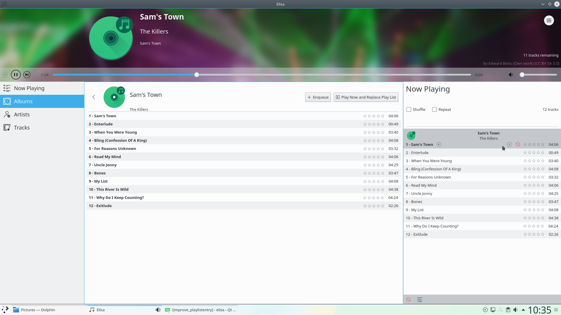
In case you did not try the proposed changes yet, here are some screenshots
Before:

| src/DraggableItem.qml | ||
|---|---|---|
| 121–124 | You can discard this comment, I was wrong about the default value of accepted property. | |
sorry for the spam, but noticed immediately after updating to the last revision that the startPlayback signal would get emitted even for invalid items.
so changed the way how the double click is set up which seems to be a cleaner solution
Sorry for the delay.
I have tested the last revision. Your patch is looking good to go.
Thanks for your work.
I would still much prefer if the icon indicating pause or play is right aligned like it was before. It is a good idea to have the tool buttons right most but I think it will be better visually if those three things stay right aligned with the disc number, track number and title left aligned.
I've actually played around with this a bit and came to the conclusion that this is the best approach.
What I dislike about the current state is when hovering the currently played entry, the position of the remove button is at the position of playNow button of other entries, which I find very inconvenient and not intuitive.
When aligning everything to the right but having the playing icon left to the playNow button, the play icon will change position when hovering. Also, there would be essentially the same icon right next to each other, one indicating the playing state and one being the playNow button. This looks redundant.
These issues above are solved when aligning the playing icon to the left.
Final decision is yours, of course. Shall I change the position back (or to the left of the buttons, aligned to the right)?
I understand your arguments but I still prefer if the play indicator is always at the same position for all tracks. Your current solution breaks the memory of where to look to know if a track is playing. Your eyes have to scan each line. The current code in git is already not perfect and sometime I get confused about which track is the current one. Let's not make it even harder.
You can have a look at https://community.kde.org/KDE_Visual_Design_Group/Music_Player .
reverted position changes of play indicator but kept the explicit sizing constrains for the layout which still seems the right thing to do
Thanks for your work.
I still am really convinced you had a good idea to make the position of the buttons stay always the same.
I would like to try to get them shown on top of the other elements and at the same place you did but make them visible through some visual effect. Do you want to try that ? I can also give a try to that.
Again, I am really convinced about the fact that they now are moving and that this is bad.
I can give it a try again when I find some time. But could you elaborate a little bit on what you have in mind? I don't fully understand.
Another idea that came to my mind is to completely hide the playing indicator while hovering. This has a few advantages:
-Positions will stay the same
-The play icon won't be visible twice in one row
-There will only be a max of two icons in one row, so the playlist view doesn't get cluttered that much
What do you think? Or is this what you had in mind?
Anyway, I will open a new revision for this.
Your idea is what I had in mind but achieved through some blur effect combined with some opacity to guarantee the visibility of the two buttons.
I will let you do that since I am working on bugs related to the music import and the music database.
I will push this revision and will review the next one. Keep doing your contributions, I am very happy to have such a good help.