BUG: 345906
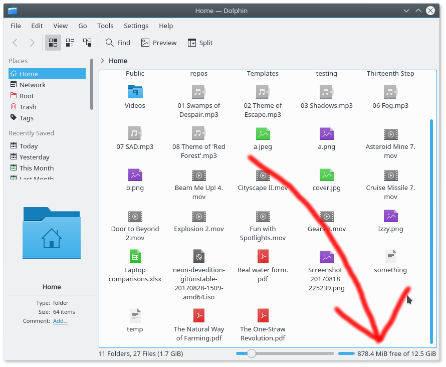
Display the disk's total capacity in addition to the amount of space free. Now it matches the presentation in the Properties window, too.
| dfaure | |
| elvisangelaccio | |
| markg |
| Dolphin | |
| KDE Applications |
BUG: 345906
Display the disk's total capacity in addition to the amount of space free. Now it matches the presentation in the Properties window, too.
Tested in KDE Neon. Works:
| No Linters Available |
| No Unit Test Coverage |
That is a somewhat cryptic notation. Sure, it tells you exactly what you want to know "if" you know that's what it's telling you.
On the other hand, anything longer might be too long.
Just curious, would it be possible to display it within the bar itself in a tiny font? Then one of the following notations:
Or something else...
While I recognize this implements a wish from bugzilla, I'm not yet convinced this is something Dolphin should add by default, as for a lot of users this might just be clutter and is not "Simple by default, powerful when needed".
I'm wondering what is the root cause for wanting to see this information: Is it because it is not clear on which partition or device the current folder is located? If so, there might be better ways to solve this. I'd suggest to open an new task on Dolphin's workboard (or a bugzilla issue) to brainstorm, even if this patch goes in.
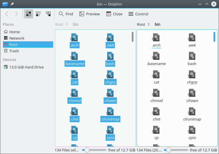
Now for something tangible. In split mode with the default window size, it looks problematic with this patch, but even in normal mode (see F5338350) the space bar is just too small in relation to the long text (before vs. after):
 |  |
Ideas:
Ideally all of these ideas could be combined, but this might be too much work for a single patch. However, at least something should be done before this patch goes in.
I think there are a few root causes for wanting this:
Even if those were addressed (and they should be) IMHO this is still worthwhile if we can address the issue of a lack of space in the bottom bar. I like your space-constrained idea of 3 steps: only space bar, space bar + free, space bar + free + total). I'll see if I can make that happen.
Maybe this information could be added to the information sidebar:
Otherwise I like Henrik's idea of using a tooltip to show additional information when hovering the free space widget.
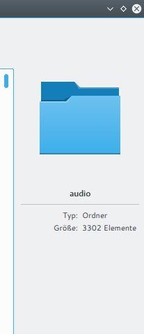
Yes, I've been meaning to add a real space calculation to the Information Panel. "Size: 68 items" is kind of useless, or at least much less useful than a real readout of on-disk space used.
I investigated full directory sizing (findings in https://bugs.kde.org/show_bug.cgi?id=158090), but it's a ton of work that's out of scope for this patch. I'm going to re-focus on the statusbar change and investigate how to improve the display in constrained situations.
-1 for the idea as is.
A few reasons:
In fact, it might be interesting to remove any textual size representation (so only keep the progressbar thingy). When hovering that bar, show a detailed tooltip with the size.
The information pane could show this information always, that would be fine imho.
That's what the progressbar already shows.
Let's take a step back and think about who will need what:
IMHO this also determines the order in which Dolphin should hide items if the horizontal space becomes restricted. You may also notice Dolphin already provides quite good usability for the first two users, no need to change that. Therefore, adding things for the third type of user should be done quite carefully.

