Dolphin softer drop shadow for thumbnails
AbandonedPublic

Authored by emateli on Jun 19 2017, 6:03 PM.

Details

Reviewers
ngraham
Group Reviewers
Dolphin
VDG
Summary

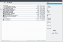
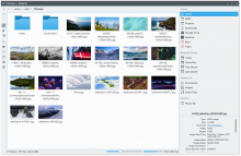
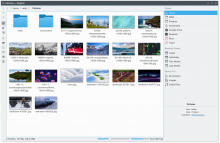
This is a minor proposal which softens the drop shadow effect for thumbnails on Dolphin. It changes the color from pure black to a light gray color. It's just a minor tweak, but I think makes Dolphin overall slightly more pleasant to look at.

On this album, there are some before-after images which showcase the current revision and the proposed patch.
Link: https://imgur.com/a/TxgdB
Diff Detail

Repository
R318 Dolphin
Lint
Lint Skipped
Unit
Unit Tests Skipped
emateli created this revision.Jun 19 2017, 6:03 PM
emateli changed the visibility from "Public (No Login Required)" to "All Users".Jun 19 2017, 6:23 PM
anthonyfieroni added inline comments.
src/kitemviews/private/kpixmapmodifier.cpp
274

Don't use hardcoded values, it can be difficult to maintain in the future. Use Qt::lightGray or other softer predefined vaules.

emateli updated this revision to Diff 15602.Jun 19 2017, 7:43 PM
emateli edited the summary of this revision. (Show Details)

Qt::dark -> Qt::lightGray

Restricted Application added a subscriber: Konqueror. · View Herald TranscriptJun 19 2017, 7:43 PM
emateli changed the visibility from "All Users" to "Public (No Login Required)".Jun 20 2017, 10:33 AM

Please upload the screenshots on phabricator, that makes the review easier for the VDG.

januz awarded a token.Aug 30 2017, 5:39 PM
emateli edited the summary of this revision. (Show Details)Sep 3 2017, 6:17 PM

Inlined the images for easier viewing.

To be honest, the submitted patch is with Qt::lightGray constant as per the suggestion above, but I think none of the predefined ones look nearly as good as the one in the screenshot which was a lighter version than Qt::LightGray (#c0c0c0). Alo hardcoding a color is not that big of a deal IMO.

ngraham added a subscriber: ngraham.Sep 4 2017, 4:58 AM

+1 I like this. Looks good. Softer and more subtle.

markg added a subscriber: markg.Sep 4 2017, 11:43 AM

Ugh, both don't look that neat to be honest.
But i would still prefer the old one over the softer one. The soft one looks too soft, specially with the tiny thumbnails in list mode, it looks like a weird white area (not as a shadow) while the old one did look like a shadow.

Could we compromise on something between the old version and the proposal?

markg added a comment.Oct 18 2017, 7:12 AM

I still prefer the old one over the new one.
-1.

Maybe the direction of the shadow can be changed, but nonetheless I still think that the current one is a bit too strong and especially noticeable on the smaller sizes.

So I completely agree with you that the shadow is too strong at small sizes, and overpowers the image. At larger sizes, I think it's an aesthetic judgment call. Could you try just changing it for the small sizes and see how that looks?

emateli planned changes to this revision.May 27 2018, 6:31 PM
Restricted Application added a subscriber: kfm-devel. · View Herald TranscriptMay 27 2018, 6:31 PM
alex-l added a subscriber: alex-l.May 28 2018, 11:20 AM

Thank for this, can you please share screenshots with dark themes, at least Breeze Dark?

We removed the shadow entirely for small sizes in cf0052c2968a7c3e110e24134dbe7ef13c835995. So this change would just be for large sizes now. Do you think this is still needed?

According to the HIG drop shadows should be in Shade Black (#232627 35,38,39) https://hig.kde.org/style/elevation.html
Qt::lightGray sounds like it is something different?

ngraham requested changes to this revision.Sep 21 2018, 2:16 PM

Yeah, I think this would need some tweaks to be land-able at this point.

emateli abandoned this revision.Sep 14 2019, 9:22 PM

#232627 barely makes any difference compared to #000. Marking this as abandoned for now as it's an old revision.