Change the volume icon/mute button into a ToolButton
ClosedPublic

Authored by Zren on Mar 23 2017, 2:12 AM.

Details

Summary

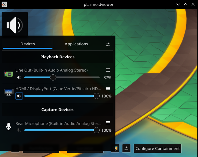
This adds a hover effect so the user knows it's a button.

Creates a reuseable SmallToolButton which overlays an IconItem on a ToolButton ignoring the svg's margins and ToolButton's padding.
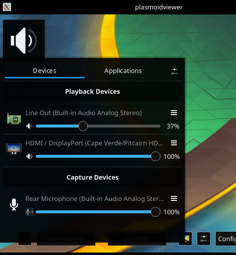
Changes the spacing between the rows to 1px (0px causes the ColumnLayout to reflow and the label sometimes shifts).

Diff Detail

Repository
R115 Plasma Audio Volume Applet
Lint
Lint Skipped
Unit
Unit Tests Skipped
Zren created this revision.Mar 23 2017, 2:12 AM
Restricted Application added a project: Plasma. · View Herald TranscriptMar 23 2017, 2:12 AM
Restricted Application added a subscriber: plasma-devel. · View Herald Transcript
romangg accepted this revision.Mar 23 2017, 8:09 AM
romangg added subscribers: drosca, romangg.

Looks very nice. I also don't think that the hover line looks weird. It's just a little bit stupid, that for these small buttons we always have to use the workaround with the IconItem. Can't we introduce a parameter in ToolButton to reduce the margins from its native icon? But this is unrelated to this patch. So accepted from my side. @drosca ?

This revision is now accepted and ready to land.Mar 23 2017, 8:09 AM
drosca requested changes to this revision.Mar 23 2017, 10:56 AM

I don't like it, the context menu button is enough hacks for one applet. Also it doesn't have spacing so it looks wrong compared to other ToolButtons (contex menu have spacing, but the icon size is still iconSizes.small).
If we want to use ToolButtons in this way, it should be fixed in ToolButton.

This revision now requires changes to proceed.Mar 23 2017, 10:56 AM

I don't like it, the context menu button is enough hacks for one applet.

The "hack" is consistent with the one of context menu button.

I think the improved discoverability outweighs your objections. We can use this here until someone diggs deeper and improves ToolButton in this regard.

@Zren: Can you tell me why your icon looks different from mine and why on my I still have a small (and nice) margin:

The "hack" is consistent with the one of context menu button.

It's not, context menu button have spacing

I think the improved discoverability outweighs your objections. We can use this here until someone diggs deeper and improves ToolButton in this regard.

If we go with this, it must be moved into a separate item, let's say SmallToolButton.qml

@Zren: Can you tell me why your icon looks different from mine and why on my I still have a small (and nice) margin:

Because you use scaling and 22px version of the icon has bigger margins.

Zren added a comment.Mar 23 2017, 3:40 PM

Yeah, it's probably dpi scaling.

And I didn't want to mess with the height of the ListItemBase. On further testing, it seems adding smallSpacing margins isn't as bad as I thought.

Back and Forth Gif: https://streamable.com/0ld55


If the increase in height is acceptable, I'll make a SmallToolButton

PlasmaComponents.ToolButton {
    id: smallToolButton
    property int iconSize: units.iconSizes.small
    property int padding: units.smallSpacing
    implicitWidth: iconSize + padding * 2
    implicitHeight: iconSize + padding * 2
    Layout.preferredWidth: implicitWidth
    Layout.preferredHeight: implicitHeight
    property alias icon: icon.source

    PlasmaCore.IconItem {
        id: icon
        anchors.fill: parent
        anchors.margins: parent.padding
        visible: false

        // From Plasma's ToolButtonStyle:
        active: parent.hovered
        colorGroup: parent.hovered ? PlasmaCore.Theme.ButtonColorGroup : PlasmaCore.ColorScope.colorGroup
    }
}
Zren added a comment.Mar 23 2017, 3:43 PM

Ah, ignore the visible: false in that, was testing which variables ToolButton uses (iconSource. iconName).

Zren added a comment.Mar 23 2017, 3:52 PM

Another thing we could do to keep things small vertically is set spacing: 0 in the ColumnLayout { id: column }.

Zren updated this revision to Diff 12746.Mar 23 2017, 5:07 PM
Zren edited edge metadata.

Create a reusuble SmallToolButton class.
Add smallSpacing around the mute button.
Remove spacing between the two rows to counter the increase in height.

drosca added inline comments.Mar 23 2017, 5:10 PM
applet/contents/ui/SmallToolButton.qml
11

This won't work when not in Layout, I think you can use implicitWidth/Height to have the same effect.

Zren added a comment.Mar 23 2017, 5:59 PM

Before tackling the implicitWidth/height stuff, I noticed that my microphone's Heading label was getting moved on the first click. Adding height: contextMenuButton.height fixes it but that doesn't feel right.

https://streamable.com/07hc0

mart added a subscriber: mart.Mar 28 2017, 11:20 AM

i think it looks better (tough only how it looks on roman's machine)

drosca added a comment.Apr 2 2017, 3:00 PM
In D5144#97171, @Zren wrote:

Before tackling the implicitWidth/height stuff, I noticed that my microphone's Heading label was getting moved on the first click. Adding height: contextMenuButton.height fixes it but that doesn't feel right.

https://streamable.com/07hc0

I've seen that, but that is unrelated to this change, so please move it into separate review.

Zren added a comment.Apr 3 2017, 5:26 PM

I've seen that, but that is unrelated to this change, so please move it into separate review.

Sorry. I hit a wall on that bug and it drove me crazy. I just found out that changing spacing: 0 to spacing: 1 will cause things to layout correctly the first time.

My theory is that clicking the button will change the ToolButton's svg, which probably causes the naturalHeight to be set, causing the ColumnLayout to recalculate the height of the rows. Whatever is loading wrong at initialization is corrected, causes the reflow, which makes the text shift.

Zren updated this revision to Diff 13070.Apr 3 2017, 5:31 PM
Zren edited the summary of this revision. (Show Details)
Zren added a comment.Apr 8 2017, 2:31 AM

Should I go ahead and commit this?

drosca accepted this revision.Apr 8 2017, 7:40 AM

My theory is that clicking the button will change the ToolButton's svg, which probably causes the naturalHeight to be set, causing the ColumnLayout to recalculate the height of the rows. Whatever is loading wrong at initialization is corrected, causes the reflow, which makes the text shift.

No, it's a bug in PlasmaComponents.Label, it sets:

height: Math.round(Math.max(paintedHeight, theme.mSize(theme.defaultFont).height*1.6))

If you do height: paintedHeight in our code, the issue is fixed.

Should I go ahead and commit this?

Yes, thanks.

This revision is now accepted and ready to land.Apr 8 2017, 7:40 AM
This revision was automatically updated to reflect the committed changes.