This is a transfer of RR ticket 129324
https://git.reviewboard.kde.org/r/129324/
It aims to improve the width feedback in the VCS commit message editor by avoiding confusion with the spell checker.
This is a transfer of RR ticket 129324
https://git.reviewboard.kde.org/r/129324/
It aims to improve the width feedback in the VCS commit message editor by avoiding confusion with the spell checker.
| Lint Skipped |
| Unit Tests Skipped |
| plugins/git/gitmessagehighlighter.cpp | ||
|---|---|---|
| 38 | I don't get these changes, why do you change the spacing? what has this to do with width? please expand your commit message and add screenshots that show the effect of this before/after from my POV, the previous code looks better, adding underlines in different color is much better than messing around with letter spacing and italics | |
| vcs/widgets/vcsdiffpatchsources.cpp | ||
| 47 | move { to its own line | |
| 79 | use editor->fontMetrics().maxWidth() * 74 | |
Please read through the original review on ReviewBoard, it contains a number of exchanges with Aleix that I haven't copied here (and I opened this ticket only because RB is being phased out). I will see about linking to or copying the screenshots attached to the RB RR.
In short, I see 2 related issues with the current implementation that uses underlining:
why do you change the spacing? what has this to do with width?
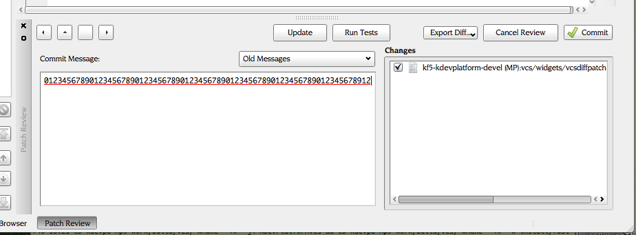
But that's exactly the point: spacing HAS to do with width. When you change the letter spacing the immediate effect is that the line becomes wider, and that should give a subtle but clear enough reminder that you are typing a line that is getting too long.
The whole proposition is based on the principle that text should contain hints that are easy enough to understand (because relevant) but also easy enough to ignore.
Seeing letter spacing increase while typing immediately gives me the hint that I should insert a newline if I want to heed the standard commit message guidelines. Of course the change to Italics when you exceed the "hard" limit isn't a width-related modality change but it shouldn't be too hard to understand either when you're already aware you've typing a long line. I considered using bold, but the effect of that depends too much on typeface and point size in use.
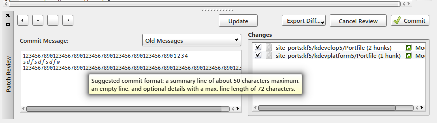
Underlining is also distracting esp. when it uses different colours and may cause clipping (it did with certain versions of KTextEditor, IIRC). The "before" screenshot also confirms my recollection that the whole line (or the whole last word) was underlined, not just the part exceeding the limit. Underlining the whole line isn't completely wrong but it also doesn't help understanding the warning (and to me that's even more true if only the last word is fully underlined). Finally, red suggests an error while here we are talking about mere guidelines that may or may not correspond to more or less severe errors depending on the repository.
As to using different colours: I don't recall ever having seen or noticed that, possibly because the whole underline changes colour if you continue typing. That lack of a lasting recollection is a sufficient suggestion that the principle doesn't really work.
My signalling in action, also showing the commit message editor width set to match the suggested 72 character line length limit.
As to which approach "looks better": that isn't really the criterium here, is it? The point is to give relevant, constructive hints that do not distract from the main purpose: writing a clear and reasonably concise commit message.
I'm still against messing with the font styles the way you do it. simply add underlines for the part that is longer than N chars and add a tooltip for that part such that people know what's happening
and an overflow in length should never get a red underline, it's not an error, just a warning / suggestion
Not to beat my chest, but visual perception is my original domain of expertise, and I have long been involved with researchers working on and interested in research on human factors including the ergonomics of human/machine interfaces.
And I'm still against using underlining in this context so I'd like to have Aleix's refreshed opinion as well. In any case I will only make that change if it makes it easier to patch the code to use my current solution in my KDevelop packages.
I recall trying to change the underlining style instead of colour but hitting the same limitation, i.e. the whole underlined section changed style. That's not acceptable to me.
BTW, letter spacing is not a font style, it's a text property. Just like line width.
Setting a tooltip on part of a line? I don't know if that's even possible and one of the reasons I added a tooltip to another element is that text tooltips are too unlikely (and frankly difficult) to be triggered reliably.
and an overflow in length should never get a red underline, it's not an error, just a warning / suggestion
Well, tell that to the original author.
Another FWIW: ideally one would introduce single markers into the text: "here you should consider moving to a new line" and "here you should *really* move to a new line". That's probably not trivial at all, apart from the question what those markers should look like (?).
The pycodestyle integration in kdev-python also uses underlines for formatting complaints, although in that case they're yellow warnings.
Note that red underlines are used for many non-spelling errors in KDevelop, such as syntax and semantic errors. There's no reason for the user to be surprised by that.
I agree with mwolff; there's nothing wrong with underlining and your proposed changes seem far more confusing.
Formatting only the overlapping section rather than the entire line is nice though.
Not for syntax and semantic errors, as they are comparable to what spelling errors are to natural language. Everyone who codes will understand that an underlined function probable indicates some other issue than a deviation from the usual spelling in language used to communicate with humans.
Commit messages *are* natural language, and spell (and grammar) checking would be very beneficial. Once you accept that you cannot reasonably continue to use underlining to indicate other issues.
I agree that my implementation isn't idea either. The simplest and least ambiguous indicator would be a pair of fixed vertical lines, a subdued one at the soft (title) length limit, a more salient one at the suggested hard limit. I haven't yet been able to figure out how draw such lines on the background.
I agree with mwolff; there's nothing wrong with underlining and your proposed changes seem far more confusing.
The keyword being *seem*.
But you're not entirely wrong: in a way it's actually the goal to confuse users. But where underlining may lead users to conclude that somethings is simply wrong with the spellchecking feature, a completely different way to draw their attention should incite them to figure out "what the &^@#$ does this mean". And hopefully a trick to make text wider will be an easy to remember indicator that a length limit was exceeded.
FWIW, overlining was tested; Aleix rejected it and I have to agree that it was too distracting in cases where you want to ignore the limits.
Is it to much to expect that people actually *test drive* a different implementation (for a not-insignificant duration) before emitting an opinion? It's well known that our perception is coloured by familiarity and can make us prefer things that are inferior or downright wrong.
Commit messages *are* natural language, and spell (and grammar) checking would be very beneficial. Once you accept that you cannot reasonably continue to use underlining to indicate other issues.
They aren't, they have a preferred syntax including the summary line gap and length limits. The whole point of this feature is to remind people not to treat it as a free text field.
What makes you think we don't do this?
It's well known that our perception is coloured by familiarity ... and can make us prefer things that are inferior or downright wrong.
Please just underline the /problematic parts/ as it's being done *throughout* KDevelop in all text edits. You say "colored by familiarity", I say: please let's stay "consistent" with what we have. Using an italic font there definitely *is* confusing to existing users. Modifying the letter spacing is a no-go.
Note that Kate uses underlines for indicating spelling errors, kdev-python also uses underlines (yellow ones) to indicate style/formatting issues. So we're in line.
Please, René, it takes lot of energy to do these kind of reviews, it would be appreciated if you'd sometimes just accept the recommendations from core developers who've been working on KDevelop for so many years already. This patch could've been pushed (in a revised form) weeks ago, but now we just keep on discussing reinventing KDevelop's/KDE's human interface guidelines for a tiny text edit.
Note that Kate uses underlines for indicating spelling errors, kdev-python also uses underlines (yellow ones) to indicate style/formatting issues. So we're in line.
And I still disagree that this is a place where you can use underlining to indicate overflow. I'm not going to repeat myself why.
Please, René, it takes lot of energy to do these kind of reviews, it would be appreciated if you'd sometimes just accept the recommendations from core developers who've been working on KDevelop for so many years already.
I do and wish I could do so more often. Already I don't both anymore with most changes that I feel are justified or needed because I know my efforts will just be driven into the ground. The diff-context-lines patch is another good example. I've listened to all objections and found a way to accommodate the GUI addition without adding visible widgets but apparently I should have concluded that all further resistance was futile.
What I don't do is taking orders to implement things I cannot stand behind.
This patch could've been pushed (in a revised form) weeks ago
Yes, we could have found a middle ground that doesn't involve using font or text attributes at all (like adding 1 or 2 margin lines).