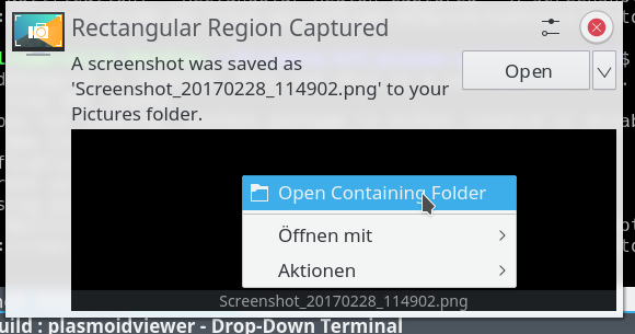
Since it represents a file, right clicking it should provide similar options found in a file manager.
This allows to open the application with an application other than the default, e.g. if you want to edit the screenshot right away. It also offers service actions, such as send as email.
Details
Details
- Reviewers
- None
- Group Reviewers
VDG Plasma - Commits
- R120:f98a90df2541: [Notifications] Add context menu for thumbnail
Took a screenshot, right clicked it, "Open Containing Folder" opened the parent folder of the screenshot.
Open With also works.
I didn't add the plugin actions, which are "Compress" and "Link to activity" here which don't work in this context but I think KDE Connect is also a plugin action, so we probably should still add them? It would only be a addPluginActionsTo(menu) call.
The notification times out independently of the menu because we technically leave the popup with our cursor and it would be quite complex to fix that. I did verify that when the popup closes the entries in the context menu still work.

Diff Detail
Diff Detail
- Repository
- R120 Plasma Workspace
- Lint
Automatic diff as part of commit; lint not applicable. - Unit
Automatic diff as part of commit; unit tests not applicable.
Comment Actions
That's an awesome idea Kai! I normally only want to open the containing folder and not the screenshot directly, so I was really missing this functionality. Would it be a good idea to not make this as a right click context menu, but as a burger menu button (or a arrow down button) next to the "Open" button like we did it for the volume applet? I remember @colomar saying in D2314 that right click actions should be reachable from inside the GUI as well, which makes sense to me because not every user will know about the possibility to do a right click.
Comment Actions
which makes sense to me because not every user will know about the possibility to do a right click.
You don't have that in a file manager, either, and this thing represents a file. Even more so if there's multiple files, they'll show up as square items. I know VDG despises context menus but I'm not a fan of adding visible menu buttons everywhere. If you can create a mockup where it won't terribly overload the design, I could re-consider. Again note that there can be multiple thumbnails in a strip, only if there's just one will it be filled to the entire width. See D3539 with screenshots of the various states it can be in.
Comment Actions
You don't have that in a file manager, either, and this thing represents a file.
A file manager has a menu bar, however, so the context menu is never the only means to execute an action.
I don't see how turning the Open button into a split button would "terribly overload the design", either. It would not cost any additional space.
Comment Actions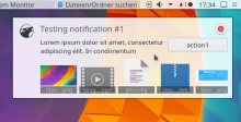
A file manager has a menu bar, however, so the context menu is never the only means to execute an action.
Dolphin does not by default. I don't see an "Open" or "Open With" action anywhere in its menus, neither the file actions (compress, activities, send to, etc).
I don't see how turning the Open button into a split button would "terribly overload the design", either. It would not cost any additional space.
And how do you think a split "Open" button (which there isn't neccessarily) would work in the following scenario?

Comment Actions
It does not, which is something we've criticized before (the menu should be shown by default, turning it into a button should be a conscious decision. The actions not being in the main menu is a HIG violation as well.
"Let's do it wrong because others are doing it wrong as well" is not a good argument.
I don't see how turning the Open button into a split button would "terribly overload the design", either. It would not cost any additional space.
And how do you think a split "Open" button (which there isn't neccessarily) would work in the following scenario?
Just as well or as badly as a regular "Open" button. If in this scenario you hide the Open button because it has no valid target, then of course there would be no split Open button, either.
Comment Actions
Just as well or as badly as a regular "Open" button. If in this scenario you hide the Open button because it has no valid target, then of course there would be no split Open button, either.
So, how can I access the menu options for the invidiaual files, here?
Comment Actions
You can't, which is okay since the whole thing is just a convenience feature anyway.
There is just little reason why we should not give users more discoverable access to the extra options when we already have an action button for the main action anyway.
If the argument is that a split button is difficult to implement in Plasma, then there is a problem in Plasma which needs to be fixed, as a split button is a regular part of the HIG.
Comment Actions
And if it's not an "Open" button? The action is provided by the application itself, after all. It might not add it (I actually want to get rid of it as we now have the preview area) or have it do something different than it does now. There could also be multiple.
Comment Actions
Okay, personal opinion on why split buttons are among the most horrible things related to UX:
(And whilst some of these points might not apply to this very specific use case here: they will elsewhere, and once one component users this button, others will too, see e.g. spectacle)
- They are very prone to accidental clicks. If you want to click the (little) arrow but hit the button instead, worst case you get an undoable, destructive action. This gets a lot worse with touch.
- They are horrible for handicapped people. Screen readers usually don't handle them properly, so these people are only aware of one action, and might not be able to see the others
- They are horrible for keyboard based navigation (see above on not applying for this very specific use case): which button presses them? Which one opens then?
- Space. These buttons have text on them, text that is translatable and might be a lot bigger in e.g. German. The buttons in notifications already suffer from this (e.g. bluetooth received files, in German) and it only gets worse if you add multiple options and an additional arrow
- They would obviously not work well with multiple items as per the example above, if you e.g. wanted item specific actions
What would work are either context menus as proposed (touch is going to be meh though, as I just learned that we can't properply do long press anywere) or a button that only has the purpose of opening a menu, e.g.: hamburger button.
Comment Actions
i don't see the split button a very feasible option on a technical standpoint (and pretty bad purely on aestetics, would also be a thing we use only here and visually clashes with a combobox)
those extra actions are not a fundamental thing at all, and i would not particularly expect to *have* to access them in order for the entire thing to be functional, that makes it ok to me (or even *better*) to be the semi-hidden way of context menu.
and here we are at the point: either the feature gets in with this design, or with a different one requires so much work for little gain that i would advise to not have it at all
Comment Actions
Okay, personal opinion on why split buttons are among the most horrible things related to UX:
(And whilst some of these points might not apply to this very specific use case here: they will elsewhere, and once one component users this button, others will too, see e.g. spectacle)
- They are very prone to accidental clicks. If you want to click the (little) arrow but hit the button instead, worst case you get an undoable, destructive action. This gets a lot worse with touch.
- You should not use a split button with the main button performing a destructive action, of course.
- Plasma Desktop is not optimized for touch input, Plasma Mobile certainly would not not use them. And as you say yourself below, a context menu does not work for touch, either.
- They are horrible for handicapped people. Screen readers usually don't handle them properly, so these people are only aware of one action, and might not be able to see the others
How do context menus work with screen readers?
- They are horrible for keyboard based navigation (see above on not applying for this very specific use case): which button presses them? Which one opens then?
Split buttons are usually used in toolbars, which are never good for keyboard navigation. That's what menu bars are for.
- Space. These buttons have text on them, text that is translatable and might be a lot bigger in e.g. German. The buttons in notifications already suffer from this (e.g. bluetooth received files, in German) and it only gets worse if you add multiple options and an additional arrow
Is that arrow really taking up that much space?
- They would obviously not work well with multiple items as per the example above, if you e.g. wanted item specific actions
As I said: Neither does the simple button. The split button wouldn't be the one crrating the problem. And it would not _replace_ the context menu, either.
What would work are either context menus as proposed (touch is going to be meh though, as I just learned that we can't properply do long press anywere) or a button that only has the purpose of opening a menu, e.g.: hamburger button.
Nobody said anything against the context menus, the split button would just be an additional, more discoverable means to access the functions.
Comment Actions
If a split button clashes visually with a combo box, it's just badly designed. I trust our visual designers to design a split button that does not look like a combo box, just as visual designers have in so many other places. Roman's mockup did npt represent the final visual design for this.
those extra actions are not a fundamental thing at all, and i would not particularly expect to *have* to access them in order for the entire thing to be functional, that makes it ok to me (or even *better*) to be the semi-hidden way of context menu.
and here we are at the point: either the feature gets in with this design, or with a different one requires so much work for little gain that i would advise to not have it at all
I agree that the split button is not a must-have (as I already said above: The whole thing is just a shortcut, so it's fine if not everybody knows about it).
What I don't like is people dismissing a well-established interaction pattern in desktop computing just because they personally don't like it.
Comment Actions
What would you use then? Also I think it's rather odd if you have to limit a certain UI element to the kind of actions it might contain.
- Plasma Desktop is not optimized for touch input, Plasma Mobile certainly would not not use them. And as you say yourself below, a context menu does not work for touch, either.
*sigh* then we'd even have another different behaviour depending on device type. That can be good, but in this case it would not be needed, as there are options that would work for both.
A context menu would work if plasma would have the proper touch support to bring it up on long touch (interestingly enough, plasma does long touch in other areas where one doesn't expect it, but that would get off-topic)
- They are horrible for handicapped people. Screen readers usually don't handle them properly, so these people are only aware of one action, and might not be able to see the others
How do context menus work with screen readers?
They are properly read, either item by item or on hover, depending a bit on the context and software here.
- They are horrible for keyboard based navigation (see above on not applying for this very specific use case): which button presses them? Which one opens then?
Split buttons are usually used in toolbars, which are never good for keyboard navigation. That's what menu bars are for.
Yaeah, no. See spectacle. Also:
(And whilst some of these points might not apply to this very specific use case here: they will elsewhere, and once one component users this button, others will too, see e.g. spectacle)
(emphasis added)
Which also goes for your answer to notmart, as them being properly designed. Look at spectacle, there you have both a drop down and a split button. Differences are minimal (a small splitter) and as expected, keyboard navigation does not work. So I am highly against introducing even more split buttons, as it might encourage people to use them, despite them being bad in so many aspects.
- Space. These buttons have text on them, text that is translatable and might be a lot bigger in e.g. German. The buttons in notifications already suffer from this (e.g. bluetooth received files, in German) and it only gets worse if you add multiple options and an additional arrow
Is that arrow really taking up that much space?
No, the action is. You end up with translatable text which you always have to show, a problem you neither have with a hamburger menu (which is always the same size, language independent, if used with an icon) or with a pop up menu, because in both variants you only have to show the text on an overlay, not all the time. All the time already is tricky (see e.g. the text on buttons when you receive a file via bluetooth, with de_DE) and it only gets worse if you add more elements like a splitter and arrow.
- They would obviously not work well with multiple items as per the example above, if you e.g. wanted item specific actions
As I said: Neither does the simple button. The split button wouldn't be the one crrating the problem. And it would not _replace_ the context menu, either.
Yes, the simple button doesn't work either, but the split button does not only not solve many problems, it even adds some.
What would work are either context menus as proposed (touch is going to be meh though, as I just learned that we can't properply do long press anywere) or a button that only has the purpose of opening a menu, e.g.: hamburger button.
Nobody said anything against the context menus, the split button would just be an additional, more discoverable means to access the functions.
As far as I was informed on IRC, as far as I can see in the very discussion here: context menus were discouraged.
And no, as the split button would only be able to show a limited set of possible actions (e.g. not item specific actions) it would imo even do a worse job, because some actions would be discoverable, others not, so the user would even more so think they don't exist.
Short: context menu or hamburger menu are imo the most sensible options both UX wise and also with regards to functionality. If context menus are bad on mobile due to lack of proper possibilities to bring them up: that should be fixed instead.
Comment Actions
As far as I was informed on IRC, as far as I can see in the very discussion here: context menus were discouraged.
Ah right, that was a miscommunication on our side. I'd never discourage context menus. They are very useful shortcuts. The only downside is that they are not very discoverable (and problematic on touch), so they should never be the only means to access something.
Comment Actions
Final comment: Do whatever makes sense, keep only the context menu if you like. I'm out.