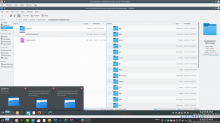
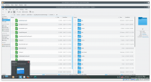
On my 13.3 FullHD laptop taskmanager tooltip are totally unreadble, while systemtray ones are readed just fine. I try to uniform them and well readed.
Details
Diff Detail
- Repository
- R119 Plasma Desktop
- Lint
Lint Skipped - Unit
Unit Tests Skipped
Can you add screenshots on your 13.3 screen with and without this patch?
I know at the moment the code on master is not perfect. But we have to find a solution, which doesn't change the current look of the text lines completely. The Heading class to my taste has too large margins for the tooltips.
| applets/taskmanager/package/contents/ui/ToolTipInstance.qml | ||
|---|---|---|
| 96 | When we improve the current code, in best case we want to get rid of "magic numbers" (like 1.1 and 0.9 below or the 0.75 in current code). | |
It doesn't *completely* change the look, it makes it consistent with literally everywhere else and this is not the first time the font size was complained about, this needs to be fixed.
The only change I could see from your comparison screenshot is the top margin in the tooltip which is actually bug in the current implementation where the Label's height is too small for text to fit in and then it overflows and eats the margin. (Also, decenders are cut off for launchers but that's probably another bug)
Then we have to ask ourselves if "everywhere else" is flawed aswell in some way. For example I don't understand why the Heading classes have always opacity set below 0.8, which lowers the contrast and makes it in comparison to normal text look less important.
If I look at the other tooltips in the task bar with their headings, these look fine, but only because there is no text next to them. In case of the tool tips we have the normal text in the tab though, which has opacity to the normal value of 1.0. Then opening the tooltip with a heading and its opacity of 0.8 at best, just looks off.
Since this is not directly solvable right now though, I'm fine with whatever you're coming up to fix the current problems (including headings). Still I would be interested in your opinion about it.
And please add the screenshots.
In work i'm on 5.8 :) I don't know what you want to see in screenshot when we talk to pixel density i.e. it depends on diagonal inches. I will update patch with heading levels instead of labels and no magic numbers, later this night :)
if "everywhere else" is flawed aswell in some way.
If it were consistently "flawed", it's better than *one* place where it's blatantly different.
these look fine, but only because there is no text next to them
There is? It's just that in Plasma's default tooltip there's a larger margin in between.
So it's not really a problem of the usage of magic numbers in current code or that it's not a heading, but of the choice of the text size itself.
But I just tried it out on a 13 inch, 2560x1440 laptop with scaling factor 1, and it's still fine to read for me.
Of course if you would apply a scaling factor higher than 1, the text in the tooltips will get bigger aswell. If you're not comfortable with the small sizes on your particular screen I would recommend that. Because on the other side from my understand most people like the new ultra small size of the tooltips, especially on devices with low dpi ratios.
Kai is correct here, we always want to (a) be consistent, (b) push flaws up into lib code so they can be addressed centrally.
So now i'm on the correct revision it seems.
I applied the diff locally to see how this change looks. It looks OK (can't test it on a "retina" display), but still quite inconsistent with other tooltips in terms of spacing.
It looks out of place compared to the other tooltips. Hover over kickoff, then over a taskbar entry to see the difference.
Also, i thing you (re)introduced a text eliding issue. Open for example chrome on this url: https://cgit.kde.org/plasma-desktop.git/plain/applets/taskmanager/package/contents/ui/ToolTipInstance.qml?h=Plasma/5.9 it has a long title (the url is the title in fact). I think there was some text eliding magic before you made your changes. Now the full title is visible. That's fine for relatively short to medium sized titles, but large ones (say 30+ characters) is imho too long to display in the tooltip and should probably be elided. Note: i don't get why this is wrong because i do see "elide: Text.ElideRight" in the code...
Second thing, the application title in these tooltips is of a "fatter" or "more black" tone then the one in the other tooltips (again, look at kickoff).
Btw. just curious, why can't you re-use the tooltip that kickoff uses (or the tray area, or the clock..)
I must investigate why elide does not work, margins are a bit different from others like systray, kicker, etc.
I figure out it, maximumLineCount or height sould be setted, i unsetted height...
maximumLineCount should be 1 or more? Elided should be left if application is RightToLeft ? Also margins to abobt to others ?
I don't know an answer to any of your questions, but i'm sure one of the other people present in this review can help you out there.
| applets/taskmanager/package/contents/ui/ToolTipInstance.qml | ||
|---|---|---|
| 108 | Because of this the tooltips aren't the same height when one of them has a too long window title. On the other hand @broulik noted that sometimes for him important informations were lost when the window title was shortened to only one line. So the 2 still makes sense. Another option would be to use 1 and Text.ElideMiddle, so you are potentially presented different informations about the window title than in the taskmanager itself. Because I was very keen on having same dimensions for every tooltip when redesigning them, I would favor the second option. But it's up to you. | |
| applets/taskmanager/package/contents/ui/ToolTipInstance.qml | ||
|---|---|---|
| 108 | Is it possible to have it always fixed to 2 lines and not just max to 2? Otherwise having either 1 or 2 line we would end up in unaligned/bad-looking tooltips (see screenshot), although I guess I can live with this :) | |
| applets/taskmanager/package/contents/ui/ToolTipInstance.qml | ||
|---|---|---|
| 108 | ElideMiddle looks strange to me for title, on other hand if tiltle contains path it can be useful. Verify new patch, looks more reliable to me. PS: jsalatas, you can use docker images https://hub.docker.com/r/kdeneon/plasma/ vs vm :) | |
I like the idea but ElideMiddle doesn't seem to work for me: Seems that it just keeps the left part of the text that it can fit and ignores anything else :\
PS: I know about docker but still prefer VMs :)
! In D4491#90001, @jsalatas wrote:
I like the idea but ElideMiddle doesn't seem to work for me: Seems that it just keeps the left part of the text that it can fit and ignores anything else :\
Yeah, looks like only ElideRight behaves correct.


