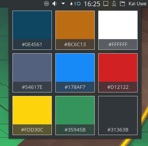
This adds a frame around the color sections, makes it look a lot nicer and improves contrast.
Since here the frame takes only a minor portion of surface area compared to the circle in a panel, I opted not to base it on luminosity, also for consistency's sake when there's 9 different colors in one view.