Remove anchors within Kirigami.AbstractListItem delegates.
They were causing random misalignment of items in the main and the overlay ListViews
Details
Details
- Reviewers
broulik ngraham - Group Reviewers
VDG KWin - Commits
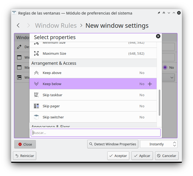
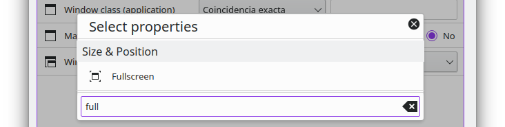
- R108:471554b7a394: [kcm/kwinrules] Fix layout misalignment of list items
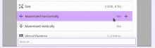
Before

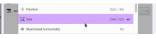
After
Diff Detail
Diff Detail
- Repository
- R108 KWin
- Branch
- fixlayout
- Lint
No Linters Available - Unit
No Unit Test Coverage - Build Status
Buildable 26346 Build 26364: arc lint + arc unit
Comment Actions
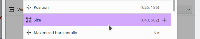
In the After views, there appear to be extra/excessive left and right margins compared the the Before images, which look more correct to me.
Comment Actions

There are more margins indeed. The anchor was also taking the margins from the RowLayout itself (only sometimes, hence the visual bug before)
On the left side (a Kirigami.Icon), I introduced extra margins to compensate. This is how it looks without them:

On the right side, there's a QQC2.Button, and what it seems to be a 1px extra margin to the right
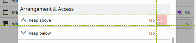
That, and the button being only visible on hover makes the right part look more empty, so I though of keeping the extra margins on the left icon. I could also add negative margins on the right button (maybe too hackish?):
Comment Actions
The extra margins for icon items don't bug me, but I think it's weird for the items that have a visible frame to have visibly greater left or right margins than top+bottom margins.
Comment Actions
LGTM, at least that part! Is it new that the section headers are escaping from the sheet by one pixel, or did I just not notice it before for some baffling reason?
Comment Actions
Maybe Kirigami.Header not knowing about Kirigami.Overlay's shadow?
It was already so before the patch.
I just noticed it yesterday too, while looking at this. It extends to both sides when there's no scrollbar.
Maybe Kirigami.Header not knowing about Kirigami.Overlay's shadow?

Comment Actions
It looks like OverlaySheet does not account for the 1px border. I'm guessing it works for the other delegates because they are transparent, the section header actually has a background colour set so the border doesn't show up.
Comment Actions
If there's no objection, I'll be pushing this this evening (CET), since it fixes an existing layout bug, and the Header issue seems to be separate from this.
Thanks!