[applets/notifications] Widen pop-up and reduce spacing when on top or bottom center
ClosedPublic

Authored by ngraham on Apr 19 2020, 5:29 PM.

Details

Summary

Somehow the notification pop-up's positioning has never felt quite right to me. When it's
in a bottom corner, it blocks the view of the latest messages in chat apps, or the text
I'm searching for in Kate. When it's in a top corner, it blocks part of the open app's
toolbar or tab bar that I often use. The best place I've found for is in the top-middle,
which doesn't block very many of the thing I'm active using, and its centered position
feels aesthetically pleasing. I've been using this for a bit and quite like it.

However there is ony deficiency: the pop-up is not very wide, so it becomes quite tall
when displaying multi-line messages from chat apps in particular, which makes the
notification stack intrude into the middle of the screen where it definitely blocks things
you want to be looking at. This is annoying.

This patch resolves that issue by making the pop-up's size wider and the spacing between
pop-ups smaller when the pop-ups are positioned in the top or bottom middle.

Test Plan

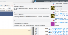
Centered pop-ups now look like this:
Single pop-up:


Stack of pop-ups:

There is no visual change for pop-ups in the corner, where they are by default.

Diff Detail

Repository
R120 Plasma Workspace
Lint
Automatic diff as part of commit; lint not applicable.
Unit
Automatic diff as part of commit; unit tests not applicable.
ngraham created this revision.Apr 19 2020, 5:29 PM
Restricted Application added a project: Plasma. · View Herald TranscriptApr 19 2020, 5:29 PM
Restricted Application added a subscriber: plasma-devel. · View Herald Transcript
ngraham requested review of this revision.Apr 19 2020, 5:29 PM
ngraham edited the summary of this revision. (Show Details)Apr 19 2020, 5:33 PM
ngraham edited the test plan for this revision. (Show Details)

Oof, what a sad set of example notifications 😂

ndavis accepted this revision.Apr 19 2020, 5:53 PM
This revision is now accepted and ready to land.Apr 19 2020, 5:53 PM

Heh, sorry!

cblack accepted this revision.Apr 19 2020, 6:09 PM
broulik accepted this revision.Apr 19 2020, 6:24 PM

The lack of spacing looks bad but whatever

On the screenshots, the notifications block tab bars and toolbars in 3 apps :)
Are you sure it's more convenient?

Well, they don't extend so far into the center of the screen as they used to.

There's no way to make a notification pop-up not block anything. This patch is what feels best for me, as most of the tools and tabs I'm going to be using are more towards the edges of the screen, not the center. Could be different for others. However this is a non-default setting so hopefully it won't annoy many people. :) But I do think it's a genuine improvement for the "centered notifications" case. Give it a try and see if you like it!

ngraham added a subscriber: bshah.Apr 21 2020, 2:21 AM

@bshah I think you said you wanted to see how this worked for PlaMo before I landed it? Have you had a chance to do that yet?

bshah accepted this revision.Apr 22 2020, 8:38 AM

Sorry for delay in testing this, works fine!

This revision was automatically updated to reflect the committed changes.