SwipeNavigator is a component optimized for lateral page navigation rather than hierarchical page navigation. This patch adds both the SwipeNavigator and properties to the Kirigami.Page that are consumed by it.
Details
Details

Diff Detail
Diff Detail
- Repository
- R169 Kirigami
- Branch
- cblack/lateral (branched from master)
- Lint
No Linters Available - Unit
No Unit Test Coverage - Build Status
Buildable 25303 Build 25321: arc lint + arc unit
Comment Actions
What is the usecase for this?
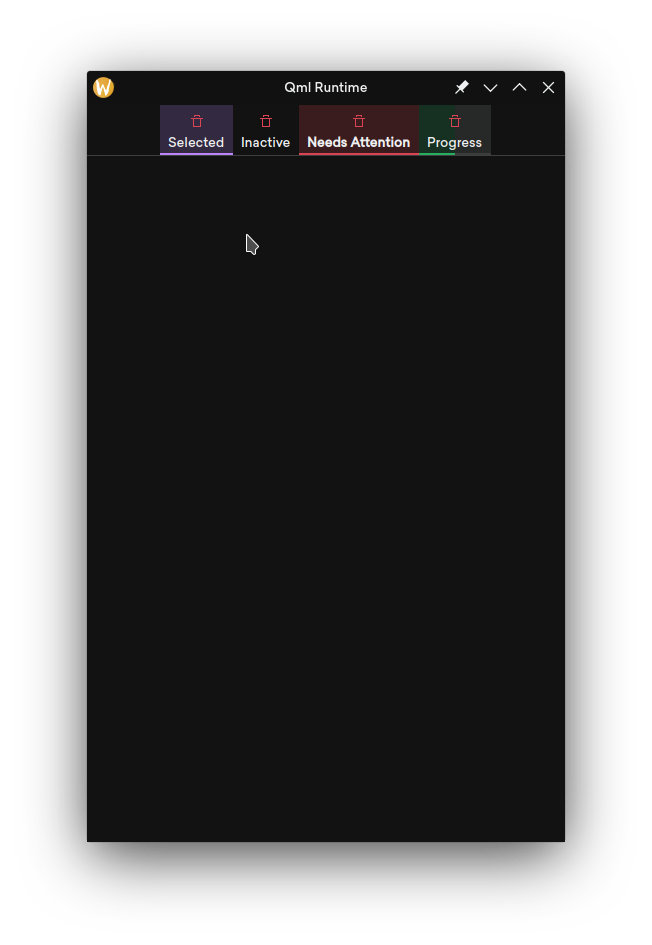
The progress tab's page highlight changes width with the percent of progress, correct? I think it looks wrong like that, unless I'm missing an important bit of context.
Comment Actions
Apps that have shallow and primarily lateral navigation.
The progress tab's page highlight changes width with the percent of progress, correct? I think it looks wrong like that, unless I'm missing an important bit of context.
Yes.
Comment Actions
So are these all views that run simultaneously like apps on a task bar? What makes this different from tabs?
Comment Actions
The tabbars have their own look, which it's against the consistency goal. I do prefer this look to the current breeze one, but this is a debate to have at the level of the future breeze direction.
It's ok in the case of mobile with the tbbar on the bottom as it's a pretty standard mobile control with an established look and feel, but a top tabbar on the desktop should look like any other tabbar
| src/controls/Page.qml | ||
|---|---|---|
| 223 | for consistency, should be a private/ActionItemGroup.qml (which mimics the upstream qqc2 api icon.name/source/width/height/color) | |
| 238 | again, not convinced we should have this, seems a bit oddly specific | |
| src/controls/SwipeNavigator.qml | ||
| 31 | perhaps any custom heading should be via a custom item (or component?) to put as a property (of type qqc2.tabbar) | |
| 39 | "layers", to have the same api of pageRow | |
| 56 | different tabbars should really depend only on whether it's a mobile device or not (and be at bottom if mobile): a very small window on desktop is not a mobile app | |
| 67 | this should be page actions? other actions? what is the exact use case? | |
| src/controls/private/SwipeTabBar.qml | ||
| 13 | QtQuickControls do have a TabBar control, instead of having a completely custom control | |
| 38 | this is kinda outside of the scope of the control. | |
Comment Actions
Plus, this navigation view is really easy to replicate with toolbars (stupid wrong example, but you get what I mean):
And this patch could add them for Kirigami as well.
My opinion from the consistency side: I actually think this is a good possibility for the Consistency goal. After some digging around, my opinion is that
Tabs should only be used on application views that are user-editable (eg: when it's possible to open a new tab or close another).
It's imo appropriate to have a different component for changing views, especially on Kiri. But of course, that component should be consistent. Right now we have big square sidebars, toolbars, etc etc etc etc etc
I think that this component could be a good solution, because we have a similar topbar on Maui:

Plus, this navigation view is really easy to replicate with toolbars (stupid wrong example, but you get what I mean):

And this patch could add them for Kirigami as well.
Of course, this assumes that some other stuff goes well:
- Pressed buttons in toolbars should use highlight style (1px opaque line all around)
- Possibly, buttons in toolbars should have an option to disable text if there's not enough space and they are not pressed
- Apps should be okay with moving to a top centered mutually exclusive toolbuttons for navigating views
- This patch should also use such highlight style
- Possibly, Maui should drop his appviews component and use this one since it does the same thing, so this patch should coordinate with them and make sure this is feature-even
We wouldn't get "swipe to change view" on qwidgets, but it's mostly for desktop so I think it's fine.
For reference, I had done some consistency mockups in the past and this idea was already there:
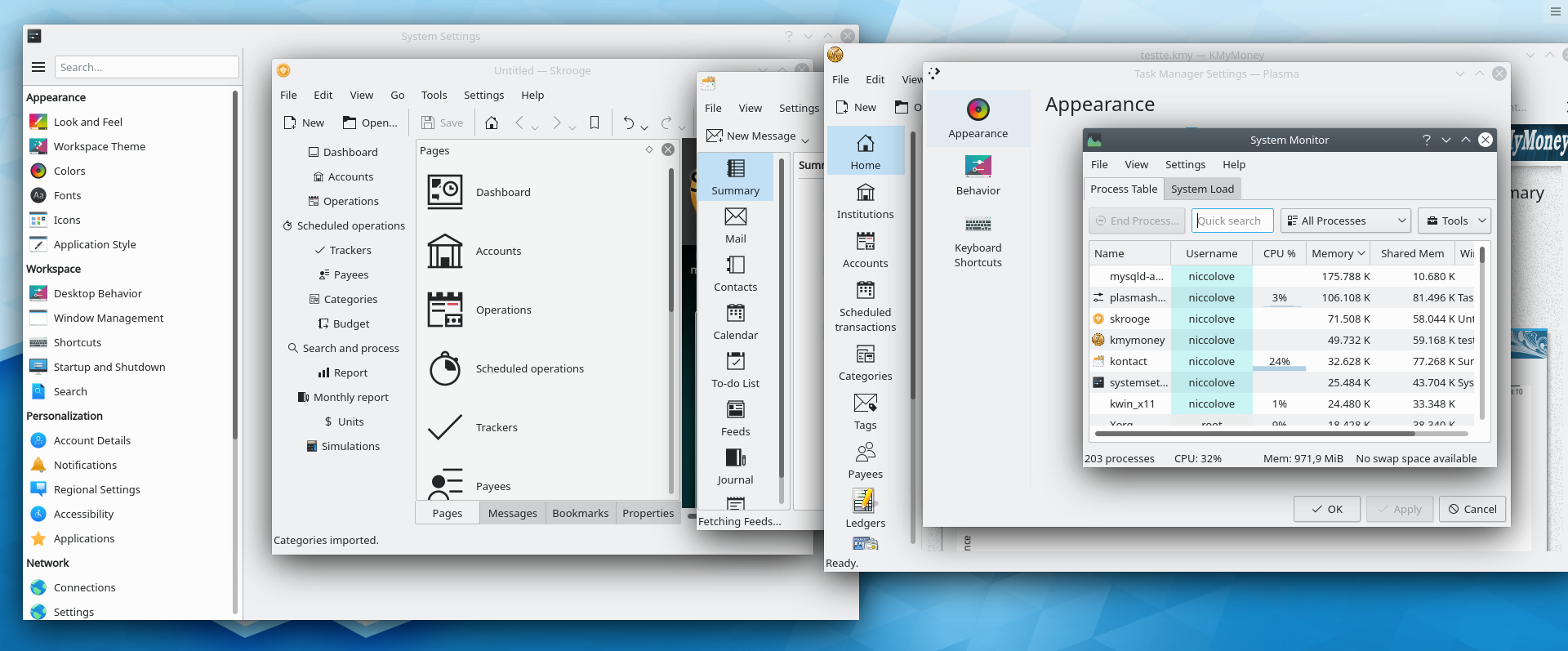
A problem I see is that most application have a high number of views that won't fit horizontal space with labels (I'm looking at Skrooge, KMyMoney, Kontact, ...). Should they be fine with only displaying label for the current one? They probably would prefer a sidebar, which we currently don't consistently offer, so we end up with various inconsistent implementations.
Comment Actions
What about having as a view a component that is not a Kirigami.Page? Such as a StackView or a Rectangle. Why not use an attached property to define its title, icon and other props instead of focing to wrap those components into a kirigami.Page?
Comment Actions
Mmm, the point of this is to provide lateral navigation between pages, not arbitrary elements.
| src/controls/Page.qml | ||
|---|---|---|
| 238 | it's not uncommon for apps to have one page associated with an ongoing task.
| |
| src/controls/SwipeNavigator.qml | ||
| 31 | i don't see how that relates to wanting a larger (bigscreen-sized) header? | |
| 56 | it's still nice to have a collapsed form of the tabbar for small screen sizes | |
| 67 | global actions | |
| src/controls/private/SwipeTabBar.qml | ||
| 13 | I'm aware, but I went with a custom control for more control of the presentation and functionality. | |
| src/controls/SwipeNavigator.qml | ||
|---|---|---|
| 56 | I think the tabbar should not be at the bottom on mobile. It's not necessary to touch the control as swiping from any point of the page should change the page, it is more visible when put at top, it is more consistent with kde and not-kde applications and introduces a position inconsistency between devices (touchscreen laptops should also be taken into consideration). | |
Comment Actions
for those that are a sidebar, there is already a standard, agreed upon look, that is being slowly and painfully moved to be adopted, which is:

| src/controls/SwipeNavigator.qml | ||
|---|---|---|
| 56 | to me on mobile this is basically (or at least, is the only use i would have for such a control): which yeah, should be at the bottom (and kirigami always had as a central point to have as much as possible controls, actions and chrome at the bottom for single hand use) | |
Comment Actions
"Lateral navigation" is basically a tabbed view. So to me this looks like a tabbed view with a different UI for the tabs. We've actually needed a tabbed view component for a while: https://bugs.kde.org/show_bug.cgi?id=394296
Maybe this could be that. I think the swipe navigation is fine. However if this is going to have all the functionality of a tabbed view, it ought to look like a desktop-style tabbed view on the desktop platform. The different tab styling therefore has to go. On mobile, the tabs should look like desktop tabs, and on mobile, the tabs should look like mobile tabs.
Comment Actions
should be fine i think (in there sizing is a bit off, but gives the idea)
This patch is about having the whole app navigation as a tabbed thing, so more like tabs in a webbrowser than a generic tabview (with frame and all which this shouldn't have)
so they are 2 different things: i still think a drop in replacement for a tabview will be needed, but this is probably different beast
so a final look like
should be fine i think (in there sizing is a bit off, but gives the idea)
Comment Actions
i think it probably depends from the app both from tab numbers and semantics of the app?
mayeb is worth to have written down use cases/scenarios with personas and what not to decide?
(btw, ubuntu touch/ubports has an item like that that when the device switches from mobile to desktop, indeed goes from bottom bar to sidebar)
Comment Actions
IMO, the affordances of a traditional tab style hint at tabs being editable. This is fairly established: Chrome uses the traditional tab style for its user-manipulatable tabs, while using a different style for non-manipulatable tabs. Firefox does the same, as well as Falkon. elementary on a platform level uses traditional tabs for manipulatable tabs and a different style for static tabs. macOS does the same thing. Using editable-style tabs when the tabs are non-editable is a misleading affordance, hence why this patch doesn't use them.
Comment Actions
I feel like this needs discussion rather than being presented as a truism. We use tabbed views for non-editable views all over the place throughout KDE software and to be honest I don't see a problem with it. If we're going to declare this to be a bad thing and move towards changing it, we need to first start that discussion, agree on it, and agree on a solution.
Would you like to open the Phab patch for this?
Comment Actions
I agree that that element has the same function on navigating views. I think that either this tasks uses that appearance on desktops (which would kill the "horizontal navigation"), or KCM should switch to whatever look this tasks ends up using (which I'm more in favor of). That's what I was trying to discuss in T11153
Agree.
Comment Actions
All right, you've convinced me.
As for the appearance, we probably need for that to be defined using styles. IMO the material style should get this very google-looking appearance and we should come up with a different one for the Breeze desktop style. I'll admit to being partial to the macOS/ElementaryOS conjoined pill style--without the same degree of roundness, depth, and gradients, of course. @squeakypancakes came up with something I quite like in T13012#227542.
Comment Actions
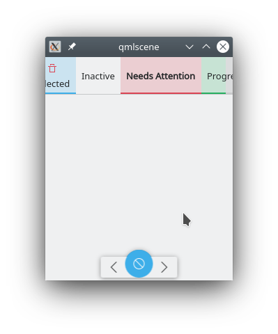
If i make the window narrow enough, that's what happens
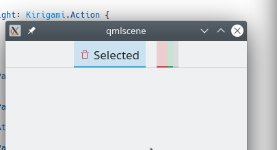
perhaps it tabbar should scroll instead?
Comment Actions
In that window, there's plenty of space for the component to expand horizontally. I would prefer to avoid scrolling tabs; their interaction is usually not great.
Comment Actions
When there isn't room to show all labels, eliding the labels or collapsing the inactive tabs to square-ish icons-only things that are still clickable/touchable would seem to make more sense to me. The above screenshot kind of looks like a visual glitch IMO.
Comment Actions
yes, that screenshot is really broken.
to me is important that the tabbar tries to take all the space available before doing any eliding.
Probably whether starting to elide a lot and make the tabs actually scrollable, will depend case by case depending fro mthe app
| src/controls/SwipeNavigator.qml | ||
|---|---|---|
| 84 | there should be a single instance capable of changing itself between the two states | |
Comment Actions
My answer would be "set a minimum window size", though on mobile that probably wouldn't be applicable.