Make headings of systray and applet merge
ClosedPublic

Authored by niccolove on Apr 4 2020, 8:18 PM.

Details

Summary

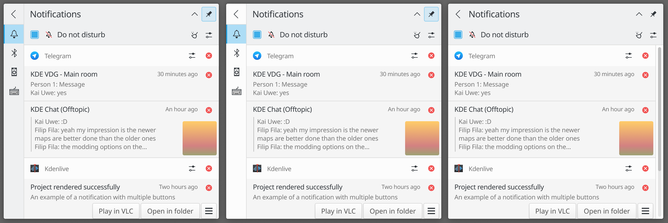
When the applet is a page with a plasmoidHeading as header, merge it with systray one.

The only big problem is that it looks bad when you open said applet while in sidebar view, see:

I'd like to solve that by removing the sidebar and adding a back button, but that would be for another patch in the future.

Test Plan

To be tested together with D28467

Diff Detail

Repository
R120 Plasma Workspace
Lint
Automatic diff as part of commit; lint not applicable.
Unit
Automatic diff as part of commit; unit tests not applicable.
niccolove created this revision.Apr 4 2020, 8:18 PM
Restricted Application added a project: Plasma. · View Herald TranscriptApr 4 2020, 8:18 PM
Restricted Application added a subscriber: plasma-devel. · View Herald Transcript
niccolove requested review of this revision.Apr 4 2020, 8:18 PM
niccolove edited the summary of this revision. (Show Details)Apr 4 2020, 8:19 PM
niccolove edited the summary of this revision. (Show Details)
niccolove added reviewers: Plasma, VDG.
niccolove edited the test plan for this revision. (Show Details)
ngraham added a subscriber: ngraham.Apr 5 2020, 3:36 AM

Hmm, here's what I get when I apply this and then D28467:

Other applets also seem to be affected:

applets/systemtray/package/contents/ui/ExpandedRepresentation.qml
28

Unnecessary newline

ognarb added a subscriber: ognarb.Apr 5 2020, 9:07 AM

I'd like to solve that by removing the sidebar and adding a back button, but that would be for another patch in the future.

-1 from me to remove the sidebar. I really liked how the sidebar looked in the final mockup in T10470 and it is consistent with the Kirigami collapsible sidebar drawer (only the color is wrong)

mart added a subscriber: mart.Apr 6 2020, 9:16 AM

I like the idea of that back button in the sidebar.
@manueljlin how would the last mockup work? (back button and no sidebar)

The last one doesn't have a sidebar and goes back to the list after pressing the back button. It looks a bit cleaner but UX wise it's a bit worse too, having to click two times to do what currently only requires one. I prefer the first and second design but since that one was discussed in the VDG chat I didn't want to leave it there

niccolove updated this revision to Diff 79477.Apr 6 2020, 1:38 PM

Generic fixes

niccolove planned changes to this revision.Apr 6 2020, 1:38 PM
niccolove updated this revision to Diff 79482.Apr 6 2020, 1:48 PM

There was a wrong spacing

niccolove updated this revision to Diff 79483.Apr 6 2020, 1:49 PM

Unnecessary newline

niccolove marked an inline comment as done.Apr 6 2020, 1:49 PM

Should be fixed now

ngraham accepted this revision.Apr 14 2020, 3:38 AM

We could still have a sidebar that goes all the way to the top of the pop-up and also a grid of items on the main page rather than a flat list. The grid items could even animate to their list positions in sidebar form! How exciting.

Anyway, material for another patch, for sure.

This revision is now accepted and ready to land.Apr 14 2020, 3:38 AM
niccolove updated this revision to Diff 80313.Apr 16 2020, 9:14 PM

Only merge if header is actually visible

niccolove updated this revision to Diff 80315.Apr 16 2020, 9:17 PM

third one's a charm

This revision was automatically updated to reflect the committed changes.