Neither the merged look nor the normal one needs to have rounded borders, as they are clipped out from the dialog and they would break third party themes without rounding. Without rounded borders, there's no need for the enabledBorders check, which also broke the heading when used in top panels.
Details
Details
- Reviewers
ngraham - Group Reviewers
Plasma - Commits
- R242:0f9abc2d403d: Remove rounded borders to plasmoidHeading
Diff Detail
Diff Detail
- Repository
- R242 Plasma Framework (Library)
- Lint
Automatic diff as part of commit; lint not applicable. - Unit
Automatic diff as part of commit; unit tests not applicable.
| src/declarativeimports/plasmaextracomponents/qml/PlasmoidHeading.qml | ||
|---|---|---|
| 58 | Worth writing "the default value is false" in the docs, as it's what most people look for. | |
| 69–70 | What should happen if this is set to merged and someone uses a theme that doesn't have a merged- prefix? The old SVG or no SVG at all? | |
| src/declarativeimports/plasmaextracomponents/qml/PlasmoidHeading.qml | ||
|---|---|---|
| 69–70 | I'd go with no SVG, to make sure that the theme creators will see that it's broken and add a merged- look. Keep in mind that the plasmoidheading svg was added barely one month ago, and no big Plasma release had it yet, so I find it very hard to believe that any third party theme already has it. | |
| src/declarativeimports/plasmaextracomponents/qml/PlasmoidHeading.qml | ||
|---|---|---|
| 69–70 | agree with nicolove | |
Comment Actions
So I have a heretical thought here: maybe we should consider using a CSD-style headerbar for system tray plasmoids with toolbar-style controls and put the controls on the same row as the header.
No wait, hear me out! This pop-up doesn't suffer from most of the disadvantages of CSD headerbars since they aren't movable or resizable and we have total control over the presentation. And using this style would allow us to achieve visual consistency with Kirigami-style toolbars, which have the title on the left and a toolbar with controls on the right. We might need to increase the width of the pop-ups to accommodate long translations, and the space for toolbar content would be very limited so we'd need to use icons-only buttons for everything; no labels. The drawbacks might still outweigh the advantages. Anyway I just wanted to bring it up as an option. :) I'm not at all opposed to this idea here, I just wanted to present a possible alternative.
| src/declarativeimports/plasmaextracomponents/qml/PlasmoidHeading.qml | ||
|---|---|---|
| 58 | Might be worth saying, "...merged with another plasmoidheading underneath this one..." for clarity | |
Comment Actions
The same thing was actually proposed by I think @ndavis a while back, see https://phabricator.kde.org/T10470#219994 .
To summarize, it's perfectly technically possible and I actually rather like it.
Comment Actions
Awesome, might be something to explore!
I think this patch should probably go in too, since even if we have headerbar-style headers, there are still going to be cases where we'll want a second row to put more controls in. But yeah, for the common case of just a few toolbuttons, putting them in the same row as the title would be really nice IMO. Feel free to polish up and submit that proof-of-concept patch you were mentioning in the other thread!
Comment Actions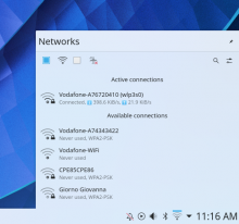
While I think this looks much better:

YMMV. What do you think?
Generally speaking, I'd still like for all applets to have a row of plasmoidheading on the bottom of system tray's own because having just system tray plasmoidheading, especially with the new small font, does not feel "enough" to me; if you look at every @manueljlin mockups, you'll see they have two rows of heading. I think it's because there's a visual minimum (plasmoidheading area / normal background area) ratio to look pretty. To clarify, I think this is not ideal:

While I think this looks much better:
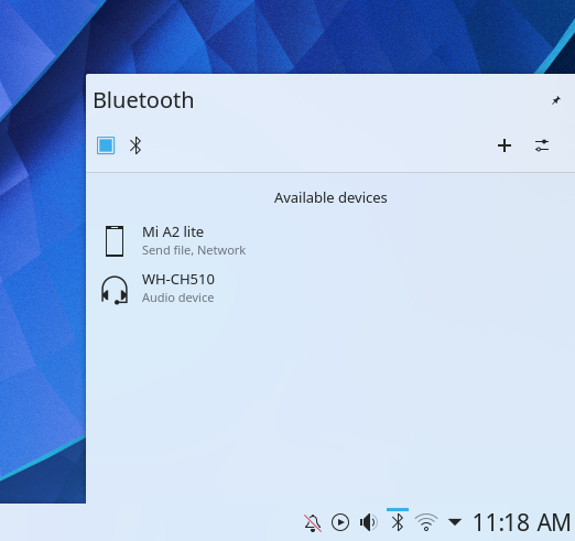
YMMV. What do you think?
Comment Actions
The second image definitely looks better than the first. However I wonder if we could even combine them into just one row. For toolbars with nothing but icons-only buttons, they kind of feel like they're screaming out to be integrated into the header.
For toolbars with controls that have labels, yeah, those should probably be on a second row.