Applies the KDE1-style 'Classik' titlebar button icon style to Breeze
Needs RevisionPublic

Authored by paulm on Mar 27 2020, 5:28 PM.

Details

Summary

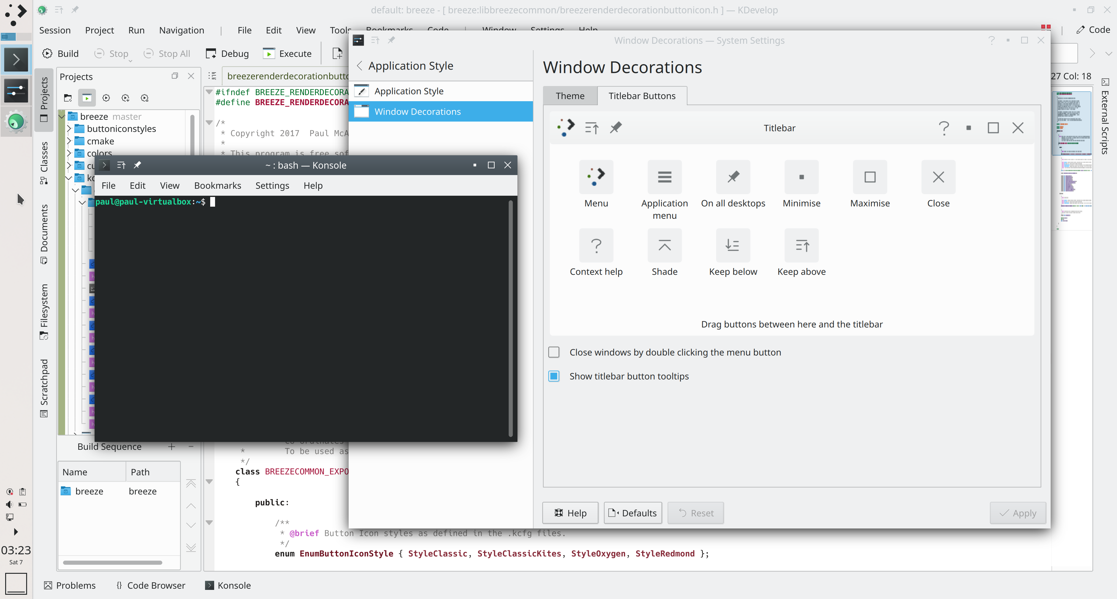
As described in T12793 , this patch applies the KDE1-style 'Classik' titlebar icon styles to Breeze.

In this diff, for Breeze, it modifies both kdecoration and kstyle so that there will be consistency when titlebar-like buttons are used within applications.

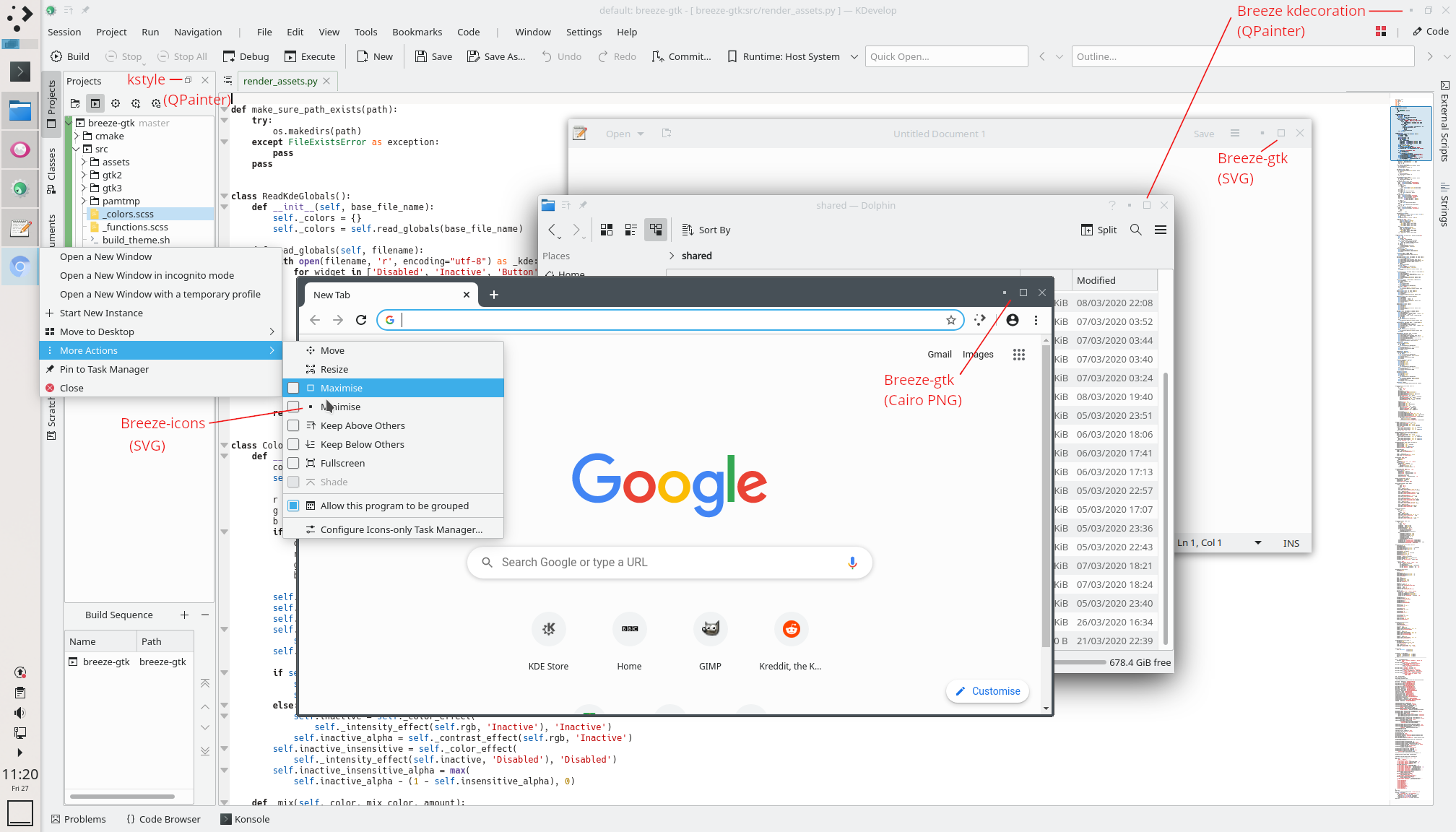
In D28358 , for Breeze-GTK both new SVG files are added (affecting GTK applications with client-side-decorations in the titlebar like gedit), and the python script has been updated to generate new .png files with Cairo (affecting applications like Chromium).

In D28359 Breeze-Icons, the action icons for window operations have been updated to match the 'Classik' style.

Screenshot from before applying patch:

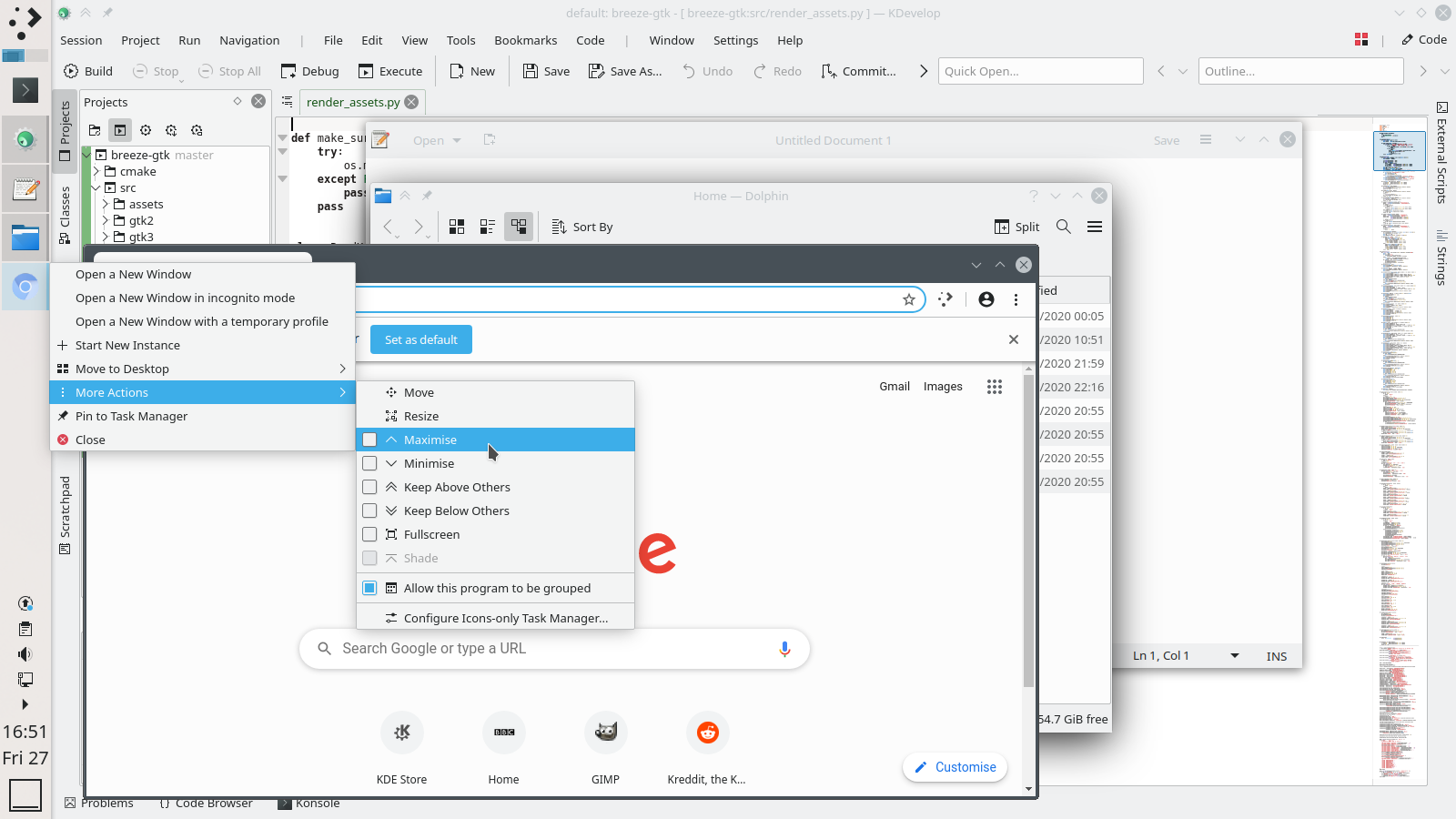
Screenshot from after applying patch:

Annotated version of previous screenshot, labelled in red with which modules are rendering which icons:

Another screenshot showing all the titlebar icons after the patch:

Diff Detail

Repository
R31 Breeze
Lint
Lint Skipped
Unit
Unit Tests Skipped
paulm created this revision.Mar 27 2020, 5:28 PM
Restricted Application added a project: Plasma. · View Herald TranscriptMar 27 2020, 5:28 PM
Restricted Application added a subscriber: plasma-devel. · View Herald Transcript
paulm requested review of this revision.Mar 27 2020, 5:28 PM
paulm edited the summary of this revision. (Show Details)
paulm updated this revision to Diff 78682.Mar 27 2020, 5:31 PM
paulm updated this revision to Diff 78684.Mar 27 2020, 5:36 PM
paulm retitled this revision from Applies the KDE1-style 'Classik' titlebar button icon style to Breeze, Breeze-GTK and Breeze-Icons to Applies the KDE1-style 'Classik' titlebar button icon style to Breeze.Mar 27 2020, 5:40 PM
paulm edited the summary of this revision. (Show Details)Mar 27 2020, 5:45 PM
cblack requested changes to this revision.Mar 27 2020, 5:45 PM
cblack added a subscriber: cblack.

IMO, the maximise and minimise buttons are a step backwards from the current decorations in terms of legibility and aesthetics.
Minimise especially, considering that a square has no meaning at all. Maximise is also less aesthetically pleasing than the current one IMO.

However, I like the new keep below and keep above icons.

This revision now requires changes to proceed.Mar 27 2020, 5:45 PM
paulm edited the summary of this revision. (Show Details)Mar 27 2020, 5:45 PM
davidre requested changes to this revision.Mar 27 2020, 6:05 PM
davidre added subscribers: broulik, davidre.

-1
I think the current design is fine. It has been part of the default kde look for many years (for all of oxygen and breeze) and forms a core part of our design brand. It's something where you can spot breeze on the first look as @broulik said (or something similar). We shouldn't give that up for imitating Windows. It seems MacOS can get away with colored circles without people complaining about usability. I think the arrows convey enough meaning as is.

paulm added a comment.Mar 27 2020, 6:09 PM

IMO, the maximise and minimise buttons are a step backwards from the current decorations in terms of legibility and aesthetics.
Minimise especially, considering that a square has no meaning at all. Maximise is also less aesthetically pleasing than the current one IMO.

However, I like the new keep below and keep above icons.

I would beg to disagree. After having this for a while on my system I feel the opposite and can't look at the aesthetics of Breeze-Oxygen any more!

The square minimize icon does not mean nothing - it now visually describes what the window looks like once minimized (i.e. compressed), as does maximize (i.e. expanded into a large square).

There is no visual description with the existing arrows which could mean many things. The existing arrows don't have a clear meaning at all - it is not clear whether the down arrow, for example would move the window down, minimize, restore, provide a drop-down menu, scroll etc. As I said in the task, I've seen several users put off KDE just because of the unorthodox nature of Plasma's titlebar buttons.

paulm added a comment.EditedMar 27 2020, 6:11 PM

It has been part of the default kde look for many years (for all of oxygen and breeze) and forms a core part of our design brand. It's something where you can spot breeze on the first look. It seems MacOS can get away with colored circles without people complaining about usability.

I would argue that usability is far more important than branding, and that KDE's brand is not that popular, especially since KDE4 there was a migration away from KDE, coinciding with the Oxygen theme; there are millions of more users that could be migrating to Linux than exist already. The fact that you are on a usable open-source GNU system should sell KDE more than anything! The main thing being imitated here is also KDE1! The arrows in Oxygen/Breeze remind me more of the Windows 3.1 brand and the usability problems I had when I first tried to use it.

I for one would argue that MacOS also does this very badly, and that MacOS usability is not as great as the fanatics would attest.

ndavis added a subscriber: ndavis.EditedMar 28 2020, 1:56 AM

It has been part of the default kde look for many years (for all of oxygen and breeze) and forms a core part of our design brand. It's something where you can spot breeze on the first look. It seems MacOS can get away with colored circles without people complaining about usability.

I would argue that usability is far more important than branding, and that KDE's brand is not that popular, especially since KDE4 there was a migration away from KDE, coinciding with the Oxygen theme; there are millions of more users that could be migrating to Linux than exist already. The fact that you are on a usable open-source GNU system should sell KDE more than anything! The main thing being imitated here is also KDE1! The arrows in Oxygen/Breeze remind me more of the Windows 3.1 brand and the usability problems I had when I first tried to use it.

I for one would argue that MacOS also does this very badly, and that MacOS usability is not as great as the fanatics would attest.

KDE4 was unpopular because it was heavier and buggier, not because the titlebar buttons were different. I didn't like KDE back then either (I mainly used GNOME 2 and Unity), but I did like the window decorations. I think the current buttons are clear enough as they are and any change would be more of a branding change than a usability change. KDE 1 copied a lot from CDE, including the titlebar buttons. Windows 3.1 is different enough that we're pretty obviously not copying it. We also have a maximized symbol, unlike Windows 3.1.

ndavis requested changes to this revision.Mar 28 2020, 1:56 AM
paulm added a comment.Mar 28 2020, 2:35 AM

KDE4 was unpopular because it was heavier and buggier, not because the titlebar buttons were different. I didn't like KDE back then either (I mainly used GNOME 2 and Unity), but I did like the window decorations. I think the current buttons are clear enough as they are and any change would be more of a branding change than a usability change. KDE 1 copied a lot from CDE, including the titlebar buttons. Windows 3.1 is different enough that we're pretty obviously not copying it. We also have a maximized symbol, unlike Windows 3.1.

I have been with KDE from the KDE1 days and personally generally liked KDE4 (have never strayed to GNOME :P). I just never liked Windows 3.1's interface nor the Oxygen Windows 3.1-style titlebar buttons (the maximized/restore symbol exists on both and is the same concept - an up arrow fused with a down arrow, though less obvious with Oxygen):

I was also a CDE user on HP-UX back in the day, and think CDE's window controls are no bad thing!

I just think there is a reason why a lot of people are being recommended desktops like Cinnamon, MATE and XFCE etc. to relatives rather than KDE despite Plasma being technically better. It is little things like this where style/branding being prioritised over thinking about how a new user will find intuitiveness/familiarity that is keeping "the year of the Linux desktop" far away!