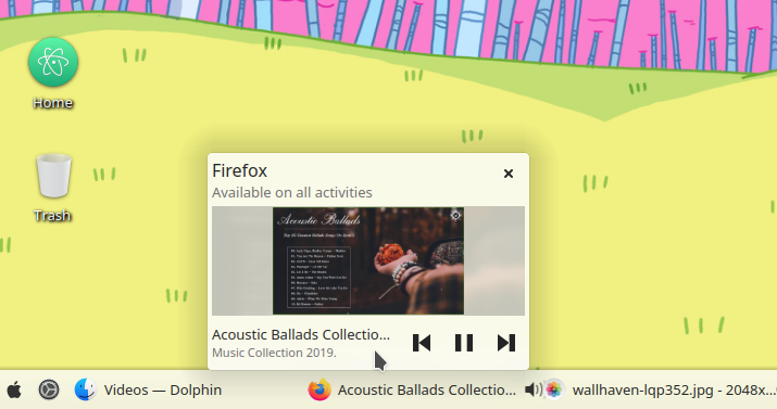
The size of tooltips are not changed between cases:
e.g. a normal window vs a window which is available on all activities,
e.g. a normal window vs a window which has a player...
| No Linters Available |
| No Unit Test Coverage |
| Buildable 22649 | |
| Build 22667: arc lint + arc unit |
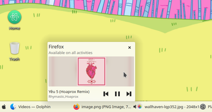
Okay, seeing this in action, I don't hate it. However I feel like my concern with the album art being squeezed too much is valid:
Even the windows previews get squeezed a lot:
If we're going to do this, I think the rectangle should be either larger or taller.
We can increase the height a bit, but not sure which ratio is the best.
Another thing is that, even with a bigger thumbnail, we could hardly see its content, so making it bigger doesn't make it more clear.
We should avoid making it larger, otherwise it looks ugly on small screens.
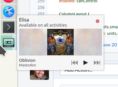
Does the 1.5 ratio look better to you?
That's better, though I dunno, I can't shake the feeling that the album art is still too compressed:

Maybe I'm just being crotchety though. VDG folks, what does everyone else think?
Hmm, I think the 1.5 ratio makes a nice shape overall while the thumbnail is also not too small.
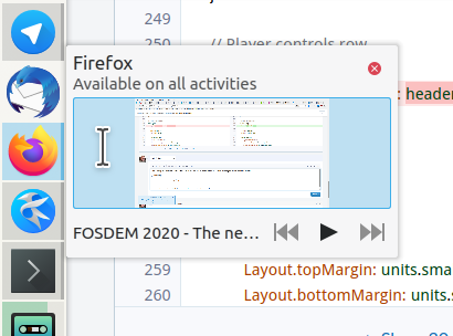
A tooltip has texts and a thumbnail, we needn't too focus in the thumbnail as well as try to make it fill all the width.
You can also try the GoldNumber/Ratio that is found in all real nature patterns and also at Ancient Greeks in their architectural buildings. That is 1.618, there is a big chance that it feels right without being able to explain why.
