With other two patches, this aims to make leftMargin consistent in widgets (See https://phabricator.kde.org/D26945 and https://phabricator.kde.org/D26944)
Details
Details
- Reviewers
ngraham - Group Reviewers
VDG Plasma - Commits
- R120:149075077b82: Changed leftMargins to smallSpacing to be consistent
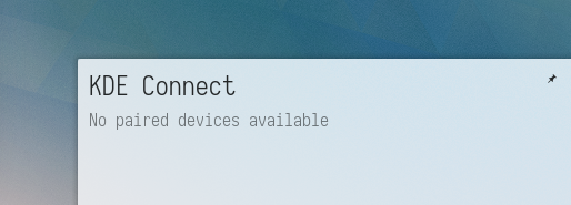
System tray
Before:

After:
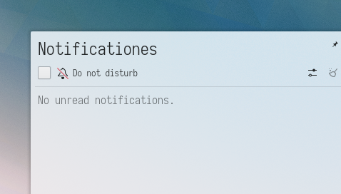
Notifications
Before:

After:
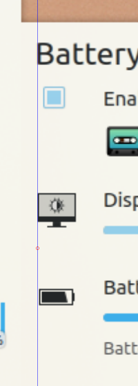
Battery monitor
Before:
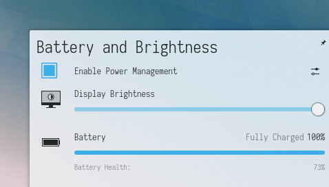
After:

Self reminder: networkmanager is still slightly badly aligned
Diff Detail
Diff Detail
- Repository
- R120 Plasma Workspace
- Branch
- smallspacingmargin (branched from master)
- Lint
No Linters Available - Unit
No Unit Test Coverage - Build Status
Buildable 21710 Build 21728: arc lint + arc unit
Comment Actions
Hmm, it almost seems like the header in the popup is over too far to the right, and we should fix that (and maybe increase the default margins in the theme: D21813) rather than adding extra margins in every plasmoid.
Comment Actions
I thought about this; so, I should remove margins from everywhere, and we add them to the desktop theme? I can make that patch
Comment Actions
What I care about is that the margins are consistent and things are properly left-aligned by default. That is to say, nothing should have to override the default margins to have everything perfectly aligned.
Comment Actions
After trying a different solution, I'd suggest to go with these patches as a short term solution. I generally want to revise margins for desktop theme - so panels as well - but I'd like to see this fixed before that. Keep in mind that this is not overriding the margins, but just adding up to them, something that most of our applet do.
Comment Actions
All right, feel free to re-open it and re-base on current master (there has been a lot of work to these applets lately).
Comment Actions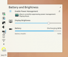
So, with a left panel, I see the following:

Things are improved, but the vertical alignment is still not perfect. :(
Comment Actions
Seems aligned to me, the problem is that the new small checkbox has a margin to the left by default.
Seems aligned to me, the problem is that the new small checkbox has a margin to the left by default.
| applets/batterymonitor/package/contents/ui/PopupDialog.qml | ||
|---|---|---|
| 127 | I don't see why decrease this spacing. | |
Comment Actions
Uff, I screwed up landing this patch: https://cgit.kde.org/plasma-workspace.git/commit/