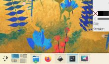
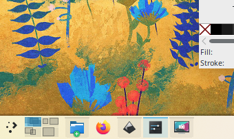
Used the T11124 highlight effect for breeze tabbars by editing the file widgets/tabbar.svg.

Diff Detail
Diff Detail
- Repository
- R242 Plasma Framework (Library)
- Branch
- tabbar_blue_background (branched from master)
- Lint
No Linters Available - Unit
No Unit Test Coverage - Build Status
Buildable 18878 Build 18896: arc lint + arc unit
Comment Actions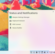
Something like this looks better and clearer.
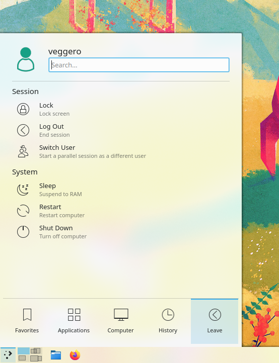
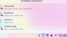
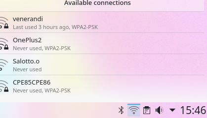
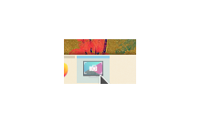
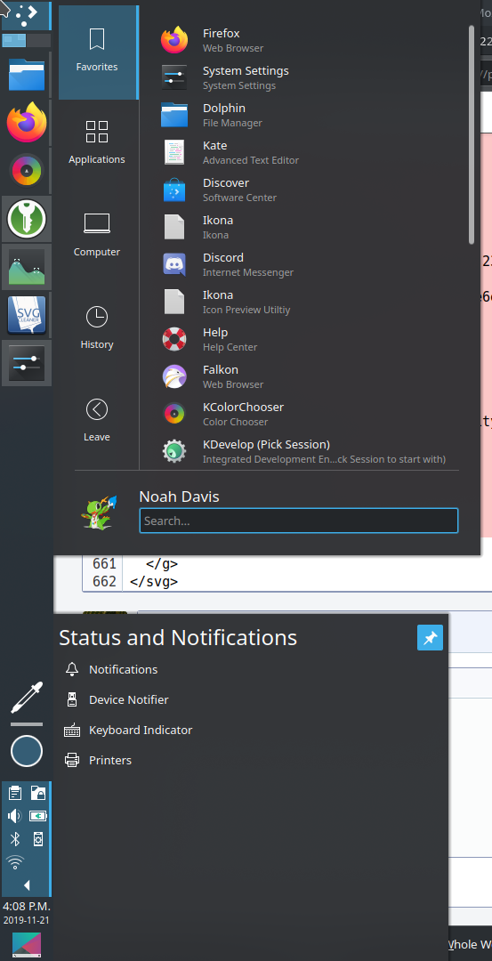
Is it possible to make the selection of system tray visually more cleary?
On this screenshot i see that opened the "Status and Notifications" tray popup, but it looks like that selected all in the system tray.

Something like this looks better and clearer.
Comment Actions
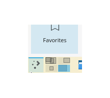
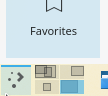
That's because no element was selected. If you select an element, only that one appears selected:
Comment Actions
This is great, I've wanted Plasma tabs to look like this for ages. It gels very well with the in-progress highlight changes that @ndavis is working on. However for me it only seems to take effect for horizontal tab bars. Did you change the SVGs for vertical tab bars as well?
I also noticed one visual papercut in the plasma-pa tab bar: the blue line highlight becomes thinner on the right edge:
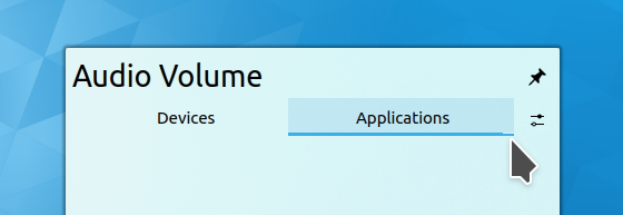
Any idea what's up with that?
Comment Actions
Uh, yes I did. Try deleting the plasma theme + svg cache in .cache
I also noticed one visual papercut in the plasma-pa tab bar: the blue line highlight becomes thinner on the right edge:
Any idea what's up with that?
Fixed, my bad. Or, better put, OOPSIE WOOPSIE! Uwu I made a fucky wucky! A wittle fucko boingo!
Comment Actions
Perfect, all issues fixed, and thanks for pointing me in the direction of the cache files. Deleting those fixed a bunch of other issues I was having with applying plasma theme SVG changes.
This looks great to me.
Other VDG or Plasma folks, any comments?
Comment Actions
But then, tweaking things around, I realized that a 2px line looks way better in my panel, imo:
Therefore right now this effect and the application hover effect are inconsistent. I'm not a fan of bringing back that 3px line though. Do you think I should change the application top lines, or leave them as-is?
Did it fix the shadows? I can't apply my own shadows to the new distro I'm using.
Regarding this task, I just realized a possible problem:
I originally copied this effect from the highlight effect that's used when you hover on applications, which uses a 3px blue line:

But then, tweaking things around, I realized that a 2px line looks way better in my panel, imo:
Therefore right now this effect and the application hover effect are inconsistent. I'm not a fan of bringing back that 3px line though. Do you think I should change the application top lines, or leave them as-is?
Comment Actions
If anything, I think the tab bar line should increase to be 3px to match the open app task manager highlight. If we do the reverse, the highlight for open app swill be too subtle IMO.
Comment Actions
After:

At this point open-but-inactive applications could be made more visible by adding a gray background as transparent as the blue on.
I think that this last one looks much prettier and usable, but that's just an idea I only wanted to try, feel free to tell me that's not a good idea. Also, changing the background colors there could also be done regardless of the line thickness. I just felt like it was much prettier.
Uhm, what if we drew the blue background for the active app? That is what Windows does as well, and I think it makes sense. When you open a widget, the window will lose focus, so there will never be two elements with blue background in the panel. Hover is still clearly visible. See:
Before:

After:

At this point open-but-inactive applications could be made more visible by adding a gray background as transparent as the blue on.
I think that this last one looks much prettier and usable, but that's just an idea I only wanted to try, feel free to tell me that's not a good idea. Also, changing the background colors there could also be done regardless of the line thickness. I just felt like it was much prettier.
Comment Actions
I agree 100%, and in fact this is also something I have wanted for a long time. It would be a big improvement IMO. There's a bug report requesting this somewhere, I just need to find it...
Comment Actions
Found the bug report tracking that requested change: https://bugs.kde.org/show_bug.cgi?id=370465
Based on the comments there, it's likely that this proposal would receive pushback, and we should endeavor to understand why it was changed to the current state in the first place. That's not a reason to hold back on doing it, we just need to understand the history and make the change for legitimate usability-based reasons so it's not perceived as "flipping things back and forth over and over again".
Comment Actions
You can do two patches at once. Just do each on a separate git branch, and then they won't interfere with one another. See https://community.kde.org/Infrastructure/Phabricator#Workflow
Comment Actions
The relevant quote:
Kai Uwe Broulik 2018-04-03 07:51:10 UTC
We had exactly what you suggest for a while and then it was changed back to line art. Can we stop randomly changing theme whenever someone comes by and doesn't like something unless it actually comes enclosed with a 20 page empirical study made in a lab or something?
Looks like he's referring to using only colored backgrounds, which is not what we're doing now. I do think the current way of showing window state is visually a bit confusing.
Here's what I think:
- The line should indicate that the app is opened, the window is not minimized and the window is focused (opaque blue) or inactive (opaque gray)
- The background should indicate whether an app is not opened (no BG), minimized or inactive (semi-transparent gray), or focused (semi-transparent blue)
This way it mostly doesn't change, but the visuals have more of a logical relation to each other.
Comment Actions
If we use a 2px line here, then using a 2px outline for button focus in D24706 would be more acceptable. If a 2px line looks good in the task manager, it might be worth making the change.
Comment Actions
Can you remove the line width changes from this? When this patch just adds the transparent blue background, I think it's pretty uncontroversial and read to land quickly.

Comment Actions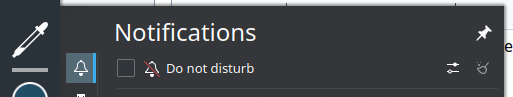
Something about this feels wrong:
Same here:
Even if the colors are fixed, there are a number of other places that need fixes in order for this to look right, so I think we should hold off landing this until these issues are fixed:
Not extending to the edge:
Something about this feels wrong:
Same here:
These may need separate patches to the code that controls the widgets.
Comment Actions

I agree.
Something about this feels wrong:
I agree. Not extending all the way to the edge was originally fixed by D19745, but that got reverted in 2594eb1b33b56ec7e0e8eb6c37acb1c7f2a5a1ff because it caused other regressions that the patch author never returned to correct. We'd need to revisit this and do it in a regression-free manner.
More generally, IMO double-width panels need to increase the size of the icons by default so that they remain in a single row/column, because having a grid of systray icons is just awful we get many bug reports about people wanting this changed by default: https://bugs.kde.org/show_bug.cgi?id=360333 It's easily worked around locally by adding iconSize=2 to ~/.config/plasma-org.kde.plasma.desktop-appletsrc in the section that has extraItems= in it. It's a pretty trivial solution that works fairly well as the icons scale themselves down when the panel is shorter. Looks like this with a double-height panel:
Maybe worth investigating.
Same here:
Looks like a lack of adequate side margins. This code is super fragile, sadly. I can give it a look-see.
Comment Actions
Honestly I think this is fine to land now. We can incrementally improve things with patches to individual widgets, but for the most part I think this is a big improvement already.
Comment Actions
I disagree. Maybe it looks good enough on Breeze, but it looks pretty bad on Breeze Dark, even if it's not the fault of this patch. If those issues didn't get fixed before the next frameworks release, we'd have to revert this commit.
Comment Actions
Are you talking about the effect itself in terms of its background color, or how it fits in the space available when displayed by widgets? The latter will require many complicated changes in various places to fix, but can't the former be fixed in this patch?
Comment Actions
I'm talking about both. I believe the former may also be complicated since I don't know where the problem is coming from. It should have been as simple as setting the opacity to an appropriate level, but something is tinting the background white.
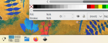
| src/desktoptheme/breeze/widgets/tabbar.svg | ||
|---|---|---|
| 47 | Oh wait, this must be where the color problem is. It's hardcoded to a light color. | |
| src/desktoptheme/breeze/widgets/tabbar.svg | ||
|---|---|---|
| 47 | It should be ButtonFocus with semi-transparency instead. | |
Comment Actions
I'm sorry, isn't this right?
The top one was like that before, and I just edited the bottom one, and they seem to be the same; shouldn't it be right then?
I'm sorry, isn't this right?
The top one was like that before, and I just edited the bottom one, and they seem to be the same; shouldn't it be right then?
Comment Actions
Yes that's right, the Kickoff tabs are fine, it's the panel that doesn't look right. It just doesn't look good with that kind of highlight to me. Or maybe the highlight background is too bright.
Comment Actions
To me it looks fine with Breeze light IMO. If you think it looks bad with Breeze Dark, that seems like kind of a problem since as far as I was aware, this is the proposed new highlight style that you're working on, right? It definitely needs to look good with Breeze Dark, or at least no worse than the status quo.
Comment Actions
I've found that breeze dark needs a higher chroma dark blue for the background to look good. It's easy enough to do with KColorUtils::tint() (doesn't work the same as Qt.tint() in QML), but I don't know how you'd do that in SVG. When you use semi-transparency for a higher chroma color on top of a background with lower chroma, it reduces the chroma of the higher chroma color.
Comment Actions
As per the screenshot above, this patch highlight look just as it was before in Breeze Dark, there was no change of that. If you think the current highlight is wrong with breeze dark, I could create a different task for that.
Comment Actions
Darker could be (example value):
Otherwise, the highlight effect could be made more transparent so that it's darker, but that would be a problem for consistency, as the same highlight color is also used throughout the desktop theme.
Breeze dark highlight is currently #3daee9 in the Breeze Dark colorscheme. If that's too light, we could darken it there, right?
Currently it's:
Darker could be (example value):
Otherwise, the highlight effect could be made more transparent so that it's darker, but that would be a problem for consistency, as the same highlight color is also used throughout the desktop theme.
Comment Actions
The base highlight color is not the problem, it's the background area based on the highlight color.