Use an eyedropper for color-picker icons
ClosedPublic

Authored by ngraham on Nov 3 2019, 7:35 PM.

Details

Summary

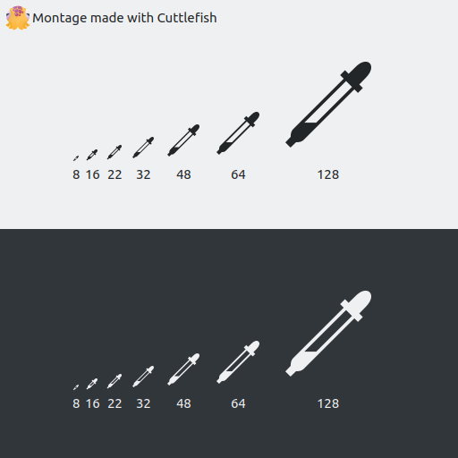
The current icon is a black droplet which doesn't really communicate "pick a color from
the screen", though that's what this icon is used for. Other apps use an eyedropper for
this too.

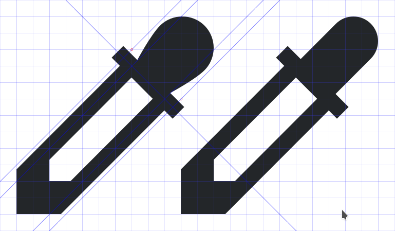
This icon is a modification of one submitted in https://bugs.kde.org/show_bug.cgi?id=403924.
I've cleaned it up to pixel-align everything, use the correct margins, and do the CSS stylesheet
magic.

BUG: 403924
FIXED-IN: 5.65

Test Plan

Montage:


In Kolourpaint:

Diff Detail

Repository
R266 Breeze Icons
Lint
Automatic diff as part of commit; lint not applicable.
Unit
Automatic diff as part of commit; unit tests not applicable.
ngraham created this revision.Nov 3 2019, 7:35 PM
Restricted Application added a project: Frameworks. · View Herald TranscriptNov 3 2019, 7:35 PM
Restricted Application added a subscriber: kde-frameworks-devel. · View Herald Transcript
ngraham requested review of this revision.Nov 3 2019, 7:35 PM
ngraham edited the summary of this revision. (Show Details)Nov 3 2019, 7:37 PM
ndavis added a subscriber: ndavis.Nov 3 2019, 10:31 PM

I think it needs to be a little more Breezy. Here are 2 of my attempts with the 16px version:

In order to make the lines crisper at small sizes: used the technique described here: https://community.kde.org/Guidelines_and_HOWTOs/Icon_Workflow_Tips#Diagonal_lines

For the 1st attempt, I tried to make it more like your version. The round bubble at the end was tricky. If you want me to explain exactly how I did it, I can, but it's rather lengthy. There might be a faster way that I haven't discovered.

For the 2nd attempt, I tried to make it more like what I usually see when I see eyedroppers IRL. I just made a simple 3x3 circle, put it in the top right, cut it in half from top left to bottom right and drew a diagonal box from the ends of the semicircle to the main body of the shape.

ndavis added a comment.EditedNov 3 2019, 10:34 PM

Here's another idea:

Makes it look like it has some kind of liquid inside of it.

I dunno, the alternative you've produced looks has a really chunky and unattractive tip to me, but I like some of the other elements. I could maybe square off the little protruding wings on the side though, and make the squeezey bit on the top part more straight. I also like the liquid level inside in yours.

Like this maybe?

The chunky look works well at 16px, but I can see it sticking out at larger sizes.

These ones have pointier tips:

1x

4x

partially filled:

Like this maybe?

Can you show it at 16px and 4x 16px?

ndavis added a comment.Nov 4 2019, 8:50 PM

another set

ngraham updated this revision to Diff 69471.Nov 8 2019, 5:14 PM

Update to be a bit more Breezey and address review comments

ngraham edited the summary of this revision. (Show Details)Nov 8 2019, 5:15 PM
ngraham edited the test plan for this revision. (Show Details)
ndavis requested changes to this revision.EditedNov 9 2019, 1:41 AM

I still think the lines on the side of the tube need to be a bit thicker. They're almost half a pixel thick, which is not in line with what we normally do and it makes them fuzzy or light gray. 1px diagonal strokes converted to paths should look right, but you'll have to change the shape of the body a bit to fit the new sides. The tip should also be exended to fill the bottom left pixel, otherwise it's kind of blurry.

You see the difference in clarity for the sides and tip?
top: original
left: modified with pointy tip, right: modified with thicker tip

8x

This revision now requires changes to proceed.Nov 9 2019, 1:41 AM
ngraham updated this revision to Diff 69699.Nov 13 2019, 7:01 PM

Thicken side lines

ngraham edited the test plan for this revision. (Show Details)Nov 13 2019, 7:02 PM
ndavis accepted this revision.Nov 13 2019, 9:08 PM

LGTM, but I noticed that there is a 32px monochrome icon. Should we keep using 32px monochrome icons for now? It seems like we can't make up our minds on this issue and the amount of work required to complete a move in either direction leads to us not wanting to commit to either direction.

This revision is now accepted and ready to land.Nov 13 2019, 9:08 PM
This revision was automatically updated to reflect the committed changes.