Makes text more readable on dark backgrounds by not changing the text opacity.
Subtext and category now have the same intensity, though.
Details
Details
- Reviewers
davidedmundson - Group Reviewers
Plasma VDG - Commits
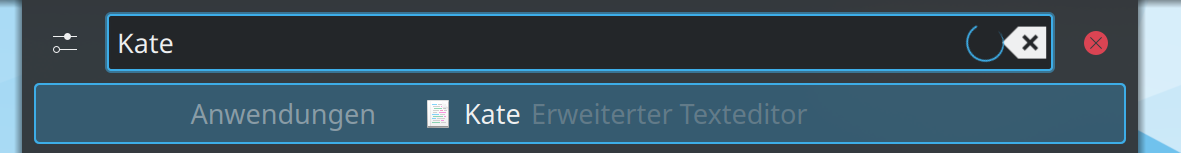
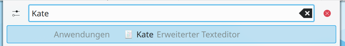
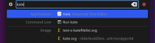
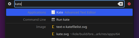
- R112:eed4eb1ed5a1: [ResultDelegate] Use theme.disabledColor
Before

After
Diff Detail
Diff Detail
- Repository
- R112 Milou
- Lint
Automatic diff as part of commit; lint not applicable. - Unit
Automatic diff as part of commit; unit tests not applicable.
Comment Actions
Not a fan of this for 2 reasons:
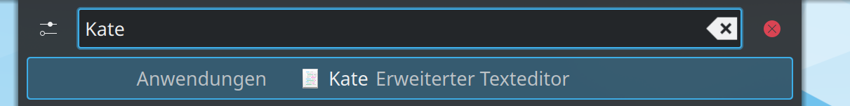
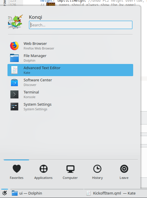
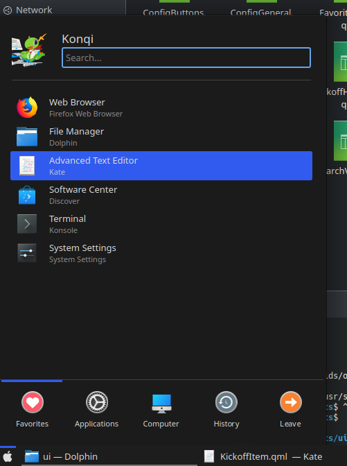
- we have no control over color schemes; they might have dumb values for this color; in fact this is what I get now when testing this patch with Breeze and the Breeze Dark color scheme:
- it's not consistent with how this effect is achieved elsewhere in Plasmashell (where the opacity is 0.6 and not 0.5 or 0.3, so it seems that was wrong here).
I'd just raise the opacity values instead.
Comment Actions
in fact this is what I get now when testing this patch with Breeze and the Breeze Dark color scheme:
Make sure your plasma-framework is up to date
- it's not consistent with how this effect is achieved elsewhere in Plasmashell (where the opacity is 0.6
So plasmashell must be fixed. The idea is to get rid of the opacity 0.6 everywhere. In fact, we have a DescriptiveLabel that should be used instead.
Comment Actions
I have the latest package installed in KDE Neon Dev Unstable, does it need to be compiled instead for some very recent change?
- it's not consistent with how this effect is achieved elsewhere in Plasmashell (where the opacity is 0.6
So plasmashell must be fixed. The idea is to get rid of the opacity 0.6 everywhere. In fact, we have a DescriptiveLabel that should be used instead.
Isn't DescriptiveLabel just a label (a QQC1 based at that) with 0.6 opacity when inactive?
Comment Actions
@kbroulik we should try to wait if there is an ongoing discussion.
I have the latest package installed in KDE Neon Dev Unstable, does it need to be compiled instead for some very recent change?
Yes, there's a partner patch adding a disabledText role to Plasma theme to bring it in line with kirigami.
I think Neon builds once every night? If you don't have it your console will be spewing errors saying "no such role"
we have no control over color schemes; they might have dumb values for this color; in fact this is what I get now when testing this patch with Breeze and the Breeze Dark color scheme:
This is a very valid point, but any colour scheme should define a disabledText colour as QWidgets and Kirigami will be using that.
Do we have any colour schemes which are used only in plasma?
Isn't DescriptiveLabel just a label (a QQC1 based at that) with 0.6 opacity when inactive?
QQC1 Label and QQC2 labels are both Text directly, so not a huge difference. We should upgrade it though.
Also yes, we should change DescriptiveLabel
Comment Actions
I don't get that error when running plasmashell and kwin in the console, but I'll build plasma-frameworks later tonight and see if that fixes it.
we have no control over color schemes; they might have dumb values for this color; in fact this is what I get now when testing this patch with Breeze and the Breeze Dark color scheme:This is a very valid point, but any colour scheme should define a disabledText colour as QWidgets and Kirigami will be using that.
Do we have any colour schemes which are used only in plasma?
Hmm not sure, I'll test a bunch of them later on when plasma-framework compiles.
Isn't DescriptiveLabel just a label (a QQC1 based at that) with 0.6 opacity when inactive?
QQC1 Label and QQC2 labels are both Text directly, so not a huge difference. We should upgrade it though.
Also yes, we should change DescriptiveLabel
Seems like it would be good then to add DescriptiveLabel to PC3 and set color: theme.disabledTextColor there and replace all labels which need such treatment (including here) with it? One problem I see though is how do we achieve the inactive vs. active effect that was now done with the 0.6 : 0.8 trick.
FWIW I don't mind moving away from opacity, just wanted to check if it'll work right and if we'll be implementing it elsewhere. It will also help us work around the Qt bug whereby label opacity fails with NativeRendering when the dialog is quite transparent.
Comment Actions
Wait, this is the Breeze Dark colorscheme with the Breeze desktop theme? The desktop theme that gets its colors from the system colorscheme? If so, something is seriously wrong here.
Comment Actions


No, it's OK. These two patches are the dependencies:
- https://github.com/KDE/plasma-framework/commit/5f46dd6bd52a2aac7f879eb7f14d26dc2cab5e3c
- https://github.com/KDE/plasma-framework/commit/1f6d7591e96a48823e3f152bc52f8c9066165de4
But I did a quick test with different themes and the results confirm my suspicions about this patch not working great with other themes.
McMojave:
Qogir:
Arc Color:
The old always present problem with dark themes is traded in for a sometimes present issue with both dark and light themes.
Can we please test and discuss this some more?
Comment Actions

Ping.
I don't think worsening text legibilty with some themes is a good feature for an LTS release.
If this is going to get applied everywhere the effect will be magnified.
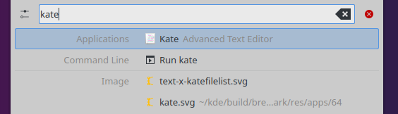
Before (Arc Color theme and Breeze color scheme):
After (Arc Color theme and Breeze color scheme):

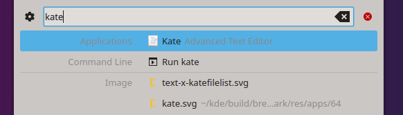
Before (McMojave theme):
After (McMojave theme):

I think what the screenshots actually show is this approach struggles a lot with filled-style highlight effects.
I have a simple proposal: replace the opacity: isCurrent? 0.8 : 0.6 hack with a color hack that would tint disabledTextColor with textColor if isCurrent is true.
Comment Actions
I think I agree with @filipf that disabledTextColor should not be used here. disabledTextColor is also semantically incorrect. This seems to assume that the disabled text color will always be the correct shade of gray for this situation and that's not necessarily true. Is there a way to use something like KColorUtils::mix(textColor, windowColor, 0.2) in QML? That would allow you to get a color similar to reducing opacity without actually making the color semi-transparent, which improves readability.