Companion to D23760
Details
Details
- Reviewers
ndavis - Group Reviewers
VDG - Commits
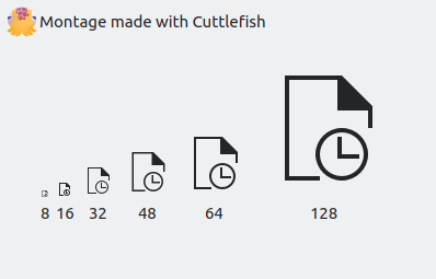
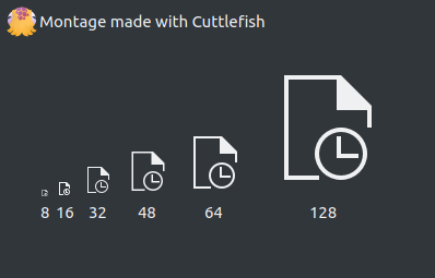
- R266:a8556bfda27b: Make small recent documents icons look like documents and improve clock emblems
Diff Detail
Diff Detail
- Repository
- R266 Breeze Icons
- Branch
- tweak-recent-document-icons (branched from master)
- Lint
No Linters Available - Unit
No Unit Test Coverage - Build Status
Buildable 16191 Build 16209: arc lint + arc unit
Comment Actions
This is one of those monochrome action icons that happens to have a 24px version. The 24px version also has a small bug: the horizontal line at the bottom goes a bit too far into the area claimed by the clock emblem (or else the vertical line on the right doesn't go down far enough).
I can fix that too, or we could delete the 24px versions for simplicity's sake.
Comment Actions
I doubt that there are any programs that use this specific icon at 24px. I should also make a script to automatically create 24px versions of 22px icons though.
Comment Actions
While you're at it, we should auto-generate the dark monochrome versions at build-time. There's no good reason to duplicate all of them with only a single difference (changing the text in the stylesheet)
Comment Actions
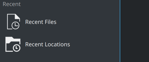
In your screenshot, it looks like the 32px version of document-open-recent is used, the removal/visual fixing of which is discussed in D23778.
The folder-open-recent icon appearsto use a smaller size than that, which is inappropriate.