BUG: 406502
FIXED-IN: 5.62
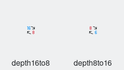
This patch fixes the missing digit "1" in the depth8to16 icon and improves the alignment of the arrows with the pixel grid.
| ngraham | |
| ndavis |
| VDG |
BUG: 406502
FIXED-IN: 5.62
This patch fixes the missing digit "1" in the depth8to16 icon and improves the alignment of the arrows with the pixel grid.
Before:
After:

| Automatic diff as part of commit; lint not applicable. |
| Automatic diff as part of commit; unit tests not applicable. |
I am not quite sure of the version for the FIXED-IN tag.
Also, this bug was reported in digikam running on Windows 10, are there any additional steps necessary to get this change from breeze-icons to the digikam Windows build?
FIXED-IN: refers to the next release (i.e. the one that this fix will make it into). The latest released version of KDE Frameworks is 5.61, so the next one is 5.62.
I imagine the Digikam Windows build scoops up all the relevant assets liek icons and includes them in the installed app. If not, then the breeze-icons framework actually gets installed on Windows somewhere. Either way, you don't need to do anything else.
LGTM! All good, @ndavis?
Not having id="current-color-scheme" causes stylesheets to not work correctly. Other than that, +1.
| icons-dark/actions/22/depth16to8.svg | ||
|---|---|---|
| 1 | style needs id="current-color-scheme" | |
| icons-dark/actions/22/depth8to16.svg | ||
| 1 | style needs id="current-color-scheme" | |
| icons/actions/22/depth16to8.svg | ||
| 1 | style needs id="current-color-scheme" | |
| icons/actions/22/depth8to16.svg | ||
| 1 | style needs id="current-color-scheme" | |
Maybe instead of hardcoding the blue and red colors you can use the stylesheet colors ButtonFocus and NegativeText: https://community.kde.org/Guidelines_and_HOWTOs/Icon_Workflow_Tips#Stylesheets
I thought about that, too, and while the red used in the icon is exactly NegativeText, the blue in the current icon is darker and has a less vibrant hue than ButtonFocus, so I'm not quite comfortable with using that for the blue color. Do we have this darker blue as a CSS color that we can use in this way? I see this dark blue is also used in the channelmixer icon, which has its colors hardcoded as well. I also don't think it would make sense to only use stylesheet colors for only one of these two colors.
Btw, in the relevant HIG page (https://hig.kde.org/style/icon.html#action-and-status-icons) the color ColorScheme-ButtonFocus in the page you linked is called ColorScheme-Highlight and there are other anme differences, too. Is one of these inaccurate, or do they both work?
It's a real shame that we can't specify dedicated icon colors in the colorscheme, otherwise that would be a nice blue to use. Or maybe it can be done, but it would be complicated. I don't think it's absolutely necessary to use ButtonFocus right now.
Btw, in the relevant HIG page (https://hig.kde.org/style/icon.html#action-and-status-icons) the color ColorScheme-ButtonFocus in the page you linked is called ColorScheme-Highlight and there are other anme differences, too. Is one of these inaccurate, or do they both work?
I need to update the HIG. We switched from Highlight to ButtonFocus because Highlight uses the Selection Background color. In the future, I'm going to change the Breeze/Breeze Dark colorschemes so that Focus Decoration color and Selection Background color are different. This prevents blue icon elements from blending in with the selection background.