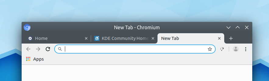
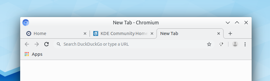
Tabs have had their colors changed to make it easier to tell which is active.
BUG: 403108
| ngraham | |
| GB_2 |
| Breeze | |
| VDG |
Tabs have had their colors changed to make it easier to tell which is active.
BUG: 403108
Breeze Normal:
Breeze Dark:
Breeze Light:
| No Linters Available |
| No Unit Test Coverage |
| Buildable 14968 | |
| Build 14986: arc lint + arc unit |
TBH I don't like it with the standard Breeze color scheme--or any color scheme where the titlebar is a bold or highly contrasting color. The top part of the window starts to feel overwhelming IMO. I think it looks out of place with other windows where that area of color is much smaller.
Could we make the tab bar background and inactive tabs have better contrast with the active tabs without going this far?
+1 to making tabs easier to see. I had to stop using Chome in GTK theme mode but use Chrome's default theme as with Breeze GTK I just couldn't tell them apart.
+100000 to the original contrasted version
The other variant with dark toolbar just looks weird. If I use Breeze light I want light controls, light address bar and favorites.
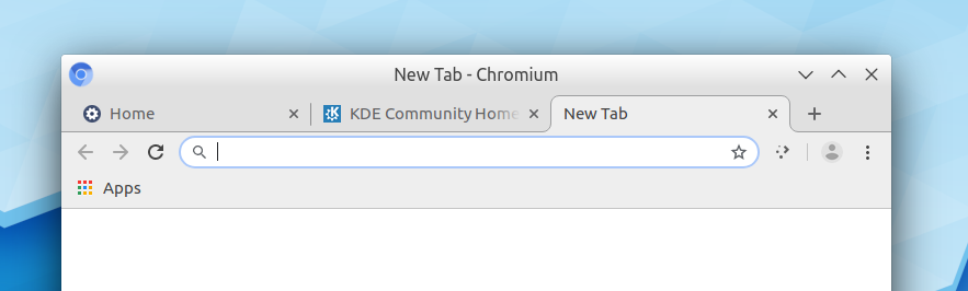
Now it's is literally impossible to tell which tab is active when the window is inactive with the default Breeze color scheme:

This doesn't happen with all color schemes I tested but it's a problem with Breeze.
I'm uneasy approving a change that is so dependent on the user's color scheme to look good--especially if it has problems with the default color scheme. For any color scheme where the titlebar is strongly contrasting with the window background, the top of the window just looks super duper overwhelming to me. It results in a look we have anywhere else and with the default Breeze color scheme I think it looks super heavy:
The only color schemes I can find where I think it looks good are light ones like Breeze Light, Breath, and Materia Light:
Breeze light:

This looks absolutely fantastic.
All of the light options you like lack contrast to the disabled tabs. The main reason I had to stop using Breeze GTK in Chrome is that inactive tabs have the same color as the current one making it hard to see which is the current tab.
Maybe we need to take step back and come up with a solution that works for all schemes, even if it means tinting the user color for this particular control (if that's possible with CSS).
IMO the ideal state of affairs would be to somehow emulate the colors of the standard Qt tab widget:
Not too contrasty, but not too subtle either.
I'm aware of the visibility issues of the window buttons on Breeze light CSD, however fixing those would require changes outside of the scope of this patch.