Tweak spacing and margins, improve the look of headers and descriptions.
| ngraham |
| KWin | |
| Plasma | |
| VDG |
Tweak spacing and margins, improve the look of headers and descriptions.
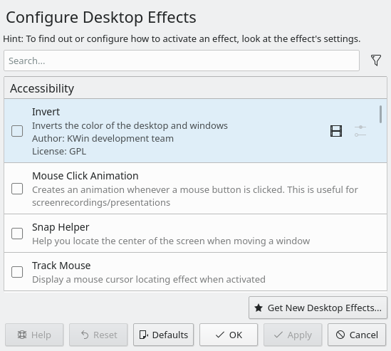
Open the Desktop Effects KCM and hover over a list item.
| Automatic diff as part of commit; lint not applicable. |
| Automatic diff as part of commit; unit tests not applicable. |
+1 for the extra vertical spacing. +1 for using a Kirigami Heading, which is semantically appropriate here.
Even though I don't like it, I won't turn this patch into a vehicle for complaining about our allergy to bold header text. :) However I will leave this screenshot here:
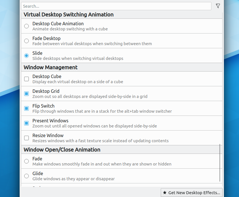
Doesn't it noticeably improve the visual hierarchy to make the category headers bold? Making the text slightly larger (size 3 to size 2) doesn't cut it IMO. In fact I think there's really not enough visual difference between size 3 and size 2 in general, while the gap between 2 and 1 is huge.