[RFC] Implement KDE-style header toolbars and statusbars for Playlist and Context view
ClosedPublic

Authored by ngraham on Jun 8 2019, 7:56 PM.

Details

Summary

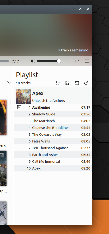
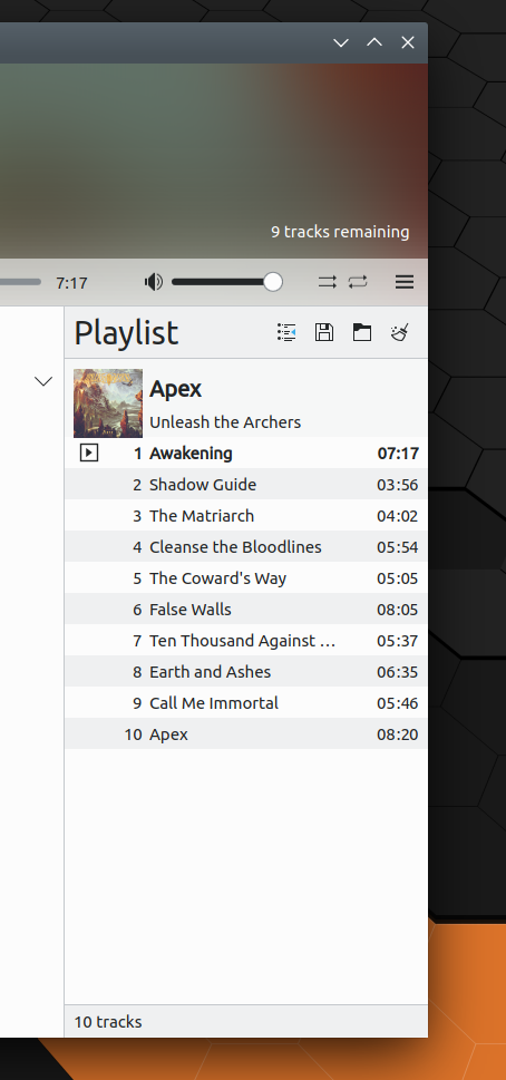
This patch is basically a design proposal in patch form.

Right now, each view's header is not visually separated at all from the content
view below it, and all header areas have different visual styles, some of then
being very tall and taking up a lot of space that could be used for more content.
The context view's flickable is adjusted to take advantage of this, resulting in
a greatly increased amount of vertical space when the lyrics portion is long.

This patch/design proposal implements a new style of header and statusbar
that looks more "KDE-style", for lack of a batter term. It mimics what toolbars
in Kirigami and other QML apps look like. Advantages include:

  • Improved visual consistency with modern KDE apps
  • Visually pleasing separation from content area
  • Scrollable content doesn't appear to get "cut off" under an invisible item anymore
  • More compact headers leave more room for content
  • Code simplification from using a re-usable component rather than multiple custom views
Test Plan

Playlist, before:


Playlist, after:

Playlist + context view, before:


Playlist + context view, after:

This patch implements the new header style for only the Playlist and Context View.
If the proposal is approved and the patch lands, I can do the main view too, which
is more complicated to port and will require changes to the autotests as well.

Diff Detail

Repository
R255 Elisa
Lint
Automatic diff as part of commit; lint not applicable.
Unit
Automatic diff as part of commit; unit tests not applicable.
ngraham requested review of this revision.Jun 8 2019, 7:56 PM
ngraham created this revision.
ngraham edited the summary of this revision. (Show Details)Jun 8 2019, 7:58 PM
ngraham retitled this revision from [RFC] Implement KDE-style header toolbars for Playlist and Context view to [RFC] Implement KDE-style header toolbars and statusbars for Playlist and Context view.Jun 8 2019, 9:19 PM
ngraham edited the summary of this revision. (Show Details)

I really like the result.
I am a bit undecided for the margins around the cover image in context view.

The header in the main view is not currently as good as it could be.
I would love to have it more useful and for example gives more data about the artist or the album when showing one.

We could get this as is and reflects later for the other parts of the interface.

I really like the result.
I am a bit undecided for the margins around the cover image in context view.

In fact my next patch was actually going to be revamping the context view, including removing the album art slice. :) It's redundant, since the main headerbar already shows the album art for the currently playing song.

The header in the main view is not currently as good as it could be.
I would love to have it more useful and for example gives more data about the artist or the album when showing one.

We could get this as is and reflects later for the other parts of the interface.

Is that a shipit? :)

mgallien accepted this revision.Jun 12 2019, 3:22 PM

I really like the result.
I am a bit undecided for the margins around the cover image in context view.

In fact my next patch was actually going to be revamping the context view, including removing the album art slice. :) It's redundant, since the main headerbar already shows the album art for the currently playing song.

I understand your reason but I really liked the cover slice because it provided a strong pleasure when reading this part by being not only about boring text but also a visual image.

The header in the main view is not currently as good as it could be.
I would love to have it more useful and for example gives more data about the artist or the album when showing one.

We could get this as is and reflects later for the other parts of the interface.

Is that a shipit? :)

Yes

This revision is now accepted and ready to land.Jun 12 2019, 3:22 PM
This revision was automatically updated to reflect the committed changes.